Lesson Info
6. Design Vocabulary: Key Terms
Lessons
Lesson Info
Design Vocabulary: Key Terms
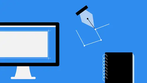
Now let's talk about some things that everybody should know. These air key terms and definitions you need to know before you get started. Ah, lot of these things are going to be terms that you run into while you're working in applications. And also when you're working with printing professionals or different people in the digital space that are doing websites and that kind of thing, all of these things kind of go hand in hand with all that need to be able to speak the language when you're working in this field. Because if you can't speak the language, you're not gonna be able to effectively communicate with other people in this space. So let's talk about raster graphics for a second. This is something that you'll hear me talk about a lot when I'm teaching. Raster graphics are basically images that are created out of blocks of something called a pixel pixels like a dot that exists on your screen and raster Graphics are created generally in applications like Photoshopped, for instance, a...
nd they're also created when you capture something with a digital camera and their edited with this software. Because this software is pixel based, meaning that it is reliant on image, size and image resolution to get the quality of the image. And I'll talk a little bit about P. P I and D P I here in just a second. But basically raster graphics are just photos, images that are created out of little blocks of color and arrange together to form an image vectors. This is my favorite kind of image because I'm an illustrator guy. So vector images are images that are made up of points and pads, so you have anchor points, and then you have pads that connect them and the paths joined together to form shapes. And the shapes, of course, make up the artwork that you have. The great thing about vector images is the fact that they're infinitely scalable without penalty. Whereas if you have an image that's in Photoshopped a photo, for instance, and let's say that it's two inches by two inches and somebody comes to you in there like we would love to use that on a billboard, and the billboard needs to be 200 feet wide. Uh, blowing an image up that big not gonna happen. It's gonna look like ah, a TV show where they had to, like, blur out somebody's face or something. It's not gonna be good. And so vector images alleviate that pain. Vector images can be two inches, 200 feet, 300 feet doesn't matter. They can be scaled up or down without losing quality whatsoever. And that's because they're built out of mathematical formulas. And that's why when you're working in applications like Illustrator and you zoom in, everything is always smooth. There's no jagged edges like you see in photo shop. There's no pics, elation, nothing. Everything is smooth, crisp and clean, and that's what vectors do for you. However, it's very difficult to reproduce photo quality results in vector images, and that's just a kind of trade off you have to have. There's no such thing as a vector photograph. Unfortunately, color is another big thing that a lot of people misunderstand when it comes to graphic design. The two basic color models that you're going to be using a graphic design R C m like a an RGB seem like a stands for science, magenta, yellow and key or black in this case, and basically this is what's used in commercial print Now there are some printing processes today. Digital printing processes that do use RGB but traditional printing processes. You see him like a and so basically that means for each color that you views sigh in magenta, yellow or black. There's gonna be a printing plate for each one of them, and you're going to put ink on each one of those plates and then combine them together on top of each other to form the full color image. Now those four colors cyan, magenta, yellow and black. They all combined together to form just about any color in the spectrum. However, C M y Que is limited in its color gamut as compared to RGB. So when you convert an image from seeing Marcato RGB, you will notice that there is some muting of the tones that goes on because it's simply just not able to be reproduced. RGB, as I said, stands for red, green and blue, and it is the primary color space four screens. So for talking about an IPhone, an IPad, a monitor doesn't matter. All of those are RGB, same for your TV. And so those three colors make up just about any color in the spectrum as well, and they're used to reproduce anything that we see. That's screen based, and I said before and it's true there are a lot of new digital printing processes that are using RGB, but that doesn't mean that you should design for print in RGB because you never know where your object is going to be printed or how it's going to be printed down the road. So I always say, Think about the destination space of whatever your deliverable is. So if your deliverable is primarily for print, I would design that in the CME. Like a space. If you're deliverable is primarily for screen, I would designed that. RGB It just depends on the ultimate destination of whatever it is you're creating. Dp I This is something I talked about a little bit early. D. P I and P P I. R. Two units of measure that basically talked about the quality of an image. Dp I stands for dots per inch, and this is something that we use when we're talking about printed materials. So dots per inch refers to how many dots are in a inch on a printed page. The higher the number, the better the quality of the image. So when you hear somebody talk about 72 d p I or 300 dp I 72 dp I obviously very low, not a very good quality image. That's why when somebody says you don't need to print 72 dp I image. That's because it's gonna look bad. But a dp I image that's gonna look pretty good. That's generally the standard when we talk about print quality or press quality reproductions, So 300 dp I just remember. The higher the number, the better the image. Pretty simple. P p I is what we talk about when we're talking about screen graphics, things that go on a monitor or an application window, Things like that and PP I stands for pixels per inch. So how many pixels are there in an inch on a given screen? Now you'll notice in some of the new phones and mobile devices that we have today, they have insane dp I amounts, and that's because they're creating these things called quote unquote retina screens. These retina screens means that you can't see anything like anti alias ng of the text or picks elation on an image at certain distances, and that just ensures that you're kind of looking at almost like a photograph of whatever it is on your screen. Now, the higher the pixels per inch, obviously, the better the image quality, and you can have unbelievable numbers in the pixel sprint space. Just look at some of the screens that Apple and Google are producing on their mobile devices. Now the PP iess. Absolutely insane, all right. My other favorite facet of design typography, typography is, of course, the art of creating, setting and styling text, and basically typography is anything that you see with type. If you're walking down the street and you see some hand lettering on a store window, that's typography. If you're looking at a billboard and it's got a big headline at the top, that's typography. Even something as simple as a book that you read you might think of that is just plain text on sheet of paper. That's typography. Somebody has taken the time to figure out what typeface to use, what font styling to use, how much space to put in between the lines, the tracking, all of that stuff goes together to form the art of typography, and it really is an art and something that I think more people should invest in because there's nothing mawr irritating to me than bad typography. It's almost like taking your nails scratching on a chalkboard for me. If I see something that's not current properly or something like that, I just kind of shiver. Uh, so let's talk about that. There's a There's a big debate. People always say, You know, that's a cool fun, huh? Well, maybe not typefaces and fonts, two totally different things. But a lot of people don't understand exactly what that means. So typefaces refer to the general family of type that you're using. So an example of a typeface would be Helvetica, Gotham, Ariel that kind of stuff. So all of those air type faces now, when we talk about a fund, a font is a defined styling of a specific type face. So, for instance, if we had aerial bold at 72 points, that's a font, and this is a cool quote that I saw that I think really sums it up best. A font is what you use, so you're using a bold version of aerial at 72 points and a typeface is what you see. So you're seeing the aerial typeface, but you're using the bold version and 72 points. So that's how we think about it. And you'll notice that a lot of people use these terms interchangeably, and I'm not saying that's necessarily wrong. But if you're, you know, if we're splitting hairs, uh, I I would prefer it if people use these correctly, But I'm also a type nerd. So when we're talking about typography, some of the more important terms that we're going to need to know are tracking. Tracking refers to the increasing or decreasing of space uniformly across a block of text. So if you need something spread out a little bit more across an entire block or line of text, that would be increasing the tracking. If you need to sort of decrease the space and nudge things together, that would be decreasing. The tracking Kern ing. Some people don't understand the difference in turning and tracking. Turning is actually the reducing or increasing of space between two characters. So, for instance, if you have like a letter T and an eye. You might want to move that a little bit closer to the T to decrease the space. Basically, when you're laying out type, you want to make sure that the spaces between letters, even though it might not be actually equal in terms of the spacing you wanted to look equal. And a lot of times that requires you to reduce or increase the tracking or the current. Excuse me. A lot of times that means that you're gonna have to increase or decrease the current in between two characters, and it really is makes it's really something to make it more visually appealing to the audience. If you walk down the street and you take a look at billboards and posters and things of that you see, I will bet you that you will see something that is poorly current. And if you just take the time to look at it, look at the type and see if there's something within that line of text that looks like there's too big of a gap. That's the most common thing that happens in current. Once you see it, you'll never be able to unsee it. Unfortunately, this is something I point out all the time and people that I'm with think I'm crazy because we'll be walking down the street. I'm like, Oh, that's that's pork hurting right there. And for non creative people, they just kind of brush it off. But like I said, once you see it as a creative, you'll never be able to un see it. So learn what it is and learn how to control it. A logo. Now you might be wondering, Why don't why don't have this as a key term that I need to know? Well, basically, because a lot of people get it confused. What's the difference between the logo and branding, brand identity and all that kind of stuff? Well, a logo is basically a symbol or a mark that represents a brand, so a logo is actually part of a brand or a brand identity. It's not the same thing. The logo is generally either a symbol, a piece of text, something like that that represents a brand and is oftentimes the most easily associate ID symbol with that particular brand. If you think about the apple in Apple computers, right, that's something that you can instantly see and you knew exactly what it is. The Nike swish. Same thing. I would bet you that I could remove the text from tons of logos that are really famous, and you would instantly know what the company is just by seeing that logo mark. That's what a logo is all about, creating something that's iconic and evokes instant recognition of the brand itself. Now branding. That's a collection of what we call tangible elements that cohesively represent a specific company. Logo's are a part of that, right? You have stuff like letterheads, business cards, websites. All of that is part of the brand identity package that people have with their company. Logo is just one piece of that. So when you think about becoming a brand designer or a branding expert, you need to know a lot more than if you were just a logo design expert. Because logo is just one piece of the puzzle
Ratings and Reviews
Student Work
Related Classes
Design Inspiration