Lessons
Lesson Info
Contrast & Hierarchy
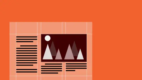
Difference is good. All these kinds of contrast that I have been hinting at and sort of mentioning are kinds of difference or differentiation in form that you want to be able to bring to elements in a composition for two reasons. First, difference creates visual interest whereas sameness creates visual boredom. When everything is the same, there is really nothing to look at. And second, when things become different from each other, they can be understood as different in meaning or different in importance and that means that contrast affects how we perceive the hierarchy of information. So there are a lot of strategies for creating difference or contrast between things. That is you can contrast the quality of dot against quality of line or curve against angle or light against dark or hard against soft, large against small, planar versus a volumetric, flat or textural, active and restful, simple and complex, orthogonal and diagonal, and so on. In addition, adjacent versus overlapping, un...
iform versus differentiated, texture against pattern, ordered against disordered, continuous or interrupted, and there are a number of these kinds of strategies being used in the poster example on the right. And then you also want to sort of think about those contrasts as also relating to each other. That is, creating contrasts between the contrasts so that there are different kinds of contrast brought to bear against each other and that they also happen to different degrees or at different levels of energy. And that kind of quality of different levels of contrast of a certain kind and different kinds of contrast in kind of confluence is called tension. So you always want some tension. So we get different kinds of things going on. We have first the contrast of angle to curve which we also see here in a different way of curve against angle and of angle against curve. But the tension results because of different spatial relationships. This is flat and overlapped but here it seems transparent or next to the object with which it contrasts in terms of angle versus curve. We have different kinds of pointing mechanisms, that is, the contrast of tight angle against open or oblique angle. We have pointing at dot, pointing at dot or circular but solid versus arc. Alignment relationships between very, very small elements that compete against this sort of massive kind of presentation. So it's a very, very tense, very active, very involved kind of set of contrasts interacting with each other. And also here, the dot in combination with the end of this line creates an optical line that points to the exiting point of this curve and that invisible line is the same angle as this physical line. So when we talk about logic in a composition is that's what you're after. You're after all the parts having a kind of a reason for being in the way that they are regardless of how they're organized. So difference creates hierarchy and there are a bunch of different ways that you can create hierarchy by enforcing difference between one element and others or one group of elements against another group and even within one of those groups, difference between an element in the group and the group that it's in. So in this first situation we have essentially an undifferentiated field of objects and without the benefit of this dot being filled in, this circle being filled in to become a dot, is that basically it's a pattern and there's no focal point. As soon as one thing becomes different and it's an extreme difference, that thing is the most important thing, that's the thing that everyone will look at first, and everything else is secondary. Now, what if my information, whether it's images or text, is gonna be a little bit more complex than that? Then I need a more complex hierarchy, I need to create groupings. So in this situation we have a group of heavier circles against the lighter ones. Still the focal point of that dot but within this group there are one, two, three, four sub-groupings that are differentiated by much subtler kinds of contrast. So you get a one-two punch there and then inside you get one, two, three, four. Foreground, background space, that is scale relationship is that thing is more different than everything else around it. Even though this dot and this dot are larger than these dots, all the dots are not as large by any means as this cluster of these two main ones. So the difference between one group and another being extreme allows then for a little bit greater differentiation. Proximity, that is how close together things are and how far apart they are. Two things that are close together seem related to us. Two things that are far apart seem unrelated. Now, similarity or parity of shape creates the suggestion that these two things and these two things might be related. And then as you start breaking internally into groups creating proximity in one grouping versus proximity in one grouping but a spatial difference is that you get again more complexity. Separating elements can create kind of a hierarchy in terms of weight but then also allowing them to integrate with each other. Because these elements are so different in their individual qualities is that the groups will actually read as units even though they pass through each other. So you do have some flexibility in being able to arrange things. I mean, you don't have to put all the stuff of one kind in one place simply because you want people to know that it's all related while this other stuff isn't. You can spread that stuff out a little bit as long as that stuff has an identity that's really clearly different than the other stuff. And then last, the hierarchy and contrast will allow you to kind of move the viewer's eye in any direction that you like. You create a path from the most contrasting or differentiated thing to that thing which is slightly less different than the surrounding field and then to other elements which are much more similar or exhibit much less contrast. So because that's true and the eye will focus on something and then try to find the thing that is the most similar to it and if it finds something that's kinda like it but not quite, it'll go there. It doesn't matter where those things are positioned in space even if it's blocks of text, the eye will read them in that order. This is a diagram, this is a poster and a diagram of the kind of the major hierarchic elements and in kind of three basic levels based on their individual textures, how small or large the elements are. So you can kind of sort of compare each of the three levels. The first level of the hierarchy, second level of the hierarchy, that is what will read second and then third.
Ratings and Reviews
Shereen Atef
he is every thing in design and more,,,,i needed this since i was 12 lool and i will follow his steps in every thing i do as an artist ,,i can't thank him enough or thank you enough, God bless you
Gary Harding
Timothy Samara is a prolific genius. He's also an academic who's written numerous required graphic design books. This is abstract, high-level graphic design theory, and is not practical in a do this/not that/ make your layouts look like this sense, but it is still important. This is advanced thinking and it may not be for everyone.
Brenda
Great information- very helpful for a beginner trying to grasp the basics.
Student Work
Related Classes
Design Projects