Lessons
Day 1
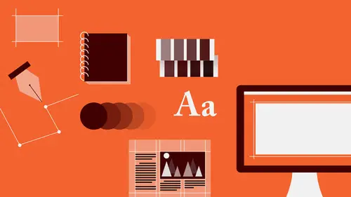
1Introduction to Graphic Design
11:27 2Graphic Design: Areas of Specialization
14:10 3The History of Graphic Design
40:11 4The Designer's Toolkit
11:32 5The Graphic Designer's Tools: Color
06:00 6The Graphic Designers Tools: Typography
01:42 7The Graphic Designer's Tools: Layout & Space
06:33Typical Work Processes
09:13 9Designing an Advertisment
41:46 10Designing a Poster
29:20 11Designing a Book Layout: Basic Concepts
36:02 12Designing a Book Layout: The Details
20:54 13Designing a Website
26:53 14How to Design a Brand Identity: Preperation
25:42 15How to Design Brand Identity: Showing the Client
18:24 16Building Brand Language
14:12 17Designing the Touchpoints
11:15 18Fundamentals are Forever
03:29Day 2
19Form & Image Toolbox
32:07 20Media & Stylization
14:37 21Representation & Manipulation
31:02 22Visual Narrative & Metaphor
19:16 23Color Identity
23:39 24Color Relationships
21:15 25Palettes & Systems
14:39 26Color as Meaning
07:09 27Typography: The Basics
25:16 28Style: Choosing & Mixing
26:01 29Text-Setting Mechanics
15:41 30Styles: Visual Qualities of Text
18:09 31Interactions of Forms in Space
24:46 32Arrangement, Logic, & Rhythm
18:57 33Contrast & Hierarchy
08:09 34Unifying Type & Imagery
05:36 35Working with Grids (or Not)
10:16 36Bringing it All Together
03:17Lesson Info
Arrangement, Logic, & Rhythm
So given that, you know there's so many kinds of options for what you can do with the forms, different kinds of approaches to organizing. So we're gonna look at arrangement and sort of the logic of that. And designers often talk about a visual logic that accompanies the decisions, or that should result from or be perceptible in the arrangement of material. And then also, of course rhythm, which implies movement and potentially spacial depth. So I always like to say, if you're gonna make, if your goal is to make a really dull, not so interesting, tiresome, commonplace composition or layout that will bore people to death, stick stuff in the middle. In any direction, it doesn't really matter. When an object or when a form appears in the middle of the space, if it bisects it, basically what it creates is two spaces that are essentially the same. And there's no need to compare. And when there's no need to compare, the brain understands quickly, gets bored, and says okay bye, gotta go. As so...
on as that form shifts off-center, higher or lower, a little more leftward or a little bit more rightward, suddenly there are now four different shapes of space. Because this is not emptiness, this is a white rectangle. It is a horizontal of a specific depth relative to a specific width. Which is different than the white rectangle that is below the form element. Same width, different depth. And you also have two vertical elements. Or one really tall vertical element that spans the entire height of the format, but is also two things. How weirdly complicated is that? How often is one also two? So whenever you're composing, so you have to look at how the element is breaking the space and what results, in terms of the shapes. And generally, as a rule, the more different the intervals are that are created above and below, left and right of the form element, the more dynamic and engaging the composition is gonna be. So you can think about a line element is essentially a flat thing, there's no real dimensionality there relative to a massive square or rectangle that it's contained inside. So when you're looking at how a line breaks space, it's really along it axis or spine. So you get, again in this case, two different kinds of shaped spaces, one that's square-like up above, and some slight adjustments in width to the side, but you get some really, really interesting kinds of different sorts of rectangles of space to play with. Always keeping in mind that you want to think about those shapes as actual other elements in the composition. So the form is one thing, and those spacial objects, because they become objects and even if you don't see them as objects, you should try to think about them as objects, is that they have relationships to each other, and to the form itself. But once the form actually has some kind of mass to it, is that you have to look at all of its contours. So there's an axis on either side, on either vertical side of the rectangle, there's one above and below. And as soon as you rotate that element, those diagonal axes actually are defined through and you can have them aligned with other axes where the point is defines a horizontal break, as well as a diagonal along the edge that is joined to that point, from that point to the upper point of that side. So the spacial breaking that happens here becomes incredibly complex. And still, we're only looking at one rectangle that's been rotated. But it's a very complex set of relationships. And the brain is chugging along on that. This is like candy for the mind. It's not something that people kind of appreciate intellectually, or even consciously, it's something that the brain is interpreting in a particular way, and the complexity is enticing the brain to kinda look around and see how many of these little connections can I make? And then you've got them. Here again, the overlaps create interesting situations where you sense an axis on one side that is actually passing through a solid object. So it helps to kind of improve the sense of sort of spacial ambiguity, the appearance of depth and so on. So there are kinda two major, oh there's a typo. There are two major kinds of compositional approach. And I will fix the typo. And you have to kind of choose one. Because they're very very different in nature. First there is the notion of symmetry. Which is about relating elements to the central axis of the page or format, and also relating elements, their kind of central axis, to each other's central axes. When I say axis, what I mean is the kind of, the central division point. So when you're looking at a human, humans are symmetrical for the most part. A little off depending on how they're rocking along. So you know, whatever, the center of me is here. So this is my central vertical axis. Depending on my position, I may also have a symmetrical horizontal axis. And you can arrange materials symmetrically in any number of ways. Straddling the axis from left to right, the central axis. Or straddling the horizontal axis from top to bottom. As well as across the diagonal axis from lower-left to upper-right. We refer to this idea that is, where what's on either side of that axis is a mirror of the other side as bilateral symmetry. And where elements relate to each other symmetrically around that axis, but appear to have been flipped, we call this rotational symmetry. And then of course you can combine those together. This is a combination of bilateral symmetry over a diagonal element, and also rotational symmetry. And this is a different kind of a situation. This is kind of quadrant symmetry, in which elements are bilaterally arranged relative to both the vertical and the horizontal axis in the format. So symmetry means dealing with the center and the opposite of that, which this should say asymmetry. Don't read this word. Pay no attention to that word at the bottom of the poster. Asymmetry which is the opposite of symmetry. It means there's no symmetrical relationship whatsoever. That is that every interval, every location of every mass item is different from everything else. No space, no shape, no shape of space ever repeats. Well it might repeat somewhere. But typically there's no single axis involved. So here is an example of a symmetrical element, you can see all the type forms flexing inward and outward and inward and outward and inward and outward and inward and outward around the central axis. And even bilaterally for the most part, supported by external elements that are also placed symmetrically. Here you have a bunch of angles that are interconnecting with each other and different kinds of shapes of space and one directional movement and a second directional movement and a third directional movement and a fourth element and all these weird little shapes and this is asymmetry. Asymmetry is useful for of course, solving the potentially static problem that a accompanies symmetry. Again, as the comparison of left right or top bottom over the central axis produces identical relationships, there is always the potential that a symmetrical configuration will become quite static and a little bit too simple, a little bit too direct. The antidote to that is contrast. So these, by using particularly dots of very different mass, of different size or elements of different size. Or in this case elements that are very different in width relative to how far they extend outward from the center axis. And how much, how close things get to the edge in kind of an alternation. There's a logic. Wide, narrow, wide, narrow, wide, narrow all the way down. By introducing these kinds of fluctuations, is that you enliven the symmetrical experience so that it doesn't become static. That said, asymmetry is always instantaneously dynamic because all of the intervals are different. Question? So would you say there's a logic to the asymmetrical design? Yes. The logic is about point connections and edge connections. And how one plane of typographic elements, their directionality, and the way that those forms, as units, interact with the edges of the format. So you'll notice for example that the edge of this planar form actually points to this connective object, this long line that hits the edge of the format. So the eye is traveling along the axis, the right-hand axis of this shape, and connecting to the point at which another element intersects, or bleeds out, or leaves the edge of the format. From there, that angle or that point becomes the starting point for another form, which now almost touches the edge, but doesn't. As a contrast to another element that is actually dropping off the edge. If you look at the angle of this particular thing, not only is that connection supported, but the upper strokes of the Ls actually point to the corner of this element. So let us not determine or consider that asymmetry is in any way random. It is just as controlled as symmetry is. Symmetry is a much older kind of thinking. Or a much older kind of approach. In terms of how to organize things. And it's based on, you know sort of fundamental and very early, sort of, conception about how nice it is that the human body happens to be mirrored. So naturally, you know and there's a spiritual component to that, in which things that are spiritually made, spiritually derived, like the human, if you subscribe to those kinds of philosophies, being symmetrical there must be something good about that. So let's arrange our material in a symmetrical way as a reflection of that spiritual and sort of natural idea. Flash forward to the 20th century, which is when asymmetry first appears, and you have a time in which not only are culture and technology in a great deal of tumult, but people are looking for a new way to think about how forms can be used to create visual expression. And so, especially in the 1920s and 30s, asymmetry became a kind of a driving, guiding, philosophical principle. Especially in regard to typography. So once you go to asymmetry, there are a bunch of kinds of strategies, different ways of creating kind of organization or structure between forms. And it doesn't matter whether or not the forms are all rectilinear, squares and rectangles, as you're seeing here. I just chose that for ease of making. But, you know, things can align with each other, they can stagger, they can create chains, they can kind of rotate inward and outward. You can have an orthogonal relationship between elements. That is that all the elements respect the vertical and horizontal axis of the format. Or a diagonal relationship. They can step, they can stack, they can cluster, they can mirror, they can be radial, they can be concentric, or spiraling or waving or grid-based or branching or constellation or network and probably a hundred thousand other different ways. You can use kind of proportional methods to try to break space apart. It's kind of interesting. There's something called the law of thirds. It's a very simple compositional device where it creates a relationship not only between three parts that are equal, regardless of the shape of the format, but that two of them can be appreciated as one thing and the other two can also be appreciated as one thing at times, or seen as groups. Rhythmic kinds of proportions. Grid-based sort of proportioning or breaking of space. Musical proportion, that is, and this is really, really true. Is that using the same kind of mathematical logic that governs the pitches of notes in musical cords, like a major fifth or a minor seventh or a major third. That is the apparent interval between the tones as a kind of a spacial idea. And then of course there's this puppy, the golden section. Which comes to us from 500 A.D. uh B.C.E. rather. In which a square sort of carved out of a particularly proportioned rectangle creates a rectangle of the same proportion and then, with a square that also carves out a rectangle of the same proportion, which carves out a rectangle that, this is actually the Fibonacci sequence that creates the spiral of a nautilus shell. So it's a sequence of proportions that actually just derived out of nature. And it's very very interesting. You can create transparency and depth. This is always another, kind of, useful possibility used to try to arrange forms and look at value relationships, as well as strictly formal or form identity relationships in the way that things are organized to create a sense of illusory depth. Again, flat is dull. Three dimensional is very interesting. If you build kind of a situation in which the viewer thinks there's like a little world that they can like jump through the window of the advertisement, and enter into your design, this is much more interesting. So here are just some of the examples of different kinds of space. You know the question of, first off, which of these is closer or further is always an interesting question. You get different responses. But these kinds of elements sort of overlapping, creating the sense of sort of deep holes or corridors of space that are moving this way, not just laterally, left and right. Things that appear to be transparent. Or opaque at different times. An interesting kind of ambiguity, where in this line we can interpret both as on top of this cluster of concentric squares or behind it, or actually weaving through. This is an example, it's a brochure cover, that uses some of these kinds of issues of scale and diagonality and sort of foreground background relationships of value in order to establish what appears to be a kind of a very very deep space. The more space you have, the deeper it feels. The more the space gets filled up, the flatter it feels. The closer things get to the edge, the flatter your composition or layout will feel. The more you pull your material inward, the more floaty they get. These are just some other kinds of foreground background studies. You know what happens with size change? What happens when elements are the same size, but different values? Looking at kind of overlap situations and again transparency. Very very complex kinds of spacial ambiguities where things appear to go inside and out of each other. Creating different kinds of movement. Again, simply by shifting the dot. Rotating an element in comparison to another one. Creating directional movement through the use of angles. Or the perception of curves because of the organization of certain forms in a particular way. To create kind of these sort of kinetic experiences. And again, rhythm as we've seen with lines and planes previously. You always wanna make sure that your spaces are active. And you wanna be careful about spaces that appear to get chopped off, or cut away from the rest of the composition so that all the parts look like they're talking to each other. So here we have the situation where this triangle of space has been cut off from the rest of the composition. This space is calling a lot of attention to itself. It's very dull. And it's also kind of self-conscious. Simply by bringing the end of the line inward so that this space has a little avenue to connect with the surrounding space, allows that space to become now actually part of the composition and not just a kind of leftover that doesn't need to be there anymore. Also as another strategy, overlapping the planar element across that line that still cuts or travels from one edge of the format to another, will also join that space to the larger one surrounding it. Whenever you're organizing elements together, you wanna be conscious of where they're all starting and stopping. And if you ever find that they're all lining up somewhere, chances are you are creating an optical boundary that will cut the space on the other side off. Will reduce it's activity to almost nothing. So the composition really ends here. And then there's this kind of blah up above it. As you have so much kind of active contouring and very tense moments of interconnection between angles and curves, ziggity zaggities. And then suddenly there's nothing. It's like. So all I have to do is just pop something up above that line and suddenly that space is now kinda sucked into participation. That's really what you're after is for all the spaces to feel like they're participating and not kind of shunted off to the side. Overlaps of course can do amazing things for activating space.
Class Materials
Bonus Materials with RSVP
Bonus Materials with Purchase
Ratings and Reviews
photo_dj
This is more about all of your courses - It would be really nice for instructors to answer questions during break times or even after the class. There a lot a fabulous questions that I see that never get answered. I would like to go back even the next day and see a short note for at least some of those questions. Just an idea to help out this wonderful format that you have going. I am sure to make use of the promote question when I see an interesting one.
user-1f91d5
I LOVED this class! I learned so much and since I had the foresight to purchase it, I can go back for a refresher anytime I want. Plus, the downloads are spectacular! Almost a book's worth and so helpful! Thank you Timothy, you are great teacher!
a Creativelive Student
This was an outstanding course, would love to see a more in depth typography course from this guy. I'm a proffesional photographer with a formal education in design, I hardly ever use it, so I forget things, this was great both as a review, and to pinpoint things I didn't know or thought I knew. thanks once again! well done!!