Lessons
Day 1
1Introduction to Graphic Design
11:27 2Graphic Design: Areas of Specialization
14:10 3The History of Graphic Design
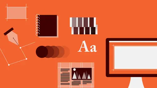
40:11 4The Designer's Toolkit
11:32 5The Graphic Designer's Tools: Color
06:00 6The Graphic Designers Tools: Typography
01:42 7The Graphic Designer's Tools: Layout & Space
06:33Typical Work Processes
09:13 9Designing an Advertisment
41:46 10Designing a Poster
29:20 11Designing a Book Layout: Basic Concepts
36:02 12Designing a Book Layout: The Details
20:54 13Designing a Website
26:53 14How to Design a Brand Identity: Preperation
25:42 15How to Design Brand Identity: Showing the Client
18:24 16Building Brand Language
14:12 17Designing the Touchpoints
11:15 18Fundamentals are Forever
03:29Day 2
19Form & Image Toolbox
32:07 20Media & Stylization
14:37 21Representation & Manipulation
31:02 22Visual Narrative & Metaphor
19:16 23Color Identity
23:39 24Color Relationships
21:15 25Palettes & Systems
14:39 26Color as Meaning
07:09 27Typography: The Basics
25:16 28Style: Choosing & Mixing
26:01 29Text-Setting Mechanics
15:41 30Styles: Visual Qualities of Text
18:09 31Interactions of Forms in Space
24:46 32Arrangement, Logic, & Rhythm
18:57 33Contrast & Hierarchy
08:09 34Unifying Type & Imagery
05:36 35Working with Grids (or Not)
10:16 36Bringing it All Together
03:17Lesson Info
Building Brand Language
After the mark is developed, what happens then is you have to sort of think about well what is the kind of realm in which the mark is going to live. 'Cause the logo is only a tiny portion of the brand. And even though, the logo is important, because it tells who, it's what you use to recognize the organization. It's really the other stuff around that's really going to carry the brand. So color, typeface usage, compositional ideas. What kinds of images, whether they're photographic or illustrative. What kind of illustration or combinations of those? How are images cropped or silhouetted or bleed off the edge of a page or off the side of something in a particular application. So what you're really building is a kind of a kit of parts almost like individual words or sort of grammatical chunks and you're building a language. It's a visual language, and just like any other visual language, all the parts have to talk to each other, and the first thing that they have to talk to is the logo. S...
o my exploration, the first goal was to launch the website, so I went there as a starting point and it was a very fast study. First, I looked at the market, and some of these show sort of earlier versions, because that refinement to the solid, actually happened over time. And this is an earlier, an earlier iteration of the type lock up. I'm gonna start to look at, you know, what kinds of supporting typography might there be. I wondered about bringing that sort of handwritten idea back in as a kind of a call out or a pull quote, something to emphasize, almost like you were writing on a recipe card or in a cookbook as kind of notes. There was going to be a kind of a thought of day. I wanted to bring back some of the other kinds of graphical elements. This is also the thing that you always have to keep in mind is that you're generating, in that initial study for the logo, all this stuff and it, and it really actually doesn't have to go away. Is it sometimes you end up making a lot of very interesting elements that, when combined with the logo or combined with each other, you know, they're not the symbol anymore, but they can become used as a decorative band to introduce contrast or you might look at something like here's a way of influencing the typography. So sometimes the, these other kinds of ideas make their way back into the final material. And there also most, sort of most importantly was the kind of a cleanliness. It's almost, it's almost clinical. And so I was trying to impart a certain kind of, a certain kind of elegance, and also a sort of an idea of precision, of consideration, of thoughtfulness, and of cleanliness. Clean, not necessarily in a, you know, physical sense, but clean of spirit, clean eating, clean cook, cooking surfaces. The clean kitchen and so on. And there's something, you know, this sort of, by using the silhouetted image with a very little bit of contrast in the background. It allows the material, the text material, the content, to pop forward. But at the same time, it also sort of refers to sort of packaging design that's often used for culinary tools. Like if you go to a place like Williams-Sonoma or any other restaurant supply store and you look at packaging for cutlery and... Plates and dishes and saucepans an so on, is that it tends to be very very descriptive, often photographic and, that there's a kind of, there's a metaphor there. There's a language, a vernacular, that is common to that. And that's a kind of an expectation or an association that you can give, put forth to the audience and make them make that connection even though it might be sort of tangential in some way. Next, I was looking at the engravings. Using the kind of that, the sort of the round, sort of stamp idea from another logo variation, and the same type face for calling out a kind of cooking tip. Using the engraving not only as kind of a background, but also a icons for different sort of subcategories. So with the sort of primary or global navigation constrained to this very very thin strip and the content essentially going to scroll underneath that. On the entry page, which is going to feature the blog article kind of entry point. There were gonna be these other sort of separate articles, and these, these would refer to her really kind of callouts of specific kind of elements, giving, again it's almost a kind of, sort of diagramming quality to the typography. And then sort of a combination, we started also to get a little bit closer to color, so there was this kind of green-purple thing going on that we kept bouncing around about. For the blog itself, she was initially very interested in shooting photographs of objects silhouetted that is not contained inside of a box, so that you would have this very very clean, very direct, somewhat honest or authentic quality in the presentation. No fluff. No extra clutter and so on. Start to look at some additional type faces and a structure for how things might be arranged that could inform other material, and that's where, we went really quickly then into really defining the system, which follows. So there's the mark itself, and so what you're looking at here are really the kit of parts and you'll see all of these kinds of decisions that have been made at some point along the way kind of isolated and sort of coming together. I began then really sort of trying to define what is the relationship between. The green-violet combo is essentially, sort of, it's a sort of complimentary relationship as between green and red, but just off a little bit. And sometimes, so what I would gain there would be a very very dynamic optical color experience, but at the same time, something that wasn't so jarring that it would seem kind of sharp or unfriendly or dangerous or jarring. So I was after comfort. So by softening the complimentary relationship and moving the red away from direct confrontation with the green towards, or rather this way towards the red-violet, towards the violet, it cools it off, makes it a little bit friendlier. And then I was interested in, and plus the green. I did end up going to green as a representative of naturalness and organisism, and plants, and so on. You know, why fight it? But it's not... A kind of earthy green. It's not a, it's not a soy green. It's not a spa green. It's not a minty green. It's a, it's a kale green, but really really super fresh kale. So you're trying to match kale, was our goal. So these are swatches of ink that show you the actually ink color that come from a Pantone book, so you can really see what those colors are gonna look like printed on paper, and so you're not judging against a screen. That's always something to be aware of, is that when you're judging against a screen, you can't really. The screen, the monitor changes, the color's off. You have to, you know, if you're designing for print, you have to look at the color in physical daylight printed on something in order to know what it's really doing. Also began to look at paper stock. So this is how the mark translated in color. The two colors are the same value, that is, if you were to take a black and white photograph of this mark, they would, each area, the green and the violet would appear to be the same tone of gray. That one is neither darker nor lighter than the other. These are the color pallettes, and so there are two defined. This is the primary pallette. Here's the violet and the green and then as a kind of a tertiary color that would show up in specific sort of high level, or primary brand applications like stationary or advertising, I introduced a third green which is a little bit more vibrant. This is much more electric than it is in real life. It is, it is a yellow-green, but it's very soft. Then as a kind of a secondary palette to provide accent and contrast when necessary but still relate to the primary corporate pallette, I chose a sort of variance of the two primary corporate colors. So, a deeper and slightly cooler version of the corporate green to add some depth to it. A cooler and much deeper version of the violet, as well as a much punchier and slightly hotter or warmer red-violet for accents. And then a kind of a hybrid between these two, in case I needed to create some kind of a transition between some kind of message on one place and some kind of message on another, is that something in between that not quite as yellow as that, and not quite as blue as that, and not quite as dark, nor quite as light, but... in the Goldilocks zone. And then these are the brand typefaces. So, there's a serif. It's really a slab serif, in a number of weights. This is the lightweight that's used for the word mark within the logo. And then also, the medium and bold weights are used for different kinds of information. As a support, there's a complimentary sampling of sans-serifs that was designed simultaneously with the serif version so that it gives me a lot of flexibility for complex hierarchic problems without sacrificing overall stylistic unity, cause they're, they're designed with the same kind of proportions, the same kind of curves in the rounded forms. The same kind of shaping in the legs of the R and the G. The same kind of descenders as far as, well related to a sans-serif. And then a couple of typefaces, one from some of the earlier visual language studies, this kind of, sort of informational sort of typewritery type that I'm not even sure I can explain why I think it makes sense here. There's something kind of informational about it. It has, it carries a little bit of sort of scientific credibility, but not really. It's a little old world, 'cause it is kind of a typerwriter type face, but not really super old world. It's got a texture that works really well with the other elements. And the last... I Selected another typeface, a script bringing back this hand generated element, again for specific element uses. The image language was actually engraving, and so I sourced dozens of 19th century engravings of vegetables and fruits, and painstakingly scanned them, cleaned them up, adjusted them, altered them, customized them. Simplified the number of lines. And that was an interesting process. And for a reason that I'll talk about later. I built one composition of them together. They can be used independently when they need to, but I found that there were a couple of, there were a couple of instances, where I needed to create an overall field of texture or pattern, either as a background or as a surface against which to place some message element, and it came in handy. And in color, it looks like this. So this is the two colors combined. That is the primary green and the primary violet. When they print on top of each other, they create a new color, which is kind of a deep violet-blue. That combination of colors, actually created some issues that I had to deal with in terms of how I set up the files to reproduce when we went to press, so that the violet quality or the red-violet quality of the primary brand didn't quite disappear and become quite as blue as you're seeing it here. This is just an enlargement of those, that language. These are two supplementary elements. The top are a series of icons that are used only on the website to denote things like cooking time, and shopping tips, and stuff in the pantry, and cooking tips. That was based on the sort of small iconic elements at the bottom, but I decided to configure them in a language, a line language that spoke directly to that of the logo. And then the tag line, which is actually trademarked now. Down to Earth. And so, it seemed that this sort of, the generous and friendly and spontaneous and human quality of handwriting seemed to be, to make a lot of sense for that particular element, and it's used on everything. From the proportions of the logo lockup, I derived a grid formation that was to be used for all, all print applications, all internet applications. Everything. So it's based on the width of the symbol itself, and it creates this kind of column structure. The only deviation that happens is that, and this is really kind of a diagram of how that grid is implemented, or one way that it's implemented on the stationary, is that there's a separation between the first column and the remainder, so that the logo's column is actually a little bit away from anything else that's... That it's juxtaposed with.
Class Materials
Bonus Materials with RSVP
Bonus Materials with Purchase
Ratings and Reviews
photo_dj
This is more about all of your courses - It would be really nice for instructors to answer questions during break times or even after the class. There a lot a fabulous questions that I see that never get answered. I would like to go back even the next day and see a short note for at least some of those questions. Just an idea to help out this wonderful format that you have going. I am sure to make use of the promote question when I see an interesting one.
user-1f91d5
I LOVED this class! I learned so much and since I had the foresight to purchase it, I can go back for a refresher anytime I want. Plus, the downloads are spectacular! Almost a book's worth and so helpful! Thank you Timothy, you are great teacher!
a Creativelive Student
This was an outstanding course, would love to see a more in depth typography course from this guy. I'm a proffesional photographer with a formal education in design, I hardly ever use it, so I forget things, this was great both as a review, and to pinpoint things I didn't know or thought I knew. thanks once again! well done!!