Lessons
Day 1
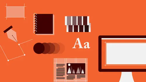
1Introduction to Graphic Design
11:27 2Graphic Design: Areas of Specialization
14:10 3The History of Graphic Design
40:11 4The Designer's Toolkit
11:32 5The Graphic Designer's Tools: Color
06:00 6The Graphic Designers Tools: Typography
01:42 7The Graphic Designer's Tools: Layout & Space
06:33Typical Work Processes
09:13 9Designing an Advertisment
41:46 10Designing a Poster
29:20 11Designing a Book Layout: Basic Concepts
36:02 12Designing a Book Layout: The Details
20:54 13Designing a Website
26:53 14How to Design a Brand Identity: Preperation
25:42 15How to Design Brand Identity: Showing the Client
18:24 16Building Brand Language
14:12 17Designing the Touchpoints
11:15 18Fundamentals are Forever
03:29Day 2
19Form & Image Toolbox
32:07 20Media & Stylization
14:37 21Representation & Manipulation
31:02 22Visual Narrative & Metaphor
19:16 23Color Identity
23:39 24Color Relationships
21:15 25Palettes & Systems
14:39 26Color as Meaning
07:09 27Typography: The Basics
25:16 28Style: Choosing & Mixing
26:01 29Text-Setting Mechanics
15:41 30Styles: Visual Qualities of Text
18:09 31Interactions of Forms in Space
24:46 32Arrangement, Logic, & Rhythm
18:57 33Contrast & Hierarchy
08:09 34Unifying Type & Imagery
05:36 35Working with Grids (or Not)
10:16 36Bringing it All Together
03:17Lesson Info
Color Identity
Color tends to either freak people out and confuse them or make them kind of uncomfortable because a lot of what happens with color is so subjective and we come to the kind of, perceiving, thinking about color from very, very personal viewpoints and so very often designers are totally at a loss for where to go or how to even think about color, whether it's a starting point of a project or down the road once basic kind of form and messaging image ideas have kind of been sussed out. So I'm going to talk about that. What we are going to do first is become familiar with color identity. That is how do you name a color, how do you describe a color, and then we're going to understand, look to understand relationships between colors, how colors change in juxtaposition. After that, we're going to talk a little bit about how to think about going about defining a palette, that is a selection of colors to use for a particular project and we'll be talking a little bit also about how color can be us...
ed as a system and we'll end up by talking about how color can be not just a really amazing visual experience but how it can also be useful for enhancing meaning, delivering narrative and so on. So, let's go. It's a very interesting question, this. Which is it? Is it blue, blue, or blue? The answer is that these are all blue and that you can't really define a color out of any context in your own head until you can see it in some world juxtaposed with others. But even so, even if you were only looking at one swatch of blue, you might register it as blue but you really wouldn't have any other kind of framework in which to consider what is the real kind of quality or the identity of that particular blue? So we have to sort of understand how one might define or describe a particular color and there are four attributes that every color exhibits or presents that we can use to kind of get a handle on what it's color is really about. The first one is hue. The term hue refers to a distinction between identities of color as defined by their wavelengths. That is color is light, where it is reflected or refracted light and when you're looking at something of a particular color, what's happening is that the certain refracted wavelength that you're perceiving off of an object because of it's chemical or physical makeup is striking certain areas of your optical system, your retina, and you are perceiving just that particular wavelength and that's what we think of as hue. So a hue is, in simpler terms, not to get all sciency on you, is the difference, for example, between orange and blue. This is an orange hue. This is a blue hue. So once we've determined whether or not we're looking at orange or blue and we're looking at blue now, we have to think about or understand whether or not we're looking at a very vibrant or vivid or bold kind of presentation of that color or whether or not that color, that hue, is kind of diminished, kind of dulled out or grayed out, a little smoky. And we describe that difference in vividness or brilliance and desaturation or neutrality with the term saturation. That is we say that a color which is very, very intense, we would describe as being saturated or super saturated. Full with that color, full strength. And a hue that is kind of grayish, a little bit more neutral, not so intense, we would refer to as dull or desaturated. We can also describe the color in terms of how it feels with regard to a kind of perceived temperature. All colors are perceived for one reason or another, usually because an association with something in the world that is that color as being relatively either cool or warm. And so we can also take a look at these two blues and compare them and we would say that the lower blue is a warmer blue because we can sense a little bit of green or yellow in it. And in comparison to the blue above, that blue is cooler as we can sense a little bit of violet in it. And it's really only one two colors that are this subtly different from each other are directly juxtaposed that you can really sense the difference between that and sometimes, of course you can make that difference in temperature quite extreme if you'd like but it can also be quite subtle. And last, we can describe a color as being either relatively light or relatively dark and the term that we use to describe that quality is value and it refers to the tonality relative to or in comparison to tonalities of black which are also called gray. So the blue swatch at the top, we would say is a darker value than the blue at the bottom. You'll notice that this light value blue also appears to be somewhat less intense than the darker value blue above it and so what we're going to find out is that changing the attributes, the individual attributes of a particular hue will often affect the other attributes in some way. So of course we're first familiar with kind of a categorizing of colors based on their kind of relative simplicity and that really has to do with where they exist in the spectrum and so we all became familiar with the primary colors as children: red, blue, and yellow and nobody probably ever told you why they're called primary and basically it's because those three wavelengths, the wavelengths of each of the primary colors, of red, of yellow, and of blue, are as far apart from each other on the visible range of the spectrum as can possibly be and their wavelengths cannot be confused with each other at all. That is also because their individual wavelengths only strike particular rods or cones in the retina of the eye and that there's no confusion on the part of the visual system as to which wavelength is being absorbed and then interpreted. So we call those colors kind of primary because they're kind of therefore a little bit basic. Wavelengths that occur in between, we give different names to. So the wavelength, the color wavelength of the hue wavelength that exists exactly evenly between the wavelength of yellow and the wavelength of red, we refer to as orange and it is a secondary color. As violet is a secondary wavelength between the primary red and the primary blue and the secondary green is, or green is a secondary wavelength between the primary yellow and the primary blue. Some colors have specific kinds of intrinsic properties. In particular, value. Depending on where the color falls on the spectrum, it will be intrinsically of a darker value or of a lighter value in it's kind of native and full strength, fully saturated state. So yellow is always, can only really be perceived as a light value color in it's pure state. Violet is intrinsically a dark value hue. The value of a color affects it's saturation and so but does not necessarily affect the identity of the hue itself. So these, we would both categorize as red. The top swatch is an intense red of medium value and the lower swatch is a darker value red. You also notice again that the intensity of the red in this, of this particular red is less than the intensity of the upper swatch red. And last, changes in value can also affect and changes in, changes in value can also affect our perception of a color's temperature. So in the top swatch the relatively light value blue seems a little bit warmer, a little bit greener and the darker value swatch of the same blue seems a little bit cooler. So sometimes when a color deepens in value, it also shifts a little bit in it's temperature. So you always have to be watching as you change one of the attributes of a color to make sure it still retains the identity that you were intending or that you started out with. So saturation again refers to relative vividness or brilliance versus dullness or desaturation. And these are just kind of examples of a very, very highly saturated color pallet. Very, very intense magenta or red violet, an intense yellow, an intense blue green. Here on the other hand, these are book spreads that use very desaturated colors. Where you see that there's a little bit of intensity that occurs in the photography where the oranges and yellows and some of the greens appear closer to full strength. You'll see that the vast majority of the surrounding area and the images around the food as well as the color applied to typography and the page surface have been sort of translated from those basic colors. Kinds of greens, kinds of yellows, kinds of oranges that have all been desaturated have had the color dulled out of them in order to quiet them down and not, to not allow those text elements to really compete with the photography and even within the photograph itself, the imagine has been art directed so that the prop setting and the use of light focuses the intensity of color on the food and diminishes it's intensity, desaturates it, in the surrounding background elements. And that, again, is kind of a strategy for providing a kind of rich and sensuous, very, very tactile, very physical almost taste like sensation for the food. So again here's just a comparison of an intense hue. In this case green and kind of a desaturated version which begins to become a little bit gray. We say that this green has been somewhat neutralized or subdued. Some colors, some hues, have also in the same way that they have intrinsic sort of value identity, many of the hues also have an intrinsic relative saturation identity. In almost all cases a primary yellow at full saturation will always be more intense than any of the other hues, in particular blue which generally has a mid level saturation relative to other colors. In general, warm temperature colors tend to be perceived as more intense, more saturated than cool temperature colors. And last is just again another look at how a change in value that is by lighting the value of that green swatch that it's intensity, it's saturation, also appears to diminish. Then we can talk about value, which is the relationship between relative lightness and relative darkness. So generally we talk about that in relationship to black that at it's strongest, any hue has a particular value difference from black. Black is the ultimate in deep value. It is the darkest value achievable. Essentially it is the absence of reflective light. So violet or blue violets have a very, very deep or dark value intrinsically in their purer saturated form but there is no violet, no matter how dark it gets, at full saturation that can come close to achieving the darkness value of black. Colors of different temperature also exhibit intrinsic differences in value. As we said before, this particular green blue which is the purest spectral green blue, a tertiary color and this yellow green have an intrinsic temperature, value difference. That is the green blue or rather the blue green is, will always be darker than the corresponding pure yellow green. That's really simply because this hue being closer to yellow is drawing upon the intrinsic light value of yellow as part of its identity. Whereas this hue, being closer to blue in the spectrum, is being influenced by blue's intrinsic darkness. So colors can be sort of registered or compared to levels of gray and what's happening here, interestingly, is that the orange is a very, very intense color but it is the same value as the gray swatch below it. That is, if you were to take a black and white photograph or a black and white scan of this combination, what you would end up with is one large rectangle of a continuous gray, there would be no boundary visible here so that means that the values are equivalent. They are the same relative lightness or darkness. Different things happen sometimes when you begin to color shift in terms of temperature you will also tend to get a change in value, especially at full strength. As you lighten that secondary hue or change it's intensity it will become even more different in value than the swatch previously and then this is just a comparison of two blues. One of an intrinsically darker value and one of a lighter value. Also there's a temperature shift here. Cooler on this side, warmer on this side but you see, so there's a really stark boundary that your eyes are traversing. You're very conscious of the division between the two swatches. As the values of these two squares become similar to each other, that boundary appears to vibrate or to blur or to disappear and again, similar to the other large called out example on the far right, if you were to take a black and white scan or a black and white photograph of this swatch pairing, you would essentially end up with a horizontal block of one continuous gray. There's an example here of how value is used to call attention to elements in a typographic hierarchy that is using darker values which tend to advance towards us in space against lighter values which tend to recede from us in space, or they're perceived that way. In order to create a specific ordering that allows the reader to navigate in a clear and direct and decisive way, despite the fact that the typography is formed in kind of a randomized kind of cluster. If all of these typographic elements, if all these words were the same value, the large one would likely read first because it is so much larger than the remaining text but once you got past that point, the similarity in size and the equivalence in value would make it very difficult to determine which of these things to read first and in what order. So value as we're going to see this afternoon, plays a very, very critical role in enhancing legibility and readability in typography. You can completely destroy a very legible, easily navigable typographical layout by misapplying color relationships to text and you can also enhance it tremendously and you can also play some interesting games as this one does. Typically we're often, it's sort of true that the largest object, the largest visual element in a field, in a composition will be the most pronounced, will dominate the others and will be read first, especially if it's type. In this particular case, you see that in the background is that this word mark, Royal Court, has been repeated at a tremendous size which is really, really quite large and yet it's the last thing that we're able to read. And what's happening here is that the difference in value contrast has been diminished to almost none. These two colors are the same value and they are overall lighter together at that value and therefore have more contrast than any of the other elements do in this particular group. So even the white that is, the white text that is knocking out or reversing from that color field has more contrast against that background than the large, the gigantic text does against the background. So by pulling values of the huge visual element and the background that it's resting on very close together and making that value as different as possible from the relative values of the other elements in a grouping, it's possible to cause a very, very large and potentially interfering typographic element to become nearly invisible and to read last in the hierarchy. Temperature again is about the perception of coolness and warmth. Here's an image in which two very, very complex photographs of architectural interiors that have a lot of detail, a lot of repetitive visual forms, linearity, a lot of movement, curves, angles, small dot elements could potentially might be competing with each other or in this particular layout could have been almost been too repetitive of each other and somewhat monotonous. Since there is a similar degree of activity, a similar degree of complexity, a similar degree of scale elements is that there's not really that much visual differentiation in the form language in these two images. The thing that offsets that is the temperature shift. In this particular image, the temperature is concentrated in the cool range. That is almost all the elements here exhibit a temperature that is somewhat cool in the kind of blue, blue violet, blue green and is also all those hues are relatively desaturated. On this side however there's a very, very strong pronounced element which is warm and it's that warmth in this particular image, even in the lighting, in the background of the interior that allows this image and this image not to fight with each other but still to kind of talk to each other in their kind of relative complexity. So colors have intrinsic kind of temperature attributes. Reds, oranges, and yellows are intrinsically warm and blues, violets, and greens are intrinsically cool. As a color or a hue shifts from one wavelength to another, it will very often change temperature. Temperature is intrinsically kind of one of the basis of the hue wavelength so a change in temperature is essentially a change in hue. Starting with a kind of more orange yellow of a same value as a more intense yellow and then a same value of a yellow green so we're going kind of here in a progression from warmer to cooler. Here what you're looking at, the color on the monitor as I'm seeing it is quite different but here you have two very, very desaturated colors that will read initially, and especially if they were separated from each other, as gray. With having almost no kind of chromatic appearance whatsoever. As soon as their brought into juxtaposition, the subtlety of those two colors becomes apparent. This is an absolute neutral gray. That is, it is a tint of black. It is a tonality of black or a value of black. So it offers absolutely no chromatic information. It's only by bringing this other gray swatch into direct juxtaposition with it by butting them together that this particular swatch, which formally read as gray, in comparison now reads as cool and may even begin to be interpreted as blue. And as you start to look at the two hues back and forth, that apparent difference which is completely an illusion begins to become exaggerated. The neutral swatch on the top will become, will take on the appearance of being warm and may even start to appear to be orange. Isn't color fun?
Class Materials
Bonus Materials with RSVP
Bonus Materials with Purchase
Ratings and Reviews
photo_dj
This is more about all of your courses - It would be really nice for instructors to answer questions during break times or even after the class. There a lot a fabulous questions that I see that never get answered. I would like to go back even the next day and see a short note for at least some of those questions. Just an idea to help out this wonderful format that you have going. I am sure to make use of the promote question when I see an interesting one.
user-1f91d5
I LOVED this class! I learned so much and since I had the foresight to purchase it, I can go back for a refresher anytime I want. Plus, the downloads are spectacular! Almost a book's worth and so helpful! Thank you Timothy, you are great teacher!
a Creativelive Student
This was an outstanding course, would love to see a more in depth typography course from this guy. I'm a proffesional photographer with a formal education in design, I hardly ever use it, so I forget things, this was great both as a review, and to pinpoint things I didn't know or thought I knew. thanks once again! well done!!