Lessons
Day 1
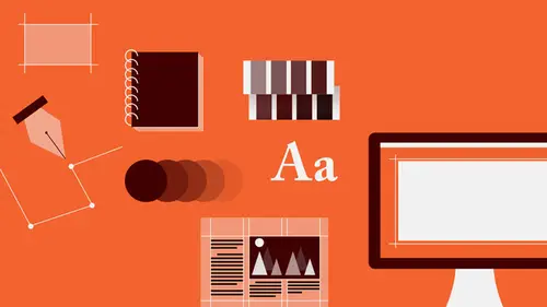
1Introduction to Graphic Design
11:27 2Graphic Design: Areas of Specialization
14:10 3The History of Graphic Design
40:11 4The Designer's Toolkit
11:32 5The Graphic Designer's Tools: Color
06:00 6The Graphic Designers Tools: Typography
01:42 7The Graphic Designer's Tools: Layout & Space
06:33Typical Work Processes
09:13 9Designing an Advertisment
41:46 10Designing a Poster
29:20 11Designing a Book Layout: Basic Concepts
36:02 12Designing a Book Layout: The Details
20:54 13Designing a Website
26:53 14How to Design a Brand Identity: Preperation
25:42 15How to Design Brand Identity: Showing the Client
18:24 16Building Brand Language
14:12 17Designing the Touchpoints
11:15 18Fundamentals are Forever
03:29Day 2
19Form & Image Toolbox
32:07 20Media & Stylization
14:37 21Representation & Manipulation
31:02 22Visual Narrative & Metaphor
19:16 23Color Identity
23:39 24Color Relationships
21:15 25Palettes & Systems
14:39 26Color as Meaning
07:09 27Typography: The Basics
25:16 28Style: Choosing & Mixing
26:01 29Text-Setting Mechanics
15:41 30Styles: Visual Qualities of Text
18:09 31Interactions of Forms in Space
24:46 32Arrangement, Logic, & Rhythm
18:57 33Contrast & Hierarchy
08:09 34Unifying Type & Imagery
05:36 35Working with Grids (or Not)
10:16 36Bringing it All Together
03:17Lesson Info
Designing a Poster
So a poster is essentially an ad. It's just bigger. It has street level presence. It is really an environmental kind of a format. It derives its power from the fact that it is so large and it gives the designer a lot of wiggle room. And the potential for tremendous scale contrast. You can make stuff really super big, and you can also get stuff to be quite small and create very profound kinds of contrast in, or perception in spacial depth. It also allows you therefore to control the hierarchy you can really focus attention on the big idea really quickly, and then allow people, permit them, to gain access to less important information simply by walking up to it. Because a poster has multiple levels of reading. It is intended to function in two ways, and sometimes three ways. First there's the distance read, that is seeing a poster on a wall 30 or 40 feet away while you're going by on a bike at 20 miles an hour avoiding traffic and at that read you should be able to know what it's about, ...
when it's happening, and what it really feels like. And that's really about all you need. When you have the opportunity, once you've drawn the audience in, because you've engaged them at that level, they're gonna walk up to it. People are curious. And so when you walk up to the poster, you actually kinda step inside it and it becomes almost like a book. It becomes an intimate reading experience where people can take their time and they can choose to pick through more detailed information at a much smaller size. So while for street level impact, very often, intuitively, you may use both image and typography, very large. A title, a headline, super big because you have the room to do it, is that secondary information can be as small as what you might find in a newspaper, 8, 9, 10, 11 points, if that information is not really critical for the viewer's needs. And part of designing is understanding, what does the viewer need, when do they need it, and what order do they need it, and if they don't get some of it, is it okay? This poster was promoting, it promoted a dramatic event, a theatrical performance of a new play that was set in Iran, in Tehran specifically during the 1979 Islamic revolution. So it' call Spring of Freedom, Summer of Fear because the revolution actually took place in the spring around the time of the Persian New Year, which is called Nowruz. And because of the sort of symbolic nature of that event, which is about renewal and rebirth and potential, and optimism and hope, the violence associated with the aftermath of the revolution and how it affected families and their relationships, ideologically and politically and socially, it was really the crux of the matter. So my research began first with finding out about the Islamic Revolution. I think I was 9 or 10 when that happened. And I remember it kinda vaguely but I read about it. I was very, very interested in the images that I saw of people participating in rallies and demonstrations during the revolution, the painted fingers, wall paintings that was both typographic or calligraphic, as the case might be, as well as graphical forms that had political qualities to them. So that was very, very interesting to discover. I looked at some other forms of political communications, posters, magazine ads, and so on, that were from the time just to get a sense of what's the illustriative language of that, and might that be useful in some way? I was very, very interested in the idea of the Persian New Year, simply because of it's symbolism and also because of the direct connection to the play's subject matter and title and the way that the playwright had framed the narrative that, it was sort of fundamental. One of the many symbols of the Persian New Year is the hyacinth, which is very vivid. It comes in a variety of colors but usually its the kind of blue, violet, turquois-y kind that is present most often. And the flower, as a symbol of growth, and also of potential, of death, of the transitory nature of hope or of life seemed very, very compelling. So I got a photo reference. I, of course, also looked at Arabic, and specifically Persian, or Irani pottery, tile work, calligraphy, architecture, weaving, and other textiles, wall painting, ink work, cultural elements, one of the primary characters in the play was a woman, a mother of two sons, one of whom was killed, and the other who was not. And so I was also interested in the mother as a figure of hope, of fertility, of nurturing, and the loss that was inherent in that way. And of course I looked at images that would convey death, or mortality, or fragility, as well as violence. Weaponry, in particular, AK-47s and grenades, and so on. So I started off with sketches, as you saw earlier. These are directly from my sketch book and I usually sketch in a little book and I sketch small so that I'm not really getting confused or distracted by the details, I'm after kinda the big picture. Like, what are the elements there? Are they pictorial? Or abstract? Non pictorial? Are they large in size? What kinds of shapes are they? And also, what is the subject matter? I'll show you a bunch of these. So because of this focus on the character of the mother, one direction I looked at was the cloaked figure of a woman, first in close up with the revealing of the eye slit, in the hijab, which is the head covering as a kind of confrontation to a crowd, some kind of activity in the background. And then also, in a reference to Michelangelo's Pieta, which is a sculpture that depicts the Virgin Mary holding her deceased son. Creating a kind of a Pieta out of that, which also brought up the whole Islam versus Christianity issue which is also kind of wrapped up in the revolution at that time, as well as in the culture. Especially because of the Shawls relationship to the United States. And thinking about the form in a very kind of fluid, almost ethereal, kind of ghost-like way, but possibly with some hint of violence, blood spatter to signify loss. Again a close-up of the mother, the mother's head, also in combination with the flag, the flag was very prominent in demonstrations. I began to alter ideas, looked at alternate ideas, in which the mother actually became a symbol of death, but because she's a woman, there's this kind of duality involved, creator and destroyer, at the same time, engaged in a gesture of prayer, and holding the hyacinth in a very delicate formation, something very tenuous. I began to look at the skull in addition, one of the other thing that happens in a ruse is that there's a gathering of different kinds of plates of food and offering elements together, which, in this sketch what I was imagining was those organized on a table setting ready for celebration but creating the form of the sockets and nose hole and teeth of the skull. So the images intend to be very, very metaphorical. Bold and initially understandable, but then able to be picked apart where you could find layers of additional meaning over time. One was a boot on a flower. This is the hyacinth in the background, its a rough sketch, but they're for me. The peace sign being made by a skeletal hand. And then looking at Islamic patterns derived from tiles and also ceramic vessels, which play with this kind of weird sort of happy, aspirational, hopeful, sort of the pinnacle of human endeavor that is art making and then, the opposite which is violence, revolution, death so here, graphical elements, decorative forms forming the skull, and here, guns and grenades and tanks and boot prints replacing the traditional decorative forms which are plant based and so on from ceramic tile, vessels, rather. I looked at a couple of flag options. The flag seemed a little bit too generic. And oddly the Irani flag is red, white, and green, and so, rotated or used, it might be mistaken for the Italian flag, so that seems like not a good idea cause it would be distracting. And then some other options looking at kind of patterns from Islamic tile work, notably the eight pointed star, as a kind of container or vessel for other kinds of images which might be something fractured or something blotted out again there kind of the beauty being destroyed by some force. Also looking at the hyacinth, here the flower's shriveled with it's fresh leaves kind of dropped. I noticed, of course, that the hyacinth is a vertical element like the gun, the rifle when it's rotated, so creating this kind of duality, this parody, this comparison of two vertical forms, can suggest that they are somehow related in meaning, they become each other. And then also using the gun, the rifle as the stem instead. A drop of blood and then the hyacinth as a kind of a garden but sliced by a shape, which could be the flag or could be some other kind of violent kind of interruption. Sliced again. So I presented three concepts, and I initially didn't even bother looking at all the complicated other text that I had to go on which was the director's name and a new play by and where it was going to be. I just want the headline in there, just to kind of give context. And because I had the opportunity to work not just with the production company, but to talk directly to the playwright, I really wanted his feedback and his response to my approaches really early on. So I isolated three directions and I went for very, very bold color. Not necessarily knowing whether or not that would be the best way to go, whether it was appropriate, but I really just wanted to call attention to the individual forms. I wasn't even necessarily set on these particular kinds of illustrations, the sort of flattened out, sort of poster like element. But I was really after the narrative. So, in the first one, the sun rising on a new day, it's the New Year, it's a new political environment. Because of the coloration, there's a sense of good energy, but also something a little bit sinister, a little bit jarring about the juxtaposition of yellow, red, orange and violet. Not showing the mother's face to make her really, kind of, a stand in for a group of people, a class of people, an identity, that of woman, of mother, not any particular person, with a tear of blood. Here is where the hyacinth got a little bit interesting. So I decided to make it out of something other than flower petals. Very bold, instantly recognizable to those of Iranian/Persian decent, for what it was. And then suddenly on second look, oh, what? A little jarring kind of a situation. On the right, kind of a symbol set up, looking at the eight pointed star, being violated in some way and sort of trading off the red and green of the flag using white type. So I had a conversation with the director, and he was very, very interested in not only being able to communicate sort of the nature of the play, what the subject matter was, but of also, one, really resonating with an audience of Persian or Irani or Arabic background that would really understand that symbology, so that it would really speak to them. And on another level, kind of educating Westerners, people of Western background as to something about the culture and to pose some questions, like why is that flower there, or why is that object there, what does that symbol mean? It's kind of a draw them into the richness of the culture. So it was the hyacinth one. And then began a process of refinement. Client was concerned that the skulls were too grim. A little bit too unavoidable. Too much of a total end and didn't really suggest, necessarily, what the political environment really was. Potentially a little bit too simple. There was also the sense that, the skulls, it was almost too easy a read. So, I began to look at well what else could I do? So I noticed that the grenade form, is also kind of round and it's contour can be interpreted as kind of petal like and flower like. But sticking it on top of this, more or less sort of slim, naturalistic thing, and its a very rough and not very useful kind of a sketch, but useful enough to tell me that that was not going to happen. It was too bulbous, there was too much contrast, I didn't really read the flower anymore, it was just a grenade with a thing sticking into it. So I began to look at clusters of grenades. And first, trying to achieve a more or less, naturalistic configuration, sort of irregular, sort of system of different orientations that the flowers have on the stalk, which seemed a little bit messy. And then I also looked at sort of breaking them out into kind of a grid formation, which was much more decorative, and not naturalistic, and that seemed interesting to me because that decorative quality and the simplicity of that iconic reduction really seemed to kind of suggest Islamic image making, in the tiles, this kind of use of floral forms, the Pomegranate is another symbol of the New Year. And so I introduced those as sort of secondary elements to help me be able to configure the grenades as they were moving so that I didn't get some weird, awkward spaces. It helped me to round the form out so it became a little bit, maybe not as directly representative of the true form of the flower, but there's some variation in how those flowers work. Then I was looking at rounding out, so you see not only the Pomegranate form, but also these more abstract sort of leaf forms. And then that was the final configuration. So I really spent some time tooling that so I knew what I was working with. And I went back and forth with the client a few times to show him these various iterations to get his response because it was very important. Designing is always a dialog with your client. It's not about you, it's ultimately about them and the people that they're communicating with. We're just the messenger. And at the very end, I also substituted a much more abstract form for the stem, because that naturalistic and curly-q, sort of more vine shape or stalk shape, the naturalistic leaves seemed to disconnect from the decorative or abstract quality of the hyacinth itself. So I started looking at roughly how I would position things, what kind of space does this thing take up when it's in the center, when it's smaller in the center, when it's bigger in the center. What if I crop it off then I start to lose stuff. And I wasn't really feeling that so I thought I'd go look at some type. So whenever I'm not really sure about where I'm gonna go, and there are other things I need to think about, I'll just put the thing that I'm not sure about aside and jump on to some other component. Cause it's gonna come up sooner or later and I might as well spend some energy looking at something different. And so sometimes, when you jump from one aspect of a project to another, some different part where your brain is focused on a completely different set of issues, is that your brain starts to do a little work about the other thing in the background. Then when you come back to it, you're like oh, well I should have seen that like six hours ago. So I started off with this, again, I went for, initially, right for a very condensed san serif, where I could hold a strong horizontal, and then play with the ascenders and descenders in letter forms to suggest the calligraphic shapes that are inherent in Arabic writing, and introduce a little contrast. As I did that, I became so interested in the Arabic, that I asked the author to send me the title in Arabic. Cause I wondered what does that look like? And I knew, also that there's gonna be this strange issue that Arabic reads from right to left. So it's an interesting thing to look at. But the Arabic Calligraphy is so beautiful. As letter forms of all cultures are. I just can't get enough. So these are the four words, Spring, Freedom, Summer, and Fear. The diacritical marks create the connective tissue in there. And I spent a lot of time, trying to get the English title to read as English, and by altering it, to look like Arabic, to actually, at a glance, read as Arabic to people who read Arabic. And I did that for about a week and a half. And I kept sending version after version, because I was like this idea is cool. So it was kind of a game. That I got a little too obsessive playing. And it was sort of interesting, but it was a little bit cold, and ultimately no matter what I tried, the playwright came back and said "It's starting to get a little bit distracting, "like it's too self conscious "and it doesn't really read as Arabic." so I was like okay just let it go. So I started looking at some other typefaces. To try to find something that would have the calligraphic quality, but also the boldness of the illustration. And that lead me to this kind of hybrid, serif, san serif, typeface, which came in a number of weights. Which could always be useful, there's a light, a medium, a bold, and a black, so if I needed or I felt like I wanted to deal with all the typography in the same uniform type family, they'd be all stylistically connected but I could still get a lot of contrast between them. And of course, it was these kinds of forms, the kind of the curve on that would end in a sharp point, as well as the swashes in some of the other variance within the family that drew me to this face, as feeling kind of Arabic, even tho we're looking at a Roman script, a Roman font. So I set it all caps to create, again, this kind of bold element. And then I altered it again, this time much more minimally. But I'm not going to show you how it all worked out, so a few diacritical marks, a couple of swash elements, just for flavor, and then I went about looking at supplementary typefaces. Something to support that titling element and also be a little bit easier on the eye for reading. I generally like to use a couple of typefaces, or a couple type families together, simply because they give a little more contrast, there's a little bit more textural variation, And I'm really bad at controlling myself. Although I should be really good at it by now. So I was looking at the san serifs, the san serif here seemed a little bit too cold, a little bit too weak. I looked at a more classical serif that had a lot of calligraphic quality to the movement of the strokes and the way that the serifs were shaped. So really looking at the details, but the proportions of it were a little bit too condensed a little bit too bitty and almost a little bit too sharp. So then I found this which is an older style serif, or a new serif, a typeface based on an older style, what's called a revival. It had some sharp elements in it which would pick up on the sharp details in the illustration, but also had the calligraphic quality of any serif typeface, which is originally derived from brush drawing. So I returned to composition. I looked at a number of variations. And I often do this, is I don't even use the type. Cause I don't wanna get caught up in the, alright, are these two letters closer together because in case you haven't noticed, I'm a little OCD. A little detail oriented. So I decided, well you know, I'll just use some shapes and rough it, what kind of presence I want, how big or how bold, or how small and what kind of shape is happening, do I wanna overlap, do I want things to be organized in the center, make it almost kind of religious in it's quality, very classical, do I want it to be very modern. I ended up moving in this direction, because I, what I wanted to get the type treatment large enough that you could actually see it and enjoy it. Cause I like people to enjoy, I wanna enjoy seeing it out in public. And in order to get it to be large enough, without interfering with the stem, I actually had to separate the stem, which almost became like the type cutting the stem off, or the head of the flower off. Once that happened and that stagger occurred, this little group of information could be kind of spread out, and then also staggered a little bit to create some rhythmic movement with it, which would also play off of the inward and outward movement around the contour as a negative space sort of dips in and comes back out and then dips in, there's this kind of radial sort of pushing outward but then also these little sort of chunks of space that cut into the form. Then it was time for color. And I didn't really look very far. I had found the image of this bowl. And I kept looking at it over and over again. I was like, okay don't ignore it. Don't fight it. Let it live. So I chose two of the blues, the darker, more violet a version in all for the turquois just for a little bit of contrast but not too much and to kind of enrich that kind of temperature shift from cooler to warmer that was happening with the blues, I added a green that was not especially vibrant, and then for real contrast, I brought out the red, also as a suggestion of violence. So these were some roughs using all the text, you can see how much text there is in there. Or that had to be. And then, so these also show you, not only different iterations of it, sort of side place types, initially looking at the title as kind of a top element and not dealing with the lower part at all but also the two other versions of the typography for the headline that I had experimented with. And then it moved very rapidly that way. You'll see this other new form, this new element that occurred in the background, which is this exaggerated, supporting pattern, which I built out of some of the elements from the flower icon itself, as well as forms from a 10 pointed star, and some decorative details that I had found in some of the ceramics. And mostly because what I saw happening, was that because this form is so bold, is that it left a lot of space, not that needed to be filled up, but needed to become somehow active. And as soon as that form got large enough to really have a really powerful presence in that space with the text aligned to it, is that the space actually got kind of boxed in. And any time you box a space in and it's not connected to other spaces, it becomes very noticeable. It becomes almost like a self conscious little object that people start to look at. So in order to activate that space without disturbing the essential layout, I thought about introducing this ceramic pattern again, as a decorative element, which was culturally relevant into the background. But using a very, very tightly controlled value relationship that is the darkness, the relative darkness of the two colors which is a combination of the red, the turquoise, and the blue, printed on top of each other so as to create a deeper version of that blue, allowed me to set that very active pattern into the background without, and not sacrifice the focus on the primary elements. So eventually it produced, silk screen. This is the final poster. So I worked with a silk screen artist to develop the individual printing screens that is to separate each of the colors, or separate the information that would appear in each color into it's own screen, looking at how those colors would register with each other when they were printed on the surface. It was printed in a limited edition of 500, and it was very bold. There's a detail of the type up close, where you can really see this very rich interaction between the analogous colors as they all kind of ping pong and talk to each other, its like vacillating between cooler and warmer, a little bit more intense, a little bit less intense, a little bit bolder, a little bit brighter in value, a little bit deeper in value, and then the red which just chops right through it, it's kind of jarring moment. This is the detail of the typography. So I ended up actually mixing three typefaces together. I used that serif that I looked at in italic, for kind of secondary information, or rather tertiary information, that is the third level down on the hierarchy, supporting things, really focusing attention on within that phrase or that grouping of information, the thing that you really need to know, which was where it was, and living in the location, which happened to be Minneapolis, if you live there you know where the Lowry Lab Theater is. And then the dates set in the same serif, san serif sort of hybrid as a title but just in a kind of straight form all capital. So there's this constant kind of alternation in texture between the little bitty detail thing which is very elegant to something a little bit bolder and solid, back again to something bolder and solid, to back again, to something bolder and solid, but still kind of formally visually related to the illustration. And that was where it hung in a kiosk. And they had a tremendous turnout, for both the opening night and for the entire run. And the playwright was very happy which is all I could ask for.
Class Materials
Bonus Materials with RSVP
Bonus Materials with Purchase
Ratings and Reviews
photo_dj
This is more about all of your courses - It would be really nice for instructors to answer questions during break times or even after the class. There a lot a fabulous questions that I see that never get answered. I would like to go back even the next day and see a short note for at least some of those questions. Just an idea to help out this wonderful format that you have going. I am sure to make use of the promote question when I see an interesting one.
user-1f91d5
I LOVED this class! I learned so much and since I had the foresight to purchase it, I can go back for a refresher anytime I want. Plus, the downloads are spectacular! Almost a book's worth and so helpful! Thank you Timothy, you are great teacher!
a Creativelive Student
This was an outstanding course, would love to see a more in depth typography course from this guy. I'm a proffesional photographer with a formal education in design, I hardly ever use it, so I forget things, this was great both as a review, and to pinpoint things I didn't know or thought I knew. thanks once again! well done!!