Lessons
Day 1
1Introduction to Graphic Design
11:27 2Graphic Design: Areas of Specialization
14:10 3The History of Graphic Design
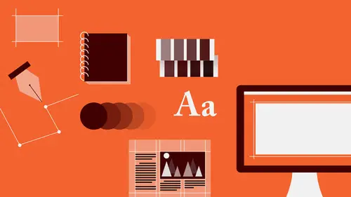
40:11 4The Designer's Toolkit
11:32 5The Graphic Designer's Tools: Color
06:00 6The Graphic Designers Tools: Typography
01:42 7The Graphic Designer's Tools: Layout & Space
06:33Typical Work Processes
09:13 9Designing an Advertisment
41:46 10Designing a Poster
29:20 11Designing a Book Layout: Basic Concepts
36:02 12Designing a Book Layout: The Details
20:54 13Designing a Website
26:53 14How to Design a Brand Identity: Preperation
25:42 15How to Design Brand Identity: Showing the Client
18:24 16Building Brand Language
14:12 17Designing the Touchpoints
11:15 18Fundamentals are Forever
03:29Day 2
19Form & Image Toolbox
32:07 20Media & Stylization
14:37 21Representation & Manipulation
31:02 22Visual Narrative & Metaphor
19:16 23Color Identity
23:39 24Color Relationships
21:15 25Palettes & Systems
14:39 26Color as Meaning
07:09 27Typography: The Basics
25:16 28Style: Choosing & Mixing
26:01 29Text-Setting Mechanics
15:41 30Styles: Visual Qualities of Text
18:09 31Interactions of Forms in Space
24:46 32Arrangement, Logic, & Rhythm
18:57 33Contrast & Hierarchy
08:09 34Unifying Type & Imagery
05:36 35Working with Grids (or Not)
10:16 36Bringing it All Together
03:17Lesson Info
Graphic Design: Areas of Specialization
Many designers tend to focus their practice in a kind of a multi-disciplinary way. I'm one of those. That is, I like to do everything, and I've been lucky enough to have addressed or worked on almost every kind of project in every medium under the sun that one can imagine. But there are a lot of designers that also kind of focus in particular areas. And whether they are multi-disciplinary or they are specializing, there are a number of different places that designers can go to to find work of different kinds, and these are those. So the first is editorial work, and that really refers to publications. Anything that you are reading during the day in print form, for example newspapers or magazines, or newsletters, books, pamphlets, are designed by people and by people who specialize, for the most part, in how to deal with that amount of text, who are looking at how texts and images work together, how language gets presented in a way that's easy to understand, and that's engaging and comfo...
rtable for a reader to deal with. And these are a couple of editorial projects. On the left is a table of contents for an in-house magazine for a pharmaceutical company. On the right is a page spread for a promotional kind of better living guide for senior citizens. Another area of focus, which is also print-based, is referred to as collateral design. And that really refers to sort of small and more ephemeral kinds of elements, things that are not likely to sort of stick around, that have a very focused and targeted distribution, and that are really sort of on the shelf only for maybe a couple of weeks. They have a kind of a time-based function. Usually they're used to announce something or to package other communications inside them, and so they're more or less sort of throw-aways, and those kinds of things are brochures or invitations, direct mail, advertising cards, annual reports, pamphlets and so on. What you're looking at here on the left is a page spread open from a brochure announcing a bank's online services, and on the right is a media kit folder for an online distance language learning company. Another area is packaging, and packaging tends to be one of the most specialized areas that designers go into. For the most part even multi-disciplinary firms, studios, tend to shy away from packaging because the needs of that particular discipline are very, very specific, and involve a lot of sort of three-dimensional fabrication and materials and processes understanding, and so very often you'll find that a studio or an agency is either kind of multi-disciplinary or they only do packaging and nothing else. And so here are a few packaging items, which can also involve point of sale materials like kiosks or display cases that you might find in a department store. These are point of sale bags and stickers, and some packaging boxes for an artist's supply. Advertising, which of course you're all familiar with, and probably not always interested in being familiar with. A kind of captive audience, any time you're looking through a newspaper or you're flipping through a magazine, trying to get to the content, or you're browsing your favorite websites and banner ads pop up and so on, advertising is everywhere and its goal is primarily to distill a very complicated brand message about some kind of product offering or some kind of service offering, and to be able to grab your attention as quickly as possible, to distract you from the act of flipping past it by focusing sort of the finesse and the elegance, and the power of visual imagery, of typography, of color, to really stop you in your tracks and get you to pay attention. These are many of the 10,000 messages that we kind of filter out over time. Because advertising is so ubiquitous, we tend to just sort of gloss over them, so it's really, really a very, it's a very sort of focused kind of specialization that demands a lot of skill in being able to sort of distill messages down to a kind of an instantaneous level of understanding, so that in that split second that you're trying to move past it, you can actually get the message and have it kind of imprint, that you'll remember it. And this is an advertisement, it's a half magazine page format done for a financial services provider. Next is wayfinding, and that's tools and objects that are designed, and applications, graphical applications, that are designed to help you get around physical or three-dimensional spaces, whether it's on the exterior of architectural facades, or it's directional information in transit hubs or in a subway, in a shopping mall, it's really about the signs, like how do I get to a certain place and how far is it? What else am I gonna find when I get there? So it's a kind of mapping in sort of three dimensions. This is kind of a wayfinding and signage system done for a health center. It plays off of the exterior building's architecture using these kind of bold, geometric shapes. In the middle of this presentation slide, you can see sort of directional signs that exist mounted to walls that show different departments that you'll be arriving at once you travel through some corridors or hallways to get there. The next area, which is also highly specialized, is that of typeface design, and those are also, those kind of designers are the kinds of people that only do that for the most part. Very often designers who are multi-disciplinary, or who are working in other areas, are called upon to manipulate or alter, or sort of redesign or completely invent a new kind of set of letters just for a specific application like a magazine masthead or title, a book title on a cover, or for a logo type for branding, and those are very, very sort of specific and very kind of highly abstract, and usually somewhat more expressive kinds of typeface design work that really occur only in that instance. But on the other hand there are designers who design the fonts that you use to read everything every day. Today there are, I think, over 150,000 fonts or typefaces that are currently in use. Some people like to say that's too many, that five or six are enough. And others would completely disagree, depending on the context. But it's a very intensive process. Most typefaces are designed over the course of two or three years before they're released, and there's a lot of very tiny sort of detail-oriented minutiae, optical characteristics of letter forms that need to be addressed in order to generate a kind of a comfortable sort of visual look to the typeface on a page when it's running in text. Then there's environmental work, which can mean anything from trade show booths to exhibition design, to again, kind of architectural signage or graphical or brand applications in the interiors of businesses, in office spaces, in shops and so on, point of sale displays as well. This is an exhibition at an architecture department. There's motion work, what you see probably every day on television and sometimes on the web, type flying across the screen, video captures, video in combination with animation. This is the opening sequence for a CD-Rom product that I designed a number of years ago. So this is a kind of an animation that the user would see when the CD-Rom program launches, as an introduction to getting into the content. So this involves a combination of photo montage, of actual live action, and then the super-imposition of typography in motion throughout the sequence. Then there's interactive design, which you are familiar with by browsing the web or your Smartphone every day, and that's really about creating interfaces on-screen that allow information to be accessed in a non-linear manner. The model for most interactive design, especially website design, is a sort of a translation of the book or editorial experience, sometimes the newspaper experience or paradigm, or the brochure kind of model. That is a number of pages of content that begin upon first entry in a very general and sort of overview kind of a way, and then by navigating from page to page, allowing you to access information that is of much greater depth and complexity. And last, wrapping all of those together, is branding, and that's really the idea of creating a visual identity or a voice, a visual voice for a company or an organization, or even an individual. Graphic designers brand themselves, public relations people brand themselves, small businesses brand themselves, and that generally begins with and centers around the development of some kind of identifying mark, what's called a logo. There are many different kinds of logos, and these are a selection of some that I've done that sort of show a variety of approaches from sort of letter-based marks, letters that have been transformed into pictorial images, purely typographic forms, and then also very abstract kind of symbol-based forms. Anybody have any questions so far? I can definitely throw you one from our online audience. We have tons of those. Sure, excellent. Let's start off with this one. So what would be the best or easiest way to go from digital design social media web to a more collateral based design work? And I don't know if you're gonna cover this later on and you want to hold off or if you want to address that one now. I could talk about that quickly. So if I understand the question correctly is that the person asking is essentially involved in digital or interactive based media, and is looking to move into print, for the most part. Is that right? That's correct. Okay, good, just making sure the brain's working. 'Cause sometimes it doesn't when I want it to. The paradigm shift is not all that complicated. There are limitations in print that don't exist in interactivity. That is that you have to move through a printed object, usually in a particular sequence, in order to understand it. It's not as flexible or forgiving, or non-linear. It does not allow for things that are on the page statically to move, so the visual relationships and how much information that you can kind of cram into that space becomes really kind of critical in terms of understanding. You really have to think about, much more carefully, the sizes of text in particular, and the resolution of images, and how those things are organized, because printed resolution is far greater, achieves a much finer degree of detail than does the screen, which is a much coarser resolution. But essentially, the same kind of principles, in terms of how you visualize something, how you organize something, at least in a static way, what makes type legible, how you're relating type to image, is really essentially the same. And we can even just sort of step back from that question to answer a larger one that no one has asked, which is that designing is essentially the same, no matter what kind of project you're working on. You're always investigating the same ideas every single time. You're always employing these fundamental tools, understandings about how visual form works and what a symbol means, and why this color or that color, and how a reader engages and navigates through text, and what makes something sort of accessible, no matter what the form is that it takes. So there's a famous designer, recently passed, Massimo Vignelli, who said if you can design one thing you can design anything.
Class Materials
Bonus Materials with RSVP
Bonus Materials with Purchase
Ratings and Reviews
photo_dj
This is more about all of your courses - It would be really nice for instructors to answer questions during break times or even after the class. There a lot a fabulous questions that I see that never get answered. I would like to go back even the next day and see a short note for at least some of those questions. Just an idea to help out this wonderful format that you have going. I am sure to make use of the promote question when I see an interesting one.
user-1f91d5
I LOVED this class! I learned so much and since I had the foresight to purchase it, I can go back for a refresher anytime I want. Plus, the downloads are spectacular! Almost a book's worth and so helpful! Thank you Timothy, you are great teacher!
a Creativelive Student
This was an outstanding course, would love to see a more in depth typography course from this guy. I'm a proffesional photographer with a formal education in design, I hardly ever use it, so I forget things, this was great both as a review, and to pinpoint things I didn't know or thought I knew. thanks once again! well done!!