Lessons
Day 1
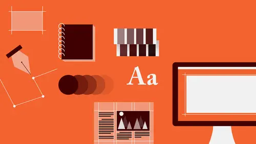
1Introduction to Graphic Design
11:27 2Graphic Design: Areas of Specialization
14:10 3The History of Graphic Design
40:11 4The Designer's Toolkit
11:32 5The Graphic Designer's Tools: Color
06:00 6The Graphic Designers Tools: Typography
01:42 7The Graphic Designer's Tools: Layout & Space
06:33Typical Work Processes
09:13 9Designing an Advertisment
41:46 10Designing a Poster
29:20 11Designing a Book Layout: Basic Concepts
36:02 12Designing a Book Layout: The Details
20:54 13Designing a Website
26:53 14How to Design a Brand Identity: Preperation
25:42 15How to Design Brand Identity: Showing the Client
18:24 16Building Brand Language
14:12 17Designing the Touchpoints
11:15 18Fundamentals are Forever
03:29Day 2
19Form & Image Toolbox
32:07 20Media & Stylization
14:37 21Representation & Manipulation
31:02 22Visual Narrative & Metaphor
19:16 23Color Identity
23:39 24Color Relationships
21:15 25Palettes & Systems
14:39 26Color as Meaning
07:09 27Typography: The Basics
25:16 28Style: Choosing & Mixing
26:01 29Text-Setting Mechanics
15:41 30Styles: Visual Qualities of Text
18:09 31Interactions of Forms in Space
24:46 32Arrangement, Logic, & Rhythm
18:57 33Contrast & Hierarchy
08:09 34Unifying Type & Imagery
05:36 35Working with Grids (or Not)
10:16 36Bringing it All Together
03:17Lesson Info
Media & Stylization
So this brings us, then, to talking about medium, since it just came up in one of those non-pictorial images. So aside from the kind of form it is that you might be looking at to use, that is, whether it's a dot, whether it's a line, whether it's a plane, whether it's pictorial or non-pictorial, that fundamental language can be reproduced or created using any variety of medium. And so the medium itself becomes yet another issue that a designer has to consider, because the medium, if it's wet or dry, or if it's cut paper, or if it's photographic, will bring a certain kind of enhancement or distraction to the subject matter or to the fundamental form language, the form identity of whatever the image itself is. That is, you can make a line in a thousand different ways with a number of different tools. You can make a line with a pencil up against a ruler, and it'll be very, very sharp, very mathematical, very neutral, crisp, perfect line. You can also make that line freehand with a very, v...
ery fat chunk of charcoal. They're both lines. They both express the same movement. They're the same form identity. But they will each deliver a very different kind of a feeling, and that feeling is communication. So the choice of medium that a designer uses or decides upon to create the form element, whether it's pictorial or non-pictorial, becomes really kind of critically important. So of course there's photography. This is an image of a figure in a particular room with certain objects, standing in space, conducting a certain kind of activity, wearing a certain kind of identifying clothes. There are certain color relationships involved in the image. There's a tremendous amount of detail. It provides an illusion of three-dimensional space. Photography is a lovely thing. Photography is as close to representing the real world as a kind of truth that we can possibly get in terms of a choice of medium, and it's because it's so directly close, so directly allied with the real world, is that most viewers, most audiences will assume that whatever a photograph shows is true. It's believable. There it is. You can see it. I saw it with my own eyes. There's no mystery involved. And there's a lot of information to kind of dig into. So photographs offer a kind of a rich, very, very comprehensive bit of narrative in a very compact area. You can have a very, very small photograph with a lot of information in it, and people will linger on that element. That means that that element doesn't necessarily have to take up a lot of space, and it doesn't, and it means that you don't necessarily have to think about a whole lot of other kinds of elements to bring. It can make the design process very efficient, and therefore also communication incredibly efficient. That is, it's all there. Here it is, boom, right in the head, and then into internalizing. Of course, what actually happens to be going on in the photograph and the very, very specific details, what's been included in the image and what has been edited out of the image, whether by the photographer him or herself or through the designer's editing by cropping. What kind of lighting is involved? How the photograph is shot, from what angle, from low, from far away or up close, really close, will also lend a tremendous amount of additional information or prevent the audience from knowing about certain information. So let us not pretend that because a photograph appears to be an example of real life, that it is actually real. It is an abstraction. So I don't know if you're familiar, you know, and this is, you know, kind of the ultimate truth. This is not a chef in a kitchen cooking with a bottle of wine on a stove with some vegetables and other accoutrements of the culinary world. It is not. It is a jumble of colors applied in very, very specific kinds of shapes to a surface. Only because of the organization of those shapes in that particular way do we understand this to be an image of a chef in a kitchen doing those things. This is kind of like the idea that a painting by a famous surrealist painter called out, if you're familiar with René Magritte and the painting of a pipe, which below, it shows us a painting of a pipe, a smoking pipe, and below it, painted onto the canvas, it says, "Ceci n'est pas une pipe," which means, "This is not a pipe." And the painting, interestingly, is titled The Treachery of Images. That is, images lie. They're not showing you something that is true. Every image is a deception. What's interesting about that particular painting by Magritte is that even though he is telling you explicitly that this thing you're looking at is not a pipe, it's just paint, even after you read those words, you still believe that you're looking at a pipe. So the power of a representational image, and especially a photographic one, is almost unquestionable for the average viewer. Of course we can move into other kinds of media, and that would be drawing of various kinds, whether it is something that is kind of expansive and expressive, classical in its nature and very, very sort of rich with detail, drawn from experience or from observation, or is something that is highly reductive. We would refer to both of these items as drawings. This drawing is naturalistic. This, they're both naturalistic, but this drawing is rich with detail, rich with information. This drawing is highly reduced in its information. And that would apply to whether or not we were looking at a painting made with gouache or watercolor, either a very reductive kind of flat sort of posterized illustration or a very rich sort of painterly, academic approach, that could be also another option. Which brings us to this, that is that illustration, which deviates, you know, sort of in its conception from the notion of drawing or painting kind of a pure, as a pure approach. Illustration invariably, it implies, the notion of illustration implies that the image maker, the designer or illustrator, has actually imposed a certain kind of language upon the image, that is, that they have stylized it. They've intervened between the depiction or the function of replicating reality, and the surface, the act of making, that they've invented it to some degree. And of course there could be a range. So this is just really kind of a gallery of, you know, 30 or 40 different kinds of medium, and again, when we're talking about drawing or painting is that all of these really constitute drawing, even though some are literally drawn with either pencil or stippling with a pen or a wash of ink or cut out as a woodcut or engraved or drawn with colored pencils or made with an illustration program software, a vector form, or a photograph, which we could also consider a photograph as a kind of drawing or painting, but with light. And then to this side, these very, very, highly stylized kinds of forms. These, you know, sort of are more classical, more conventional in terms of the use of the medium, that the medium is not really there to get in the way of the depiction. Here the medium or the choice of kind of form elements used to assemble the subject matter of the pear has been very, very purposefully pushed beyond kind of an invisible kind of, sort of curtain, that we've moved into the realm of fantasy for the most part, and as the image becomes more stylized, where the act of its making, the way that it's been put together, and the difference between the form elements that are making it the image and what those form elements would be if they were depicting reality becomes very, very extreme. So there are no stars and blasts of energy typically that come out of pears, but we may attribute some kind of special meaning to that. The dot formations here give us kind of a sense of volume, but it's not a sort of a volume that we would really find as described by the play of light over the surface of the pear, because the light and dark areas of the, that are creating tone are not really distributed around the shape of that object in a way that seems like they're made in life, or that they come from your life. Here the pear element has been replicated or created out of some very, very hard, angular, geometric kind of cut out shapes, and here, in a similar way, but more organically, cut out of paper. So here the medium and the choice of form element that the tool makes, or that the tool can make, sort of supersedes or takes over, becomes much more important than, as part of the image, than what's happening in these cases, where the medium, you can tell it's drawn by a pencil, or with a pencil or by charcoal, but it's really the form and the subject matter that is the most important thing. The act of its making is not, is kind of diminished. Of course, there's also collage is yet another possibility. That is, to take found items, whether papers or cloth materials, sometimes hardware, nuts and bolts, things you find on the street, something stuck to your shoe, or things that you find out in the world that are three-dimensional, can be combined into very, very powerfully compelling and very visually exciting kinds of compositions, so that offers another kind of an approach. Rather than drawing or replicating by contour or in a kind of volumetric ways, a collage offers the possibility of generating, as we just saw with the pear, a kind of, something that is recognizable, or something that is completely non-pictorial, as these are. And that just, it's really about the, kind of the joy of the textures, the shapes, their tonal relationships, their color, the contrast of the natural against the artificial, of matte or non-reflective surface against highly reflective and very varied surface. So there's a lot of richness that can be found within sort of found materials that have been cobbled together. And let us not ever forget that type, letter forms, words, can also be images. Type is always visual, and we're gonna look at the visual qualities of type in addition to its informational qualities in the afternoon. That is, that typography, you know, a column of text and a bold headline both exhibit the same kind of visual qualities as other kinds of lines or texture and line, but in a kind of a conventional text setting, for reading, the visual qualities of those are kind of diminished or downplayed in favor of their informational or verbal qualities. Here, on the other hand, is a situation where, by altering the form of the letters that make a word as well as their arrangement, is that one can express the meaning of that word as a kind of a symbol, as a kind of pictorial reference, even if there is no literal pictorial reference to some kind of a building, in this case, we understand the qualities or the nature of architecture simply by virtue of the fact of the combination of being able to read the meaning, which provides context for understanding why the forms are organized in these ways. So every word, of course, has multiple senses, or there are many aspects to what a word means, to the subject that it encapsulates or conveys. So any single word is likely to be able to be manipulated in its form in hundreds of different ways to pull out very specific kinds of nuances relative to that word's meaning, or what is the treasure trove of meaning contained inside that word. And by virtue of the form change, which meaning are you calling attention to? Even though those other meanings may surface, they may be there, the specific relationship might be one that the designer needs to emphasize because of the context in which that image is going to appear. That is, what is the intended message about architecture. In a brochure for an architectural firm where you're using the word architecture, for example, as a kind of a headline or as a kind of an idea to sort of qualify what the architectural firm does. There could be many different kinds of nuance, and that might also play, then, into issues of branding. What is the kind of meaning or feeling, what kind of mood is to be evoked on behalf of communicating about that particular architecture firm?
Class Materials
Bonus Materials with RSVP
Bonus Materials with Purchase
Ratings and Reviews
photo_dj
This is more about all of your courses - It would be really nice for instructors to answer questions during break times or even after the class. There a lot a fabulous questions that I see that never get answered. I would like to go back even the next day and see a short note for at least some of those questions. Just an idea to help out this wonderful format that you have going. I am sure to make use of the promote question when I see an interesting one.
user-1f91d5
I LOVED this class! I learned so much and since I had the foresight to purchase it, I can go back for a refresher anytime I want. Plus, the downloads are spectacular! Almost a book's worth and so helpful! Thank you Timothy, you are great teacher!
a Creativelive Student
This was an outstanding course, would love to see a more in depth typography course from this guy. I'm a proffesional photographer with a formal education in design, I hardly ever use it, so I forget things, this was great both as a review, and to pinpoint things I didn't know or thought I knew. thanks once again! well done!!