Lessons
Day 1
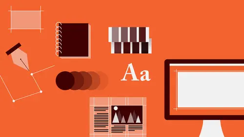
1Introduction to Graphic Design
11:27 2Graphic Design: Areas of Specialization
14:10 3The History of Graphic Design
40:11 4The Designer's Toolkit
11:32 5The Graphic Designer's Tools: Color
06:00 6The Graphic Designers Tools: Typography
01:42 7The Graphic Designer's Tools: Layout & Space
06:33Typical Work Processes
09:13 9Designing an Advertisment
41:46 10Designing a Poster
29:20 11Designing a Book Layout: Basic Concepts
36:02 12Designing a Book Layout: The Details
20:54 13Designing a Website
26:53 14How to Design a Brand Identity: Preperation
25:42 15How to Design Brand Identity: Showing the Client
18:24 16Building Brand Language
14:12 17Designing the Touchpoints
11:15 18Fundamentals are Forever
03:29Day 2
19Form & Image Toolbox
32:07 20Media & Stylization
14:37 21Representation & Manipulation
31:02 22Visual Narrative & Metaphor
19:16 23Color Identity
23:39 24Color Relationships
21:15 25Palettes & Systems
14:39 26Color as Meaning
07:09 27Typography: The Basics
25:16 28Style: Choosing & Mixing
26:01 29Text-Setting Mechanics
15:41 30Styles: Visual Qualities of Text
18:09 31Interactions of Forms in Space
24:46 32Arrangement, Logic, & Rhythm
18:57 33Contrast & Hierarchy
08:09 34Unifying Type & Imagery
05:36 35Working with Grids (or Not)
10:16 36Bringing it All Together
03:17Lesson Info
Representation & Manipulation
So as you've been seeing, images and forms can show us things that are, that we would not dispute are actually part of reality. And sometimes they show us things that we could dispute are part of reality. Or sometimes they show us things that are so not of reality at all that there is really no question that they are not real. So there is this issue, that designers have to address which is the representation of subject matter. Of meaning. By virtue of form choice and of medium. And therefore also how much you are interfering with the image and its form. That is whether or not you are allowing the form to communicate on a literal or denotative level. If it's pictorial even if it's abstract or if you are, non pictorial rather, or if you are manipulating the meaning by virtue of what you're doing to the form. So, when designers or artists choose a subject, and then choose a medium with which to reproduce that subject or to represent that subject, depict it, and they also choose a kind of ...
an approach using that medium to depict that subject, what they are doing is called mediating. Which means that they're interfering with reality. So the photographer interferes with reality the least. And a photograph is likely, unless it has been heavily manipulated, and purposefully configured in a way that it's being shot in terms of its lighting, in terms of how close up. Of how abstract or non pictorial it starts to appear. In terms of what kinds of image elements or subject matters are contained within it. Whether it's kind of a posed situation or something that's happening kind of spontaneously. A kind of slice of life. The caught in the frame flick of an eye. Unless those kinds of things are happening, a photograph is likely to be the least mediated kind of an image that you can encounter. That is that there's little no interference on the part of the image maker. Getting in the way of you understanding what the subject is and feeling anything about it. Again the less mediated, the less manipulated the image is, therefore the more naturalistic it is, the more literal it is. And the less it will communicate anything in particular. Devoid of any context. As soon as the images comes into some situation where there are other things to think about, that image will take on new meaning. But in a vacuum hypothetically speaking. A photograph of an object by itself or a figure is really only about that object or figure. Now as soon as the artist or the image maker or the designer involves a medium or an approach in which the naturalism might still be there but the presence of that medium becomes especially pronounced. Or that there's some editing in detail. Editing in their information. Or a change in the actual kind of light dark relationships that occur. Or some change as can be seen in the photograph, or where information is purposefully left out for compositional reasons. For purely rhythmic and light and dark tonality reasons to create certain kinds of movement. Create density and focus. As soon as that happens we said that images become highly mediated. This may still be perfectly naturalistic. And it could be infinitely more naturalistic than this one is. But we can still essentially recognize the sort of the truth of a female body. The proportions of limbs. How the limbs are joined to the torso. The position of the figure. What parts of the figure are in the foreground and what parts of the figure are in the background? We can understand the figure is reclining, or it's lying down. And we can also understand how all those kind of parts fit into each other and we also understand a kind of a truth about the body is it's curvilinear. It's a soft organic form. All the kinds of things that we attribute to humans in general. So, we're moving away from the un-mediated. But we're still kind of in a naturalistic stor of world. There is no real kind of excessive stylization. Some degree of stylization is occurring but not so much. The last image in the other hand is very very highly mediated. Where in this case, the designer has decided to kind of maintain kind of the color language from the source image, in order to generate a sense of foreground background between image elements within the figure as well as between the figure as a whole and the sort of the field in which it exists. The designer has also decided to removed the curves and to chop the kind of the plainer forms up, using these very very flat angular kinds of shapes, that do not exhibit kind of the naturalistic or empirical truth of a figure in space. As is even visible here. So, this decision, along the spectrum, there's so many decisions to make. First of all what kind of form is it? And then is it pictorial or not pictorial? And then what is the medium that I'm gonna use? And then how much am I using the medium? And then how much am I stylizing it? (sighs) But these are all decisions that the designer or an illustrator who's working for a designer has to make, in order to get the image to do what is needed to be done. So that it communicates in the best way, in the clearest way, in the most appropriate way possible for that particular kind of project. So whenever you're merging media together, the more, or the less pictorial the matter, the material is, the more neutral it is, the more it's about the visual experience. Which might impart a certain kind of energy or elude to certain kinds of feelings or ideas. And as soon as any of those image elements become pictorial or they begin to become more literally pictorial, then content appears that a greater and more specific degree of meaning or level of meaning begins to become inserted. So here on the left, it's just a kind of a range, a transition from an absolutely non pictorial composition of lines and scribbles and cut out shapes. So we might interpret art making, but also kind of helps, because we see things like a brush stroke and we see a little blop of something that could be paint. And we see a ripped piece of paper and there's a scribble which is clearly made my a person scribbling. And other kinds of textural forms. And of course it doesn't hurt that the line forms that we see actually make an A. But, so a person coming to this might say okay this is about art. Okay. It's not about any particular kind of art. It's not about art from a particular period. It's just about art in general. Woo! Okay and that might be perfectly useful. Then as we move to the middle image, we introduce now a new kind of situation where some of the image elements have been replaced by pictorial forms. In this case both photographic elements. And what happens here is that the identity of those subjects now influences our understanding of the entire composition. That is because we see a compass and because we see a sculptural relief, we are either looking at something that has to do with sculpture or potentially architecture. Or architectural detailing. Stone masonry. Carving. So, even though many of the forms that surround those two are quite painterly, and the fact of their specific subjects in combination, now becomes of greater importance to the viewer. Typically viewers will focus on and obsess over any pictorial element that is recognizable. Compared to any non pictorial element. Because the pictorial element tells us things. We understand that. So, essentially it renders the other material essentially decorative. There for compositional purposes. For vivacity. For energy. For fun! And then just as a they provide a general kind of a context. You have art which is a subject a very broad general subject, and then within that subject you have sculpture or architecture. Which is a part of art. And then here we get even more specific. That is some of the tonal plains in the background have been replaced by images of architectural drawings and maps, from a particular location. From a particular time period, that's generally recognizable to most people. Still the compass exists, or the calipers. And the architectural carving. And now we have a brush. So we may be talking about Leonardo da Vinci here. It might not just be about architecture anymore, because now there's also a paintbrush. It might be about art in general. But specifically painting and architecture. And at the same time there's a kind of a diagrammatic map that comes to us from Italy, and is rendered as an engraving that's very recognizable as having been produced during the renaissance. And so suddenly, all these little kind of details are informing each other in different ways. So we've gone from art, to sculpture and architecture which is part of art to renaissance architecture and art. Or renaissance art. And potentially because of (coughs) our kind of cultural familiarity with the ultimate renaissance man Leonardo da Vinci, whenever someone says renaissance and then you're talking about art people go oh! He's very top of mind. So as a subject matter, Mister da Vinci is highly iconic. He represents a thing other than himself. We may, you may lead the viewer directly to that connection. Just by virtue of those particular elements and how they're combined. So going back to stylization, so we return to the fish again. There's more than one way to cook a fish. (laughing) If I had a rabbit it would be in a different metaphor. Or cliche. So here when you get down to the reductive or stylized level, the options are endless. I mean the possibilities are without limitation. And you have to be really careful about, sort of what kind of representation or what kind of stylization of the image you are bringing to it. So, again these are all recognizable as the subject fish. It's not any particular kind of fish. It's about the notion of fish. And then each one of these stylizations may call out a particular aspect of that idea fish. In this case this one is drawn with a very very rough element so this might be fresh fish. Or organic fish. Or it's kind of calligraphic so it might be sushi. It might be Japanese fish. Here we have this kind of sort of pattern of sharp angular elements that appear to be overlapping and are kind of a representation of scales. Not in a naturalistic way. Highly reduced. And we can also see that the drawing of the fishes contour is also incredibly sharp and angular. So this could be a dangerous fish. Or it could be an armored fish. I don't know what a digital fish might be, or this could be a prehistoric fish. Yes? Spamming. Fishing (laughs). What? The digital fish. Spam? You know fishing? Ah! See there you go. (woman laughing) That's exactly how your brain should be working. And that's exactly how an audiences brain works. When you see this kind of, you have this disconnect that you recognize the form, but it's shown in an unexpected way with an unexpected medium, is that you ask questions. And your brain says one is what is that about? And then you project some meaning on to it based on your prior experience with those kinds of forms and then in the context of this subject matter. That's exactly it. Okay so the presentation's done. I'm done. (audience laughing) I'm kidding. (laughing) I was gettin' ready to come after you. Yeah yeah, quick! (laughing) So, we'll move on then. So stylization can enhance intrinsic meaning that's already there. So these are both stylizations of a photograph of a bird. They've been filtered digitally. And then drawn into a little bit, to different degrees. And we know that birds fly in general, typically, unless they're something like a chicken which is flightless. This is not a flightless chicken. This is a seagull. We know that seagulls fly. We know that birds fly. And we know that this one is flying, because it's not standing walking on the ground. We see that its wings are up, it's tails back and it's not attached to anything. Plus it's been situated in a field of blue which means it's clearly in the sky, it's flying. (grunting) it's not rocket science. So (laughs). And the stylization, the drawing here, is creating more of a kind of decorative effect. The medium is, it is interfering a little bit with sort of the truth of the animals depiction. But it's not really getting away. But because it's a little bit more vital, it's a little bit less static than the straight photograph would be. The naturalistic texture caught mid frame. It kind of gives a little bit of the energy of that flight to us but not a whole lot. Then as the stylization becomes extreme, almost verging on abstraction. And of course it may be a little bit more abstract than I would have wanted. But, we really kind of get the sense of this kind of whooshing quality. Even potentially the flap of the wings because we become kind of conscience of the surface of these painted marks on as each other as flat non pictorial abstract forms. And so our eyes go back and forth between, okay it's a bird, it's a blob of marks. It's a bird, it's a blob of marks. It's a bird, it's a blob of marks. And as our eye, as our minds do that, the image begins to actually move. I mean it doesn't literally. It happens up here because the mind is a strange thing. But so that, stylization can be really really profound. These are just kind of a range from, again from very naturalistic to incredibly kind of abstract with very different kinds of form language. Very geometric. Very organic. Very iconic. Still naturalistic but kind of flat and plainer. Again a kind of a slight sort of degradation or graphical qualities. Some working into the image. Just to again to show the range. And still all recognizable as the same subject. So what I'm trying to get at here is that you don't have to just go to a picture of a tree, and let it be. No offense to photographers. (chuckles) I love photography. My father's, was a photographer so it's in my blood too. And I love it but I like to make things. I just can't let it go. 'Cause I'm a little too OCD that way. So again manipulations are kind of interesting things. And again it changes meaning. So here's an image of a book. The image of the book has been burned. And so we may read certain things into that. Burning books. And then here a portion of the image has been pixelated, and so we may understand this to mean a digital book or an e-book, or it could be, editorial web work or so on. And then again this is an image that we also looked at yesterday which is the clock. And here the manipulation, because of the overlapping repetition of the form, it's still the same form and because of its super color saturation and the misorientation of those repeated instances, cause us to interpret this not just as any clock but as alarm clock. And now we can also hear this image. Images an be quite synesthetic. That is that they can create the impression of sound or the impression of tactility by virtue of their stylization. When we're talking about how we perceive these things, we have to talk a little bit about a weird branch of science called semiology. Or semiotics which is the study of how we look at stuff and do things with it to interpret it. And so when we look at things we kind of map it out. We map it and compare it to things that we've seen before. And when we do that, sometimes the thing that we're shown out of any context is perfectly identifiable. It shares a structural resemblance to the thing that it represents. That is the signifier, or the form of it represents the signified, the subject matter, in a one to one relationship. They're both the same thing. The form of the bee means the bee. The form of the key means the key. I wish I had a third one. That would also rhyme (laughs). But I don't. Here on the end and then so here we can say, so we refer to this as an icon. Is that in terms of the way that our brains our processing are processing this image, is that the thing, the form represents only itself, or only its subject matter. Without any additional overlay. So that's what we'd refer to as an iconic image or an icon. This one on the other hand gives us a little bit more to play with. Because we can recognize some iconic qualities to it. And out of any context, we'll recognize that okay these are eggs and they are in a nest. There are two things here that are working together. But the image you're really seeing right now is the bird. You saw the eggs in the nest. You said oh there's a bird. Then you thought about the bird flying. So what your brain just did is called indexing. Is that you've made, which is really a kind of an association. Is that from the iconic form, you have been lead to call up a memory. A recognized, a sort of a cataloged item that your brain is storing away. Because, again you want to know things. And there's enough to go on even with this little amount of context, to create that indexing function. The last kind of image that we can look at in terms of, or sign that we can look at is called the symbol. And the symbol typically does not, it might but it does not necessarily have to share a structural similarity to the thing that it represents or signifies. So, in this case and the symbol gains its power from mutual agreement. We agree as a society that this kind of shape or this sort of image, the form of this sign, means this certain other thing. So here we have a symbol of a star. We know for a fact that stars are not actually shaped this way. The star form, we have all agreed over many generations that this sort of five pointed object stands in for the idea of a star. It symbolizes the star. We like it because it's got this kind of focal point in the center and then this feeling of radial quality. So it kind of suggests the energy or light that comes out of a star but it doesn't really happen this way in the galaxies. So there's a symbol. So there's also this whole other narrative that exists. The symbol carries a lot more information in it than an index. Which is usually a pretty quick and single association. Or an icon which has no association other than the thing it's showing you. So the symbol is, it's a very very powerful little tool. 'Cause you got a whole lot of information to bring to the table and you have a whole lot of information to choose from in terms of which information in that symbol you're going to bring to the table and show to your viewer. And the symbol will change meaning in different contexts. So when you place the symbol with a surrounding field of film and film reel, is that this is about celebrity or Hollywood. It's that kind of star. Not the sun. When you place the symbol within the context of a crescent and some Arabic tile work, it becomes the Star of Islam. Not the celebrity. When you place the star in the context of some children and a teacher who are interacting in a happy way, we know they've gotten a gold star. They've done okay. Any particular form, any particular kind of sign can represent the same idea. That is one idea, one signified, can be represented by many signifiers. Usually depending on how non pictorial it gets or how immediately unrecognizable or unfamiliar it is, that signifier might need context. But it can happen. So when I tell you, when I say the words New York City, any of the images any of these signifiers can represent that idea. That notion. So you have options. And you always want to look for options. How far can you stray away from a direct relationship, a denotative relationship, between the image and its meaning, or the intended meaning and still get the meaning across. Because the further away you get from that, the more specific you can you can be about which particular aspect of the meaning of that subject that you want to talk about and you can be so much more original. And there's this, it opens up so many possibilities. If you go to a literal, like if there was a picture of the New York City skyline here, you'd be like okay there's New York. It's in New York (snoring). Okay fine. It's clear it's direct. But, or even a drawing of New York, or really like an engraving of the skyline. Naturalistic. So why be stuck with that? When there are so many interesting possibilities. So just some more manipulations. And our brains work very very fast. So initially even when we confront something that is not immediately recognizable our brains are going back into our memory banks and shifting through the index cards and going okay I recognize numbers. I recognize zeros and ones and monetary symbols and those mean cash and money. And then I see them forming the shape of the hemispheres of the brain. And actually it's the type element that reads first, and the overall icon form which is the brain that reads second. So it means that in this context, the way these, the way that the two elements form each other or the way that one element forms the other one, actually causes there to be a kind of a hierarchy. The notion of money and digital ideas about money, or the digital flow of money, becomes primary. The identity of the brain becomes second. So this means that internet money security is on your mind. I don't know what this means. But it's (laughs) just a configuration of photographic elements that are quite surreal. And here's the thing is that, but I'm sure that some of you, hopefully and some of you out there in the world, are looking at this image and going yeah I can believe that. Sure. Yeah there's a guy with a clock for a head coming out of a door in the ground and there's a giant butterfly with clouds. Basically because all the elements are photographic. And again photography does wonders for convincing us that even things that are not possibly true could actually be true. We talked a little bit about non pictorial matter. Just to show again how non pictorial forms even at their simplest level can communicate. So when we see something as simple as a circle, I'm gonna ask you in your minds, what does the circle mean? What does it mean? Could mean any hundreds of things. It could refer to continuity. It could refer to cycles. It could refer to the seasons. It could refer to the cycle of life. Birth, death, rebirth. It could refer to unity. It could refer to the sun or the earth or the moon. Or a drop of water. Or a cell. The circle is about the organic. There's nothing else here. I just want to remind you that there is nothing else here except for a circle. But hundreds of pages of information are available in this form. Now think about that and think about the square. What does the square mean? How is the square different than the circle? It will give you the answers. So they're both closed forms. So there's that. So, whereas the circle has no beginning and no end, the square has finite points and ends. Whereas the circles dimension is not really measurable because there is no starting and stopping point, we can actually measure the sides of these. We know that the sides are parallel to each other. That the distance from left to right is the same as the distance from top to bottom. We know that the vertical sides meet the horizontal sides at a 90 degree angle. We know that 90 degree angles do not occur in nature ever. So the square, is artificial. It's about the rational. The scientific. The mathematical. The studied. And therefore it is about the man made. So whenever you're bringing images together, you want to be also looking at kind of the syntax if you will. That is the formal qualities or formal identities of the parts that make it up. It's overall shape. It's general kind of structure. Whether it's dot like or radial in its structure or if it's very linear. And you also want to look at kind of the syntax or the gestural quality of how forms are relating. Or how the parts within a particular image or form are relating to each other. Because there's meaning to get there. So, we can look at these two pictorial forms and because they are being shown at the same relative size, and because we recognize that they are both circular forms or dot like in nature, and because there's a focal point in each, and because there's a radial structure outward in each, this parity or equivalence in their formal or visual qualities, may lead us to believe that there is some relationship of meaning between the two. And in fact there is. One is an organic form. And one is an artificial form. And so this is a, this has to do with a contrast. And because then that this is an automobile wheel, and this is a flower this is about the environment, and the effect of automotive transportation on it. That's just two images. And if you look through this kind of set of groupings, when you group elements together, and then you do something to one of them, you separate it out in some way, you create the potential for other meaning. So for example here, one of the elements in this grid of forms, one of these dots has been pulled out. So it has become isolated. So you say that we have altered the syntax by changing a distance relationship and created a sense of isolation. Here we have another kind of an alteration to the syntax in this form grouping, that is three of the elements in the grouping have been slightly rotated off of their horizontal axis. So, compared to the others they create a sense of movement or energy. And it goes on. So you want to always sort of consider not just what the shapes, the overall shapes of elements are, and what kind of form identities are making those, but also how the forms are kind of relating to each other. Are they grouped or seperate? How was each one separated from the other? We're gonna talk about that again more when we're looking at layout in the afternoon. So again here are again those sort of syntax elements again but a greater number of them for you to look at, where I've actually labeled the sort of the intended meaning for each of them. And this one is just a fun one that I threw in. This is wind and water moving through trees. This is completely non pictorial, as are all of these. Sometimes they refer to the physical world. Physical experience in a kind of a close way. The shorthand is not as extreme. Sometimes they're very very abstract. Some of the ideas themselves are abstract, as others are quite tangible.
Class Materials
Bonus Materials with RSVP
Bonus Materials with Purchase
Ratings and Reviews
photo_dj
This is more about all of your courses - It would be really nice for instructors to answer questions during break times or even after the class. There a lot a fabulous questions that I see that never get answered. I would like to go back even the next day and see a short note for at least some of those questions. Just an idea to help out this wonderful format that you have going. I am sure to make use of the promote question when I see an interesting one.
user-1f91d5
I LOVED this class! I learned so much and since I had the foresight to purchase it, I can go back for a refresher anytime I want. Plus, the downloads are spectacular! Almost a book's worth and so helpful! Thank you Timothy, you are great teacher!
a Creativelive Student
This was an outstanding course, would love to see a more in depth typography course from this guy. I'm a proffesional photographer with a formal education in design, I hardly ever use it, so I forget things, this was great both as a review, and to pinpoint things I didn't know or thought I knew. thanks once again! well done!!