Lessons
Day 1
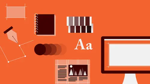
1Introduction to Graphic Design
11:27 2Graphic Design: Areas of Specialization
14:10 3The History of Graphic Design
40:11 4The Designer's Toolkit
11:32 5The Graphic Designer's Tools: Color
06:00 6The Graphic Designers Tools: Typography
01:42 7The Graphic Designer's Tools: Layout & Space
06:33Typical Work Processes
09:13 9Designing an Advertisment
41:46 10Designing a Poster
29:20 11Designing a Book Layout: Basic Concepts
36:02 12Designing a Book Layout: The Details
20:54 13Designing a Website
26:53 14How to Design a Brand Identity: Preperation
25:42 15How to Design Brand Identity: Showing the Client
18:24 16Building Brand Language
14:12 17Designing the Touchpoints
11:15 18Fundamentals are Forever
03:29Day 2
19Form & Image Toolbox
32:07 20Media & Stylization
14:37 21Representation & Manipulation
31:02 22Visual Narrative & Metaphor
19:16 23Color Identity
23:39 24Color Relationships
21:15 25Palettes & Systems
14:39 26Color as Meaning
07:09 27Typography: The Basics
25:16 28Style: Choosing & Mixing
26:01 29Text-Setting Mechanics
15:41 30Styles: Visual Qualities of Text
18:09 31Interactions of Forms in Space
24:46 32Arrangement, Logic, & Rhythm
18:57 33Contrast & Hierarchy
08:09 34Unifying Type & Imagery
05:36 35Working with Grids (or Not)
10:16 36Bringing it All Together
03:17Lesson Info
Style: Choosing & Mixing
So, you know, given that there are 150,000 typefaces, how would you even think about starting to choose one? Or any at all. Well there are some places to look. The first thing that you can look at is the overall sort of period style. And you need to be aware of those because period styles have different qualities with respect to legibility, and of course they also carry a little baggage, a little timestamp of the time in which they were drawn. So if you choose a typeface from the 16th century it's very likely it's gonna carry a 16th century flavor into whatever you're doing. And that can be useful, and not useful. There are some designers that advocate on behalf of using a typeface drawn in the period that corresponds to the period in which a text was written. Which is a little bit limiting, but it's an interesting kind of philosophical idea. So if you're setting a text of Shakespeare, you would use a typeface that was drawn in the 16th century. But it's not necessary to do that. So th...
ese are the basic categories of stylistic classification, and they are more or less chronological. We really start counting at the Renaissance, around 13, 1400, that is the year. And so we refer to typefaces from that time up until the early part of the 18th century as Old Style. They exhibit very very specific characteristics. They tend to be a little bit more organic. They show evidence of the brush or pen drawing tool that was used to make them. The x-height tends to be very very small, and the curve forms distribute weight on kinda a slanted axis, an oblique axis. And the reason for that is when you're drawing a typeface with a brush, which is flat, a flat-nibbed brush, or with a flat-nibbed pen, you hold the brush or pen at a particular angle, and without moving your arm, you make the stroke. And as that happens, the angle of the brush deposits thin and thick weight in different areas. And if you look at any typeface, even sans-serifs in which the strokes appear to be the same thickness, and compare them to other serif typefaces, you'll find that in every typeface that has ever been designed for the past 2,000 years, the weights are in the same location. Verticals are always thick. Horizontals are always thin. Diagonals that go this way are always thick. Diagonals that go this way are always thin. And in curves, like the O, the upper parts or the curved area that's traveling horizontally is thin, like a thin cross-stroke. And as the curve descends into the vertical, it becomes thick again. And you see that happening here. The transitional typefaces are an evolution. Much sharper, much crisper, a larger x-height. You'll notice that the serifs themselves have become not really rounded, but really closely, sharply cut off. And this little element, what's called the bracket that joins the stem to the terminal of the serif, actually tightens up in radius. It becomes a lot more mathematical, a lot more rational, very precise. Part of what's happening there is that this kind of type design is happening during the Age of Enlightenment, when science and the secular world are sort of front and center, in terms of focus. Science and math and other kids of learning endeavors. And the other thing is that paper technology improved radically in the 1700s, which allowed for finer detail at smaller sizes to be reproduced. So designers could actually make the contrast between thin and thick strokes even more pronounced. The next jump forward is from about 1785. The modern, or neoclassical. You'll see that over the course of time, the axis in the curve forms has become absolutely vertical, that the circular forms are actually based on a circle, that the bracket to the serif has disappeared, and that the stroke contrast has become really extreme with hairline horizontals or cross-strokes and really bold verticals. The x-height has continually been increasing in size. And this is, you know just sort of a trajectory of a certain kind of evolution following it to its kind of end conclusion. Flash forward 150 years to the Industrial Revolution. And as a result of having to compete in a very crowded and busy typographic environment, with manufacturers competing for consumers, designers decided just take the serifs off and make the strokes all the same weight. So that those typefaces would really pop out in an environment of these. The overall presence of the sans-serif, because all the strokes are similar in weight, is very solid as compared to these where you get some breaking point, you've got a little bit of flicker. Right around the same time, the designers also decided that it might be fun to put the serifs back on to the sans-serifs, but make the serifs the same thickness. So these kind of chunky serifs are referred to as slab-serifs because they're slab-like. And then there's a kind of last category. The catch all, which is graphic. Which refers to anything that doesn't fall in here. So script faces, really extreme proportion faces, faces with decorative elements, and so on are generally kind of lumped into that category, you know for simple classification. You can actually sort of split this category into scripts, super-weighted, inlines, graphical, certain kinds of graphical would cut decorative categories that also had their own developmental tracks. But for our purposes, graphic is fine. At least I hope it is. So you always have to be conscious of how the typeface presents a certain kind of a rhythm between the strokes and the counters. And this is just a quick kind of demonstration of really sort of the rhythm that's happening. In this bold condensed face, the stroke and counter are about the same relative proportion, and they alternate very very much at the same rhythm. In this typeface, the strokes are much further apart, and that even happens, is even more dramatic in this extended typeface. And generally the spacing that's considered natural or normal for text of a particular typeface, is based on the stroke counter relationship in the letter itself. So when you're setting text where the strokes are this far apart, you also wanna have about that much space in-between the letters. Otherwise the verticals will begin to bunch together and make dark spots, and then you get an uneven gray value across the line. Here is just a study of x-height. Just so you can see how radically varied the high to the lowercase can be among typefaces of different styles. So you always also wanna look at all the other kinds of details. Sometimes the specific kinds of joints or the shapes of curves lend certain kinds of qualities to the overall feeling or the flavor of the type. The flava. And so the things that you always wanna look at, are the bowls which are the round elements, the super curves. Usually at the bottom, this area is called the bowl. The shoulders, which are the upper curves. And the axes, that is how rotated the heavy elements in the vertical are relative to the vertical axis. And depending on how much lean there is in the axis or how sharp or generous this radius is, you either get a typeface that feels fluid and generous and calm and relaxing or something that feels very mechanical and tight and anxious. You can also look at the apertures and eyes. Apertures are the little openings that occur between strokes, that lead into internal counter-spaces as in the lowercase A and E, and also the G here. And then you can also look at the eyes, which are these little nuggets, these enclosed forms in the lowercase E and G. And then last, the ascenders and descenders. Sometimes the ascenders extend really high above the capline, and sometimes they actually meet the capline. And not only does that create a different kind of a rhythm, a kind of little disturbance in the horizontal continuity, which gives it a little big of a quirk, but it does also affect how closely you can space lines of text together. 'Cause you don't want the ascenders and the descenders touching each other. It's bad. And then you can also look at these other things. The joints and branches, that is where strokes come together. The stroke formation, that is are the edges of the stroke parallel or uniform in thickness? Or do they modulate, change in thickness? The terminals, that is the ends of the strokes. The serif-shapes, which can be radically different. And the spurs that are sometimes little extra strokes that kick off the end of a letter. And you can see how much tremendous variation is possible just in this tiny detail. And it seems like a really small thing. But these particular elements provide so much character to individual typefaces, that it's almost impossible to describe. And then you wanna look at things, sometimes, like graphic details, like whether or not there are kinds of outlines or inlines, or graphical forms that are violating the overall stroke, or if there's some kind of shading. Whether or not the contour is actually uniform and smooth or if it's got some texture to it. Or if it's a really kind of fluid, swoshy thing or something that's a little bit bulbus and round. And all of these kinds of details really just sort of lend feeling, flavor, almost kind of an emotional quality to the typeface. So the language that you're reading, set in that particular face, then also communicates that emotional quality. In addition to whatever you're getting from understanding what the words say. You always have to be careful about how stylized you wanna get with text or with typeface choices when you're setting text. These are very very interesting, very beautiful, bizarre, very experimental typefaces, but they do not work for text because you can't read it. So whenever you're setting text, you wanna go for a font or a typeface that's referred to as a work horse. Gets the job done. Usually it's got a track record of five or 600 years, or it has proven itself in a multitude of applications that it can withstand a lot of manipulation, that it's very legible at a small size as well as a large size, and that it's stroke formation and stroke to counter relationship yields a very fluid, undisturbed gray value. So this is just an example of how radically different the appreciation or the perception of a word's meaning from an emotional standpoint can be when the word is set in a different typeface. So here you have three different words that each mean different things, but set in the same selection of typefaces. So as you're looking, you know, you can try it at home. You can cover up some of them and then just sort of look away and read the word again, set in that typeface, and then sort of think about what changed in the way that you thought about what that word means. You usually wanna choose typefaces that will come with a couple variants in them, that is a family of the same style in which you have some options in terms of weight, light medium and bold, and as well as a Roman and an Italic version and potentially a condensed and an extended version. Because the purpose of a typeface is to not only deliver information, but to also allow a reader to visually separate different parts of texts, or elements of text that are more important or less important than others, you really need this kind of variation to be able to support a hierarchy. That is, to introduce an ordering to the information, so that a reader knows what's most important and what's less important. Or what to read first before reading something else. Or which pieces of information within a grouping of kind of informational chunks are related to each other in terms of their meaning or their sense, and which ones are not related to those other ones. So to use a type family, a single type family in order to achieve, kind of an overall cleanliness, a stylistic unity, and still be able to differentiate between parts of text, and also have the visual contrast for fun. Choosing a typeface that has a tremendous number of variations can be a really powerful option. On the other hand, there are other things you can look at. If you wanna combine, very often people like to combine a serif and a sans-serif together. It's a little bit, you're going from really closely related to sorta related or not so much. And the wilder the combination of styles gets or the more extreme the difference, the greater the likelihood of a kind of eclectic, sort of stylistic disunity where the visual form language of each of those elements, starts to kind of butt against each other. And contrast is a nice thing. If everything were the same, it would be very dull to look at. But even when you start to combine typefaces of different styles, you have to sort of find some common ground between them. And you can look at things like the way that joints happen, or the way that joints happen, certain angles of strokes, and how those might be similar from the serif to the sans-serif. You can also look at the axis in the curve forms, which between these two typefaces is about the same angle. And you can also look at things like how the shape of the terminals interact or is the bowl of the lowercase A about the same size and proportion? Here you see that it's got this kind of, sort of squat little bounce to it. So you wanna try to find something that's gonna link them together in a textural way while still supporting enough contrast that the decision looks purposeful. Yes? Do you have an opinion about bold-facing? Using a software program to bold-face a font that wasn't natively bold? That's an excellent question that I'm not happy to hear that people are still asking it. They still make it in the program, so that's why I'm asking. I know. Don't ever touch the bold button. The bold-weight face in a type family is drawn as it's own creature. And there are a lot of optical corrections that have to be made, in order for the bold weight and the regular weight to appear to be the same size optically, and to appear to be the same proportion, optically, in terms of width. And to keep the same kind of stroke counter relationship. When you click the bold button, if you select like a regular weight typeface and you hit bold, what the computer software is doing, is taking that letter form, and doubling it or tripling it on top of itself a couple of times to create the illusion of a bold face. And then the stroke counter relationship changes and the counters get clogged up or it appears bloated. And it's ugly don't do it. [Woman In Audience] What about Italics? The same is true with Italics. Don't touch any of those buttons. When you want Italic, choose an Italic typeface. When you want a bold, choose a bold version of the typeface. When you wanna use small caps, don't click the small cap button, choose a typeface that has actual custom-drawn small caps included in the character set. I have a question. Not about any of those buttons. There are As that are like circle with the line on the side and there are As like this one. Would I choose, if I tried to mix the sans-serif and serif, should I try to opt for the same A size as well? Yes because that becomes kind of a glaring, stand-out difference between them. That can be very very distracting. Sometimes if you have other kinds of aspects that are creating a dialogue in style between the two different fonts, and you're stuck. That's the best set of relationships. And one of the As is this kind, which is called the two-story A because it's got two stories. And the other one is what you're asking about which is an A that looks like a circle with a vertical stick on the side of it which is called a single-story A. If you're stuck with it, then fine. But yeah, that's one of the things that you would look for. There are a lot of, now the two-story A, is actually an older kind of a form. But it has been carried over into many sans-serif typefaces and still is continuously because it actually has a better, more integrated stroke and counter rhythm relative to the other letter forms that helps differentiate it as the lowercase A. The single-story A can sometimes be mistaken for an O if you're reading really fast. Sometimes that's not a problem, I mean it's always a problem. If you're looking for A and you get O then something is wrong. So just be careful. Another thing to look at is sometimes a typeface or type family, which has a regular and a bold weight, doesn't give you enough contrast between the two weights. So this is an example of a typeface in which the regular weight and the bold weight are only kind of moderately different in heaviness. And that may, you know it's a very subtle, very beautiful, very elegant kind of difference. But within a small size, set in a small size and in a tremendous volume of text, it's very likely that the eye is gonna kinda gloss over and not perceive the emphasis that's intended with that bold. So whenever that happens, find another typeface that is close enough, as close as possible, in overall proportion and stylistic detail or sharpness, in terms of how the strokes are terminated, in terms of the serif shapes, and just substitute it. It's fine. No one will die. Yes? I feel like I learned that having similar serif and sans-serif can fight with each other, where you're like wait is that the same? You're like on the next slide. Oh I am? Okay. Yeah. Which is an excellent question. In this case we're trying to create purposely a stylistic correspondence, so that it looks like you're using one type family but using an alternate bold weight from a different serif, in order to overcome a particular challenge. Typically yes, you don't wanna mix styles that are the same. Here's just an example of a work that uses sort of a multitude of type styles that have some contrasts relative to each other, but at the same time also share some aspects. Some of the type forms share multiple aspects, and some of them share like two out of five. So you get more pronounced contrast between certain of the typefaces and less contrast between others. And you also want to assign the typefaces that you choose to work with, specific functions. That is not just to say willy nilly like oh I'm gonna set this chunk of text in this typeface and then I'm gonna set the headline in that typeface again, but then I'm gonna change the headline somewhere else to another typeface, even though you might be working with a few. So this designer for this book spread, for this book design, has made some decisions about which typefaces are going to be used for what kinds of information. And that's a way, not only to introduce visual contrast and to enliven the typographic experience, the optical quality of the page, but also to help with hierarchy. To be able to differentiate very quickly and easily between different parts of text. So the running text, which is the body copy is set in this typeface. Pull quotes, certain pull quotes which I might not have an example in this spread, are set in that typeface. Callouts, and there's a difference. A pull-out is a kind of callout. A callout is a piece of text that is excerpted from within the running text and given emphasis as more of a graphical element, a kind of quick glance read-in, lead-in to the subject matter. A pull quote is a kind of callout that is specifically a quoted piece of text said by someone who is being referenced in the text. Just so you know. So differentiating between emphasized text elements that are actual quotations versus just descriptive pros, gives a greater, sort of, intricacy and kinda of finessing to the hierarchy. And then you have some bold and sort of more extreme all-cap kinds of elements that are also used in order to deliver some flavor. It's all about the flavor. And this is really kinda referring to what you were asking about, which is about combinations. So basically these are kind of don'ts. Don't ever combine two serifs that are too close together in stylistic classification or period. And the same is also true with two sans-serifs. These are actually two different sans-serifs and you can sort of tell, but almost not. It's totally indecisive and it looks like if you're gonna do that, it would look like you couldn't make up your mind or that you don't know the difference between them or that you were working with one first and then decided to change to another one, but then forgot to change others. A better kind of a contrast, now you can bring two serifs together as long as the serifs have enough stylistic separation, they may even be the same classification, but some of their details might be radically different enough. The degree of contrast in the stroke, or the proportion might be really different. In that case, sure go ahead. What you want to make sure of, is that you have enough difference between the typefaces that you're combining, that it's clear that you made that decision on purpose and that there is a strong visual result. If you choose two typefaces to go with each other and they're not really that different from each other, the the purpose of choosing a second typeface kinda goes out the window. Because usually you choose more than one typeface to bring contrast and interest and deliciousness. And if they're really kinda the same, then you might as well just get rid of one. It'd be like, sort of like making a sandwich and buttering one side, and then using mayonnaise on the other side. You're not really getting a true flavor differential between the two sides of the sandwich. So this is a slab-serif with a neoclassical modern serif. Here's kind of a combination with, this serif has been combined with, as an alternate, with a slab, and then also introducing another kind of a bold slab-serif. Here's extreme contrast in both width and weight. Very bold, very light, extended, very condensed. And then also the contrast of the two styles together. It's this text and that text with the sans-serif. And you said you wouldn't do that 'cause the As. Well there are very few typefaces, there are some more now. There are very few typefaces that are able to get this bold, and maintain enough counter space inside the A that is remains recognizable, and where it will stay the same width. So this is the solution, is simplify the form. Take an extra stroke out. So if you have to, so be it. Typically these two typefaces are not gonna be showing up like right next to each other, or at the same size. So you're not likely to really be thinking about it. But it is something you wanna think about.
Class Materials
Bonus Materials with RSVP
Bonus Materials with Purchase
Ratings and Reviews
photo_dj
This is more about all of your courses - It would be really nice for instructors to answer questions during break times or even after the class. There a lot a fabulous questions that I see that never get answered. I would like to go back even the next day and see a short note for at least some of those questions. Just an idea to help out this wonderful format that you have going. I am sure to make use of the promote question when I see an interesting one.
user-1f91d5
I LOVED this class! I learned so much and since I had the foresight to purchase it, I can go back for a refresher anytime I want. Plus, the downloads are spectacular! Almost a book's worth and so helpful! Thank you Timothy, you are great teacher!
a Creativelive Student
This was an outstanding course, would love to see a more in depth typography course from this guy. I'm a proffesional photographer with a formal education in design, I hardly ever use it, so I forget things, this was great both as a review, and to pinpoint things I didn't know or thought I knew. thanks once again! well done!!