Lessons
Day 1
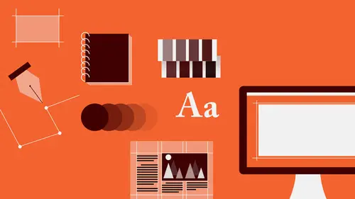
1Introduction to Graphic Design
11:27 2Graphic Design: Areas of Specialization
14:10 3The History of Graphic Design
40:11 4The Designer's Toolkit
11:32 5The Graphic Designer's Tools: Color
06:00 6The Graphic Designers Tools: Typography
01:42 7The Graphic Designer's Tools: Layout & Space
06:33Typical Work Processes
09:13 9Designing an Advertisment
41:46 10Designing a Poster
29:20 11Designing a Book Layout: Basic Concepts
36:02 12Designing a Book Layout: The Details
20:54 13Designing a Website
26:53 14How to Design a Brand Identity: Preperation
25:42 15How to Design Brand Identity: Showing the Client
18:24 16Building Brand Language
14:12 17Designing the Touchpoints
11:15 18Fundamentals are Forever
03:29Day 2
19Form & Image Toolbox
32:07 20Media & Stylization
14:37 21Representation & Manipulation
31:02 22Visual Narrative & Metaphor
19:16 23Color Identity
23:39 24Color Relationships
21:15 25Palettes & Systems
14:39 26Color as Meaning
07:09 27Typography: The Basics
25:16 28Style: Choosing & Mixing
26:01 29Text-Setting Mechanics
15:41 30Styles: Visual Qualities of Text
18:09 31Interactions of Forms in Space
24:46 32Arrangement, Logic, & Rhythm
18:57 33Contrast & Hierarchy
08:09 34Unifying Type & Imagery
05:36 35Working with Grids (or Not)
10:16 36Bringing it All Together
03:17Lesson Info
Text-Setting Mechanics
So, all type is designed to read. And so we have to talk about text-setting, and stuff that you have to look at, which is a very intricate, very detailed, really wonk-ish, OCD, anally retentive kind of situation. You will find that most people who are really interested in type and who are really expert at using it are, like, total geeks. I count myself among them. I don't think it's a bad thing. So, when you're setting text, one of the things that you have to look at, first is, you're trying to determine a certain kind of proportional relationship between things. You've got to look at how many characters you're gonna fit on a line, from the beginning of the line to when the line ends, and you're asking the reader to then travel back. And when the character count becomes too long, that is, when you get past around 70 characters on a line, it gets really hard to remember what you were reading at the beginning of the line. So, usually you want to stay, you want to make sure that you have ...
a character count roughly somewhere between 55 and 75 characters, and that does a lot of good things for you. Yes? What about spacing between words? Do you count them-- Yes. You count the spaces and punctuation. As a character? As well as the characters, yes. Excellent question, thank you. The character count for the same size of text will vary in every typeface because of the specific proportions of the letters. So that's always to be, it's something to look at. So you just want to do kind of a quick count and see what's happening. And then you also want to sort of think about the spacing in between. So, what you're really always interested in is what's called the interline space. That's the space between the baseline, of the line of text above, and the top of the lowercase of the line below. Leading, which is the measurement from baseline to baseline, is essentially unimportant. You can pick a default leading, that's fine. And the default is usually that the measure of the leading is 120% of the point size. So if your text is set in 10 points, your leading is 12 points. But, it really depends on how close together the ascenders and descenders are getting, as well as the height of the lowercase. If the X height is very, very large, sometimes it feels like there's not enough space between, and you get a very, very tight, very tense, almost sort of over-packed kind of a feeling in the text. And so you want to sort of be thinking about, looking at that space, and typically, for a comfortable reading experience, in general, you want that interline space to be about the same height, or the same depth, or measure, or a little bit larger, than the height of the lowercase. Typically, that is not a bad place to start. And then you adjust based on whatever the specific typeface is doing. Type has a structure. It makes shapes. And there's only a few ways that you can set text when it's extensive. Anything more than, well, I'll get back to that in a minute. So there are different kinds of alignment logic. That is, how the lines relate to each other left to right. So, first off, the lines of a text can be centered over each other, which we call centered axis, or they can be justified. That is that, they all line up on the left, and they all line up on the right. Both of these are symmetrical text structures. The outer contour on both sides is identical. Then there are the asymmetrical text structures. This we would refer to as flush left, or aligned left, and ragged right. That is, that the right-hand edge of the text creates this irregular kind of organic fringe. And then of course you have the opposite of that, which is flush right, ragged left. If you're ever setting more than 10 or 15 words of text as a grouping, you only have two options for alignment logic. And those are justified or flush left. Anything beyond that, anymore text than that, the shapes that are created and the reversed anchoring point interfere tremendously with legibility, with readability. That is, the ability to navigate from line to line in the correct order and maintain the sequence of reading. You can mix alignment logics. This is a book layout in which you see a center axis configuration, which is a very classical, much older kind of compositional idea for text that comes from the Middle Ages, and an asymmetrical configuration that is flush left, ragged right text with a little bit of mixture in between. So we get a repetition of the chapter titling here in the margin, and this text is also set asymmetrically on the page. The margins left and right are different from each other. You'll see that the caption, which is, a small amount of information is actually set flush right, ragged left, so that it's rag form, so that the left edge does not try to create a hard vertical cut that will seem in conflict with the irregular, organic quality of the centered type, and so that its right-hand edge will seem very, very closely and cleanly set up against the vertical line element. When you're ragging text, there's good and bad. It's complicated. So here are a couple of examples. This is a good rag: constant, regular, long, and short. No weird shapes of space cutting in, no bulges, no long lines sticking out, and the column appears to be the same width from top to bottom. These are bad rags. Don't do this. If you ever see this happening in your text, it means you have to drop your cursor into a place, hit the return button, or, at the beginning, hit the delete button and re-break and reflow your words from line to line. Don't rely on the hyphenation and justification settings that text-setting software allows you to use because it won't do it correctly. It has to be by eye. It's a very organic, natural object. You must do it by hand for every line, for every page of the 300-page book that you're working on. Justified text also presents problems, challenges, specifically that you're trying to fit an uncontrollable variable into a fixed space. You've defined a width for the text, but language is fluid and organic. It changes. You're trying to get words of different lengths and different numbers of words of different lengths to fit in the same measurement. So usually what happens is that you get some hellish spacing within the block that looks like this, usually of two different kinds. First we have this situation, which is where there are not enough words on the line because of the words that are too long or too short, or above or below, and you get these enormous word spaces, these holes. You see this in a newspaper all the time. And, no, you can't set justified text on the web yet. Newspapers and magazines, where the column is too narrow or there's some other thing going on. And you'll also tend to get a lot of hyphenation. So these word spaces are really dangerous because they begin to kind of line up over each other, and you get these rivers of white space that travel through the text. It's very distracting, first of all, because you want an overall even gray texture, because reading is difficult and people are lazy, and their eyes and brains will look for any kind of distraction to help them stop reading. The other thing that happens is that as you are reading, if the word spaces create these kind of little lines between, you'll suddenly start to jump in your reading from line to line instead of going across horizontally the way you're supposed to. You might start reading down, like, the typesetting device, whether it happens functions describe evenly as design to of letters, what? And that's something that just can't happen. The other thing that happens is, what's going on down here is that you get the opposite, so much text crammed into that space that there's almost no word space between the words and even where the letters are starting to crash into each other, and then you get kind of a dark spot, or a really light spot, and there goes your even gray value again. When you're setting justified text, because, really, the reason to set justified text is to get rid of the uncontrolled fluffiness of the rag and have very clean, strict, austere, and elegant appearance, so that means that you have to go in and detail everything along the aligned edges. At the beginning of the text, well first of all, when you've got columns of text or different things next to each other, as everything is lining up this way, you also want to make sure that lines of text that are directly opposite each other are also lining up. So you need to make sure that the baselines of different portions of text are somehow corresponding to the things that are to the left or right of them, which means a lot of detail kind of shifting up and down, zooming in a lot. And the other thing is punctuation. On the left edge in particular, you have characters like quotation marks, that, because they're there, they indent the first letter of whatever's following. Or you may have something like a parentheses, and what happens there is that the clean line that you've got suddenly has these little bites taken out of it, like a tiny insect has come along, or a mouse, and nibbled at the edges of your beautiful alignment. So what you want to do there is to actually flush all the text and hang the punctuation outside. That freaks some people out. Like, some editors will just argue with you for weeks about it. I fight it as much as possible and then, eventually, sometimes I have to give up, or I make my case, depending. So all of these kind of variables have to come together to result in what I like to call the ultimate paragraph, or the optimal text-setting experience. And this sequence that you're going to see is a series of steps, first setting kind of a default, just choosing a size and choosing a leading, and choosing a width, choosing a character count, just kind of willy nilly. So, picking a pretty big size and just sort of flowing it in. I've chosen this width. And you can see some things that are happening. It seems overall a little dense. And in addition to being kind of dense and a little bit sort of heavy, you see that things like the tittle of the lowercase I and the descender of the P, descender of P and ascender of L are crashing into each other. So that's already bad. You'll see that within this text, there are already two hyphens, and you always want to ensure that your hyphens are under control, that you're not getting more than one hyphen every 10 to 15 lines or so, and never, ever two in a row, or three in a row, which is called the hyphen stack, or the ladder. And then the rag is kind of nothing to speak of. This is kind of bulgy, there's a kind of a lineup of two lines, so it's not even really ragged here. The paragraph seems to be kind of leaning out a little bit. It's bad. It's not desirable. No one will die, but they might vomit. So, a change. Shrinking the size of the type and keeping the same leading, we get a little bit more of, kind of a decisive and soft rag shape. We've still got a couple of hyphens, but at least we've cleared out this issue with the ascenders and descenders. But now it looks like the interline space is a little bit too much. It's beginning to become kind of self-conscious, where you can really see, at a glance, that there are these black stripes of text and then this white space in between. And again, what you're after is really a kind of undifferentiated gray value. So the graphical linearity of the text is starting to show up. Shrinking the leading a little bit, and changing the character count slightly, widening, did I widen or narrow? Oh, narrowing the column just a tiny bit and tightening up the overall spacing has produced a little bit softer, more regular rag and we're down to one hyphen. No issues in the ascenders and descenders, but still a little bit loose. And then, blowing up the point size a little bit more, which takes care of some of the leading. The leading feels comfortable, but now we have, again, two hyphens, and a really horrifyingly bad rag, where the bottom few lines don't even look like they're ragging, they look like they're justified. And then if we make one last change and just narrow the column a little bit more, so that we're in that optimal character count range of between 55 and 70 characters, everything becomes perfect. Beautiful long, short, long, short alternation consistently, top to bottom. No hyphens, that's an em-dash, which separates this part of the sentence from that part of the sentence. No interaction between ascenders and descenders. The leading seems comfortable relative to the mass or presence of the type. We get an overall gray value, it's lovely. This is what you're after. If all that stuff is not happening in your text, your text is crappy. Fix it. It wants to be beautiful. The author and the ideas contained in what the author has written want to be beautiful visually as well as informationally. So, there are a lot of kind of decorative things that you can do with the separation between paragraphs. This is just kind of a little laundry list of, you know, you've got a column of text and you've got a paragraph break. What do you do with that? Well, there's, like, 20 of 500,000 things that you can do with the paragraphs. You can be inventive, very inventive with paragraph divisions, introducing lines or really deep indents, or graphical elements without really separation, or just a line separation, or you can hang the first line out a little bit. It can be a lot of fun.
Class Materials
Bonus Materials with RSVP
Bonus Materials with Purchase
Ratings and Reviews
photo_dj
This is more about all of your courses - It would be really nice for instructors to answer questions during break times or even after the class. There a lot a fabulous questions that I see that never get answered. I would like to go back even the next day and see a short note for at least some of those questions. Just an idea to help out this wonderful format that you have going. I am sure to make use of the promote question when I see an interesting one.
user-1f91d5
I LOVED this class! I learned so much and since I had the foresight to purchase it, I can go back for a refresher anytime I want. Plus, the downloads are spectacular! Almost a book's worth and so helpful! Thank you Timothy, you are great teacher!
a Creativelive Student
This was an outstanding course, would love to see a more in depth typography course from this guy. I'm a proffesional photographer with a formal education in design, I hardly ever use it, so I forget things, this was great both as a review, and to pinpoint things I didn't know or thought I knew. thanks once again! well done!!