Lessons
Day 1
1Introduction to Graphic Design
11:27 2Graphic Design: Areas of Specialization
14:10 3The History of Graphic Design
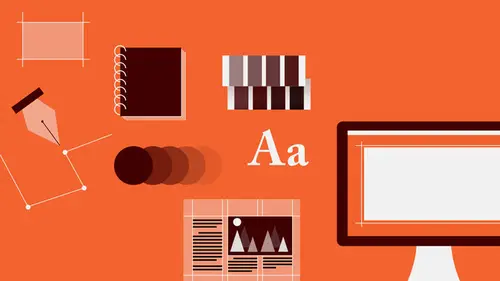
40:11 4The Designer's Toolkit
11:32 5The Graphic Designer's Tools: Color
06:00 6The Graphic Designers Tools: Typography
01:42 7The Graphic Designer's Tools: Layout & Space
06:33Typical Work Processes
09:13 9Designing an Advertisment
41:46 10Designing a Poster
29:20 11Designing a Book Layout: Basic Concepts
36:02 12Designing a Book Layout: The Details
20:54 13Designing a Website
26:53 14How to Design a Brand Identity: Preperation
25:42 15How to Design Brand Identity: Showing the Client
18:24 16Building Brand Language
14:12 17Designing the Touchpoints
11:15 18Fundamentals are Forever
03:29Day 2
19Form & Image Toolbox
32:07 20Media & Stylization
14:37 21Representation & Manipulation
31:02 22Visual Narrative & Metaphor
19:16 23Color Identity
23:39 24Color Relationships
21:15 25Palettes & Systems
14:39 26Color as Meaning
07:09 27Typography: The Basics
25:16 28Style: Choosing & Mixing
26:01 29Text-Setting Mechanics
15:41 30Styles: Visual Qualities of Text
18:09 31Interactions of Forms in Space
24:46 32Arrangement, Logic, & Rhythm
18:57 33Contrast & Hierarchy
08:09 34Unifying Type & Imagery
05:36 35Working with Grids (or Not)
10:16 36Bringing it All Together
03:17Lesson Info
The Designer's Toolkit
So we're gonna look a little bit at basically what it is that designers work with in order to do the things they do. How do you do? It's really about makin stuff and so this is the stuff that designers make. And the first thing is form and image. That is to represent ideas with some kind of visual sign that tells us things because of the way it looks, how it's shaped, what it's parts are. And there are a lot of possibilities for that. The possibilities, of course, are unlimited. And they begin with things as simple as, sort of, pure geometric graphical shapes that designers can use to create movement in spaces. And then there are kind of pictorial elements which can be very, very reductive, that is illustrative in nature, sort of iconified, taken down to absolute bare minimum for bold graphic impact. But then of course there's photography. Photography is very popular, and it's kind of the go to for a lot of designers. It's quick, it's clear, it's clean, it's very understandable. And th...
ere's a lot of stuff you can do with it. You don't have to use a photo as it comes into the camera just as it is. You can tweak it. You can change it's color, you can change it's tonality, you can put it in shapes, you can silhouette or chop out parts, you can collage with photography, and work with it in a very, very painterly way, in an illustrative way. So there are a lot of different kinds of option available. Of course there's illustration. And there are as many media under the sun as there are people, from drawing and etching, painting, collage, color pencil, printmaking, and of course digital drawing and montage, as well. Patterns and texture, whether they're photographic or hand made, whether they are representational or pictorial in nature, that is you can tell where the pattern came from, or they're completely abstract patterns, create surface activity. And, you know, we can sort of divide form into kind of two basic categories. That is form is either geometric, it's made up of sort of fundamental form language elements like dots, lines, plains, trapezoids, polyhedra, semi-circles, triangles interacting. And then on the flip side is organic form, form that seems, because of it's irregularity, it's spontaneity, it's softness, to come from nature. It refers to natural experience. You'll notice that these are also completely abstract, or non-pictorial images and they could, in fact, be representational. Simply because you're not looking at an image of something that you can literally see in the physical world around you doesn't mean that an image isn't communicating. And sometimes an abstract, or non-pictorial image, can pack in so much more information because it's not limited by what is actually there. That can be very, very powerful for communicating. You can mix images, of course, and manipulate them. And you always have to be, sort of, conscious of what's going on in the person's head. And this is another kind of an area of using images that's very important. It's not just what you're showing. It's just not the medium you're using to show that thing, but also how you're showing it. What are you combining those image elements with, and what happens to their meaning? How do people understand them when their form deviates from what they expect to see? So when you see this alarm clock not as a pure, kind of, representational, naturalistic photographic image, but as this kind of, sort of, hyper-saturated color repetition, you get the sense that this is just not any clock. This is an alarm clock and it is ringing. You can hear this. So the meaning of this neutral object has changed. It's become a specific kind of that thing, not just any one of that thing. And of course our brains will put together narratives. We'll make up meaning based on stuff that we see, especially if the image elements are photographic, because we appreciate, or we almost assume, that any image that has been taken by a camera that is photographic is actually somehow real. And so, working with photographic elements together in a way which is unexpected, which is surreal, gives you a lot of power as a designer. It allows you to kind of draw the audience in and, sort of, almost fool them into believing that what they're looking at is actually true already, because it's made up of photography. And then you slip the messaging underneath. Once you've got them, you've got them. Design is a lot like dark magic. Use wisely. And so when we talk about narrative, or meaning, the first thing we can look at is, you know, juxtaposition. Is that any image changes it meaning entirely when it confronts another image. And so we can look at these different bits, these different combinations, and sort of project some ideas onto them. So here, of course, we have a baby as our sort of base, our control, the placebo. And so here we have the baby, infant, juxtaposed with an image of a kitten. So what we might read into here is a very, very sort of closely related, or almost literal, kind of narrative. The gap in sort of idea or understanding or meaning between these two images is quite small. They are both infants. They are both innocent. They are both pre-developed. They have not evolved. They are both cute, they are both soft. As soon as the image changes to something where the connection is not as intuitively expected, the narrative gap widens, and in there you have leeway for metaphor or symbolism. The questions the viewer has to ask become a lot more complicated. Who is this woman relative to this infant? Is it mother, is it sister? Is it cousin? Is it the same infant all grown up? And then last, when the juxtaposition is really unexpected, when they're doesn't seem to be, at first glance, a really understandable connection between the two images, that is that their individual subject matters are so far removed from each other. It's in those cases where the narrative becomes infinitely more complex. And this is sort of where you wanna be as a designer, not so much down here. This is almost so easy to understand that your audience is likely to say, "oh, okay, got it, blah," and then move on. And then you've lost them. But it's where you give them a little question, where you, like, "just come a little but and I'll..." And then they're trapped and they've gotta figure it out. Because humans are curious creatures, and they wanna know stuff. So they're gonna ask. So here, when we have the stack of bills, the Benjamins, next to our friend the baby, all kinds of interesting possibilities open up. Children are expensive to raise. Maternal care is expensive. Education is costly, or babies cost a lot on the black market. It could be any one of those things. And when we start to ask these questions and we start to see images in sequence we start to move down this kind of road of understanding. And as juxtaposition follows juxtaposition the narrative changes, it grows, it evolves, and we start to move faster towards what we want. At the end is some kind of a conclusion, a summary, that bares out our expectation. And when the designer takes the audience to that place, it's like a punch to the gut that the audience doesn't realize has happened. But, you know, you can twist the narrative any way you want. So on the top we're starting with the same house image. And it's interesting to note the kinds of assumptions that I know that you're already making, because not only do we ask questions, but we come to visual information with our own baggage. We project meaning onto those things. And so, designers are really kind of tweaking or playing their audiences psychology. And you'll probably have assumed that after looking at this and seeing this couple that this couple is looking at this house. That they are gonna buy it, they're gonna rent it, they're having a life together. You don't actually know that these two people are a romantic couple, but you might have assumed that. They could be anybody. They could be brother and sister. They could be friends, they could be coworkers. But because of the coloration in the photos, because of their gesture, how they're relating to each other, we make that assumption and that's born out by the following image. Even though this image is in black and white and you don't see those people, you have assumed that this is the married couple. But there's nothing empirically available to prove that. It's just lied to you... in a good way. And then of course we follow up with kind of the result of that intermingling which is the production of our baby from the previous slide. Here you can see how easy it is to warp that narrative in another direction. That is the same house, followed by the image of the storm clouds, and we assume that this house is in that environment and there's an impending ecological disaster. You see then, people running. We don't know if they're running because they're playing. Maybe it's this couple. They're on a date, they're going on a picnic. But they seem to be running. There's a slight blur and the way that they're cropped causes them to kind of slide, almost precipitously, out of the frame. So there is this kind of implied danger, some anxiety that's being transmitted. And in the final image we see a house that's completely dilapidated. And I know that you have, as well as you all out there, have most likely inferred, assumed, that this house was destroyed by this storm and it's this people's house. If you look at this house you'll see this house is of wood construction. This house is of stone. This house doesn't have to be empirically the same house in order for you to believe, to kind of suspend your disbelief, that this narrative actually becomes true at the end in this way.
Class Materials
Bonus Materials with RSVP
Bonus Materials with Purchase
Ratings and Reviews
photo_dj
This is more about all of your courses - It would be really nice for instructors to answer questions during break times or even after the class. There a lot a fabulous questions that I see that never get answered. I would like to go back even the next day and see a short note for at least some of those questions. Just an idea to help out this wonderful format that you have going. I am sure to make use of the promote question when I see an interesting one.
user-1f91d5
I LOVED this class! I learned so much and since I had the foresight to purchase it, I can go back for a refresher anytime I want. Plus, the downloads are spectacular! Almost a book's worth and so helpful! Thank you Timothy, you are great teacher!
a Creativelive Student
This was an outstanding course, would love to see a more in depth typography course from this guy. I'm a proffesional photographer with a formal education in design, I hardly ever use it, so I forget things, this was great both as a review, and to pinpoint things I didn't know or thought I knew. thanks once again! well done!!