The Graphic Designer's Tools: Layout & Space
Lesson 7 from: Graphic Design FundamentalsTimothy Samara
The Graphic Designer's Tools: Layout & Space
Lesson 7 from: Graphic Design FundamentalsTimothy Samara
Lessons
Day 1
1Introduction to Graphic Design
11:27 2Graphic Design: Areas of Specialization
14:10 3The History of Graphic Design
40:11 4The Designer's Toolkit
11:32 5The Graphic Designer's Tools: Color
06:00 6The Graphic Designers Tools: Typography
01:42 7The Graphic Designer's Tools: Layout & Space
06:33Typical Work Processes
09:13 9Designing an Advertisment
41:46 10Designing a Poster
29:20 11Designing a Book Layout: Basic Concepts
36:02 12Designing a Book Layout: The Details
20:54 13Designing a Website
26:53 14How to Design a Brand Identity: Preperation
25:42 15How to Design Brand Identity: Showing the Client
18:24 16Building Brand Language
14:12 17Designing the Touchpoints
11:15 18Fundamentals are Forever
03:29Day 2
19Form & Image Toolbox
32:07 20Media & Stylization
14:37 21Representation & Manipulation
31:02 22Visual Narrative & Metaphor
19:16 23Color Identity
23:39 24Color Relationships
21:15 25Palettes & Systems
14:39 26Color as Meaning
07:09 27Typography: The Basics
25:16 28Style: Choosing & Mixing
26:01 29Text-Setting Mechanics
15:41 30Styles: Visual Qualities of Text
18:09 31Interactions of Forms in Space
24:46 32Arrangement, Logic, & Rhythm
18:57 33Contrast & Hierarchy
08:09 34Unifying Type & Imagery
05:36 35Working with Grids (or Not)
10:16 36Bringing it All Together
03:17Lesson Info
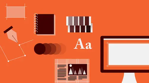
The Graphic Designer's Tools: Layout & Space
And then we have to also be able to organize typography with graphic elements with images and to understand a way or to find a way for these two very very different kinds of things to kind of live together in the same space. Images are allover the place, they are photographic they are soft they are hard they are geometric they are organic, they are dots they are lines they are planes they are textural they are flat and typography is always the same thing. It's always dots, it's always lines and it's always masses and usually kind of hybrids and that stuff never changes and it's sort of basic quality and this is why it's very challenging for most people to bring typography and imagery together into a composition, into a project because you are looking at these two radically different kinds of material and how do you find formal or visual relationships between those so that you create a totality and that all the parts are talking to each other. And that happens in layout. So we have to b...
e able to understand the relationship between form, the stuff, and space, where it is. That is the positive and the negative, and not negative like in a bad way but just the opposite of thing. So, and a form will change it's appearance from positive to negative depending on how it's oriented within or cropped within a format. So as a form changes size, it's level of dynamism increases or decreases, it's sense of being an object or a space or sometimes both changes. We have to be conscious of how space is being broken in order to create movement and kind of trajectories between elements, relationships between elements in their positioning around the space. There are two kind of basic sort of organizational ideas, one is symmetry in which things are organized around the center axis of the format in one way or another and then there is assymetry of which there is an unlimited number of kinds and stepping, stacking, clustering, spiraling, concentric, radio, branching and so on and these are very very different kinds of compositional approach or layout approach and very rarely do they like to play with each other. They are so specific and they each have their pros and cons and they are each relevant or useful in a different place. When we are talking about bringing elements together in space, we have to start to talk about differentiating them and creating some kind of interplay that makes that composition vibrant and lively. And one of the things that we look at is what's called contrast, creating differentiation or visual differentiation between elements. YOU could put all of the visual elements in a space or a page layout or a poster or webspace and make them all the same size and space them evenly and that would give you a dull snoozer of a layout. The more things are the same, the less interesting it is and the less likely that the audience will be able to determine which of those elements is of greater importance compared to the others. So the compositional contrast that you have to try to introduce functions on two levels. It functions on a visual level that is to engage, to create dimensionality and rhythm and movement and also to emphasize or de emphasize. So that relates directly to hierarchy, that is, how do you create an ordering for the information How do you show people instantly by looking that something in this field is more worthy of their attention than other things. That is the most important thing, it's the thing you really wanna be thinking about. And then, how do you downplay those other things and still have them relate, I mean clearly all the information in a designed communication are important, but they are not all equally important. And so there are different ways by creating difference relative to surrounding fields of similarity that is the different thing gets called out. You can introduce levels of difference, these are less different overall than this is compared to everything and so on. And you can look at the proximity of things, generally things that are close together in space are more likely to be understood as related to each other and things that are separated in space are understood to be less related to each other. And then you can kind of ping pong people around hierarchy and composition is also about movement, how do you cause the eye to follow a path from one place to another and it doesn't have to be from upper left corner to lower right corner. Because if you are doing your job, you can get a person to read in any order that you choose. And as another kind of organizational idea, there's this, which is called the grid and a typographic grid and it's a kind of a mathematical or architectural framework for organizing a lot of complex information, pictures and images. Usually in publications where you have tremendous volumes of text, very very complex hierarchies, different levels of information, different kinds of information running side by side or alternating and the grid gives you a way of creating a kind of proportional similarity, a kind of a harmony of size and position anchoring points, alignments within a page that helps tie everything together but it acts as a system. You can group these little pieces of space in different ways to accommodate images of different sizes, text of different lengths, information of different kinds in any combination. So the flexibility of the grid is that it allows all these kinds of changes and information which are unavoidable to live together as a totality. And that's usually why they are used by designers for complex publications when you are going page after page after page.
Class Materials
Bonus Materials with RSVP
Bonus Materials with Purchase
Ratings and Reviews
photo_dj
This is more about all of your courses - It would be really nice for instructors to answer questions during break times or even after the class. There a lot a fabulous questions that I see that never get answered. I would like to go back even the next day and see a short note for at least some of those questions. Just an idea to help out this wonderful format that you have going. I am sure to make use of the promote question when I see an interesting one.
user-1f91d5
I LOVED this class! I learned so much and since I had the foresight to purchase it, I can go back for a refresher anytime I want. Plus, the downloads are spectacular! Almost a book's worth and so helpful! Thank you Timothy, you are great teacher!
a Creativelive Student
This was an outstanding course, would love to see a more in depth typography course from this guy. I'm a proffesional photographer with a formal education in design, I hardly ever use it, so I forget things, this was great both as a review, and to pinpoint things I didn't know or thought I knew. thanks once again! well done!!