Lessons
Day 1
1Introduction to Graphic Design
11:27 2Graphic Design: Areas of Specialization
14:10 3The History of Graphic Design
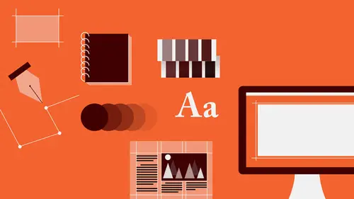
40:11 4The Designer's Toolkit
11:32 5The Graphic Designer's Tools: Color
06:00 6The Graphic Designers Tools: Typography
01:42 7The Graphic Designer's Tools: Layout & Space
06:33Typical Work Processes
09:13 9Designing an Advertisment
41:46 10Designing a Poster
29:20 11Designing a Book Layout: Basic Concepts
36:02 12Designing a Book Layout: The Details
20:54 13Designing a Website
26:53 14How to Design a Brand Identity: Preperation
25:42 15How to Design Brand Identity: Showing the Client
18:24 16Building Brand Language
14:12 17Designing the Touchpoints
11:15 18Fundamentals are Forever
03:29Day 2
19Form & Image Toolbox
32:07 20Media & Stylization
14:37 21Representation & Manipulation
31:02 22Visual Narrative & Metaphor
19:16 23Color Identity
23:39 24Color Relationships
21:15 25Palettes & Systems
14:39 26Color as Meaning
07:09 27Typography: The Basics
25:16 28Style: Choosing & Mixing
26:01 29Text-Setting Mechanics
15:41 30Styles: Visual Qualities of Text
18:09 31Interactions of Forms in Space
24:46 32Arrangement, Logic, & Rhythm
18:57 33Contrast & Hierarchy
08:09 34Unifying Type & Imagery
05:36 35Working with Grids (or Not)
10:16 36Bringing it All Together
03:17Lesson Info
Unifying Type & Imagery
Type and image in one place together, talking to each other. Type is very different from every other kind of image, except if that image element or form element is lines or a texture, because type is always lines or a texture, but other kinds of images are often many other things and exhibit much more complicated kind of form language or syntax. So, trying to get them to talk to each other is often quite difficult. These are situations where the type is creating compositional and textural and color relationships with the image forms. Very simply, here, the text expressing the same kind of lateral back and forth overlapping or stagger, but creating a warm to cool relationship with text as well as expressing the center axis and introducing assymetry at the same time. Here the type changes in tonal value in relationship to the alternation of light and dark in the image. And here, the type is formed on a kind of an architectural structure that kind of puzzle pieces around graphical forms a...
nd images. In fact there is an underlying set of measurements or guidelines that is governing where everything is, how narrow or tall it is, how wide it is, and even the shapes of the space, which we'll talk about shortly. There're kind of two sorts of relationships that you can create between text and image, and one is, and it's both about creating form relationships. Finding some kind of visual idea, that will connect the two in some way. And the first, I would term formal congruence that is similarity of form, form identity, form qualities. So there're always kinds of four aspects of that congruence that are possible. There's congruence in shape. That is, for example, that the feather in this image has a certain kind of curve to it, and the type also has a certain kind of overall curve to it. A texture congruence. That is that there are very light, delicate frondy things and very light, delicate frondy things that there is value congruence, a kind of stepping down in weight from very, from much bolder to lighter, to lighter still as the feather also starts very solid and light to darker and darker still. And then rhythmic congruence. That is the elements are moving in space in a way where they're kind of complimenting each other. So as the feather is doing, sort of this, the type is also kind of doing this at the same time. The opposite of that, which is also kind of an equally valuable sort of possibility is creating utter and total contrast between the text and surrounding elements. And the same kinds of things or the same aspects of things that you would contrast against. Shape, opposition in texture, opposition in value, and opposition in rhythm. And we refer to this as formal opposition or formal contrast. And so the same kinds of things, you know, you have very very textural type of graphic elements, but very bold plainer forms that are very angular. You have texture against different kinds of texture, that is certain kinds of grid pattern against other ones. You have value opposition. Extreme changes in tonality. And you also have rhythmic opposition, that is very very explosive against very very quiet. Type can appear to be, to occupy different spatial levels depending on how it interacts with an image. Sometimes it may appear next to or on top of or inside and outside, and create a kind of a pulling or connection. It may appear to overlap and transition between spaces. And there're a lot of different ways that you can also create alignment relationships. Looking at the axis of different elements or certain kinds of diagonality, or to look at the shape of a rag against a similar kind of shape in an image. To relate alignments to an axis. The vertical here in the tree. Or to create overlaps where there's a clear contrast of one kind of movement against another. You can also look at, like if you have a form that is shaped in a particular way, it's that you can locate text elements in alignment to its outer edges or to rotate it against an axis. You can always play with the central axis of an object whether it's a dot or a plane, some other kind of a plane form, circular or not, as well as the outer edges above, below, and side to side. And here's just a situation where you have a lot of different kinds of relationships. You've got a dot-like image. The angle from within the photograph gives rise to the rotational angle of the E. You have an alignment relationship top to bottom. You have very very different kinds of sort of pulsing. Wide, narrow, wide, narrow, wide, narrow rhythms in the space so that both the text and the form elements are contributing to the same, to the same rhythmic idea.
Class Materials
Bonus Materials with RSVP
Bonus Materials with Purchase
Ratings and Reviews
photo_dj
This is more about all of your courses - It would be really nice for instructors to answer questions during break times or even after the class. There a lot a fabulous questions that I see that never get answered. I would like to go back even the next day and see a short note for at least some of those questions. Just an idea to help out this wonderful format that you have going. I am sure to make use of the promote question when I see an interesting one.
user-1f91d5
I LOVED this class! I learned so much and since I had the foresight to purchase it, I can go back for a refresher anytime I want. Plus, the downloads are spectacular! Almost a book's worth and so helpful! Thank you Timothy, you are great teacher!
a Creativelive Student
This was an outstanding course, would love to see a more in depth typography course from this guy. I'm a proffesional photographer with a formal education in design, I hardly ever use it, so I forget things, this was great both as a review, and to pinpoint things I didn't know or thought I knew. thanks once again! well done!!