Lessons
Lesson Info
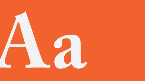
Typography: The Basics
We're exploring yet another in depth treasure trove of goodies for designers to play with, to work with, and that would be typography, which is the aspect of design that deals with working with text, with letters and words, and bringing that into organization with other kinds of visual imagery. Thinking about the typography in a visual way as well as a verbal way. And so, we're gonna start off by covering the basics. Pretty much the nuts and bolts. Letter form anatomy and structure and optics. We'll then segue into looking at the intricate world of text-setting. When you've got a lot of text and different parts of text, what do you do with it? We're gonna try to understand some issues that are related to style, like choosing and combining different typefaces or fonts together. We're gonna then explore typography as a visual medium, very much like other kinds of form elements or images. And last we'll end off with thinking about typography as information, which ultimately it is. Type is...
language, and it's there to be read. So, first off we're going to explore what are kind of the nuts and bolts of the forms of letters and words, and the spaces that surround them and show up in between them. Because that relationship between the stroke of the type, that is the line element that makes it, and the spaces that exist in between and around the typographic elements within letters, between letters, between words, between lines of text, and also surrounding blocks of text, is really intrinsic to understanding how typography works. Typography gives a lot of people trouble because it is a very strange kind of abstract hybrid of two completely different sorts of communication function. On the one hand, it is entirely functional. It is there to transmit verbal information, that's written information, and so it has to function for people to be able to read, in an easily understandable way. The text has to be a reasonable size for most people to be able to see it properly. And on the other hand it is also a visual form. This is really the aspect of it that trips most people up when they start working with type, and that is to try and get past the sense of the text being only there for reading, but to be able to consider it in the same way that you would consider the scale or location, or arrangement of images, the qualities of images and their contrast and detail, to consider typography from the same kinds of vantage points, so that type and image can live together when they need to. And, when type is standing alone, that it still presents a dynamic optical experience without necessarily having to have other kinds of form elements or images around. So what we're looking at here is kind of a diagram of letter form anatomy. Over the course of about 1,200 years, all of the parts of letters have come to have their own little names. So if you want to walk the walk you gotta talk the talk. And I'm not gonna go through all of these individual terms, because we'd be here for three hours, or explaining them, but I'll hit a couple of the basic ones. So, you're gonna hear the word stroke come out of my mouth a lot, and stroke just refers to one of the linear elements that is composing a letter form. So letters are made up of strokes. The strokes have different names. They do different things depending on what direction they're moving. Vertically, horizontally, diagonally. Next, you'll hear me use the word terminal sometimes, and that just refers to the end of the stroke. The terminal always has a particular shape depending on what typeface you're talking about. So if you're talking about a serif typeface as we're looking at here, and serifs are these little kinds of feet that stick out of the end of the strokes, that is a very specific kind of terminal shape. Sans-serif typefaces, those that don't have the little feet sticking out, where the strokes just end and meet abruptly, sometimes also exhibit very, very specific kinds of shaping details. And so you always want to be sort of aware of those. So the terminal is the end of the stroke. The other important sort of part of the type is the stuff that's not really there. That is the space in and around the strokes, and those are called counter-spaces or counter-forms, or just counters for short. So, the relationship between the stroke and the counter drives every single aspect of typography, because it is essentially a relationship between positive and negative, or form and space. How tight together those strokes are, and how little space exists between them, or how far apart the strokes are, and how much space exists between them. As well as whether or not the strokes are very, very heavy in weight, or very, very light in weight has dramatic consequences on the overall sort of textural and visual qualities of the typography overall. It starts with the letter form itself. So you have the stroke and you have the counter, and then you have to sort of look at two basic forms. That is, the capital, which is the larger form. It's the older form, it's more authoritative. First standardized in the first century AD, or in the Common Era, CE, by the Romans. So the capitals are really very, very old. The lowercase letters or the small letters only came into being as part of the modern alphabet in or around the 12 or 1300s. So it is really a kind of a late Gothic or early renaissance addition to the letters, to the alphabet rather, but they work together as a set. They have specific kinds of functions. And the lowercase establishes a specific kind of proportion of height relative to the capitals or the uppercase, and that proportion of the lowercase to the uppercase is different in every typeface or font, and it's an important consideration when you begin to consider legibility and how small or large you need to set particular text in order to be able to read it. Last there are a couple of basic structural elements that we need to look at. The first is the baseline. That is the imaginary line upon which the text rests or rides along horizontally. There's the cap line which establishes the height of the typeface, and is based on the height of the capital letters. And then you have the mean line, which is the line that describes the height of the lowercase, or the measurement, the break from cap to baseline. That actual height, the height of the lowercase is usually referred to as the X height. Only because the lowercase X is the only lowercase letter that has an actual flat top and flat bottom to be able to measure the proportional height against. Then last, there are a couple of extra little stroke forms that you'll want to be aware of, and that is that sometimes in the lowercase letters there are strokes that extend above the mean line, and rise to either the cap line or another measure above. Those are called ascenders, because they ascend from the lowercase. On the other hand you very often have strokes that drop below the baseline, as in the lowercase Y, or the lowercase G. And those we call descenders because they descend below the baseline. Letter forms are deceptively simple in appearance. Generally they are designed in such a way that all of the parts within a letter, and all the parts of different letters between letters feel like they belong to each other, that all the diagonal strokes for example in the capital A, in the capital V, in the N, actually appear to be the same angle. That all the strokes appear to be the same thickness, or where you have different weight strokes, thin strokes and thick strokes within a typeface, that all the thins appear to be thin, the same thinness, and all the thick strokes appear to be the same thickness. As well as the heights and the widths are designed to be optically about the same in proportion, so that what you're trying to establish in design of letter forms for an alphabet for text is kind of an un-interfered, an undifferentiated kind of seamless gray value. A constant alternation of light and dark at the same rhythm with no deviations. No bright spots, no strokes appearing further apart or closer together. And that aids the reader in being able to transition smoothly through the text without being distracted by little sort of optical details. Where none of the letters appear darker or lighter than any others. Because you have to think that reading is a really, really labor intensive activity. It demands a lot of the eyes, of the eye muscles, and of the brain. And people get tired fast, and generally in terms of reading, people are lazy. So, type designers have to work really hard to kind of correct these minute optical differences in things like the angle of the diagonals or the thicknesses of the strokes, so that at a small size, those optical illusions, those corrections take care of some strange sort of details that happen. For example if you look here, the angle of the V, the left stroke of the V and the right stroke of the A you can see are actually not the same angle. If they were, the A would look a little bit too condensed, and the V would look a little bit too extended. You can see also that the curves in the uppercase R and the uppercase B are actually very different, and their thicknesses are also very, very different in actuality. So, letter forms are not designed mathematically. They're designed entirely by eye so that those optical corrections result in what appears to be a smooth seamless completely structurally integrated set of forms. Spacing is critical in typography, for a lot of reasons. Again, the idea of the space in and around letters and words is to help control the apparent gray value, the rhythm of stroke and counter as they alternate across the line. And so there are a lot of different kinds of sort of aspects of spacing that designers working with type need to be aware of in order to achieve evenness. For example, letter forms, if they are spaced mathematically, that is with literally the same amount of space in between the outermost edges of each letter, results in a situation where the letters actually look like they are closer together and further apart, which then creates this kind of internal sort of pushing and pulling rhythm on the line, and what you really want is for every stroke within a letter and between the letters to appear as though they are the same distance from each other. So that the rhythm of dark to light, the flicker that happens, seems very, very even. And there is a lot of different kinds of spacing and sort of rhythmic issues that occur depending on whether or not the type is bold and condensed, or it's an italic, and how much contrast there is between the weights of the strokes. Very often you have to adjust the spacing of all capital or all uppercase setting in order to achieve a more comfortable appearance, and also to aid in legibility. You always need to correct the spacing between certain kinds of letter pairs, because of the shapes of the counters of those particular letters as they come into juxtaposition. And again, very often combinations of letters, because of their specific shapes, create a lot of difficulty, challenges, in being able to space them evenly. So what very often happens is that you kind of have to find the worst case scenario, like where is the space the tightest where you cannot get the letters any closer? Or where is it loosest, where the letters also can't get any closer? And then to try to adjust everything to match that worst case scenario so that you are able to achieve a kind of an evenness in the texture of the strokes. That make sense? This is just a diagram of typical or of conventional type sizing, which really dates back to about six or seven hundred years ago. Up until the 1970s, it was actually not possible to set type above the size of 72 points, which is relatively small, it's about that big. Until photo typography was invented, and then eventually digital typography where the letter forms could be scanned or photographed and then scaled up larger. Up until the 1970s, all text-setting was set with lead moveable type in the same way that Gutenberg invented it in 1445. Just so you know. So the ability to set type very large is something that is relatively new. But these are the typical sizes. From the sizes, the largest size of down to 14 points, we consider those sizes display sizes. That is that those sizes are large enough to command attention from a distance, to be used in posters or as titling on book covers. They're not, that size is not really intended to be used as text. Below that from 14 points to nine points is considered a text size. The average text size for a newspaper or magazine is about nine points for a particular kind of serif typeface. And that seems to be kind of comfortable for the vast majority of the population, but it does sort of depend on the typeface itself. Any sizes below that, seven points, six points, five points, are really considered caption sizes. Kinds of sizes that you could use for a very small amount of information. A label, a caption, where even though you're asking the reader to strain really hard to read because it's so small, that they will still put up with it, that it seems still appropriate at that size even though it's quite small. You have to be really kind of conscious of the point size when you're thinking about legibility. Especially with regard to the height of the lowercase because the height of the lowercase is different in every typeface. So, as you can already see here, at 48 points for example, you have a selection of two typefaces. A sans-serif and a serif, and you can already see that the capitals themselves are different sizes when set at the same point size. So in order for these to be optically the same size, to appear the same size, you would actually have to adjust the size of the serif upward to match the height of the sans-serif face, and this is also something that needs to happen when you're thinking about the lowercase. So these are three different typefaces that are all set at a size of 36 points, blown up a little bit here, and you can see that the height of the lowercase is radically different, even though the caps are all, for these two at least, are in alignment at 36 points. The older style typeface is a little bit shorter, and that's typically true of older style typefaces, serifs dating back to four or five hundred, or six hundred years, is that the lowercase is typically very small. But more contemporary typefaces, especially sans-serifs have X heights that are quite large. You always want to be careful with spacing when you're dealing with print, because when ink hits paper, it bleeds. So, if you're working with letter forms that have very, very tight or intricate counter-spaces, sometimes those typefaces are not so useful for text applications at a small size, because the bleed of the ink will fill the counter-spaces in and then you're messing with character recognition, and people will not be able to read. So all the letter forms are essentially unchanged, have been unchanged for a good 2,000 years. 2,000 or 1,300 depending on whether or not you're talking about the caps or the lowercase. And so, they all follow the same basic structures, that we rely on a basic kind of an archetypal form, a kind of a model to be able to recognize and distinguish an A from an F, from a B, from a C, from a G, and so on. And yet at the same time, it's worth noting that there are nearly 150,000 different typefaces or fonts in use today. How can that be? Because they're all very, very different kinds of styles, and the issue there is that by making very, very relatively subtle changes to the shaping of the strokes, to the shaping of the terminals, to the proportions, is that a type designer is able to radically affect the visual presence and style of the letter form. And it doesn't really take a lot. So, there are really, one, two, three, four, five, six, six different ways that letter forms can vary in their style. And the first is case, and we've seen that already. Every letter form in the alphabet comes in two versions, the uppercase, which are the big letters or the capitals, and the lowercase which are the small friendlier, happier ones. Then there's weight, which refers to the thickness of the strokes in the letter relative to its height. So, generally typeface design or font design begins exploring a weight that is considered regular, there's a specific proportion of how thick the stroke is compared to the height. That acts as a kind of a baseline kind of jumping off point. And we refer to that as the regular weight. It's actually one seventh the height of the letter. Interesting fact. I don't know where that number came from, but there it is. Anything, any letter in which the strokes are actually thinner or lighter in weight, than that proportion, we refer to as being light in weight, and anything, in any letter in which the strokes are actually thicker than that, we refer to as being heavier in weight, and either bold or black depending on how much heavier they really are. So these are just examples of weight changes in a sans-serif, and then weight changes in a serif. Now you can also have changes of weight directly within a letter form itself, within a single letter, and that we refer to as contrast or stroke contrast, where there are thin strokes as well as thick strokes. So some typefaces are drawn in such a way that all of the strokes are uniform weight, they appear the same thickness. And others exhibit thins and thicks. Sometimes that contrast is really extreme, where the difference between thin and thick is huge, and sometimes the contrast is not so different, where the thins and thicks are a little bit lighter and heavier, but not so much. And the last thing we can look at with regard to contrast is modulation, because you can actually have strokes that change in thickness from beginning to end, regardless of how overall bold or light the typeface is, regardless of how much or little contrast there is between the thin strokes or the thick strokes. But the stroke itself can actually bow inward and outward, or flare at one end. Sometimes at the baseline rather than at the cap line, and that is called modulation. The next characteristic that can be adjusted to change style is the width. Just like weight there is a kind of starting point that determines a basic width or a regular width for the average letter form. Which is about 80% of its height. Anything that is narrower in proportion is referred to as condensed, and anything that is wider in proportion is referred to as extended. Next is posture. That is whether or not the type is standing straight up and down, 90 degrees perpendicular to the baseline, or whether it leans to the right. If it's standing perpendicular, the posture is referred to as Roman, because that's how the Romans made it. If it's leaning, usually at a slant of about 12 to 15 degrees off of vertical, we refer to that as italic, and again, any thoughts? Because the Italians made it that way. Humanist scholars in Italy during the Renaissance looking for a form of letter that would kind of replicate the slant of handwritten script decided to create a form that was somewhat slanted. You can also have this kind of crazy thing in which the slant happens in reverse, and it's called a reverse oblique. And last there's the issue of style. And we have to talk about style in three different ways unfortunately, because it's kind of a catch all term for a number of different aspects that a type designer has to think about. The first is the difference between two major classes of typeface. That is the serifs, those that have the little feet at the ends of the strokes, and then the sans-serifs, those that don't. So, most typefaces are divided into those two general categories. The second way that the word style is used is in reference to period classification. That is, when was the typeface designed? And often, where was it designed? Because typefaces designed around the same time exhibit very, very specific related characteristics. They have a similar kind of a style. So, serif typefaces designed in the 14 and 15, and 1600s have a very, very different kind of set of proportions and stroke details, and contrast than do serif typefaces that were designed in the 1700s or in the 1900s and so on. And last one has to talk about style with regard to the relative neutrality, or decorative quality of the typeface. Is the typeface drawn in such a way that it kind of adheres to the normal or regular kind of proportions and structure as defined as kind of the archetype or the icon for that form? That is, is it regular width? Is it regular weight? Does it have minimal contrast? Is it basically the skeleton of the design structure of the letter? Or, is it doing crazy stuff? Is it really extended, or super condensed? Or are there kind of weird like twisty things coming off? Or is it drawn out of twigs? And so, we would say that typefaces that are basically adhering to the model, playing by the rules, are neutral, and that those other crazy things are not neutral, that they're stylized or decorative, or idiosyncratic. But just like color as we were looking at, typeface neutrality is relative. So if you're looking at a particular typeface you can get a kind of a sense right off the bat in no context that okay this is a relatively, this is a neutral typeface. As soon as it comes into contact with some other typeface, one of them is likely to be more neutral than the other one. So you always have to look at what's going on among the typefaces that you're choosing.
Ratings and Reviews
athina k.
Great class! The lecturer was so descriptive...to detail...and at the same time so relaxed and funny. I loved him and understood better things that i' ve heard before, but never cared that much to paid attention to...!
Deb Green
Excellent! I will never look at typeface and daily examples of typography design the same way again! Brilliant teacher who animates the 'deliciousness of an optimal text setting experience' in such a hilarious and engaging manner.
Brenda
Wonderful class. I have a much better understanding of how to use text in my work. I will be revisiting this class, I am sure! Highly recommend it.
Student Work
Related Classes
Design Projects