Black and White Conversions in Photoshop
Lesson 6 from: Hot Tips from the Photoshop PlaybookBryan ONeil Hughes
Black and White Conversions in Photoshop
Lesson 6 from: Hot Tips from the Photoshop PlaybookBryan ONeil Hughes
Lessons
Photoshop Playbook
02:27 2Adobe Bridge: Camera Raw
08:04 3Quick Select & Refine Edge in Photoshop
05:33 4Sharpening in Photoshop
09:40 5Correcting Distortion in Photoshop
07:36 6Black and White Conversions in Photoshop
08:45 7Content Aware in Photoshop
11:02 8Depth of Field Modifications in Photoshop
13:33Lesson Info
Black and White Conversions in Photoshop
Let's talk about black and white for a second. There are a lot of different ways to do Black and white conversions. I wrote two books on black and White conversion. Um, and at the time, uh, I think they were. They were interesting to people, and they enjoyed them. They were actually a couple of the first books on using Light Room and Photoshopped together, which I've always been a big advocate of, Um, And again, you should use light from as much as you possibly can. I'm gonna show you the workflow that I use in camera raw because again, it works in light room. Really straightforward. If you saw the prior course, we actually took this image here on. We passed it through light from mobile. You could do almost everything I would do to make a great black and white conversion using our mobile APS. Eso know that you can do great black and white conversions wherever you are. My only guidance to you is when you're doing black and white conversions. You either want to use camera, are light room...
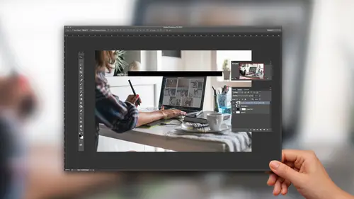
so that you can go back to color. If you change your mind or you want to use a layer based workflow. I will show you a way to do it in photo shop. There's some reasons you might want to do it. Um, the thing about black and white is a lot of the time. You're not sure if you want it to be a color image or black and white image until you've worked with the file for a while. So I'm gonna double click on this. This is, um, should be straight as it came off. Yep, straight as it came off the IPhone cameras. So many of us were using so often. And what I'm gonna do is I'm gonna try to get a much more dramatic black and white exposure. Those of you saw the last course some. We do this in mobile app. Here's how it works in here. First thing I'll say is that auto used to be a bad word in our wraps. It was one of those things that people didn't use. Um, but it works really well. If I click auto, you'll notice a whole bunch of things they're going to change. The exposure went up. The contrast went up. The highlights went down The shadows went up, whites and blacks suggested all sorts of things changed its analyzing the image and applying that it's giving us a good place to start. You'll notice that I'm going to correct the highlights. I'm gonna open the shadows. I'm gonna add clarity or mid tone contrast. I'm doing this all to the color image. Gonna work the color image as much as possible for two reasons. One you might decide somewhere along the line. I like it more as a color image, and the other is you can see more information when it's color image that once black and white. So when I'm satisfied with that, then what I'll do is I'll move over and I'll convert it to black and white. I like to poke a little bit camera team that they call this grayscale. In here, there's all these friendly words like orange and purple and words you don't expect to find anywhere near photo shop. And then there's scary old grayscale. Um, the thing to know about this one is that once you do this, you'll notice that there's this natural s shape between the color channels, and we've done that to introduce just a little bit of contrast between them. Um, rather than adjusting those manually, what I like to do is take this targeted adjustment tool appear. And if I click on the screen and I pull that, you might notice there's two things. There's two sliders that are moving. In this case. It's almost all blue, but it's a tiny bit purple, which is probably noise. If I move it to the foreground of the sand, you'll see that it's the oranges and the yellows moving together. So I think a lot of people dismissed this targeted adjustment tool. As you know, maybe a little gimmicky or not is powerful, but it can move multiple sliders at varied rates. It's actually doing something you couldn't do as a user, so I really like it a lot because I have no idea if this grass was dead and gold or if it was live and green. I just click on it. I click up and down, and at this point now it's moving the yellow sliders more than the orange. Now remember, everything we do in camera is global. If you wanted to do selective adjustments, that's where you'd want to pop over into Photoshopped. Um, if I click done here, it's not gonna open into photo shop. But the change is going to be reflected back there at the file. If I opened it, it would have translated it into that language that photo shop understands. Okay, so let's take this tiff and let's just pass it right through. Let's open the object in the photo shop and look at the workflow within Photoshopped. Two things I'll tell you about here one we talked about auto over in camera raw. I'm a big believer in using auto because we've fixed auto, so whether you're using it in brightness contrast, and I know talk about it used to be that every book on Photoshopped began by telling you to never use brightness contrast. And that's because brightness contrast used to work like this. I'm gonna check. Use legacy used to be that if you brightened it, they threw much contrast. You would lose all of your data. It would just get pushed off the cliff. Um, that's no longer the case. Brightness and contrast actually adjust the image, and they look nice. But the other thing that works nicely about it is you have an auto button, and the auto button on every image automatically analyzes the image and adjust it. So there it is in brightness contrast. Here it is in levels. I come in here and click auto. You'll notice that it's done a nice job of adjusting it automatically without throwing bunch of gaps in my levels. The old way of auto did it by channel, and if the channels didn't align, you'd end up with all these gaps that could actually lose data. The other way that auto works really well is with curves. If I come in here with curves and I click auto, you'll notice it's actually plotting three points on my curve automatically. For me, all of these analyzed the image and apply auto. And the reason I say that is you want to make sure your tones air right before you do any black and white two things I'll show you here. One is the black and white adjustment layer. We just click on here and you see separation between the channels, you see. Ah, an easy way to do tinting or toning. You see a bunch of presets their user defines. You could save your own. The advantage to this because you could do masking you could have a little more pixel based control. There is one other way that I really like. And this is I used to do a talk called Hidden Gems. That's very much with this. Next one is let me show you how this one works. Just toe strip this down. So it looks exactly like it's gonna look when you come in here, maybe you get your flat image. One of their way to do black and white that a lot of people don't know about is the ingredient map adjustment layer. And I think a lot of people don't even know this exists. I'm gonna come over here to my adjustment panel and hit ingredient map adjustment layer. Then I'm gonna click here on my different options. Then I'm gonna come in here to this little wheel, come down here and I'm gonna load photographic toning presets like were were several levels deep into no man's land here. And it's gonna scare me, and I'm say, Okay, go ahead and do that. If I change this to a large list, will see that what we've added are these really beautiful, radiant map presets. They're all one clicks, their sepia selenium, platinum. This is a really nice way to get one click effects to do black and whites a lot of time when I sort of hit a creative wall and I'm not getting what I need out of light rumor, Photoshopped will come in and I'll play around with these because they're layers. Ike. Unmask them. I can play around the blend modes we licensed all of these years ago, and there are a nice way to change the look of your image very quickly. So the truth about black and white is it used to be, ah, lot harder than it is now used to have to do channel mixing and all sorts of sort of, ah, you know, witchcraft. It's just not necessary anymore. I recommended in camera light room, and if you want to do it in Photoshop, there's some cool tricks there as well. The one other thing that I'll speak to but I won't show you is that using HDR for black and white is actually really powerful is well, if we have time will look at that later. A lot of what people are drawn to with black and white landscapes. The stuff that Edward Weston did, the stuff that Ansel Adams did uses a red filter. Its high contrast HDR is a great way to get that look. I'm not a big fan of using HDR for I bleeding candy color, but it can be used for really dramatic reinterpretation of images.
Ratings and Reviews
Mike Thompson
I think this class was well worth it. I like that you are sharing this info, like the "secrets" so I can try them and have acquaintances ask, "how did you do that". It was great. Thanks!
user 12004e
Lots of good tips. Gets to some deeper aspects of the programs.