Digitizing with Illustrator: Step 2 - Live Trace
Lesson 7 from: Digitizing Hand-Drawn ArtLaura Victore, James Victore
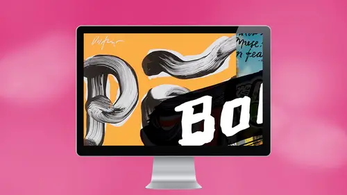
Digitizing with Illustrator: Step 2 - Live Trace
Lesson 7 from: Digitizing Hand-Drawn ArtLaura Victore, James Victore
Lesson Info
7. Digitizing with Illustrator: Step 2 - Live Trace
Lessons
Planning Your Strategy
06:34 2Digitizing with Photoshop: Step 1 - Scan
03:57 3Digitizing with Photoshop: Step 2 - Adjust/Edit
07:57 4Digitizing with Photoshop: Step 3 - Layer
17:24 5James Victore's Workhorse Fonts
22:22 6Digitizing with Illustrator: Step 1 - iPhone Capture
07:29 7Digitizing with Illustrator: Step 2 - Live Trace
08:58 8Digitizing with Illustrator: Step 3 - Overlay Vector
12:10Lesson Info
Digitizing with Illustrator: Step 2 - Live Trace
What I'm going to do now is go to file place, and then I'm gonna find No, he bought my desktop. There it is gonna place it, you know, it'll show up like this until you get it. You know, place it onto the page and just click wherever you want it. Okay? Obviously, this is needs a little turning around. If you hover your mouse over the corner turns into this lovely little curve there that if you click and drag around while you're holding the shift key, you can get it to do nice 90 degree turn right. Okay, so and now, now that you have this selected with this selection tool, black selection tool, then, uh, what I'm going to show you is Step two, which is the image trace tool. Okay. And it's just this little tool up here tab up here that says image trace. And this is fun to play around with. So it has a little arrow here. Next, a drop down menu, and you can click on that and there's a lot of different options. But what we used mostly is the black and white logo. There are shades of gray. Ar...
e there are there? Are there 50 shades of grey? It says 36 colors, But it just says shades of gray. Just shades of gray. Okay, we don't know. We don't know. Uh, wait. Just go for black and white here. Black and white logo And Okay, so that's kind of interesting. We could that it just made it into this black and white. Very stark black and white image. Right? What you have to do now is you can turn this word French. I'm sorry, darling. Yeah, because you could take this and put it as an accent. Nee Lee might do that way we could do that board. Okay, so after you've done that one little clique that made it so miraculously black and white, you're gonna go over to expand, and you're gonna make sure you click that. And then what happens is it creates this vector graphic for you. Okay, so it's an outlined, you know, vector graphic. What I do now is because it has transformed this photograph into black and white. What happens here is this Black is surrounded by a block of white, okay? And I want to get rid of the white because I just want the black. So I just come over to this direct selection tool the white arrow and I met Click off the image. I clicked onto the white box and I just delete. Okay? You might find what I find sometimes is that that might not get, like, these little counter areas like you. You got everything around, but you didn't get the things inside. So you can go in and delete those the holes? Yes. Like if it was a doughnut, the holes is the proper word. I'm sure you can probably You can select all. That's another way you can, like, select similar color. Um, to select all of the white in that whole image. That could be easier if you're working with a more complicated image. Okay, So and and for this tool, you know, it's obviously from here. You have a lot of detail, A lot of beautiful folding and everything. You're not gonna get that when you do the live trades tool. Um, and you're probably gonna find that if you work with it, you can get a little bit more like, um, definition surrounding Say, the line that you're working with and sometimes it will be a little more detail, and sometimes it will be less. And that's something you can work with in the settings. So this is a sector now. This is a vector. Now, that means we could like I mean, if we wanted to spit it out, Goto sent it to a file place and have it turned into vinyl lettering the size of the wall. Yeah. Yeah, you could. You could, So you could, Um So now you can select Say, OK, do we want to keep this little funny accents, or do you want to get rid of that having me crazy? Okay, so let's just select that whole. That's just with the white Pharaoh. You're gonna select that little part that you don't want to delete it. You're good. Okay, so now you have nearly pot. It looks like a fun like a cool logo. It's lovely. You know, I could totally see that as a logo for something. And then here's the idea. Here is the funny thing. Here is the truth. This is this tiny little company that Marina starts, right, causes her word, and, um um because it has this authenticity it's going to go well. And because she's putting her love and her, you know, because their work is a gift, right? She's gonna put her soul into it. People gonna flock to it, and then this company is going to go public, and as soon as it goes public and it's a big going concern designers going to come in and go, you know, we should fix all this stuff e and get some professional letter or to clean it up. What do we say? Rubbed the magic off? Exactly. Exactly. But I think that's lovely. Did you expect to see something like this? Oh, wait. Oh, it's mirror marinas. Yeah. Sorry. Did you expect to see it looks really beautiful. I didn't see like, a big company. Good, I fear. But I like the flattery. Like the that Kerney learning drives me crazy. Like e l that Yes. Wow. Really? Really, Really. You guys are all like I would save this out event. I would, too, if truth be told, I would to a little a little Yeah, a little, but nah, it's groovy. Very cool. Does that bother you? Touching right. Crazy. Awesome. Awesome. Yeah, it's funny. how we take this also personally, it's really amazing, you know? But we all have our own aesthetic, so you can scale as a vector. You can scale this image as wide and not lose any resolution. President J. Peg, If you started scaling up, you would start degrading it. Yes, correct. So you can make this is big as you want to make it and it won't ever get pixelated way have done. I've done very intricate line drawings. Really intricate. Beautiful. I drew the word truth a bunch of years ago a drew about this big, and it was made of Bynes, right? And then I was having an exhibition in in Texas, actually, and we scanned in and victory eyes and we sent it to a place to the did vinyl letters and we had it. It was actually the word was stuck in the corner attached to the wall, stuck in the corner. But it was like eight feet wide on either side. And it was intricate line work instead of this. So it was vector rising, right? You were saying about capturing like the texture if you really wanted to get detailed. So at that point Forget the scaling, but for the for the detail in the texture and that, like delicate, um delicate nous, I suppose, doesn't matter if you use a vector or ah j Peg. I mean, yes, if you're going to scale up, you would use vector, right? But why? I don't think he would use vector at all in that you would only use the vector is exercising issue. I believe that that's the only situation that we've come up with maybe animating or something possibly, Or if your client needs it for, you know, a logo. So it's really versatile over a lot of different media that they're using it on. Then they probably will want a vector version. Um, but yeah, yeah, that's what I would say. I would say if you're gonna if you're gonna want high detail with all this folding and everything, then I would do like we did earlier and scan it in and really work it in photo shop and get it to that point that you that you like
Ratings and Reviews
Melville McLean
It is a mixed report. There should be a thumb neither up or down rating. James Victore is a talented, with a big, as in New York metropolitan area big, bold, self-promoting personality who presents a persona that defies conventions and hates rules. That is all fine although I have never worked with or met a designer who has his attitude towards fonts before. Let me warn others studying design that you might not like that attitude. But everything in his world sounds passionate, impulsive and experimental. I think it is a good thing to be introduced to someone who seeks out working outside the box and embracing the counter intuitive. In short he is an artist who relies on the exciting and chaotic flux of inspiration to happens to design for a living. His left, hand-drawn letters are an expression of that, making words into art. He says he primarily wants emotional responses and people to react like they would to poetry. If you are a little more familiar with New Yorkers and the business you will also recognize all of this as his pitch. It is entertaining. And this course is a performance. His wife Laura is his muse. But this approach will not suit a lot of students here. We are not potential customers hearing a pitch. We are here for educational reasons, mostly practical reasons although he is definitely an inspirational force. And IMO, there are limits to teaching when the instructor is incapable of taking a step back and being objective too. Moreover, he and his wife offer the least of any teachers on CreativeLive that I have seen in terms of sharing in-depth skills and knowledge. In fact, some members of this class knew more than they did and it was the class that answered many questions that the instructors did not know. Laura in particular who was using the software shared with us that she "is not a Photoshop professional." That is an understatement. It can be tedious watching their trial and error approach. Moreover, neither one could explain the difference or use between JPEG, PDF and PSD files. Yikes and double yikes! They send them out to clients in what sounded like an arbitrarily arrived decision. The class was surprised to also discover that neither knew the distinction between kerning and tracking. Worse is that questions like this, the most simple, fundamental ones seemed to catch them both off guard so they were not prepared with an answer--which astonished me. Furthermore, any discussion of resolution was incoherent. They knew bigger was better so they let others decide for them later. Right. Well maybe they can take a few classes here to learn all of these simple fundamentals before teaching their next class because this was unfair to those who turned in as well as those who bought the class. Incredibly, they were ill prepared to teach this course. The class was very loosely organized, often somewhat chaotic and disappointing a lot of the time. I read that James has taught for 30 years. It makes little sense to me. And not everyone will appreciate his novel approach which apparently has not been sufficient to give his wife what she needs to use, let alone teach Photoshop. If you are here to learn specifics to augment your skills and knowledge, this is probably not the best choice you can make. You might prefer Erica Gamet and Jason Hoppe for Illustrator and anyone else you can find on CreativeLive for Photoshop If you want to see two folks make numerous errors, rely upon heuristics, demonstrate they do not understand or seem to even have any curiosity about what is behind their technical decisions and yet still manage to pul off a a fine looking finished product in the end, then this is for you. You also might be inspired by their passion, enthusiasm and maverick approach seen here. What they share is their process, warts and all but they are creative dynamic duo. I liked them but accept that this is a different kind of course than you usually se here. It all depends upon what you are looking for.
michael mcquilkin
I love that you as a designer, use the no rules apply to you work. Also, I love the fact that you appreciate the art of screen printing you posters. The heart would work great as a distress overlay.