Digitizing with Photoshop: Step 2 - Adjust/Edit
Lesson 3 from: Digitizing Hand-Drawn ArtLaura Victore, James Victore
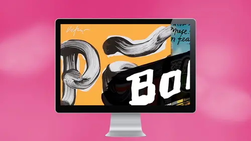
Digitizing with Photoshop: Step 2 - Adjust/Edit
Lesson 3 from: Digitizing Hand-Drawn ArtLaura Victore, James Victore
Lesson Info
3. Digitizing with Photoshop: Step 2 - Adjust/Edit
Lessons
Planning Your Strategy
06:34 2Digitizing with Photoshop: Step 1 - Scan
03:57 3Digitizing with Photoshop: Step 2 - Adjust/Edit
07:57 4Digitizing with Photoshop: Step 3 - Layer
17:24 5James Victore's Workhorse Fonts
22:22 6Digitizing with Illustrator: Step 1 - iPhone Capture
07:29 7Digitizing with Illustrator: Step 2 - Live Trace
08:58 8Digitizing with Illustrator: Step 3 - Overlay Vector
12:10Lesson Info
Digitizing with Photoshop: Step 2 - Adjust/Edit
Okay, So all I've done here is just open up this scan file into Photoshopped, okay? And this is how it comes out, actually Looks pretty good. It's not bad. What I'm gonna do is just take the cropping tool and pull it to a little better crop double click here on and make it a little bigger so I can see what's going on there and the detail. So now I think Is this so our scanner at home, We just got a recent one, and it's fancy and like so, if I do Sharpie on whatever's think the surface really shows, I mean, it's like the black ink looks reflective and you get a lot of that and I'm I like flat. So we're gonna I'm gonna have to, like, ask. I'm gonna bug Laura to kind of get rid of all the kind of a little glossy details, but I also want to maintain, like, I've gotten to the point about not cleaning up some stuff that I want to maintain all the little teeny little splatters at the same time. So how do we You know, how we How do we keep that right? So the thing about the scanner is, um it p...
icks up a lot of detail, and that's really nice. Like, say, if you have a lot of texture on your handmade work and you want to keep that in your digital file, you might want to consider getting having it scanned either getting a on inexpensive scanner or borrowing someone's o r get scanned for you. Okay, um, so we're going to do here is what I usually dio is if I want it really stark black and white crisp so I can select that black lettering, as is if I want to take that and layer it over something else that I just want to separate out. But let on. Yes, yes. Did you skin in grayscale or line or color or what? That's a great question. Great. Usually at home, I think usually in our studio we do. A lot of we do a lot of line work, but I think we scan it in in grayscale first right to maintain all the Yes, Yes, I usually scan in gray scale. Um, you know, if I wanted to be black and white and then, um and then I go from there. Um, I think, you know, for me, I think the black and white instead of line art. If you try to scan in Leinart, it usually comes up and it's a lot. You lose a lot of junky. Yeah, I know I've had issues with that. So I usually just do it in, um, the grayscale setting. Okay. But we want to make it really black and white. So what? I what I usually do is I come up to the toolbar and go to image and adjustments, and I just goto levels. And here you can play around with the levels. These little the's little buttons here, you can slide around, and I don't know if you can see very much happening there. You can come see what's going. Oh, yeah. Thank you. I was like, Why is it not there? Now you can see, So let's see, we started about here, right? And kind of see, there's a little grayish tent. You pull this over, see how the type gets a little bit more dark, okay? And you want the this black to be really black, and you want the white to get even brighter. White. Okay, Sometimes, you know, you can do this manually, or you could click auto and see what happens and see if you like that. Uh, and if you don't, then you can, you know, start immediately. So here's a funny thing. If Laura is not around, I will hit auto because I don't know how to use this stuff, and it will show it. Maybe it'll show up like this, and then I have to rethink my philosophy. And I say, You know what? I like that So awesome. So you're basically just trying to get, um, this black to be is rich and dark as as you can. Um, another thing I sometimes do is go to adjustments and you brightness contrast. Um, it makes the contrast just a little bit more sharp. So it's really black and white, and you can just just play with, um, there's play with these settings here. I honestly, you know, I just kind of go back and forth between those until I get it, how I want it. And then, um once I get it to a place where I think it looks pretty good Stark, black and white. Then I come over Okay, here's another thing is here, Right here. I will probably like if there's a little cleanup that I need to do will come over to the eraser tool, and I'll select a little brush that's no thicker here. And then I can erase. There was like a little line there. You can get really close in there and let's say I just want to take that tiny thing out which James usually hates because he wants all of that in. But you know, it's funny because you have to decide what is quality and what is not like he doesn't You don't want it to look like you didn't care. You know one thing that's the one thing that we're that that we have had to deal with recently at home because I said we got Oh yeah, that one goes, That's good. That was good. Is something over here, but it won't be in the final crop, so I wouldn't worry about it. Yes, the whole line. One thing at home is like we've got a new scanners, we hit gray scale, and the texture of the paper in the background comes up. It's like, Oh, so there's a whole another level of kind of messing with these tools to kind of figure out which way you want to just do it through. The background is just white. Yeah. So you want to do all your clean up here and say like, James was saying before, Um, see how there's all these kind of, like little white space is white little dots here? No. Yeah, um, sometimes he wants to keep that in there, and so I'll ask him and it's like, Oh, yeah, that's that's how I wanted it. That's the texture. Like this. Yeah, why did you remove it? But if you want to fill it in then, um what I usually dio is just take the paintbrush, fill it up with black and kind of go in. It's a little meticulous if I can get the pain. Oh, I mean that I'm still in the crop. Here we go, OK, And you can just kind of fill in, touch up whatever you need to touch up beautifully. That's going to take a little while, so I'm not gonna do it all here. I think I lived with this right. You like the texture. It's old brightens up our whole work. It's great. All right, So say we're done with this little piece. Okay? Thank you, James.
Ratings and Reviews
Melville McLean
It is a mixed report. There should be a thumb neither up or down rating. James Victore is a talented, with a big, as in New York metropolitan area big, bold, self-promoting personality who presents a persona that defies conventions and hates rules. That is all fine although I have never worked with or met a designer who has his attitude towards fonts before. Let me warn others studying design that you might not like that attitude. But everything in his world sounds passionate, impulsive and experimental. I think it is a good thing to be introduced to someone who seeks out working outside the box and embracing the counter intuitive. In short he is an artist who relies on the exciting and chaotic flux of inspiration to happens to design for a living. His left, hand-drawn letters are an expression of that, making words into art. He says he primarily wants emotional responses and people to react like they would to poetry. If you are a little more familiar with New Yorkers and the business you will also recognize all of this as his pitch. It is entertaining. And this course is a performance. His wife Laura is his muse. But this approach will not suit a lot of students here. We are not potential customers hearing a pitch. We are here for educational reasons, mostly practical reasons although he is definitely an inspirational force. And IMO, there are limits to teaching when the instructor is incapable of taking a step back and being objective too. Moreover, he and his wife offer the least of any teachers on CreativeLive that I have seen in terms of sharing in-depth skills and knowledge. In fact, some members of this class knew more than they did and it was the class that answered many questions that the instructors did not know. Laura in particular who was using the software shared with us that she "is not a Photoshop professional." That is an understatement. It can be tedious watching their trial and error approach. Moreover, neither one could explain the difference or use between JPEG, PDF and PSD files. Yikes and double yikes! They send them out to clients in what sounded like an arbitrarily arrived decision. The class was surprised to also discover that neither knew the distinction between kerning and tracking. Worse is that questions like this, the most simple, fundamental ones seemed to catch them both off guard so they were not prepared with an answer--which astonished me. Furthermore, any discussion of resolution was incoherent. They knew bigger was better so they let others decide for them later. Right. Well maybe they can take a few classes here to learn all of these simple fundamentals before teaching their next class because this was unfair to those who turned in as well as those who bought the class. Incredibly, they were ill prepared to teach this course. The class was very loosely organized, often somewhat chaotic and disappointing a lot of the time. I read that James has taught for 30 years. It makes little sense to me. And not everyone will appreciate his novel approach which apparently has not been sufficient to give his wife what she needs to use, let alone teach Photoshop. If you are here to learn specifics to augment your skills and knowledge, this is probably not the best choice you can make. You might prefer Erica Gamet and Jason Hoppe for Illustrator and anyone else you can find on CreativeLive for Photoshop If you want to see two folks make numerous errors, rely upon heuristics, demonstrate they do not understand or seem to even have any curiosity about what is behind their technical decisions and yet still manage to pul off a a fine looking finished product in the end, then this is for you. You also might be inspired by their passion, enthusiasm and maverick approach seen here. What they share is their process, warts and all but they are creative dynamic duo. I liked them but accept that this is a different kind of course than you usually se here. It all depends upon what you are looking for.
michael mcquilkin
I love that you as a designer, use the no rules apply to you work. Also, I love the fact that you appreciate the art of screen printing you posters. The heart would work great as a distress overlay.