Digitizing with Photoshop: Step 3 - Layer
Lesson 4 from: Digitizing Hand-Drawn ArtLaura Victore, James Victore
Digitizing with Photoshop: Step 3 - Layer
Lesson 4 from: Digitizing Hand-Drawn ArtLaura Victore, James Victore
Lesson Info
4. Digitizing with Photoshop: Step 3 - Layer
Lessons
Planning Your Strategy
06:34 2Digitizing with Photoshop: Step 1 - Scan
03:57 3Digitizing with Photoshop: Step 2 - Adjust/Edit
07:57 4Digitizing with Photoshop: Step 3 - Layer
17:24 5James Victore's Workhorse Fonts
22:22 6Digitizing with Illustrator: Step 1 - iPhone Capture
07:29 7Digitizing with Illustrator: Step 2 - Live Trace
08:58 8Digitizing with Illustrator: Step 3 - Overlay Vector
12:10Lesson Info
Digitizing with Photoshop: Step 3 - Layer
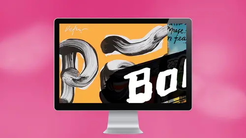
So now we're going to go over to the magic one tool, click on it, and then we're going to click. We're gonna try to find, like, the richest, darkest, black part of this artwork that we confined. We're gonna click there, okay? And see how it selects fall of the black pretty well. Right? OK, so now what I'm gonna dio is just command. See? Copy. Okay. So you have that copied into your computer, just the type selected. Um, and then yes, Andy. So there's the tolerance. Does that help If you use the tolerance of the tool to, like, say, you selected a black and didn't select everything you wanted it to Yeah. Yeah. You know what I usually dio, Actually, I was just going to go into This is what I will do is yeah, you can come up and say in select and you can say, like, grow and similar, um, and that will usually select, like, as much of the similar similar to black as you can get. Um, here's another thing is that if I want to make sure that it's all like everything in there is not any form of g...
ray, it's like super Super Black. Then what I'll do is once I haven't selected the way I like it, I will go up to fill, and I will just fill it with black. So I know it's all black, right? So all of that selected area is for sure Black. OK, that's a good thing to Dio. And then So we have copied this and we're going to open something that we already scanned in this heart. Okay? It's actually a crumpled piece of paper. You have to come of crumpled people piece of a magazine paper, and I crumpled it in and put on the scanner. And it's funny because you kind of don't know how things are gonna work and it looks like a piece of ham right here. That little bitches. You know what I think? You know, we just stepped into a nice mistake. And with this obviously even manipulate color and contrast, whatever to get it to the way you like it, Frank, you just kind of put up a sheet of white shape in the top of the heart or you didn't put nothing is going on this one. I did, but yes, for the heart, but I don't think I really needed to. Sometimes you sometimes just to be safe, you can put a piece of white paper so the background is, like, perfectly crispy, the inside of the scanner Lidice, sometimes black and sometimes white. So we just we just generally have a sheet of clean white paper. And also the scandal, it gets messy. I mean, I sometimes I'll draw something and we'll put it on the scanner bed and scan. And it's not dry. So stuff like that happens. Yeah. Yeah. All right. So we've opened up our file that we want to work on and check this out. We're just gonna make sure we're on. This is pretty cool. We're just going to do a command, V, uh, Is your a magician, darling? Thank you. That's a nice poster. That's a pretty good looking right there. And we're done. I haven't signed it. Oh, yeah? You gotta put your way. Have a little file that's got a collection of signatures. Fat one. Since the thin ones. I kid you not my ego knows no bounds. Um, let's see here. Um, so I mean, and now you have what I do in order to get it into the correct placement is you can move it around wherever you can also go to. I usually use the short cut. Can you move the heart? If I wanted elsewhere? Yeah, I'm just being a designer now. Where would you like it? James North Norris. Okay, since that since the background is all 11 piece right now, that means the heart is on the white, the white. But that's OK, because what we could do since tall white on the background, we're just going to select a big old piece there. We're gonna go into the selection tool and just move it up. That's good. Is that too far? Too far? That's good. Better? Better. Okay. Ha. And it even just de select in your good. Um, one thing I see. Can you all see it? This, like a little hairline of gray around the the black type. And I'm wondering what that's about. Um what we could dio me try. One thing is to select that. And sometimes I try. This is select the inverse and delete it. That's weird. Um, let's see. Actually you to do there. Let's just try that see what happens. No, that's not right here on the back. Thank you. Say, sometimes I Okay, so let's try that again. So much pressure. Okay, Now you on it on there. Okay. So let's see what happens if I select universe kind of late. No, Hang on. Hang on. I was already in the inverse. Hey, it sort of went away. There's still a little bit here. So sometimes what happens? What I will dio it is go to that layer and go to multiply. What is gone is gone. It's magic. So that's what I usually that's my last ditch effort to make it work again. I'm sure there's a lot of other ways to make it actually officially work. That's my way. Yeah. Gator done. Yeah. Get it done. Okay. Any questions about that now? No. Okay. What's next, Charlie? What's next? Let's talk a little bit. We're gonna go back, Teoh our screen here. There we go. And then going to talk about We've already done the later Michael. What? You had just finished. So would you. How would you say that? Would you save that Azaz? Great idea. Size and resolution. Yep. Yep. Great. Um So for this image since we're doing it for a magazine, um, we would save it. And I'm wondering what this size is right now. It's probably It's very small, actually. But if you were doing it for a magazine, I would want the resolution to be at least dif e I our pixels per inch and you're gonna want it to be whatever size of your that you are. Publisher has sent you. Your creative director has sent you right. They're gonna send you all the specs of what? Of how they want it. And don't be afraid to ask. Like that's, you know, that's what they're there for. We usually send out. We usually send out J pegs. Or do we send a photo? Shopped files are usually send a J peg. Can they move stuff around? No. Okay, wait. We send usually so they can't get around. Yeah. Yeah. If you want to see a grown man throw a hissy fit, mess around with my work. Yeah. Yeah, exactly. itt's. It's or not to be safe, right? I think. Yeah. dp eyes good for publishing is good for 300 g p I's gonna be fine, but we always send bigger, just in case, OK, just in case, because they can always bring it down. Right? Okay. Yep. In the beginning, you work at 6 600 as well. Yeah, we usually Yeah, because, um, you Yeah, Because if you bring it in at 600 then, um, you're safe with it being that size when you save the file, right? If you bring it in and like, 302 100 you get to the end of the file and it's like you save the file of this large size, you might see that it gets really pixelated. And that's probably not something you want. Unless you want to do that on purpose. Holy. You might You might question Yes, on. Let's say this is for a big poster position. Don't I, like, need to victories. This good question we're going to We're gonna work with vectors in a little bit here, but say for like, for your papa poster. Did you have to that I mean, that was a silk screen, so that was a different thing, right? Eyes in a digital? Not really. But But it was Ah, it was grayscale image, and we wanted it to be clean at Swiss style size, you know, in a size poster. So I think that that file it was pretty much a monster. Yeah, and we had to send it out. So when we send it out, we generally used these, you know, different different sources. We transfer or what is The mother was shot box Dropbox. There's a bunch of Sometimes the client sets up a drop box for us and then that. Then there's the naming, right? Like if we work, we work for Esquire kind of every month, and we can't call it Esquire because it's going to go in the daycare Dropbox, and it's gonna get lost like, Oh, it gets called Esquire something or other and they're like things called it. So the naming thing is important, and you have to figure out your own. You know, your own source generally, you know, it's like our last name, and they usually use our name so they can know who it's from. And then we use may be sort of the subject material, like some sort of reference like like reasons or reasons to love or something. And then we might even add the date just so they know which your condition it is. Because you have to do another revision. We can. There's nothing like calling something a final file and not having it be a final file. So, yeah, there's a caveat. That's that you get into Final a final be? Yeah, and it gets confusing. Okay. Yeah, You said that you're going to export it into a cheap back. But why? Because usually experts Something to appear fast for magazines. Yeah, Like what? Difference Can you explain cheap? That's a good question. Um, I honestly I don't know if I know the difference. I think that it all depends on what your client wants at the You know what there you ask for? Um, a lot of our clients it actually, it's alternates between them wanting j pegs. Some of them want pdf's. So we just we kind of, you know, air on the side of hi rez. Full detail. So, in case they want something smaller, they can always go down. Um, but you can't. You know, like I said, you can't go back up. I read so and the last thing you want is to, you know, is to have someone calling Tell us is not of the right size, and we have to make it again. There's nothing more infuriating than than that or to have something. And we see it. We see it all over the place in magazines and stuff, especially in publishing stuff, not showing up at the quality of level. Not just There's nothing like that, you know, kind of squash your day. Yeah, Cool. Before you go to the next part, I wasn't sure you gonna talk about scanning light type or changing black type toe white type and go to question. Yes. Good question. Um, white type. What kind of crazy? This is that white tight, actually. Scott made white type yesterday, didn't It? Was like drawing on black if we drew withdrawal with white out. Obviously you have white type, and you have to convert it or not. Put it on a transparent background, cause you can't see white unlike or how would you go about it? That's true. That's a whole another. You know, that's more of a design question of, you know, making sure that the type is legible on the background that you have, um, like, say we were going to turn this reasons to love New York into white type. Then we want to make sure that that white background was a different color so it would stand out and be eligible. Or, um, let's just try this real quick. Let's say select reasons to love New York and let's fill it at it, Phil, with white. Okay, now it's in multiply Appear right. So let's make that normal again because that's why you won't see it. Okay, so this is kind of a cool thing, cause it's overlaying this heart there. So you see, there's something interesting there. What I would do is go to command t and transform. You gonna click and drag, um, the corner arrow. What I would do is do click and hold down shift. So you make sure our shift option even to make sure that it's keeping its proportions okay and the Newton drag it like into the heart and that kind of nice move, baby. Right? And it was really tiny, but it's really I know, but we're just showing de select and let's come in. That's groovy, right? And you can see now that, um Because I had to make a really tiny you can see a little picks, elation starting to happen here. You know, um, so you would you would probably scan this heart in a higher resolution so you could bring it in, and it all be kind of the same size, right? And here, we'll get to this later. But you know that I would imagine me to look at the look at this on the screen and go. I hate the heart. Why does it look like that? And we decide to not put it on a flatbed scanner. But Teoh photograph. It's another way. And there are There are multiple ways to do that, too. So we'll talk about that. Cool. All right. Any more questions about that? Yeah, that outline of the larger. Like how you had it before when it was enlarged. The taxi si there is that there is a ghost of Is that showing up on your 00 I see. I see. Yeah, that is interesting. Um, see what happens. You know what I think that might be from Oh, this the war before is that on the background. It is that it is that line that was showing up white before. No, it's there before. Oh, no, it's on the It's on this. I honestly have no idea what that's coming from. I could You never and delete isn't there anymore? Gone. Okay, so they invert. What I found over the years is doing a good job at teaching is very selfish because you learn so much more from your students. So thank you for that. We've I've never seen that before. That's awesome. Could happen sometimes.
Ratings and Reviews
Melville McLean
It is a mixed report. There should be a thumb neither up or down rating. James Victore is a talented, with a big, as in New York metropolitan area big, bold, self-promoting personality who presents a persona that defies conventions and hates rules. That is all fine although I have never worked with or met a designer who has his attitude towards fonts before. Let me warn others studying design that you might not like that attitude. But everything in his world sounds passionate, impulsive and experimental. I think it is a good thing to be introduced to someone who seeks out working outside the box and embracing the counter intuitive. In short he is an artist who relies on the exciting and chaotic flux of inspiration to happens to design for a living. His left, hand-drawn letters are an expression of that, making words into art. He says he primarily wants emotional responses and people to react like they would to poetry. If you are a little more familiar with New Yorkers and the business you will also recognize all of this as his pitch. It is entertaining. And this course is a performance. His wife Laura is his muse. But this approach will not suit a lot of students here. We are not potential customers hearing a pitch. We are here for educational reasons, mostly practical reasons although he is definitely an inspirational force. And IMO, there are limits to teaching when the instructor is incapable of taking a step back and being objective too. Moreover, he and his wife offer the least of any teachers on CreativeLive that I have seen in terms of sharing in-depth skills and knowledge. In fact, some members of this class knew more than they did and it was the class that answered many questions that the instructors did not know. Laura in particular who was using the software shared with us that she "is not a Photoshop professional." That is an understatement. It can be tedious watching their trial and error approach. Moreover, neither one could explain the difference or use between JPEG, PDF and PSD files. Yikes and double yikes! They send them out to clients in what sounded like an arbitrarily arrived decision. The class was surprised to also discover that neither knew the distinction between kerning and tracking. Worse is that questions like this, the most simple, fundamental ones seemed to catch them both off guard so they were not prepared with an answer--which astonished me. Furthermore, any discussion of resolution was incoherent. They knew bigger was better so they let others decide for them later. Right. Well maybe they can take a few classes here to learn all of these simple fundamentals before teaching their next class because this was unfair to those who turned in as well as those who bought the class. Incredibly, they were ill prepared to teach this course. The class was very loosely organized, often somewhat chaotic and disappointing a lot of the time. I read that James has taught for 30 years. It makes little sense to me. And not everyone will appreciate his novel approach which apparently has not been sufficient to give his wife what she needs to use, let alone teach Photoshop. If you are here to learn specifics to augment your skills and knowledge, this is probably not the best choice you can make. You might prefer Erica Gamet and Jason Hoppe for Illustrator and anyone else you can find on CreativeLive for Photoshop If you want to see two folks make numerous errors, rely upon heuristics, demonstrate they do not understand or seem to even have any curiosity about what is behind their technical decisions and yet still manage to pul off a a fine looking finished product in the end, then this is for you. You also might be inspired by their passion, enthusiasm and maverick approach seen here. What they share is their process, warts and all but they are creative dynamic duo. I liked them but accept that this is a different kind of course than you usually se here. It all depends upon what you are looking for.
Mary Thomas
I too am glad I can watch this for free before purchasing. It is unfortunate that the teachers do not have the skills to teach. They have great talent in what they are doing artfully, but teaching what you know is an art in itself. The time of the students is valuable and in my opinion this is totally a time waster. Sorry, but this gets a thumbs down here.