Lumetri Color Effect
Lesson 9 from: How to Color Correct in Adobe Premiere Pro For BeginnersAbba Shapiro
Lumetri Color Effect
Lesson 9 from: How to Color Correct in Adobe Premiere Pro For BeginnersAbba Shapiro
Lessons
Class Introduction
01:53 2Attention Deficit Color Correction
06:13 3Understanding Color
12:55 4Basic Color Terms
04:35 5Shooting for Easier Color Correction
09:53 6Color Calibration Gear
24:41 7Understanding Scopes
19:28 8Introduction to the Lumetri Color Panel
07:02Lesson Info
Lumetri Color Effect
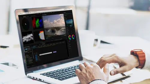
Let's actually dig into color correcting in Premiere Pro. We spent the first half of this course getting our head wrapped around scopes and color temperature and light and some of the nuances in shooting. Now let's look at how we can fix all those things that are ignored when I actually shot this footage. So the main thing we're gonna be working with is a very specific effect called the lumetri color effect. Now this came out I'm guessing a couple years ago in one of the Premiere Pro CC updates. If you are using, we had some people who were using other older versions of Premiere or they were using Premiere Elements. The lumetri color effect is probably not available in those, so there are other color correcting tools and you can use some of the examples that I'm working with but you probably have to use multiple tools instead of this one streamlined tool, but I just wanted those who had earlier versions to be aware that they're not finding it because it's not there within their applica...
tion. So let's take a look at some problematic footage and how I might fix it, and in some cases that the quick fixes may or may not help. So here's a shot and I spend a lot of time in hotel rooms. (chuckles) And I often try to shoot time lapses outside the window of hotel rooms, and this was yet another beautiful shot... Through a green tinted window. So everything is kinda muted, it's a little blue-green, it's really not color balanced. Look at the contrast here, my contrast is, it's fairly horrid. I can look at the color cast and I can see that what should probably be a generic blob in the middle is definitely going down towards the (mumbles) with a little bit of blue. And here again I see, I'm losing a lot of reds. Probably the right amount of greens but I have a little bit too much blue. So let's take a look at what I would do, the first thing when I color correct anything is I work with the luminance, because as you make an image brighter, and I indicated this right before the break, colors actually look less saturated and the problem may go away, you may not even see the issue. If I'm making something darker, colors go even more saturated and may reveal an issue. And since we discovered that really the waveform and the vectors go up are fairly mutually exclusive, I'm gonna go ahead and see if I can expand the dynamic range of this. Now, we could go with the auto button. Sometimes the auto button works, it does a best guess, let's take a look and see where that is as a starting point. It won't change the color. So it didn't really expand my contrast, but it just brightened up the image a little bit. Cuz it was fooled, it was fooled by the clouds, it didn't want this really bright element in the clouds and the buildings and there's probably a couple spots of black and what it literally does, it says, I'll make the brightest thing white and the darkest thing black, zero, and if there happen to be a couple of spots that are really white or really black, those tend to take control. So how would I work with this image? The first thing I wanna do is I wanna make sure that the overall exposure is correct, and we're gonna go down through the entire lumetri panel here, and throughout the next 45 minutes, make changes with that. I do wanna step through the lumetri panel just so you have an idea of what's there and what's coming. So when you first open it up, and I'm gonna zoom in so you can see this a little bit better. The first tab is basic corrections, and this is where you can apply a lookup table if you shot something flat, which is, we showed you some of that earlier. I can actually go in and I could do a white balance sample if I shot a gray card, if I shot a white balance card, and I can also manually control temperature. So I have two elements there, we work with those when we work with the sliders and the scopes, then I can deal with exposure. My contract, okay, so I need a wider contrast. I can also deal with the whites and blacks and the highlights and the shadows. So what's the difference between those? Well your whites and your blacks are your extremes, say the upper five percent of the brightest areas and the lower five percent of the darkest areas. Highlights and shadows might go from five to 15% and might go from say 85 to 95%, so you can actually make sure that your whites are fully bright, but you could take the highlights and bring them down a little bit so maybe the sky doesn't look as blown out. So that's the difference between these. And then if we scroll down just a little bit more here in this first tab... There's also a saturation slider because as I said, you're working with luminance values here pretty much, so you may want to adjust your saturation as needed. I often don't do that in this top panel, and I'm gonna zoom out so you can see where I'm stepping, so if you notice, underneath your main panel, there's, again, a bunch of other panels and as you click on each of these, it closes the panel above it or the tab above it and reveals new information that you can work with. So you can really focus on what you need to, so the second one is your creative palette, and depending on your workflow, there's a couple of things that you can use this for. If in the first palette, you completely neutralized everything, you're happy with the image, you don't wanna take it to the next level, you can go ahead and you actually can apply different stylistic looks. So this is just like a quick fix, you can say, you know what, I'm gonna step through, all I'm doing is clicking through these arrows, find a look that I like maybe and of course I never balance this image. Maybe I want some sort of black and white, I can click it, apply it, and I could be done. I could also get these by scrolling down through this list. Okay so I could say, you know what, I want blue steel on a blue. It's like, eh, it's a whole, let's try something golden. Gold rush high dynamic range. So it just puts a different look on it. I generally don't use this til the end cuz I do a lot more color correction, but sometimes you just wanna do things quickly. It's stylistic, this is not a lookup table, it's stylistically. So I'm gonna go again and switch that back to none. And just point out a couple of other things that are really nice and unique in a color correcting tool for most non-linear NLEs. Non-linear NLEs is a redundancy. NLE stands for non-linear editor, so if I threw out jargon, send a message and say, "Abba, what does that word mean?" And I will say, "I made that word up. "It doesn't mean anything." Okay. So there's a slide if you wanna create a faded film look, again, I'm looking for neutral, use that, but these three elements here I find very valuable. And if you look at those, there's sharpening. And sharpening will allow you to try to make your image look a little crisper. It's the same thing you would have for sharpening in Photoshop, it gives the perception of a sharper image because it actually gives more detail to the edges, you're not really able to sharpen something out of focus, but it does give it a little more clarity and a little more punch, but a little bit goes a long way, so don't go crazy with sharpening, cuz you'll get this image that just looks too artificial. These are the two magic wands, and these will come into play more when we are dealing with people and fix the shot, but I want to point this out now. Vibrance and saturation. Saturation equally makes everything more or less saturated in your image. Vibrance is a lot more powerful. I think of it as smart saturation, what vibrance does is it will add saturation to the less saturated areas and it lowers the more saturated areas, so everything kinda evens out. So if we have something that's like a bright red shirt and you use saturation, that shirt will blow up. But if it's a really saturated red shirt and you use vibrance, everything else will get more saturated, but it won't affect that really saturated shirt. It also tries to protect skin tones, so people don't get these big red faces. So that's not a good thing, and then you can actually work with the shadow and the tint. This is basically if there's lots of like blue maybe in your shadows and you want to be neutral, you can adjust it but we'll actually walk through this. I wanted to show these two elements because these are the two primary areas that I work with. We'll look at the other elements as we continue through the class. So I have this really blue image. I did hit the button and tried to do an auto balance. It did an okay job, but I know I wanna bring in more dark here, and I may wanna open it up a little bit, so the first thing I could do is I could work with exposure and then I jump back to the basic correction tab, so if you've been following along and you followed me into creative, go back to basic. And the first thing I'm gonna do, I'm not gonna deal with temperature or color balance at all, is I'm gonna make sure that it's good exposure. And I'm getting the exposure kind of in the middle, that's fine, but really what I wanna do is I wanna deal with contrast and if I move my contrast to the left, lower contrast. You've noticed now I have a less dynamic range. So in this case I'm gonna add contrast, and I'm gonna be gentle when I pull this, cuz if I go too crazy, sometimes you just get really crushed black and really blown out whites. So this is giving me a much wider palette as I expand my contrast, and I'll show you a little trick here, I'm gonna zoom in. If you use the slider, it takes you up to 100. Premiere tries to protect you from really butchering the color and luminance of your image. But if you want, you can ignore the slider when you get to the top and go over here to where it's a virtual slider and then get a little bit more out of each of your sliders. So that's a little secret there, so I'm bringing the contrast up, opening that, it's still very blue. If I wanted to, I could take my blacks. Using that slider, bringing it down just so they touch the bottom, okay, so you see it's just touching the bottom right here and I'm gonna add a little bit more white to it. So it just touches the top a little bit, just gives me my full dynamic range. Still is very blue. And if I wanted to, I could start working with shadows and highlights, but for now I'm getting a little bit annoyed with how blue this is. I wanna go fix that. I could go ahead and try the white balance selector, hoping to get one of these goldens. And I do but you know something, it still's pretty blue. It's not guessing what's going on. So I'm gonna go ahead and reset this. Anytime you have one of these adjustments changed, if you double-click on the actual circle, it'll resent to zero. I do wanna point out that this is the lumetri color panel. For those of you who have been playing in Premiere, you are very familiar with the fact there is an effects control, that's how you normally work with any of your filters or effects. Guess what? You have your lumetri panel right here. With all of these corrections, and sometimes a little more granular control and your reset buttons and your key frame things, your little stop watches. So as I made changes to the right side, it will make changes to the left side. So I just wanted you to be aware of that. As a matter of fact, sometimes when I do an eye color correct is, instead of having to switch back and forth between my scopes and my effects panel, I'll sometimes grab the effects control panel, drag it away. I got it, there we go. And I will go ahead and I'll put it right next to my lumetri color panel. So now I can jump back and forth here and there and the whole time keep my scopes up. So I do modify my workspace sometimes. If you do like that, you wanna keep that once you've created that workspace, go to workspaces, zoom in here and you can save that as a custom workspace. You call that color correction two, okay. So the eyedropper didn't work. The way the eyedropper works, by the way, just in general is you wanna click on something white but not really the brightest area of the image. Because there's no color in it. You wanna click on something that's white or gray that is obviously influenced by the color temperature of what's around it. So that I would never click on clouds. I might click on a building, but this is just so blue and white, there's really no other colors there. I'm gonna have to go manually. So I know there's too much blue, so I'm gonna go to my temperature and I'm gonna just start bringing out as much of that blue and try to bring in some of the orange. And with my tint, as you see I go back and forth, I'm gonna go ahead and try to bring back some of that red. Okay I'm gonna get too much red there. And my goal to get this neutral is really to try to get these as even as possible if I can, and to get this blob to be central, so I'd have a little red spike there, it's caught between the red and the blue, so it's just a matter of playing with these elements. I can see maybe that my luminance is too bright so I'm gonna take my highlights and bring that down a little bit and I think my shadows are actually pretty good. You know sometimes if I bring that down, now this is punching. But I still don't quite have that full color that I want if I get too much red in there. So let me see if I can cheat here. I'm gonna bring a little more orange into it. And this is where you're really getting into subtle nuance and we're looking at that and you say, it's okay, it still is a little bit blue, but I wanna point out what it would look like without the filter. That's where we came from. That's where we got to. It's a little more usable. It was horribly shot, but you can work with that. And if you wanted to, you could actually go down into some of the other areas, so I could go down into creative, and instead of working with saturation, I could see what happens if I throw a little bit more vibrance into it. Okay so it's already pretty blue but if you notice, it adds some color but it doesn't really shift the color, it actually looking a little more normal, and I probably would want that to be a little bit more gold. So I could go over here to my highlights and I want it to be a little bit more away from the blue so I click on the little dot and I pull it a little bit towards the yellow and the orange. And that's gonna affect my highlight area. And then if I wanted to work with the shadows, then I wanted to neutralize those if those are too blue, or those are too red. Actually I have too much red in my highlights here, pull that down a little bit. And the trick here is, you wanna pull it in the opposite direction of where there's too much of the color, so I see too much red and too much blue, so I really wanna pull it in this direction, it's gonna add green to the shots. I have to be very careful. Because there's not a lot of color in this shot to work with, okay, so I need to be pretty sensitive. Now, once you touch one of these, it become solid, and that way you know you've modified this parameter. If you double-click on it, you'll get the hollow thing again and you haven't changed any element there. Okay, now I've done this and this slider now allows me to say where I have, I'm gonna give more weight to the highlight tint or to the shadow tint. So those are some elements that you will play with. And we're getting a much better image. Ultimately, I'll probably brighten it up, this is the fixed image, so as you noticed, if I brighten it up a lot more, you lose a lot of that color saturation and it actually looks a little bit better. So again, that's the before, I'll go back to my basic correction, maybe open that up a little bit, clean it up, but you can see that with a little bit of work, you can go from that, to that. I'm gonna teach you a couple of tricks that I do when I color correct in Premiere. This is really useful. As a matter of fact, this is worth writing down or buying a course. If I wanna switch between windows, I can use the shift key. Shift one will go to my project window, shift two will go to my source, shift three, my timeline, shift four, my program, okay. Shift five will actually go to my effects control. So whether your effects control is left or right, shift five is a good key to know. But, I also wanna go to my scopes, okay, and I may also wanna go to my lumetri color panel. So you can, if you go into the preferences, and the keyboard shortcuts, zoom in here. I can go ahead and I can say, you know what, I wanna be able to jump directly to the lumetri color panel, which doesn't by default have a key assigned to it. You can pick whatever works for you. I picked one, so whenever I hit the one key on my keyboard, it's gonna take me to the lumetri color panel. If for some reason I've switched over to looking at the image on the left side and I wanna get back to my scopes, I hit the number two. So I programmed one and two for that. The other number that I program, and let's see if I can remember what it's called. It's... I programmed it to be three, it's down here, let me zoom in a little bit. Bypass lumetri color effects. So I can hit the number three when I'm in the lumetri panel and it will toggle off all of the effects so I can look at the original image, and remember, I said, sometimes you have to see where these come from and where you are because if you keep looking at that image, you're always gonna say it's a little too blue, it's a little too red and you don't realize what a crappy image it was to start with. So those are three keys I programmed. Normally these are used to multicam. You can make a separate custom set if you want so you can switch back and forth. But any key that's not being used that you can remember, those are three good keyboard shortcuts to assign if you're gonna be working in color correction. So that's why I can and if you have a program that you can't... If I'm over here looking at audio clip by accident or looking at the source, I hit two, I get to my scopes. Okay, I hit one, it opens up my lumetri panel if that's not the active panel. And if I hit three, it will turn one on and off.
Ratings and Reviews
Jason Acuna
I've been filming/editing language learning videos recently and thought "The free tutorials on YouTube are cool, but I wish I could pay an expert to just clearly explain white balance/color correction to me. How to confidently read the scopes, etc". Lo and behold, a few days later this course appears out of nowhere! It delivered all the basic stuff I wanted, clearly explained. I particularly liked the encouraging advice - if you get 95% there (regarding getting the 'perfect' balance), be happy with that 95% and keep moving forward! Thank you!
Bradley Jadir
Nice succinct class. Would be good to have a follow up more advanced class or more examples but this is certainly good for beginner, and more experienced editors that want to deepen their knowledge. (I don't consider myself a beginner as have been color editing for a few years but still learnt a bit here - having previous experience with the lumetri panel will be useful)
OLIVAfilms
It is a very very good class for beginners. It gives you a very good overview of the color correcting tools available and empower you. If you are advanced in color corrections and/or grading this may not be for you. Thanks Abba.