Understanding Color
Lesson 3 from: How to Color Correct in Adobe Premiere Pro For BeginnersAbba Shapiro
Understanding Color
Lesson 3 from: How to Color Correct in Adobe Premiere Pro For BeginnersAbba Shapiro
Lessons
Class Introduction
01:53 2Attention Deficit Color Correction
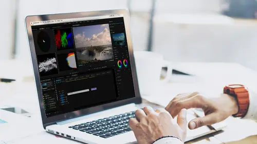
06:13 3Understanding Color
12:55 4Basic Color Terms
04:35 5Shooting for Easier Color Correction
09:53 6Color Calibration Gear
24:41 7Understanding Scopes
19:28 8Introduction to the Lumetri Color Panel
07:02Lesson Info
Understanding Color
So understanding color. Well first of all, what are the goals of color correction? Why are we color correcting? Well, we're doing it for several reasons. One, we may wanna improve the shot; we wanna extend the dynamic range. So you might have a shot that's very low contrast, and you wanna make sure that your blacks are nice and deep and rich, and your whites are as bright as they should be. So a lot of times you'll expand the dynamic range. You wanna neutralize a color cast. So you saw the shot that I had of my face, it was very yellow. That could have been because it was golden hour, it could have been that I was just in a room that had a lot of yellow lights, or maybe the camera's white balance was set wrong. So you wanna fix that. You wanna be able to make it look like it should as the audience expects it. You also may do color correction for matching your cameras. You may be shooting times of the day, you may be shooting with different cameras, the sun may be going in and out of th...
e clouds. All of that will affect color temperature and light temperature. And if you're shooting a commercial or film over several days, you want it to look like if you have cutting from scene to scene to scene, that's all supposed to take place within the same few minutes, that there aren't big jumps in your luminance and changes in color, because that's gonna distract the audience from your story, because they're gonna go, "Wait a second, "is it night now; wait it's day again. "I don't understand, they're wearing the same clothes." So shot to shot color matching is one of the reasons that you may do color correction. And then finally, you may do it just to give a unique look to your program; you wanna stylize it. A lot of films you'll go see, and they have a specific color palette, they have a specific look. So for instance, when people think of New York, they think of like maybe more of a high contrast, a little bluer, a little colder. Maybe add a little bit of grain to the image. That's a look. And then they think of Hollywood and they think, ah bright colors, okay. And everything is clean and crisp. And then they think about, oh we're now going down to South America, and it's hot, and so maybe it's a little more golden. Maybe it's a little more washed out. In reality, the colors are probably all the same, but there's a visceral feel when you start changing the color temperature of a scene, and changing the luminance, and adding grain to a scene to give a feel for location. And there are a lot of films that come out and they decide what is the color palette. I mean, if you look at some of the really old films such as the Matrix, for many of you people, 1999 was just like a lifetime ago. And other people are going, "Oh I need to get to the theater to see that." We have the whole wide range. But it had a lot of really green tones. It was a very cold, computer; it kind of had that feel of the green of fluorescent lights. So that was the vibe of the movie. So when you start watching TV shows, when you start watching, going to films, take a look at what colors they're using and what emotions they're getting from using those colors. So let's talk about video is an assumption; video. What does this actually mean? Your brain interprets what your eyes see. We can't process everything. We glance into a room, we focus on key elements, our brain processes it, and that's it, and we go forward. So those are the memory things. And everything else is we fill in the blanks, okay. And over time we kind of learn what we wanna look for to make assessments. So you know, you walk outside and you're in a park, your brain is ready to see green grass, and blue sky, and maybe you see a merry-go-round or something. Your brain says, "Okay, I can process all these colors "'cause it's a nice day out." You walk into a nightclub, your brain is expecting a certain type of lighting so it can process it faster. So our brain tricks us, and that's the key thing. Our brain tricks us, and you need to learn not how to get tricked, to be a better color correcter. And these are some of the examples. So we instantly make a comparison, we use luminance and color to figure out time of day. So if your shot is darker, probably evening or night. What if your shot is more golden? What do you think that might be? Probably the golden hour, sunset, okay. If it's really bright, middle of the day. So the time of day can be reflected by the color temperature and the luminance. It also can give a feel. So a lot of times, if a person is more muted or more blue, you're gonna react to them differently than if they're a more natural color or more golden color, okay. Colors can also control if you're feeling safe or unsafe. Dark and red; gold is different. So you're thinking about all of this when you're not only neutralizing an image, which is the first step, but also if you start tweaking it to give it a look or a feel. What is your objective? And then again, when we're dealing with luminance and light, shadow is a big thing. And you can control all of this. Color grading is not just dealing with color, it's actually more important to think about the luminance levels. You know, are your blacks really crushed, so you're losing a lot of information and the audience is feeling why can't I see that? Or maybe your whites are really blown out, and you add a little bit of gold to it, and you really feel like you're in that desert. You really feel the heat. So think about all that as you're color correcting. This is what we try to do. Love these long things; there we go. Boom. This is important. We remember what things look like. There are some key colors, that when you're grading, you should focus on. We know what we think the color of the sky should be. We expect it to be blue. Now this is just in like a normal grade, a normal day. We kind of know what grass looks like. We know grass is a certain shade of green. We see grass all the time, unless you're in Phoenix, in which case grass is brown and you should be color correcting. Shout out to the people in Phoenix. We kind of know what people's skin tone look like. You know, you can see if a person's a little green, or if they're like too pale, or if they're too red. So we have an expectation of certain colors. And these are defined as memory colors, okay. And when you're correcting a scene, if your grass is not green, it's gonna throw everything off. If your sky is purple instead of blue, it's gonna throw things off. And the same thing with skin tone. If the person is a little bit more yellow, they may seem more jaundice or more green, or too pale. And then on the flip side, too saturated, okay. And then as I said earlier, it's not just color, light and shadow are important. That's things like contrast, that's your black point, that's your white point. The last sentence is really important. We tend to remember things brighter, and more colorful than they probably really are. Skin tone is one of those things. You look at skin tone on your monitor, and you're like, "They don't seem quite as saturated "as they should be." And I can't tell you how many times I'm sitting in the suite going, okay, that's my skin tone, that's their skin tone. And it's like; and I realize that I've made them a little too saturated because I think they should be more saturated. We remember things that way. So keep that in mind. Our eyes can be tricked, and I'm gonna show you a trick, and hopefully it will work across the internet too. But what's really white? The eyes and your brain are amazing things. When you look at this board it's white. But what color temperature is it? It's television, it's probably 6500 degrees, we're gonna talk a little bit about temperature. But you know, if I look at the A in my name, is that white, or really is that kind of blue? Our brain will automatically white balance for us. If you look at a piece of paper inside, it looks white. But you take it outside, it still looks white to you. Your brain automatically color corrects, and you don't even think about it. But if you had a camera, you would see that the color temperature is different. Inside is probably more golden, and outside it's probably more blue. But our brain fixes it. Cameras can't always do that. So your eyes can be tricked when you're editing. If you look at something long enough, your brain says, "That's the color it should be," and you keep going. Usually you don't hear a voice saying that, sometimes I do, but probably because I've been color correcting too long. But your brain just automatically does it. Saturation. If something is undersaturated, our brain will automatically maybe add more saturation to it, but more likely, as you tweak up saturation, your brain will compensate for that. And you'll say, "Oh, that looks okay, "I like these colors." 'Cause your brain has automatically muted it for you. So these are things that can be affected by your perception, which is when you ultimately color grade or color correct. You're gonna be using your scopes so that it's technically accurate and your brain isn't fooling you into thinking the colors are right. And there's also some things you can do while you're color correcting, to reset your brain. So, our eyes lie. Good friend of mine, Jeff Greenberg, this is his daughter from a few years ago. And I want you to do this. I want you on the next image there's a black dot, I want you to stare at the black dot, and we'll do it for about 20 seconds. If you don't wanna do this exercise, you have 20 seconds to get coffee. But I think you'll enjoy it. So go ahead stare at the black dot for 20 seconds. Now I kind of rushed it a little bit. How many people saw that in color? Anyone saw it in color in the class? At first. At first, and then what happened? It went black and white. It was always black and white. It was always black and white. I'll go again. Because what happened was, if I go back and forward when you're staring at that, the color, the negative colors kind of get burned; it oversaturates your retina. And as soon as we go to the black and white, your retinas oversaturate it, and it automatically then adds the inverse of the reverse of the colors to the black and white which is really your luminance and your sharpness. I'll let you do that again. I actually have that slide on here twice. So for those who wanna experience it again, it's gonna go to black and white, but what does your brain tell you? So keep staring. And the longer you stare, the longer it stays in color. I'm gonna warn you, we're gonna go directly to a black and white image. Pretty interesting huh. Your eyes lie. And you need to know that, because you have to be able to figure out what real color is when you're color grading, or else all your work could be for nothing.
Ratings and Reviews
Jason Acuna
I've been filming/editing language learning videos recently and thought "The free tutorials on YouTube are cool, but I wish I could pay an expert to just clearly explain white balance/color correction to me. How to confidently read the scopes, etc". Lo and behold, a few days later this course appears out of nowhere! It delivered all the basic stuff I wanted, clearly explained. I particularly liked the encouraging advice - if you get 95% there (regarding getting the 'perfect' balance), be happy with that 95% and keep moving forward! Thank you!
Bradley Jadir
Nice succinct class. Would be good to have a follow up more advanced class or more examples but this is certainly good for beginner, and more experienced editors that want to deepen their knowledge. (I don't consider myself a beginner as have been color editing for a few years but still learnt a bit here - having previous experience with the lumetri panel will be useful)
OLIVAfilms
It is a very very good class for beginners. It gives you a very good overview of the color correcting tools available and empower you. If you are advanced in color corrections and/or grading this may not be for you. Thanks Abba.