Adobe In Design Demo Postcard
Lesson 7 from: How to Create Marketing Materials for Small BusinessesErica Gamet
Adobe In Design Demo Postcard
Lesson 7 from: How to Create Marketing Materials for Small BusinessesErica Gamet
Lessons
Class Introduction
04:25 2Defining The Glossary Of Design Terms
26:26 3Adobe In Design Demo Update Your Current Materials
08:44 4Adobe In Design Demo Business Card Part One
39:08 5Adobe In Design Demo Business System Materials
23:55 6How To Procure Free And Low Cost Stock Images
11:51 7Adobe In Design Demo Postcard
16:16 8Object Styles For Continuity
07:40Lesson Info
Adobe In Design Demo Postcard
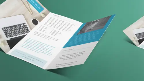
All right, let's jump out and check out our postcards. So, we saw what they're gonna look like. Let's see how do we work with postcards. So, for me, when I create a postcard, it's going to be a four by six, most likely, or six by four, rather. You tend to say the width before the height. That's supposed be how it is. Notice that a lot of people don't do that, but that's how it's supposed to be. So, let's look at the postcard first and see what we have. Let me close up my styles here. I'm just dragging these back by the panel and dropping them into the little side panel by the side. So, that's one of them. Is that the one we used? No, we used this one, so I just had two different versions of the front, and then a third page for the back. We'll turn on the margins so that I can see those. Again, everything's kinda sitting outside that margin. It's kind of a thick margin. I'm not even sure I need that much of a margin. Let's just go with 5/16ths. Notice I did math, I just, whoops, let me ...
change my units and increments in this one to inches, so I don't have to remember to type inches all the time. This one was set up with that, so what happens is whatever it was set up with, that's what it still has. So, I'm gonna do layout, margins and columns, and I'm gonna come back here, and I can do five over 16 and hit tab, and it converts it to decimal for me, so I don't even have to remember what 5/16ths is, it's already that. And I'm just gonna grab everything again and just kind of move it over till it sits right against the margin there. That looks a little better. And I've lost some stuff here, 'cause I got the little plus symbol that says, oh, look at that, what happened to that style? Look at that. Or maybe we had that closed off so we didn't, yeah, we had that so it wasn't actually showing up. But we'll go ahead and see if we got some styles in here. This is using address line, so let's keep that in address line as well. So again, I'm just gonna click that, and it becomes part of that. All right, so that's the back of the card that's here, and here's the front. So, what goes on a postcard? Well, like I said, the front should be just really eye-catching. You don't want a lot of information. Don't put everything that you do, because this might be the only thing they see, right? So when you're going through your mail, you pull it out and you go, you look at that. If I look at it and I see, oh, that has something to do with dogs, I hate dogs, let me throw that away. Shh, I don't really hate dogs, but don't tell the dogs, but I'm a cat person. But I love dogs too. In fact, I just spent a couple days with a French bulldog, so now I love her, so I'm a fan of dogs, I just don't have dogs. But yeah, if you look at that and you go, I don't have pets, this is not for me, you know, I don't even need this thing, but it basically, it says right away, this is what we do, this is what we're about, and gosh, don't we have cute dogs, you should really look at this. So hopefully you wanna compel them to flip the card over, and then this is where you put some information. Now, being that it's a postcard, you don't have a lot of space to work with, right? So you have to be concise with what you wanna say. Now, I realize that what we have is a bunch of fakey-fake Latin. I call it that because it's just not even good Latin. But, so we've got Latin on the back, and so it's like, that's not very helpful for us to look at. But what I would put here is just kinda put a little bit who we are, and maybe not what we do. I mean, obviously, if you say that it's a dog walking service or a pet sitting service, and maybe that goes in the paragraph, you know? Because obviously Fido doesn't really say what all we do. But you know, you could just put we're a full service, you know, full service pet service sounds weird, but you know what I'm saying, that you wanna say that we do everything that you could possibly think of for your pet. And then you just basically put, you know, why, again, why we wanna have a connection with you. We think of our pets as family too, and I'm sure you do, so that's why we're best. So, kinda be concise with a couple sentences. Put the information, because where people are gonna go, especially these days, they're gonna go to the website, and they wanna check it out. If I look at that, I'm like, that's nice, that might be something I'm interested in, I go to the website, because the website's gonna have the history, the bios of the people that own it, they're gonna have hopefully prices that are on there, they're gonna put, you know, are you available 24 hours or whatever. If it's a restaurant, you wanna put food on the front, right? You wanna make that person hungry. You just wanna show some food and say, great, where are they? Okay, that sounds like it's close, I wanna go online and I wanna look up your menu, and your prices, and when you're open, right? So that's what I'm gonna do is always go somewhere else. I suppose that, depending on certain services, you might wanna call. I'm just one of those people that don't wanna call people, 'cause I don't want you to know who I am just yet 'cause I haven't decided if I wanna work with you yet, you know, that kinda thing. I wanna do it, that's what I like about the web, I can be very anonymous and be like, I've checked everything out, now I'm gonna actually call and ask, you know, some more questions or whatever. So, postcards are this short, short blast of information, and you wanna get stuff out there right away, because you basically wanna capture their attention and have them be able to read it while walking back to the mailbox, theoretically. Or, if it's at trade show, not everything's gonna actually be mailed, these might be just, you know, set out at a trade show, I wanna come up and go, what are you all about? Okay, I'm going to the next booth now. You know, I mean, I just wanna be able to, and sadly, that's where we are. I mean, even me, I don't consider myself as part of the younger set, but I have a short attention span because we're all busy, right? We just have things to do, and you need to get that information out there. So, that's what our story needs to tell. That's why the front, we basically just have a pet care you can trust. What else do you need to know? I mean, that basically says they'll take care of my pets and I can trust them. Now I need to actually, you know, figure that out, do I really trust them, do I like them? But that says I'm either interested or I'm not interested right away. So, we say that with, like I said, we grab them with a cute puppy picture and then we tell 'em what it is and we give 'em a little bit more information on the back side, and that's what a postcard or any kind of mailer really should do. When we get to the next lesson, we're gonna do a trifold brochure, and that can be a mailer, but that's a mailer that has a lot more information, so we're gonna look at what goes into that as well. That's a little bit more on the desig part of it, and talking about text, and we talked about text styles, so in this case, I also wanna make something called an object style. So, what an object style does is it says I'm gonna use this same kind of item again and again. So, I might use it on the front, I might use it on the back, I might use it on two different fronts. Maybe I'm printing out five different postcards. They all are the same on the back side, but on the front side, the image side, all look different. So, I'm gonna actually need to set up a style for that so that I know that I have the same thing over and over again. Let's go ahead and assign this style. So, I have it set up, I believe, as a paragraph style called tagline. So, when I did that, I selected the text, I went over to paragraph styles, and then I clicked on the little option down below, I'm sorry, option or alt clicked on the little icon down below, to create a brand new style. And one thing that you notice is I can also base the style on another style so they update. So, for instance, on this one, I might want this tiny little style, but maybe on this here or on the backside, I want a style that looks exactly the same but maybe it's in a different color, or it's a different size, or slightly different in some way, and I can do that as well. So I'm gonna do that here, I'm gonna create this style. Then I'm gonna create an object style, which basically says what the frame looks like that it sits in, and so I don't have to make all those changes as well. So, it's gonna be two part. So here, let's say I wanted a tagline here, and I'm gonna type in your other best friend, and it's typing it in whatever style I used last or no style at all, and I'm gonna select that text, and I'm just gonna turn this on so we can see that we have overset text, 'cause I had too much text, it went to the next line. I'm gonna put my cursor inside the paragraph, because paragraph style doesn't dictate that I have to have it completely selected, and I'm gonna come over here and we'll choose tagline, so now it looks like the other stuff that we had. But I want this to be bigger, so I'm gonna go ahead and select all of this, and then I'm going to make it larger. Actually, you know what I'm gonna do? Actually, I'm gonna create a new one based on this style that's here. That's where I was going with that. So, I've got this selected, I've assigned the tagline paragraph style. Then I'm gonna come down to this, the little new style again, option or alt click on it, and I'm gonna call this tagline bigger, and it says, based on tagline, the reason it's already there is because the text I created, I did assign tagline to it, but I wanna make this bigger, but not replace the tagline style. I've got two different tagline styles, but I'd like them to be connected in some way, so that if I decide to change my tagline to a different color, all the ones that are based on it will also update that color as well. So I'm basically doing these cascading sort of styles. So I'm gonna say tagline bigger and based on tagline, and the great thing is, I can come in here and it says it's tagline, plus something else that's different. So, in this case, I want something different, I want it to look a little different, so I don't have anything different yet, but it's tagline bigger based on tagline. So, what I need to do is come back here, and I need to assign my paragraph style, tagline bigger, and it looks exactly the same right now. So what I can do is go up and I'm gonna change this to the bigger size, and probably change some letteing, you know, so change here. What I'm gonna do is I'm gonna make it auto letting. I had a specific amount of letting, which was a little bit less than 11 points, but as I made my type bigger, of course, it crashed into each other. I tend to keep it at auto most of the time. Some people like to really have that control over the letting. Auto is always gonna be 120% of the size, so if I have 10 point letting, or I'm sorry, 10 point font, I get 12 point letting. All right, so I have that selected, and I have that override again, but here's where I right click on that and I tell it to redefine that style. So now that's what tagline bigger looks like, and tagline still looks the same as it did before. But, if I come in here and select this text and change the color to something else, let's just go ahead and choose one of the swatches here, and we change it to green, let's say we change the text to green. And you notice, when I chose the swatch here, it has a square or a T. This tells me that it's affecting the text inside the frame, as opposed to the frame itself, so the fill of the text and not the fill of the frame. And because I had the text selected, it automatically assumed I meant the text. So it changed the text to green, and I can see that it did. I need to have some of it selected, I'll go back to that paragraph style, and I need to change tagline, remember redefine style, right click on there and say redefine that style. It changed that tagline to green, but it also changed that tagline to green, because it was based on that other style. So the only thing that remains the same in this based-on style, or the secondary style or child style, is the things that were different, the exceptions to the rule. So if I changed the color, the colors were the same before, the colors all change. But what I had changed in the second one was the size, so even if I go change the size of tagline, the tagline bigger remains exactly the same, because it already is defined as being different. Does that make sense? So, things that are the same, when I change one, it ripples down. So you can see where you can start building your style is you can have, and we'll do some more of those when we get into the brochure as well, because we have body, and then we have body with bullets, and we have body left justified, body centered, and we want it all to kinda look the same, except there's these few differences, and so when I change the body text, I want it to ripple down through all the different text that are based on that. All right, so that's how we have that. Now let's go to our object styles and go back in here. And actually, I'm going to redefine this back because I liked the blue much better, so we're gonna go ahead and switch that back to the cyan and redefine the style again. So we're just doing just what I just did, I'm just putting it back. All right, so we have that color there. And what I wanna do is I want this to be sitting in a frame that is white, but it's slightly transparent, so we can still see the image back behind it. So, in this case, let's take this item, and I'm going to change where this frame sits, which may change it. See, it's left justified so it pulled it off. But I'm gonna make some changes to it, so I'm not really too worried about it, because what I wanna do is I want this background to be white so it's sitting on a white, transparent frame. But I need to do a couple things. First of all, I need to move this over to the right a little bit more. And in this case, I really do want it right justified. I want it kinda right justified so that, even if I pull this over longer, the reason I pulled it over there is so that it bleeds off. I'm gonna talk about the bleed. The bleed on this is not set up correctly. We're gonna fix that as well. But I take that item, I'm gonna go into the text frame options again, where we went earlier to set where it sits in the frame, so object, we're gonna do text frame options. And I'm gonna tell it to align it to the center, and I'm also gonna tell it to right justify the text, but that's in the text settings, so we're gonna do that in a second. But right now, I just want it aligned up and down, and I also wanna give it a little bit of breathing room, because when I go to right justify this, I don't want it against the right side of that frame, because I'm going to fill that with the color, so I don't want it to butt up against the side, I want it to come in a little bit. And that's what the inset spacing here is for. And again, I have this little symbol selected, and that means all of them are going to be exactly the same. I might not want that. I can click that so it's different. And maybe I don't worry about the top, the bottom, or the left at all, but on the right, I definitely want it to come in a little bit, and you can kind hopefully see it draws this little blue bar that tells you where that image is. So I'm gonna do that and I think that's good, so we'll say okay. Now let's actually make that background a color. So, I have the frame selected, I go over to swatches, and I'm gonna choose paper, which is white, and I wanna make sure, also, that again, the frame is selected and not the text. I don't wanna turn the text white. All right, so say paper. Then I need to select this text, just put my cursor in there, 'cause I'm working with paragraph, I'm gonna go up to the paragraph and tell it right justify it, so it puts it all over to the right. So far so good? And again, it didn't put it all the way to the right 'cause I gave it that little inset spacing, so it gave it that little bit of breathing room. So, so far, that's what it's looking like, but I don't want a solid white, I wanted it to be translucent. So I'm gonna select that frame again using the selection tool, and I'm gonna go up under the effects menu, all the way up here, and choose transparency. When I do that, it looks like a huge dialogue box. Don't worry about it, we're just dealing with transparency, not all these other effects. And I wanna change the opacity of this. Again, transparency, opacity. If I just change the slider, and I turn on preview so I can see what's happening, if I come in here, you notice all of it's being transparent. I want just the background to become transparent while the text remains solid. I need to come up here and say the settings are not for the whole entire object, but just for the fill itself, so I'm just changing the transparency of the fill. Now I can slide this down to where I want it. Let's make it about like that. So you can kinda see it's white, but you can kinda see what's showing through. So, if it were sitting, say, on top of the dog like that, you can still see the picture through it. In this case, it's just off to the left side.
Class Materials
Bonus Materials with Purchase
Ratings and Reviews
Laure Donteville
How lucky to attend this class in person!!!! So worth it and it was exactly what I needed to have the right tools and give me the confidence to jump start my business. I can't wait to finally put together my ideas to create my business cards and send my very first postcards to reach my future clients. Thank you Erica for such a funny and interesting class on things that usually feel so overwhelming. Yes, you can be a designer!!!!
Cynthia Dauterstedt
Erica is just awesome - did several of her courses and she has a great style, is funny and explains very well the basics and beyond what "Design Dummies" like me need to know to get the stuff done they don't have money to pay an expert for. Good Job, worth each penny!
julie haskett
She said at the beginning that her purpose was to make us confident enough to use Adobe In Design and she absolutely did. Perfect class, perfect instructor. Really enjoyed this and lots of info absorbed. Can't wait to put it in action.