Lessons
Lesson Info
Working in Photoshop
Do you always use a tablet? And if so, what do you use? Yes, I always use a tablet. And if you don't, you should. And it's not a lot of not a lot of space here now that they did my screen at the solution of this queen. Sorry for being a little wonky here. Yes. If you use a mouse, you obviously welcome to I know brilliant structures that do it. But I think if you choose to use this, you have a more control. It would be really awkward the first day you'll be wanting to do like this, but as soon as you get into the emotional this, it's a very different, different game. More accurate, very more intuitive to at least for me. At my age, I grew up like this and not like this. So this'll feels very better to me. You can also see that I modified my initial Photoshopped palate. It's on bid early on, and I don't see why Footage shot doesn't come like this for the shop will put this over here. And as you retouch, you will go back and forth all day long across the screen with your hands drove me cr...
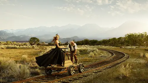
azy. So now I have this year and everything is right on my right side. All right, So I think maybe start is to just turn everything off and turn everything on so you could see how it got built. Then I'm gonna layer in a couple of the long ones, and then we'll build the white one at the end. So our us curious to see everything in this file because we couldn't jump straight into the putting in other people. But this will just take a minute. So I kind of show you how this got built in that really quick videos. I'm just gonna turn the zone so you could see essentially, I never deleted layer a lot of people they duplicated layer, and we touched on that duplication. But that just creates a lot of memory that you don't really need. If I'm to be touch, I create a separate layer, and I just have this, you know, if I want to re touch on it. I said my here to current and below, and what I do here will affect all these below. So don't be touching any of these layers. They're all individual just processed tips, so I never touched anything. Everything is in its raw state, pretty much so. This is how it goes. There's small adjustments between every little frame to make sure the contrast lineup and I stitch them together. And I talked about the process not using auto states but doing it by hand. Contrast using curves. And I'm gonna go through this in a minute so you could see it. But for now, just the layers. Little foreground grass. These are contrast layers to shape the picture a little bit. This one here has some contrast down in this corner. The grass We talked about what I wanted to have some more atmosphere in this corner. The layer in some grass, my sky talent have a layer alcalde multiply body parts, and if you get time, you could go into that process. But instead of cutting out here, I often like to blend here, and that is in my multiply folder. That's the train tracks that was called Top Moves. It set my color and contrast. No, let's stuff and that's it. Then I add, this piece is let me see, go to into our talent folder. It's a lot of small foot shops here, but this really is three things that I do, and that's right here. Put this face folder underneath. When I retouch elements, there's really three layers, this contrast layer and as a color layer there's a use saturation, and between those three, I could match almost anything. So if I were, we'll do it afterwards. But it's really you saturation here. And then there's curves. When I say contrast, Always talk about curves. I never used a contrast layer. Everything I do sits with both color and contrast sits in a current tool so we can open this one up here. It's a slight contrast is the reversed S curve, which means it's less contrast. But as you pull on this, we will see how it changes. So let me let me open up there the file before I start tweaking it, cause it seems really complicated probably, but it's not. It's really just layer by layer, and there's a curves for contrast occurs for color, a new saturation at the end of every picture. Pretty much I'd like to add a colorful layer and colorful layers has a beautiful way of taking highlights and shadows, blending them into the same monochromatic palette. So you could take this color layer that you find appear and set it to color. And then it has a capacity here, 10%. If you do this at 100 you will see what it really does. Makes everything a certain tone. So if you take down to capacity, what happens is it will add that little tone to the conference to the shadows on the highlights, and it will blend everything quite lovely. So are you following so far? I just want to show you the layers. Yeah, so let's open up some pictures here. So this is what I would do when I put a picture in their curves. So that's the process. File open. You choose your file. This isn't an intermediate class. Yes, I'm not gonna go through. You know all this. There's tons of creative like classes and how to maneuver within 40 shop. So you open your file and these are the elements that I use for every single layer. Correspond, contrasts right now it up a little bit. Maybe open up the shot of a tiny bit for her face. They call that the contrast color. So you see, underneath there you see the warmth in this versus what I have here gonna come down to our blue channel at a little yellow to the highlights and a little yellow overall. So the curse are extraordinary. It's my favorite tool by foreign photo shop, and I use it for a lot blue, yellow, and you could then see if you look at this picture, take some practice. But if you look at this picture and you say, Well, it's a little blue in the highlights you can look at the Dolby site and you could see how to maneuver the colors. How the opposite of that is, what the next? Cholera, ours. It's just a really beautiful tool. So if you want to check that out, you can. So I'm gonna call this for color your saturation. If I don't like the red as much the background, it's a little muted. I will tone this down in the saturation. Come here. Going to go to solid color, gonna choose a yellow color right in there. Remember, little warmer. You're gonna put this to a color mode. We're gonna tone this down. This is all I do pretty much in footage, obviously this masking. But that's a completely different game. So in double click on this, I had a mask and we could do something like this here really quick. It's really awkward to work on this queen, by the way, because it's a very different resolution than what you see on the main screen. So apologies for being really often why my pen tool? Okay, so they're gonna put this into a folder, I'm gonna take this whole thing, I'm gonna drag it into our background. So, as you see now, I affected everything underneath it. So to avoid that, you know that this onto normal these color layers are beautiful, but they always affect everything underneath it. Even though if you put that to normal so you're gonna attach that right there, so it only effects this layer. These contrast layers will only affect this layer group since we put it on normal. But for some reason, the color fill layers never do. So now they got Andrea in there and remember I said that there were rising line is your friend and that's our target. If you don't have the measurements. So if I were to use this background plate, I've had come in here and I would look at the horizon line and that's rabbit pitter right. They see if it's fine there that could actually use the clouds for this. But we cannot use the ground. You see that this doesn't work out. That's back on. In order for her to fit in there somewhat at that perspective, she would need to be standing way back here. Now you start seeing that the horizon line start matching up. So if I were to put her up here like I wanted to, this is way too low. You following hard, Easy. Do it again. Let me get into the real one so we could keep this and had the other one. You can see the difference. So when it comes to matching here, it's not. Not terrible, is it? Tonality back here is kind of starting to match up. I would say it's a little too saturated, so I would come back in here and come back on the saturation a little bit and she would probably fit pretty well in there in the background where we did not want her, but that's how it ended up. So let's find another one. Open our files and you're gonna open the one that says right, Right? All right, here she is. So I want to follow the same process by screen. It's a little cluttered here, guys, but bear with me. Put this side by side. I'm gonna do the same again. Curse for contrast in this. Soften that contrast a little bit and do another curve for color. And what we want to adhere is yellow. And this takes some practice. You guys, what you can use to get started to take a color dripper here and then just select the colors in your highlights and shadows. And then you'll get a really good measure what the values are here and what the values are in this frame that will allow you to in a soul, mates almost technically set the color range here in this frame, in the color range in this frame. From now, though, I want to just do it by I and get it in there so you could see that the things line out when you do it properly. All right, again. We got to set this layer to normal so doesn't affect the layers underneath. We're gonna put her behind the cart lineup our horizon lines, Wellfleet. And there she is, a bystander.
Ratings and Reviews
a Creativelive Student
If you are expecting to learn how to composite, this is not the course for you. However, if you want to know the fine details of compositing well, you want to refine your work, this is the course.