Composite in Photoshop®: Lighting and Color Adjustments
Lesson 7 from: Simple Backdrops for CompositingBrooke Shaden
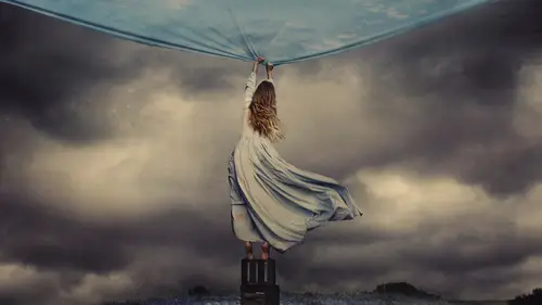
Composite in Photoshop®: Lighting and Color Adjustments
Lesson 7 from: Simple Backdrops for CompositingBrooke Shaden
Lesson Info
7. Composite in Photoshop®: Lighting and Color Adjustments
Lessons
Class Introduction
02:34 2How to Use Bedsheets as Backdrops
05:37 3Effectively Use Color Theory
06:07 4Set Design and Prop Placement
05:02 5Shoot Props and Self-Portraits for Composites
13:41 6Composite in Photoshop®: Selection and Shadows
33:25 7Composite in Photoshop®: Lighting and Color Adjustments
19:43Lesson Info
Composite in Photoshop®: Lighting and Color Adjustments
Now that we have the shadows fairly well placed we're going to move on to some lighting changes and color changes and more overall adjustments to make this really fit. Because right now I think that the first thing that you notice when you really pull back from the image and you take a fresh look at it is that the teacup and the teddy bear both have this yellow tone to it whereas the subject has a very blue tone because of that dress and the way that it picked up the color temperature of the light. So we need to make some adjustments to make everything fit. We also need to make sure that they are of the same brightness so that the teacup and the bear aren't too bright looking and we can do that by making some overall adjustments to the objects themselves. I'm going to click on the teacup and I'm going to create my adjustment layer, a curve adjustment layer. Curves is my favorite thing so I'm almost always going to choose curves above anything else. So I'll choose curves, and I'm going ...
to then pin that layer down to the cup so I'm making sure that this adjustment layer is only affecting our cup. Now when I make my changes it's only going to be on that teacup. I'm going from my highlights and taking that down so that that the cup is a little bit dimmer. But I also want to make sure I'm making a choice here, and that is, am I going to change the color of the teacup or the color of my subject? Do I want her to be more yellow or my teacup to be more blue, because we have to make them match here. And I think that we can test both but I'm probably going to want to make the subject a little bit more yellow. But first let's going into RGB, right here in this dropdown, and choose our blue curve. Because the opposite of blue is yellow, so if you are lacking one you simply need to pull the curve in the other direction. Right now we have our blue curve and if you pull up on that curve you're going to get more blue and if you pull down you'll get more yellow. I can test right now, this is normal, but I can test adding a slight bit of blue in there. Maybe that'll look good. A little tiny bit in curves can go a really long way. So we're just neutralizing the color. I think that looks good but what this has done is now indicated to me that this curve, where it used to be a little bit whiter, a little bit more yellow, I'm actually now seeing red in it, and I see that this dress is not only blue but also cyan. The opposite of cyan is red. So there's a lot of color matching go on which goes back into color theory and what colors match and what colors don't, what opposites are and how exactly to work with that. So I'm going to go to my teddy bear, which we have up here, and do the same exact thing with a curve adjustment layer that I'm pinning down. But I'm gonna make my teddy bear a little bit darker, especially paying attention to where we are in this room. For example, this teddy bear is in this natural shadow in the room. We need to make sure that the teddy bear is in shadow. So I'm going to go ahead and darken him quite a bit more than the teacup, and just make sure that he really is in the shadow of the room because that's what's there. Alternately we could lighten that shadow, that would be another option. But we'll go ahead and darken that teddy bear down. And then same thing with the blue curve, just adding a little bit of blue to our teddy bear. Maybe that's too much, we'll pull back just a little bit. Now we want to work on our subject which I saved 'til last because our subject is going to be a little bit trickier. If we zoom in you can see that my skin is already pretty yellow, it's just the dress that we want to change the color of. So we'll see how we do with an overall curve adjustment just the same as we did the others. I'm going to pin that down to my subject. And I don't think that she needs to be any darker. We could make her darker, but she actually fits pretty well as it is, we just adjusted the other objects. But do you see now close up how much more red the tea cup and the teddy bear look than she does? The first thing I want to do is go to the red curve and let's see what happens when we just add a little bit of red to her. Do you see how much more she blends in now with the other objects in the room? And it might not be perfect, so maybe it was too much, maybe it was too little. It's really hard to tell sometimes when you're making these tiny little adjustments to individual objects, so it's good to step back and say, "How does this look?" So let's go ahead and zoom out. And I think that our objects are all matching pretty well right now but we need to make some good overall adjustments. Up until this point, if you remember, we haven't actually done anything but make individual adjustments to the layers of our composite, but I want to make overall adjustments. For example, maybe I want to add a little bit of shadow to the back of this wall. That's going to really bring it all together, and then maybe we can start to change overall colors and light. I'm gonna quickly draw in a shadow wherever I think it should be. That's a weird shadow but we'll see how that goes. Could be good, could be bad. I'm gonna feather it just like we did before. I'm gonna try 30 pixels, that might not be enough. Again we're always experimenting. And that's in the background which is our background layer here. I'm just gonna great a curve layer, create a little shadow. Eh, that's a weird shape. Let's try one more time for that one. Instead we're going to maybe-- nope. I'm doing a weird shadow but don't worry, it's gonna turn out normal in the end. Maybe not. Okay, we're gonna get rid of that weird thing. Okay, it's a little bit more normal. Maybe we'll just do that. Feather, and we'll do 35 pixels this time. And we'll go on down to our background layer, and just try again. I mean that's what this editing process is largely, just figuring out what's working and what's not working. And it's super subtle. We don't need a really dark shadow back there, just something to indicate that we know that there are objects in this room. Nobody else knew it but we did. Creating a new feather and doing the same exact thing, in the background just creating that little bit of believability. And the teddy bear doesn't need it because he's not tall enough. So let's go ahead now and we're going to make our first overall adjustment. First thing that I'm thinking is the foreground is too light. There's just too much light coming in here, I don't like it, so we're gonna select anywhere that it's a little bit too bright. We can always change our selection. For example the shadow doesn't need to be any darker than it is, so we'll get rid of that. I'm going to right click, feather, and I'm going to do a big feather on this one because we have a much larger selection. The size of your feather can often correspond to the size of your selection. In this case I'll try 250 pixels. I don't know if that's enough but we'll see. Try in curves, and then bringing that down. See how by bringing that area much darker it's actually making our subject fit in a lot more. The lighting simply has to match, and it doesn't yet. Now that I have done that I notice that the dress is too bright where it's hitting in the shadow. So I'll go in, select that dress, feather that selection, and then make an adjustment on the dress, only the dress. I'm making sure this layer is pinned down to my dress. Just making it a little bit darker in that region. There we go, just there. All right, so that's looking pretty nice. I've got this weird thing in the foreground which I'm going to fix very quickly just by cloning that out. I don't have any idea what that was. Might have been a rug or something that I rolled up to try to fix that. So I'm just clone stamping that out by selecting some pixels and replacing the foreground. Just a little bit so that everything is nice and clean. Then I'm actually go in and darken this area even more. I'm gonna go in and create sort of a vignette here so that we have a lot of attention drawn on to our subject. 200 pixels, another curves layer, and make that area even darker. Now that we've got some darkening in the foreground let's see what we can do with light play and see if we can make this whole area bit brighter and draw some attention to our subject. I'm going to pretend like the light is coming from the upper right hand corner of this picture. I'm just gonna go ahead and make this weird big selection which is going to be our light beam coming in. Not a strong light beam, just some slight sense of direction here. Going to right click and feather, and we'll do 300 pixels on that, just some nice big number for a big feather. I'm doing this above all of my layers. I don't want this to just hit the background or just hit the teacup, over everything. Curves, and we can work on making this brighter. We can go from the highlights, we can go from the midtones, or we can go from the shadows, and I tend to like to go from the shadows a little bit because it gives sort of a dusty feeling in the light, almost like there is a beam of light coming in in this indoor attic space, which I think is really beautiful. That's going to help us bring some cohesion to this image, but let's try another overall adjustment. Instead of just one specific part of the image let's go ahead and do our first curves layer that will change absolutely everything, not just a specific part. We talked earlier about color theory, and I talked a little bit about color signature. Well you can also have a lighting signature if you want. You can deal with light and color in the same way, with highlight, midtone, and a shadow. It's very obvious to do that with light, not so much with color. So let's do that with light first. The way that I handle light is to work from the highlights and the shadows and not so much the midtones. What I wanna do is actually take my blacks and skew them up to be gray, and do the same thing with my highlights but opposite. So I'm taking my highlights and skewing them to be gray as well, which is exactly what everyone is taught not to do all the time. That's okay, because I know it's technically not correct, but it's fine. I'm then going to add contrast back in to the midtones, bringing a little bit more attention to my subject. What we've done there is we've gotten rid of the harsh distinction between the shadows and the highlights and we're softening those shadows and highlights. It gives it a little bit more painterly feel, and that's really good for an image like this which is very fairy tale. We've gotten rid of those things, and now let's go in and do our first real big color adjustment. I'm going in, I've got my new curves layer, and I'm going into RGB, and I've got red, green, and blue. Maybe you're the type of person who stops on green first and that's your thing, and you think you adjust green and magenta. I think those colors are the worst so I never touch them. But you might. If green is your thing or magenta is your thing, go for it. I like the blue curve personally, and part of my color signature, working from the highlights and shadows, is to add blue to the shadows and yellow to the highlights just like this, which also will soften the image quite a bit. So I like to start with that. Now that I've got some lighting and color signatures put on there, you can see the difference that made overall, now I'm starting to think about, okay, I've got some color in there, I've got some light, but this wall is pink, and it is driving me crazy. I hate the color pink very much, so I need to change it. What color will I change it to? I have so many options. One option that I have here is to try to do replace color, like we did before, on this wall. Would it work? Maybe, I don't know for sure. Because if you zoom in you can see that the skin tone is fairly similar to the wall color. And you might say, "No it's not, "the skin is yellow and the wall is pink," but they're still in the same range, they're in the same family, and I have tried to replace color enough times to know that it doesn't work very well on anything that's a soft light color, and these are not saturated colors here. So what might work even better in this scenario is actually to just select the wall. I'm gonna do a really bad selection here just to show an example. But you wanna select the wall. In fact I'm going to just go in and refine this in just a moment. Okay, there we go. And instead of trying any sort of overall color replacement to do this more manually, just to shift the color. You don't have to get a perfect selection on this, but something fairly close, because what we're going to end up doing is we're going to choose curves again and we're actually going to go in and just manually adjust the color of this wall. I don't know if we're going to shift it very drastically but some little amount will probably work out here. This is looking pretty good. I don't know if I want to include this. I think that might get rid of the little crack in the wall. Hey, what are you doing? Okay, there we go. And right click and feather, which is probably very predictable by this point. I'm gonna do 20 pixels. Could do more, could do less, we're just experimenting, seeing how it goes. And curves. So you notice whenever I do an adjustment layer the selection goes away but it's still retained here in the layer mask. I always have that, and I can always click on that layer mask if I hold command and click and you can get your selection back. So if you need to go in and make another adjustment to this wall you can totally do that, and that works out just fine. And let's see what we can do about color here. I'm in my curve adjustment, and you can see that we have that wall selected. Now it's just a matter of what direction do I want to take this in. Do I want to add more red to this? Probably not. Do I want to take away red? That looks much better to me, just dulling it down a little bit, making sure that we're not having too much of that pink salmon color in there. I'm going to see what I can do with that but I'm keeping in mind that right now the selection looks okay because you can't see all the parts that we've missed. If I go ahead and I deselect you can see that there are lots of pieces in here, right up against the subject for example, that need to be refined, but that's okay because we have an adjustment layer which has a layer mask attached to it. I'm just going to take my opacity up and adjust my hardness a bit. We can always go in and make those adjustments. So if I need to erase because I selected too much, that's okay, we'll just refine it. But I find it much easier to go about it this way, instead of getting a perfect selection, instead to go in and just erase later. That is so much easier for me, I have so much more control when I do that. I'm totally aware that I just messed that up but we're gonna fix it 'cause we can. I'm just making sure that everything is finessed. There's a bit of a halo effect happening around the subject, but that's okay. Same with in here. I would go in and fix this a little bit more of course, especially around the door. Whoop, wrong way. Especially around the door there, but you get the gist of different ways that we can adjust colors in the frame, one being replace color, the other being a manual selection. Of course there are many more than that but those are my two favorites that I like to do. I'm going to back up here, back up, and look over this once more. We've got the color adjusted but now everything looks a little bit sad and dreary. I don't know if you guys agree, but I definitely think so. So let's go into curves one more time and see if we can't really ramp up the color here. I'm going to add more yellow, and more blue, the same way that I did before, into the highlights and shadows. And we'll see if we can't just play with that a little bit. Seeing if yellow is good for this image or if blue is good for this image. Going into the red curve at the same time, maybe adding a little bit of a dim blue feeling to it. Because you never know what's going to look good, what's not, unless you play with it just a little bit. I'm going ahead and just adjusting these colors to see what looks nice, what doesn't. I'm trying cyan in the shadows, I'm trying red in the highlights, and I'm not sure. You see how much red that was though before. I think it's good to get rid of some of that. I think we're getting into a decent area here where we've got some blues coming in, which I like. I think that we could still do a lot of work here in terms of toning down this door in the background, maybe adjusting the dress a little bit. But for now I think that it's pretty good, I think that we just need to step back, take some time, figure out what needs to happen, if anything and then move on from there. That's a large part of my process, is stepping back from the computer for just a little bit. Sometimes I'll even go ahead and make the image really really tiny and just look at it fresh to see an overall composition, overall light. I don't know if you guys agree but when we do that I notice that the door is really bright and that's really distracting. That's the thing that I will definitely go after next, is just a really big selection on that door, seeing if we can't take that down. I think that editing is so much fun because it gives you this opportunity to create whatever you want in your process, in your editing process. You can make this door darker if you want to, you might choose not to. Whatever is authentic to your personal flow. Much better. That makes me feel so much better. So I'm going to leave it there because I think that we've really gone over the basics of how you can get rid of a background, how you might transform an image. And it might not be perfect yet but we've got the basics down. So if you have a sheet at home that you can use, great. If you've got a piece of fabric that you don't know what to do with, use it. You don't have to have any particular thing to create and that's what I really wanna drive home right now, is that you don't have to have a lot of money, you don't have to have great locations. All you have to have is an imagination and some super basic tools and you have everything that you need. So have fun creating.
Ratings and Reviews
Heather Lynn
I really liked this class. There are so many ways to accomplish the look and feel that you want. It's nice to see the variety of ways people use their own processes and pick and choose what works best for you. Great job Brooke. You related very well, and were very thorough with the steps your explained.
fbuser c20ec902
I would recommend the class to anyone that has an interest in composing and learning how to blend and tone objects and how to place objects in background. I was looking more for creating backgrounds, but this was just as good. Some of Brooke's techniques are interesting to say the least as in a few i would use a different tool, but that is what makes this class different in that there is another way of accomplishing a result using another technique which I'm sure I use. I will watch this a few more times. It was well presented and explained. Thanks Brooke....