Lesson Info
23. Using Multiple Colors for Shading & Highlights
Lessons
Class Introduction
02:26 2Get Started Drawing
13:07 3Line Quality
18:27 4Shading
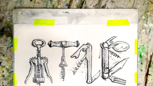
18:59 5Drawing Supplies
15:19 6Drawing Supplies Exercise: Draw Spoons
17:26 7Measurement
12:08 8Lightbox Drawing with your Mobile Device
06:48Learn Composition
10:17 10Refining and Shading the Layered Image
13:39 11Color Introduction
06:25 12How to Apply Color Using Watercolor
11:42 13How to Apply Color Using Gouache
07:06 14Color Materials & Setup
04:33 15Color Style #1: Pen and Watercolor sketch
06:05 16Color Style #2: Doodle style using Pen
07:01 17Color Style #3: Brushpen
06:26 18Color Style #4: Chalkboard Technique
15:23 19Color Style #5: Spot Coloring Book
07:44 20Color Style #6: Add Color with Your Background
03:07 21Color Style #7: Create Color Combinations with Metallics
07:01 22Color Style #8: One Color Value Study
06:25 23Using Multiple Colors for Shading & Highlights
19:56 24Develop your Style by Showing Your Work
06:04 25Ways to Display Your Art
22:03 26Turn Your Drawing into a Digital Product
09:16 27Paper Crafts with Your Drawings
15:50Lesson Info
Using Multiple Colors for Shading & Highlights
So now we're gonna combine several of these techniques that we've done on 21 drawing. Okay, this is gonna be back to our dog painting in class one. We drew a dog. Now, the best thing when you do a nice drawing that you like and you're thinking of painting it in one of the first things you want to dio is trace it. This saves a copy. This is another kind of an along version of what you would normally do on your computer is you save a copy of any file that you think you might want to go back to. So I traced the dog that I drew because I'm going to start messing with it with paint, and there's a really good chance I'm going to wreck it. Mike, I like my dog pain, my dog drawing. And then I'm going. Teoh transferred on. So I'll just start out this a little bit. But I think by now you've seen tracing and transferring. You could if you if you didn't draw this dog and you had a photograph of your dog, you could start at this point. We already did a dog in the last class. Um, so we're going to s...
tart using the one we already drew. So you take that on your paper. I have a nice piece of arches. Hot pressed watercolor paper. Here again, I'm taping and down, and I'm going to put my transfer paper underneath there and just use my hardest pencil draw around everything, and it's going to come out. This image is transferred onto their. Then I'm going to start filling it in. I'm going to use a combination of the techniques that we have already used. So as you can see in the background, I did this technique. I just colored in the big shape gold and I colored in my back background this teal color. But in this case, I did something a little bit different. See, High left this gap line that just gives you another look. I kind of like the look. Um, either one is fine. I'm just going for this one, because it it's a little more of like a printed look. I'm going for a kind of this retro lift. A lithograph look. So in printing, they often get these miss registration gaps. So this was just that so far then I'm gonna add a few more techniques. I think I want to add some background shading, and I definitely want to do some paint over the gold. So for my background shading, I'm gonna try out some colors. Let's see. Okay, I know I want to paint. Um, a lighter kind of just a lighter, a little bit in the sky and fade this out. So I've done some samples of that blue color on just a piece of scrap paper and use a smaller brush. So I take the same uses palace. I'm gonna take the same green that I painted the background with. I know I wanted to be lighter, So the first thing you think is okay, add white. So I mean, as a white to it, you can add as much as white white as you feel like, And then Okay, try it out. How does it look on that green? All right. Looks okay. I think I'm just gonna paint it on like that. And then I know my backgrounds gonna have a bit of a fade. So just gonna rent out my brush trying just drag this out and faded out a little bit. I'm actually trying toe lift the paint underneath it. So it'll mix with this so I can get a fade. Oh, please. Okay. All right. So that's OK, but I'm gonna take a look at it, and it looks I don't think I like it quite enough. I think it needs to be warmed up a little bit. So I'm gonna take that same color, and I'm just gonna add a teensy bit of yellow to it. If I had too much is gonna get really green. I wanted to stay the same color, but just be a little warmer. Let's try that one. Okay, That looks a little more natural. See how it kind of looks like it could be. Maybe some sunlight on the background as opposed to some white paint on the background, drawing off my brush a lot and just dragging that out. Okay. I like that one. I'm in a circle. What? I'm gonna take notes on my chart. See, once again, I'm making a chart. Um, and this says I had a green background and I did yellow with just a little bit of white. So now I know I want to paint some highlights and some shadows on the gold. Well, what's the first thing I think? Oh, okay. Highlights and shadows on the gold. I'm gonna try some black. OK, what happens if I dio this gold with a little bit of black on it? Oh, wow. That's very dark, isn't it? I'm not gonna be able to see the gold through it all. Let's see what happens if I wash it out just a little bit. Okay? Okay. So let's pretend that was a shadow area, and then it faded. Kind of into a sunny area. It would look like that. All right. It looks a little harsh for me. I think. Doesn't look like a shadow it all to me. Maybe I'll try purple. I have that color. Okay. Same thing. Tries. What? What is purple on gold Look like? That's kind of a neat look on, then. Let's see what happens when I fade that one out. Hi. Sorry, Doc. I could go for that. That's not too bad, but it is also pretty harsh again. That's gonna be I gotta think of how the purple is gonna look with the green. Um, okay. What's another color? Have that indigo. I've been using that a lot. Okay, let's try that one. Oh, what's that? Pigment goes on much thicker. That's kind of more of a charcoal. Anything? Okay, lets see if we can get down to fade out. All right. Okay. Also, you know, all of those are still seeming pretty harsh to me. I want this to be a little bit more cohesive. I'm gonna try this warm gray color. This is called Gray number three. Now, you could make gray by, you know, mixing a whole bunch of colors together. But that's right here. And it's nice. And I want to keep this consistent. Look, if I mix it myself, if I try and remix it, it's gonna be really hard to get the same color. So I'm just gonna use it straight out of the tube, Okay? That I like that a lot better. That is a lot softer. I think I'm going to go with that one. So I'm gonna use that gray number three over the gold for my shadows, OK? And I'm also gonna have some highlights on the gold to, so I need to pick those. So let's start. It's gonna be the same thing is this. I'm gonna pick, um white and see what a white shot highlight would look like. Okay, that looks like my dog may have some whipped cream on him or something that looks like a will to harsh. So I'll do the same thing. I'll add a little bit of yellow to that. Okay, there we go. That's softened up a little bit. I think what I need to do is add a little bit of yellow highlights and a little bit of gray shadows. So I'll go through this whole thing when I'm trying to pick colors that I want to use. And I spent a long time on this drawing. It took me a long time to get all transferred and straight. Might as well take a while to choose these colors. Okay, Gotta picked. So let's just finish up and do a little painting here. Okay, um, your picture of your dog is on your tablet. Um, that's the same dog drawing that we were working with before when we were doing our drawing. So you can just download it. I'm creative life, and I'm going to start out, and I'm gonna Onley use that gray and that yellow gold. So I think I'm gonna move them over here, OK? Just gonna know this gray. It's gonna be my shadow color now see how I've got all the pain all the way up on the feral, over the brush. I'll do that when I'm mixing, but not when I'm painting. Because when you get a big glob of paint, this is what happens Here is a picture of your paintbrush. You've got a nice point on it and it comes into the feral of your brush like that. If you get a big glob of paint stuck right up here way high, your bristles are going to go like this and fan out and you're not. They're going to go straight across from that big glob, and they're not gonna be a nice pointing point. So what I try and do is any time I get all the paint shoved way up in the feral like that, I try and rinse it out, dry it really well, and then I'll just go back into that same paint with just the tip. Now I've just got paint on Lee on the tip and I've got I can do like a really nice final delicate line without it's spreading out. Okay, back to this. Okay, So I know my dogs a black dog and has black spots, and I've got gold on here, so it's a little hard to see my drawing. If I wanted to, I would take that same tracing and I would trace back and transfer over the gold. But I can see my lines well enough. I think so. Here I go. Gonna start painting anything that I see is dark in the darkest spots. And then I'm gonna pull it out into any lighter spots. Okay? He's got his collar on, and he's got most of his tales Black. Okay, While you're filling in the details on him, I actually want to pass along a question from one of our online students that somewhat related Poppy wants to know when painting colors next to one another and watercolor egg wash. Do you necessarily need tohave one color dry before you paint the color next to it? If they're going about one another, um, depends on if you want them to blend together. So, um, if you want to really paint by numbers. Look where everything's very separated. Yes, one should be dry. If your pain is like more of a creamy consistency where it doesn't have a tendency toe wash so much, you could probably get away with it. Okay, But there is a lot of time when you want to use wash more like you're doing oils or acrylics where you actually have them, but up together. And then you kind of scrub it that line in the middle and blend them together. So it really depends on the look you want and what technique you feel most comfortable with. If you if you put the paint next to it and it blends and you go Oh, no. Dang, I ruined it, then probably shouldn't it. Or you should practice it, Maura, until you get comfortable with and like it. Okay, so my dog is getting brown. Here's his eyes, and his ears are dark. Um, most of his face is black. I think whatever he has, a half of his half of his forehead is white. So anything that I think is white, I'm just gonna leave it gold for now. Okay? Okay. He's coming around his name is Pocky Little Rascal dog. Um, that's kind of it for the dark on him, I think maybe just a little bit more darkness, toes, you know, he pads under his toes are dark, but I'm just kind of doing this is a little bit of a shadow color. This is right Now, what we're doing is the technique that you can try and practise using Kraft paper if you have just like a brown paper, like the paper that you have on your tables right now or you could go out and buy a nice tone of grey that you like or it could even be green or blue, anything that's a medium range. Right now we're painting dark darks and lights on a medium color. So we've practiced here. We practice painting lights on a dark color and we practiced painting darks on a light color a lot. So now we're we're doing just the darks and just the lights, and we're leaving the medium's okay. Parking. So we've already used the pineapple technique to do the background. And now I would say we are using kind of more like a um, which one is it? I guess it's more like this. We're just going for finding the darks. So we're doing a little bit of that technique. Find all the dark's no, but shade behind him. Okay? And I'm gonna say there's a little bit more shadow to say. The sun's coming from this side over here. There's gonna be a little bit more shadow on this side. So I'm gonna really color in a shadow in here in the same room for my highlight. I got my big kind of more of a full intensity section, and I'm gonna fade it out a little bit. See, there is a little bit of that reflected light that I am leaving in there, just in case. Hey, and just kind of get all thes darks on the dark shadowed side and blend them out a little clear away. This is adding that dimension. It's almost referring back to those charts you did earlier where we saw the cube in the sphere and all of those really kind of giving them those rounded edges. I wonder. I know this is gonna take a while to kind of work through. Would it be possible to look at the finished piece, and you kind of walk us through some of the steps that you took to kind of polish it up and finish it off. Yes. So I'll just gonna bring out the finished piece and one time I just want to show you a little bit of how I would put on the highlights. Sure. Okay, so now we have our areas of highlights have been saved. We didn't put any paint on those at all, So the highlights are just, you know, a tip of his tail, you know, a teeny bit of his nose. Maybe just a little bit in his ears. You really? The highlights are hardly anything. Not much at all. Just a little bit on the I, his star because you wanted. Make sure you don't cover up your meat medium tones. So the highlight on here, it would just be a little bit in there. Try and leave as much of the mediums as you can. That will. If you just If you're highlights, actually run into your darks, then it's gonna flatten out again. So now, as you can see, Okay. Oops. I forgot to paint the background. So as you can see the color that I chose, um, for our background color in this one, I put just a little bit of yellow and white into the into the blue. I painted that on the background. Next, um, and then you saw as I was filling in here, I was hitting all the dark areas and then hitting all the light areas. Um, and if you just take a little bit more time, I was almost there. But just take a little more time and really carefully draw in those shapes. It really starts to take form. And then here the last minute, you know, just pain, his tongue and pink. That's kind of the neon pink tongue finale. Um, and then I would do the background next and fill that in. So that's kind of how you combine all of these. You know, it seemed a little random. Maybe when we were doing all these different techniques and trying out How do we apply things? This is how you really bring it all together on a finished piece
Class Materials
Bonus Materials with RSVP
Bonus Materials with Purchase
Ratings and Reviews
Lt. Cmnd. Data
This fun course is perfect for the beginner that wants to learn how to draw with pencil. Cleo had lots of great tips and techniques that are easy to employ and you can get started with whatever supplies you have around the house (back of the envelope and a #2 pencil..). It is great to have more fuel for my creative habit!
michella
This class is fantastic for getting you off and running for a daily practice of drawing and DIY exhibition. The range of techniques that Cleo goes over are easy to follow and enable you to create something that has potential! I am inspired to apply what I have learn in this class right away. I primarily work in the digital space, so spending time developing analog skills with an experienced instructor has been so valuable for me and my work. And as a side note, I loved focusing on everyday things (keys, scissors, etc.) and bringing out the character and beauty of those objects in our drawings.
Sierra
I thought this course was great! Cleo broke down the fundamentals of drawing in a way that was easy to understand. I was particularly impressed by the different tracing paper techniques and using the pencil as a measuring tool. After taking this class I can now look at drawings and identify the techniques that were used to accomplish them and that's an awesome feeling :)