Lessons
Lesson Info
Blend Modes
blend modes changes how your layers interact with each other. And so I'm gonna show you a few different ways. Feel my favorite ways to use blend modes. Now blend modes are divided up into a few different categories, and you'll notice they all have dividing lines between each of them. See veteran normal blend modes. You got normal and dissolve. No one really use Dissolve. It looks like the cross dissolves from like 19 eighties television shows. You have your dark and blend modes, which start with darken your lightened blend modes that start with lighten. You have your contrast blend modes that start with overlay the effect contrast to some degree you've got the comparative modes, which basically use complex mathematical algorithms to manipulate the images to each other. I'm going to show you one of those, which is actually surprisingly useful. And then you got your HS cells down on the bottom, which allow you to manipulate some specific component of color. Cold is broken up into hue, sa...
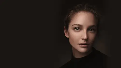
turation, luminosity you get to pick. So what we're gonna do is we're gonna look at a few of my favorite ones. Generally speaking, I usually say that with the exception of hue, saturation and luminosity, which I like all those, except for maybe saturation. I don't really use, um, pretty much pick the top two from dark and top two from Lightened top two from Overlay. I think those air usually probably the most useful. So when you approach blending modes, which can be kind of overwhelming and complicated when you actually just hear the straight up definition, Um, there is a lot of logic to them. It's just there. Explanations and definitions are all kind of similar to each other, and it gets a little bit confusing. So we're gonna look at darken and multiply lightning screen overlay and soft light. We're gonna look at subtract and we're gonna look at your h s, your hs l down at the bottom and each of those air kind of going to do different things were not going to get into crazy, complex explanations of any of these. But we are going toe. Look at some of the more useful applications. More practically useful applications, some of them. So if you actually we're gonna go to the darken to start off with, So a darken blending mode is going to take and compare the pixels from one layer and compared to the pixels of another layer and generally the two terms that are gonna be most helpful here when describing these are gonna be basin blend bases. Whatever is on the bottom and blend is whatever you're using on the top and blend modes going to the layer you're changing. Blend is gonna be the layer you're changing the blending mode of Okay, So if I use Darken, what it does is it compares the base and the blend, and it keeps whatever is a darker pixel. And the thing about all of the dark and blending modes is that white is invisible. Okay, white is invisible, darken by the way, opposite of lighten, right. So in all the light and blending modes, black is invisible. Now. This is particularly useful because every once in a while you get a logo where it's not on the transparency. You get a logo that's on black. Sorry, it's on white. That may look like this. I got to cut this out, and so there are a lot of ways you can do this. You can come in and brush it out manually. Or maybe you're gonna come in and you're going to do a ah select and a color range, and you're gonna pick this color and you're gonna mask it out. Um, let's go that way. And sometimes this can work well. But sometimes you end up getting little tiny, harsh edges, depending upon what that cut out happens to be. Depends on the logo. That's frustrating. There's a much easier way than trying to do any of that manually because white is invisible. If we change the blending mode to darken, you've now cut it out instantly. Okay, Now, this really works best. When you have a much darker pixels in your in your logo, you notice I have a black logo here, so the black shows up especially right. You're not gonna really everything that circles in that when you start having light elements of your logo, that tends to be a little bit tricky, and you may have to kind of bring that in separately and manually, and that's a little bit more frustrating. But if you have a simple black and white logo, this is a incredibly easy is an incredibly easy way to cut that logo out, put it on top of your image without having to come in and bring in a transparency based on your background from our all the all the dark and blending modes compares Basin blend keeps the darker information. Okay, now the one under Darken is going to be multiply and multiply is gonna do exactly what it says. It's going to multiply the value of one by the other, and it's going to result in an overall darker image. Kind of works very similarly to painting dark contrast or burning shadows. You end up getting in effect like that, and so what you see is you kind of end up creating something that looks like you're painting in kind of contrast and darkened shadows and stuff like that doesn't really quite work in this particular image, but you can use it as a way to burn. I don't necessarily use this technique a lot, but again, if you check out the creative blending modes, you'll see a lot of good applications for burning in darkening techniques. Now the opposite of the dark and blending modes is going to be the lightened blending modes. So let's say you have a logo that is all white on black. I'm meeting command a for select all command. See for copy, and I'm hitting paste to bring it in. Now this logo's a little bit small, so let's say you want to make this a little bit bigger. A good thing to do here. If you are re sizing something you don't know how big it's going to be, just right. Click on it and convert it to a smart object. And a smart object is kind of like a container for a layer, and you're making changes to that container instead of the actual layer itself. So what that enables you to do is make nondestructive changes to a layer. So if I want to resize this by hitting command T. And I'm holding down the shift key to keep the constraints of my resize. If I don't hold down the shift key, whatever you know, whatever it is. But shift key keeps the constraints. And so the idea here is that every time I change the size of a smart object, it's going to reuse the original information to resize it. So I'm not constantly making it bigger and smaller and destroying that data every time. And you could do this with filters like If you want to run a blur and a noise and all these different things on one different layer to create different kinds of effects. You can do that this way. You can change anything at any given time. You can also mask out different effects, and that's a whole other thing. What smart objects sometimes definitely have their use. So I brought this in and again instead of coming through and masking this out individually. A simple lighten makes black invisible, and I now have something that works anywhere. Now let's say that you've been given. I'm gonna delete this. Let's say you have been given this logo and it doesn't quite work because it's black, Right? Doesn't really show up too much like, Oh, well, I wish I had the other version of this logo. Sometimes you can just do a little command. I for invert change that blending mode to lighten, and you have the other logo now screen, which is the other one I mentioned. We talked about blending modes. The lightning bill. Anyone screen is the opposite of multiply, quite literally it multiplies the inverse and results in an overall lighter image. That's what it means. Basically, what it's gonna do is it's going to the opposite of Multiply its going to Brighton while adding contrast. And you actually see this particular effect used a lot when you want to create lighting effects, things like flares. So, for example, if I wanted to make a little bit of a flare over here, I could do this in a couple of different ways. You want to make movies, these windows glow a little bit. I could grab white, and I could kind of paint it a little bit. Here I change the blend mode to screen, and it's gonna work a little bit differently than it would if it's just a normal brightened you're actually gonna see it's a little bit better. If I have a little bit of color in there. It's a little bit easier to see. Let's say we want to do this a little bit, so I'm gonna bring this through here, Scream, see what interacts a little bit differently. It's definitely a lot more noticeable when you use it with a color, and I don't necessarily know if the color is the right one to use in this all white image. But you kind of get the idea that color is going to interact a little bit more differently. But I think this is a really cool way to come in and create glow effects. And I'm doing it just kind of creating a little streaks of white change that to screen, and you're not really noticing a huge difference because there's not a lot of color, but you can kind of create that glowing effect quite nicely. Okay, Another way to do this is to create a sun flare. So sometimes in your image, you may see a little warm glare from the top of the image. A great way to do this is use a screen blending mode and then come over to your Grady in tool. Now, in all of these lightens, black is invisible, right? So if I as long as my ingredient goes to black black, isn't gonna show up, but you can also if you want, you can change this to transparency. If you're really not into Bleck going to black, but it's not gonna notice a difference, it would return to, but you don't see it. Okay, Now what I have right here is I have a linear Grady in, which is the first grade Ian that's gonna make that transition happen in a straight line. It's basically to go yellow to black, and I'm drawing out the transition. If you look quite literally on this, it's doing this helps which in my capacity, all the way up so you can see it doing this. Okay, again, I'm drawing out the transition. If I go here, it's this. Go here. It's this. If I make it really long, it's a gradual transition. If I hold down the shift key, it draws that transition in a straight line or at a 45 degree angle, depending upon what you want. Now for lighting effects, generally light is circular. The second tool is the radio radiant. And what it does is we're gonna draw from the inside out. You can make that glow around candles and light posts and and everything else. Um, I always always once you see this, this is another one of those movie tricks. But once you see it, you never really un see it. When you look at TV shows that are often lit by candlelight. There aren't many that have actually pulled that off, but they look like they're lit by candlelight, and what they do is electorally have your lights and they have candles, but they'll create a fake glow over the lights. And once you see it, you'll actually notice that radio glow that moves over the lights. And that's how they create that illusion of glow. And it's basically this more or less they like Game of Thrones does it all the time, Um, but what you do is you got this and we change it a screen and voila, we have a flair. This is obviously too much, so we just kind of dial it back and you can make that flare. Do whatever you want. If you want to make it short and tight, you can do it there. We can kind of increase that a little bit, but over there they're the cool thing about the transparency. The only things really different about it is you can stack Grady ins on the same one if you want, so if you want to come in, you feel this. So I came in this way, and I added one over here, and I kind of added one over there. You could kind of create something that almost looks like it's shot through, like a spark, any background or, you know, shot through lights. And that's kind of a cool, fun effect has a really neat little element and a little bit of death to your image. Then, of course, you can erase it and lower the opacity and do whatever you want. I always think that's pretty pretty useful. All right, Now let's say you want to utilize the layers right underneath that. So the blending modes right underneath that and those going to the contrast blending modes and those are gonna be the two that we're gonna look at overlay and soft light. They are basically the same thing, except one is more intense. Most of these contrast blending modes are some combination of the lightning, the dark and blending modes. So overlay and soft light, technically speaking, are both combinations of multiply and screen. The only difference is that soft light is a more subtle version of overlay. Okay, so if you want a stronger effect, you use overlay. If you want a more subtle effect. You use soft light. Personally, I gravitate a lot more to soft light. I use soft light way more than I use overlay, but those of the differences between the two. Some people like the more aggressive effect. So whereas with darken whites invisible whereas with lightened black is invisible, with all of these contrast blending modes, 50% gray is invisible, and this goes back to why, said it's so important to remember to get to that Phil dialogue to fill with 50% gray. This is where I do that. So I basically come in. I hit shift delete to ring up the field dialogue. Or you could go to edit and Phil, which is right here, and you change the contents to 50% gray. It's important you don't change anything else. It's also not a color fill layer. This is not a color film layer. You're actually filling the layer with 50 cent Greg. You can also do it from over here like if you want to come in, pick your foreground color picker and you come over here to where it says 50% right here. It doesn't matter what your human saturation are longer saturation. Zero that's gray, and that 50% is a 50 is a 50% brightness. And so, like, let's say your background was this. You could fill it with your foreground, and that's going to give you the 50% great, too. It's just another way to get there. But like I said, a soft light. It was that great disappeared. So any changes you make to this, only the changes show up. Commonly. This is used to dodge and burn fewer dodging and burning on a grey layer. That's this. And so what that means is, whenever you come in and you dodge and burn part of the image, you're doing it on this 5% gray layer. The change occurs, all right. Looks like this option clicking to reveal it. Only the changes I was showing up. The cool thing about doing this on a 50% gray layer dodging and burning on the sangre layer is if you ever don't like what you do, paint gray over it, grab your brush paint 50% gray, and you can undo any part of it or all of it. Start again. Whatever you want to do? Not a race. Just paint gray over it, and it basically allows you to work now destructively and go back. And so that's That's pretty excellent. So, like, let's say, for example, I came in here and again, I wanted toe brighten this up again. Just another way to do it. I'm just gonna gonna come in here at a little bit of brightness to this part of the image on her face, you hear? Whatever. Okay, so it looks like this, and then I'm gonna burn a little bit. So I've got this. This is soft light overlay, more aggressive. I'm gonna show you. Ah, a couple more things here with the blending mounts that I think are particularly useful. And one of those is the subtracted, subtract, blending. Move on. What subtract does is lets say you bring in two images or you're kind of a compositing trick or a lining up trick. Let's say I have this here, and it's a slightly different image. I just need to be very, very close. Maybe snap doesn't quite work because the images are a little bit off. But if you change your blend mode to subtract. What it's gonna do is it's gonna show you black wherever you've got the same information. And so turn off, snap just to pretend like these aren't the exact same image you can kind of see when it goes black, it's lined up. You turn that back on and voila, we've lined it up. That's what subtract is very useful for lining up two different images you kind of see through. You can often use opacity, but that's actually what that's what that's for. Finally, we're gonna look at the H S L. The three different 34 different blending modes and at the very, very bottom. I'm not gonna get into too much depth on this, but I'm going to create a couple of adjustment layers here really quick. And let's say you come in here and you've added contrast to your image. But it's a major subject. Look a little bit orange. That's because curves modifies your red, green and blue layers equally, but sometimes creates a little bit of a shift in your colors. Specially skin tones are very, very guilty of this, and so what I'm gonna do is not applied to color. There are three components of color, hue, saturation and luminosity. He was its position on the color wheel. Saturation is the purity of that color. Fluminense's the brightness or darkness of that color. I only want to affect the brightness or darkness, so I'm gonna change this particular blend mode to luminosity. Leave the color alone before, after before, after. And here it is, with my adjustment and without. And so it allows you to make that adjustment very specifically for just tone. Anytime you want to make a tonal adjustment, target the tone with a blending mode of luminosity. Now the opposite is true. Let's say you want to come in here and you actually do want to change all of the color in the image. And I'm gonna overly exaggerate this quite a bit because I know that when I change these colors aggressively, it's going to flatten out the image a lot. And I know this doesn't necessarily particularly look good, but I am gonna I'm going to do it anyway, so we can kind of see that this is actually coming through, its flattening the image a little bit as well as affecting the color. But if I don't want it to affect the color. I just change it to what if I don't want to check, affect the tone. I just changed it to color and it's gonna preserve the tone. I can isolate those two elements separately, and it gives me a lot more control, lot more flexibility and allows me to get to where I'm going. Ah, whole lot faster.
Ratings and Reviews
PAULINA Chávez
Amazing, thanks for share so many easy steps, that really can improve a photo. Thanks for share your knwoledge, and thanks for make a very productive 1 hour. Hope to see more of you.
Melville McLean
CreativeLive is wise to offer us a variety of approaches using teachers from several different backgrounds that can better cover the range of interests and background of its students. Chris Knight brings a lot to the table that distinguishes him. First of all he is exceptionally bright and has both a deep knowledge and appreciation of Art History that both informs his own fine art but also enriches his teaching for us. He is an exceptional teacher, very well organized and concise. He breaks his classes down into a logical succession of parts and appears to have a solid background in teaching as well as being IMO, a talented artist. They do not necessarily come together in the same individual but the combination produces an approach that I enjoy very much. I will continue to follow his class offerings and his career. Highly recommended.
cmc
Chris is in the league of most confident & accomplished instructors who is sharing his work flow in bits and pieces. He is brilliant. I wish he had longer and more classes.