Create Style Through Shape & Word Connection
Lesson 5 from: Illustrative Stylings: Lettering and More with PhotoshopChris Piascik
Create Style Through Shape & Word Connection
Lesson 5 from: Illustrative Stylings: Lettering and More with PhotoshopChris Piascik
Lesson Info
5. Create Style Through Shape & Word Connection
Lessons
Class Introduction
01:42 2How to Set Up
04:20 3Letter Styles
07:21 4How to Start with Lettering Basic
04:37 5Create Style Through Shape & Word Connection
10:31 6How to Get Creative w/ Script Lettering
12:08 7Tighten Your Composition
17:00 8How to Work Hand Lettering Into an Existing Design
05:29Lesson Info
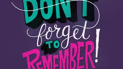
Create Style Through Shape & Word Connection
So now we're going to talk about cutting style through shape and word connections so as you saw in the last section we're illustrating the phrase stop doing that so to get my candace set up when I'm going to be drawing a little tighter and paying attention to more things I'm going to switch my my photo shop uh set up to full screen mode of many of our the reason I do this is that when I hold the space bar to switch to the hand we're moving my our border and I can have free rein to move this anywhere so what I'm rotating things I can move it around like this and just gives us a lot more flexibility with our art board so we're gonna go back to being a copy this basic framework that we created in the last round that I'm going to do and you layer I'm gonna pace that and then I'm gonna make this um bigger so that we're working very large and then I'm going to take that layer and I'm gonna bring the a pass it e way down so I just barely want to see it underneath what I'm doing so I can draw ...
on top of that to try to get a, um a little more detail so I want there to be a little more of a difference between these words between just a scale so I'm thinking that I'm going to do um doing in a stripped whether it so again staying very loose at this point still because I'm solving a lot of problems about how we're going to connect and how they're going to fit together so I'm just gonna write this pretty loosely I usually start with script that there's going to be multiple types of lettering in each composition so, um the reason I do that is there's more flexibility if I'm doing simple or letters like this than there are with script because there's these a sanders where the type is coming out on and the d sanders with the g is coming down and since I'm working with uppercase letters for the others, I don't really have to worry about that, so I have some flexibility so now I'm just gonna ride out these other letters still loose but tightening them up a little more just tryinto figure out this composition, I think this was kind of split out a little bit more I want there to be a little more balance, so going a little bit shorter on the first line in the tee toe tuck it under the other the first line in the h to tuck it under the tea and then I'm gonna go a little shorter on this tito account for that descend there, so once they get to this point, I'm going to turn off that other died later and look at what I have been kind of address what I'm doing so I'm keeping this still really simple I'm noticing that this has a little bit of an angle which I don't want so I could go in with the race or tool and kind of quickly figure out how I want this to work I want us to have a little bit more of a curve that kind of mimics that so I'm going to take this the layer and then I'm gonna bring the opacity down and do a new layer on top of that that you'll find I do this quite a bit it some you know it helps you to get the best possible composition if you just keep trying these quick little things since I'm not spending much time on them I have the flexibility to just keep going it's one of the benefits of working in photo shop because we can just keep adding layers back when he used to work analog I would have lots of stacks of tracing paper so this is a little more efficient so as I'm doing this I'm noticing this area right here there's a lot going on we get the bottom of the s and we got this d and I'm trying to figure out a way for this to feel little more cohesive so I'm thinking that maybe I can combine these two so maybe we loop this s around and bring that down until the d then maybe we can loop this g up a little more toe kind of wrap these two together so again still staying very loose and quick just tryingto get everything to flow right before I spend too much time trying to finesse things I think if we got the exclamation point last time it's very important you always want to use an exclamation point when you're saying stop doing that all right? So I think we're I think we're getting somewhere with this now we just need to kind of finesse it so again bringing the opacity way down as you'll notice we're starting to accumulate a lot of layers um and again, I've gone through this once before already, so I have that file in the bonus material with all of these separate layers I think I labeled them a little better for you so it's a little more confusing in their number, so I think I want this s toe just have a little bit more body to it. So I mean, I kind of bring the top of this s and then have it taper a little more and see if I can get this beautiful a little better thinking we might need tio do something with this s t combo is well, so maybe I'll tuck that ended or anything so again, this is really about experimenting and just playing around to try to get this tow kind of full a little better I'm shifting this up a little bit and maybe I'll skip that up until there and we can add a little uh, barrel into that to reference the stop of the doing so since we got a little more playful and stop maybe we can a little more playfulness with these layers and maybe make this exclamation point for more fun so I think we're getting somewhere at this point um I'm gonna try one more one more a little sketch to try to get this to fall a little better well actually I think adding some weight to the letters will be more beneficial here, so I'm going to try that I'm gonna start down with this because I want to make sure that this this line feels ok so what? I'm adding some weight to these letters I'm kind of just going in and filling somebody in I wanted to taper clinton mitt teo said that it um we can keep the thinner line wait with the script lettering so I'm starting wide on this ass and then slowly getting a little smaller and again, I'm not worrying about filling in any of these letters because I'm going to do that when I get to the the next phase or I used the inking brush, so I'm going to bring this p up when I add mad in this little bit of ah well, a little bit of a sarah toe kind of balance what's happening over here, the fact that then this is all coming out of a center point and kind of expanding out on each side um trying to make it a little more symmetrical. So now is it because I'm bringing more body to this expanded that that little loop at the top of the oto kind of fill that space on a little bit when you're doing script? It's ah, helpful to remember that on the upstroke you my letters to be thinner and then all the down stroke you want them to have a little more body which relates to how they were, um with calligraphy, how it's drawn with a brush so you're up strokes around the on a different part of the brush and then when you're coming down, you're getting the wider area it also helps live great ability. So I'm not worrying too much about my lines here because I know that I'm gonna be able to clean that up only further. So again, I'm just fattening up his letters I'm just using the underlying sketch is almost like a skeleton and I'm just adding some letter meat to it remember that letter meat is ah technical term, so you want to make note on that all right, so we've got a pretty good sketch right now. I think we will leave that there for this point.
Class Materials
bonus material with purchase
Ratings and Reviews
user-3a9318
This was very interesting. It would probably be best for beginners. It's always nice to see process. I feel very confident about jumping into lettering now.
a Creativelive Student
Love this class. I would like to see more like this class.