How to Make Letters Drip
Lesson 11 from: Illustrative Stylings: Lettering and More with PhotoshopChris Piascik
How to Make Letters Drip
Lesson 11 from: Illustrative Stylings: Lettering and More with PhotoshopChris Piascik
Lessons
Class Introduction
01:42 2How to Set Up
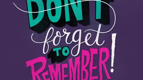
04:20 3Letter Styles
07:21 4How to Start with Lettering Basic
04:37 5Create Style Through Shape & Word Connection
10:31 6How to Get Creative w/ Script Lettering
12:08 7Tighten Your Composition
17:00 8How to Work Hand Lettering Into an Existing Design
05:29Lesson Info
How to Make Letters Drip
So now we're going to talk about how to make letters trip doing drippy letters is one of my favorite things to dio um I like to do it a lot with strips lettering because you could make some kind of gross connections where these things are make them nice and therapy so we're going to go back to this um stay we're drawing that we did earlier who make a drippy version of it so what I'm gonna do is take my um finished illustration I'm gonna make a new layer and then I'm gonna make that um almost transparent so that I can use that as a guide and just follow this guy to make my drippy letters so what I'm doing drippy letters I like to zoom in pretty tight because I want to get the lines toe um have some nice variety in them some fix and then so when I'm doing drippy letters I like to just get a smooth undulating shape and then start bringing in some trips so that's why I liked his him in quite a bit so just undulating this around and then every now and then I'll get a bigger trip in there wh...
en I have areas like this where it's hanging down I like to do some kind of cool drips there and tried over very the size of the drip so they feel more real than in sometimes I'll come up like this what I find that works well is when you're doing these lines like this to just get really light at the end and then it'll taper off push you again so as I get to the top, I'm just kind of very lately coming off and then it tapers smoothly because I get over here kind of just deciding every now and then where I want some drips and often skip around a little bit so this is kind of blowing back on itself sometimes it's fun to bring the drip over this connector like that? I think um for our purposes I'm gonna not have this gap between them because we're going to use actual lines so it was no amount to show where we're going um in a bit and just trying to get a little more of this asked them there then when you see it as a whole, they don't make a little more stands. I think you want to make sure you're keeping variety and like changer thick symptons more dramatically as you're doing these, which makes it look a little more believable tryingto change the way you do their ear trips maybe sometimes you have an extra little drips sometimes you don't know about variety and just kind of playing with them I like to try to go it really thin sometimes, so it's feels more kind of slimy when I'm doing drippy letters I'd try not to rotate my art board at all so that my drips are always pointing down um I found that if you try to rotate our board a little bit when you're doing these you kind of forget where the bottom is then you have like drips that air going sideways perpendicular which end up looking kind of odd so for some reason drawing droopy letters is one of my favorite things to dio you see many daily drawings or follow them and all you'll notice that there's a lot of trippi drawings just kind of fun to play around with them that kind of fun to color to which I'll say to make them look a little more real so I'm not going to do all of these for you and this time I'm just gonna do a couple letters and then we can and show you how to make them look a little better and again we're they're so silly drippy letter so you don't have to be they don't have to be perfect in any way because we're supposed to look like trippy blobs so once I get the letter like that I'll go in and try to do some in the middle so again I'll go very lately when I um first they're pushing it and then push a little heavier as they get to the bottom then come off the pressure lighter so there's a variety and the uh the line wait d'oh this w and then we can add some color to show you how to make them look a little more believable, and I mean, we're not we're clearly trying not trying to make realistic like slime letters, but we can still give them a little bit of dimension and find that balance between and a fun, playful semi kartini later on, when I show you some example of client projects, I have a poster that I did with really trippy letters, which is kind of fun. We'll give you an idea how this could be applied in a real world setting. All right, so I'm gonna go ahead and start working with some color here so we can see what these would actually look like when they're finished. I'm gonna turn off the layer below, so we're not getting distracted. Um, so gonna pick some colors will pick some slimy colors and sort of lettering looks like, slim. I'm gonna go ahead and fill the d s with that color, and I'm gonna do the the w in a different color so that because it was actually doing this as the final illustration, I'd want to separate the words a little bit so many is this gross pinky color, so when I'm doing the next part, I'm going to do a new layer. I'm going to set that layer in the later settings to multiply, and what this is going to do is going to let what's below show through. So on this later, I'm going to add some shadows underneath the drips to give a little more dimension when I'm doing shadows all often just pick a very light purple that's, something that I can use across the board on all colors because, um, the light purple is like a shadow color um, in the just the cool, the cool shade of purple is always good for shadows, and it helps give some contrast someone is human really tight when I'm doing this, when I get some drips on the screen and as you can see when where's I'm going really far my lens or not that clean, they're pretty they're pretty loose here. Um, so what I'm doing the shadows, I often make the brush a little bit bigger, and then I just kind of go in and follow these shapes, and I just get a little bigger towards the bottom and I try to taper them off and then get really thin towards the top, so I'm following the lines, but I'm keeping it with cement sometimes where there's an area like this all kind of going and outline that kind of born in this together. So we're basically just tracing the shapes but maybe extending them a little bit more on the bottom when I do um I have drips like this on the edge and that kind of tucks under I might go even further and maybe carrying over a little bit like this so it's not so so it doesn't look so formula formulaic then since we have this one that goes really far just fill in this whole area that kind of talk this under here sometimes that's when you have a big drift like this or like this it's nice to kind of give it a little shape I trace me outline a little bit so gives it a little more form doing this part was kind of ah have is like this part because it's kind of relaxing I'm not really worried about, um getting my letters right or anything it's just adding some nice finesse and subtle detail aiken county just zone out phillies and you can always, um do too much you can go in and simplify it. I'll often uh, bring the opacity of the weigh her down quite a bit afterwards, but I leave it nice and dark while I'm doing it so that I can see what I'm doing finally to do ah shadow around the area where they overlap so that we can get some good to mention between the two and then I'll just go in and do some more of those drippy lines on lee in the er in the shadow color should give it a little bit more depth zoom out and sometimes I want to get extra gross maybe I'll put some like little circles or something like a little google do bubbles so when I have very different colors like this um the shadow color can be maybe too dark on one and not the other so I'll go ahead and do another layer um to do the shadows on the other color just in case I want to have some more um variety and how dark they are on that color as you can see I like the shadow color here but I think it's a little too dark on the green so this gives me the flexibility of turning it down a little bit on the green but um keeping it a little punch here on the pink so then when we have connections like this all kind of and you bring that down a little more make it a little more dramatic that way it's not doesn't look like we're just outlining all of the drips again bringing this one down quite a bit we'll go in and some more of those just let a few more lines like the switch back and forth people too and maybe just doing like one drip and then some letter like too cool. So we'll zoom out, see how this was looking so I think the shadow on the green is too dark. Song was going to go ahead and turn that capacity down. I like the way it is on the pink, so we'll leave it there. The other thing I like to do to give this a little more shape has to do a new layer and then switch over to, um, wait. And then I'll just go in and find some key areas, maybe like on the top of bigger bubbles and just do like, a little little circle or two, maybe a big one. A little one. You just kind of finding areas to put these in just to give it a little little shine. Little crow scooper, uh, highlights it's, easy to go overboard with these, but sometimes overboard, this phone. I'm just kind of randomly putting this and finding places. Then when you see him out, because that a nice kind off gross tactile feel. So I'm gonna show you a skip ahead to show you, um, the finished piece here, there's, open it up for my files, which are included in your, um the downloads. So there's the finished composition for the drippy letters, which is a little different from one where you're doing just now, but same overall concept
Class Materials
bonus material with purchase
Ratings and Reviews
user-3a9318
This was very interesting. It would probably be best for beginners. It's always nice to see process. I feel very confident about jumping into lettering now.
a Creativelive Student
Love this class. I would like to see more like this class.