Tighten Your Composition
Lesson 7 from: Illustrative Stylings: Lettering and More with PhotoshopChris Piascik
Tighten Your Composition
Lesson 7 from: Illustrative Stylings: Lettering and More with PhotoshopChris Piascik
Lesson Info
7. Tighten Your Composition
Lessons
Class Introduction
01:42 2How to Set Up
04:20 3Letter Styles
07:21 4How to Start with Lettering Basic
04:37 5Create Style Through Shape & Word Connection
10:31 6How to Get Creative w/ Script Lettering
12:08 7Tighten Your Composition
17:00 8How to Work Hand Lettering Into an Existing Design
05:29Lesson Info
Tighten Your Composition
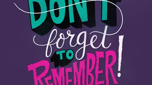
Ok so we've got our sketch here and now we're going to start tightening up our composition so the first thing I'm gonna want to do is make this sketch as big a czar because the space we want it to be so for our purposes I'm going to make it you know nice and big in the center of our report so I bring the capacity down low enough that I can see it never make a new layer that I'm gonna use as my thinking layer an ominous switch um to a different brush from this pencil one that I've been working with I want to make sure we have russia selected and then you'll see in your tool presets window um if you don't have it up here you can find it under windows so tool presets allows us to pick a different brush so again this set from kyle t webster has a lot of options but I keep it pretty simple and lo fi here one of the ones that I like to think with a lot is too smooth to be forgotten um I think I used this one mainly because it is easy to find because it starts with a number and it's got a goo...
d name there were no making I usually we'll switch to black um helps with some visibility when I'm looking over the sketch and then I'm gonna zoom in pretty tight at this point so you'll see this brush has a little bit of shape to and it's not perfectly around and it's got pretty good pressure sensitivity so that I can get some thicker and thinner lines which isn't necessarily as important for this cause I'm outlining my script and filling it in it still helps us with their curbs so I'm gonna start um down here you can kind of start anywhere but I liketo start somewhere where I can have a long continuous flow when you're doing script you kind of want to try toe keep your lines relatively straight though don't be worried about any kind of imperfection because again that's what we want with him later and we don't want this to be perfect so it was him in pretty tight but I'm gonna start right down here in the middle of this letter and then try to adjust bring this line over I think my that brush is a little bigger than I want it to be right now someone got a little smaller that way you have more room for flexibility so they bring that line down the reason why I started in the middle is because sometimes it's hard to get a smooth connection um with where airlines are so if you start in the middle of one of the shapes sees era start up again without having a weird transition so what I'm gonna do is grab this line bring that down so one of the reasons why a is this fancy glove right here is because, um, what I'm trying to do these long, continuous lines that allows me to smooth flied smoothly across the glass and into being more important when you're working on I sometimes work when I'm in my home office, I worked on a bigger sin take the twenty four inch and I have more room to slide around it's not as much of an issue when you're working on a smaller screen with this, and if you're just using a regular tablet, you won't really have the issue because you don't have the glass from the display, so I, as you see, I'm rose, hitting my canvas around quite a bit, which is just hold down the are you can rotate it again. You won't really have this issue if you're working with a regular tablet because you can just move the tablet around. But if you do like to keep your table in a static position, you can you can definitely use that option. So the good thing about when you're outlining and if you get us a rough line like I just did, you can kind of go in and touch it up a little bit because we're gonna be feeling this and afterwards. Then I'll keep like going over lines if they're not perfect and I'm kind of just rotating the candidates around to try to get or it's easiest to make a smooth line from and one of the beauties of photo shop is you can zoom way in and kind of keep doing it until you get it right you can experiment with different brush sizes sometimes it's easier to he's a bigger brush to get smoother loans we can always go in and erased polices if we want to smooth out our lines a little bit so once I get a little further I'm gonna finish the's lined out and again in the bonus material there's a working file for this or I have part of this completed that you can follow along on again the good thing is a few don't get a line perfect you can always undo it and then try to get which I often do a lot um I think I'm going a little quicker here not worrying too much about pure perfection, but if I need something to be especially tight for some reason often we do the warrant for example, there that tapered a little too sharply so just undo that and then try it again okay, so I'm gonna close this w up there um anthony is the key command a lot, which is just the crop tool, but it reese enters the screen for me and then I'll just switch back, so since I have these letters outlined, it was going to go in and use the paint bucket and fill those in, and you can kind of see what's happening, um, filling them and allows me to see areas like up here, we're kind of dense and a little bit on down here that could be smoothed out, so then I'll zoom back in smooth that out a little bit smooth, and then sometimes, if it's actually coming out to further mind, we're both kind of intense, but right here, you can see there's, that little chunk that sticks out and you might see this any that might be something desirable, having a little kind of lump like that if there is a lot of them are, but if you do want it smooth, there, you can go on with the eraser and just smooth so again, it's all about kind of experimenting with what angle you can draw your best lines for me while I'm doing this when I usedto work with paper out, always, we flip in the shed around so it's kind of the same thing here, so I'm feeling in this tea ahead of time right now because I want to check this angle up here. So you could make the decision when you're doing it, see if you just wanted to go straight across, I wanted to have a little bit of an angle toe flow with this composition, so I think right now, it's a little too flat, I wanted toe kind of mimic this angle that we're getting here, so I'm gonna go in and bring that up a little bit, adding little details like this will really make your composition come together and flow better, so see how that it's almost like we're matching the baseline with that angle there. So just continuing thinking about my wider down strokes, thinner up strokes, the script that we're working on here is, um, pretty dramatic between the fix, some things gives it some character when I'm doing this, why I'm going to think about the same thing that I did for that tea and have the ends of these match that same angle, so we're trading cohesion between all of our letter so that they feel like a set together, so I'm just I've only it now and then we may resume and will be able to see if it's pretty accurate if I wanted to, I could kind of copy and paste that that tip, but, um, I don't want it to be too perfect, and I like to have each letter have its own unique character. Sometimes when you have repeated letters, you could copy and paste them, but I like to draw them individually so that it's clear that there's um, some distinction some people wonder, well, there's, lots of hand lettering, typefaces can't we just use those? And one of the reasons that they don't work that well is they end up looking kind of goofy when you have a word with multiples of the same letters and it's very clear that they were all the same letter, so it makes it obvious that it wasn't handled like in both letters have the exact same imperfection, so I like to go even thinner on these connecting lines because they're not really part of the letter, so I think I'm not going to do this full phrase because I'm doing kind of the same thing, and it showed you all the main points I'm going to show you one thing that I do like to d'oh, um, when I'm working with script, that kind of adds a little dimension to it. What I like to do is, um, go in and break the lines where these connections are, so what I'm doing that I will, um you could do it with the eraser, I like to do it with the brush just cause there's more flexibility for me I think you could make like custom rushes for the eraser that would work well but this is the way I do it so I switched my brush to white and then I go in and I go over these lines right here where they connect so when I'm doing them I kind of think about where what the letter is that it is there and try to emphasize that so here I could go over here but I'm gonna do these lines that go across so that we can emphasize the yes the fact that we're doing connections off both ends of this you know could make it a little challenging to read so I'd like to emphasize though the letter s by not compromise to get more by having the w overlap over the top so by doing this line we're really emphasizing the shape of the s this is also a good time to help smooth out your lines to you can come back in make sure the angles are right as you can see it kind of adds a nice dimension to it with the overlapping letters sometimes I'll do it with the uh but the tea as well so as you'll notice that I just had this happen so I switched to the crop too a lot just to get centered so I can look at it and then I was trying to use the rotate and um wasn't working for may undo breaking everything. Okay, so you want to make sure you're back on the rush tool, and then when you rotate, it will stay there for you. So if you find that happening, just make sure that you're on the brush tool, and again, I keep hitting be to go back to the breast tool. So even though it's not really a connector, sometimes I'll do that same thing with the tea just add dimension, then later on, when I go in and add color, sometimes I'd like a little darker tone over there so that we can, so it really enhances the democrat dimensional aspects that were working for and as you can see, him kind of smoothing out this, it was like a lumpy shape here, and I want to get rid of that's really my city when you have the way brush. All right, so I think that's, as far as I'm going to go for this, I think if you kind of get the gist of it, they could just be tedious end up watching me do all these because I'd be just doing the same thing over and over again. So that's, really how you start to tighten up your composition before he moved to color, so since I'm not going to finish this here. I'm going to skip ahead and show you what this would look like. Finished the one that I'm gonna show you, finish this slightly different it's, one that I did for the working file that you can download from the bonus materials. But it will give you an idea for what we're doing is just slightly different since I did this one from scratch here. So this is how it looks in it. This is finished where I use the wait for all the connectors, and, um, yeah, so that's basically it before I would get to color.
Class Materials
bonus material with purchase
Ratings and Reviews
user-3a9318
This was very interesting. It would probably be best for beginners. It's always nice to see process. I feel very confident about jumping into lettering now.
a Creativelive Student
Love this class. I would like to see more like this class.