Lesson Info
26. Simple Lightroom Workflow
Summary (Generated from Transcript)
In this lesson, the instructor discusses the editing process in Lightroom for engagement photography. He explains the importance of culling and only keeping the best images to deliver a high-quality experience to clients. He also demonstrates various editing techniques, such as adjusting exposure and tone curves, adding split toning, and using local adjustments. The instructor emphasizes the importance of processing images to a 90% level of perfection, as most clients cannot discern beyond that.
Q&A:
Why is it important to cull and only keep the best images for delivery?
Keeping only the best images ensures a high-quality experience for clients and avoids delivering mediocre images.
What is the difference between editing in the library module and the develop module in Lightroom?
Editing in the library module allows for faster scrolling between images, while editing in the develop module provides more precise adjustments.
How can the tone curve be used to adjust exposure and color in an image?
The tone curve can be used to adjust exposure by targeting specific tonal ranges and pulling them up or down. It can also be used to selectively adjust colors by adding or reducing certain color tones in the image.
What is the purpose of split toning in Lightroom?
Split toning adds different colors to the highlights and shadows of an image to create a specific look or feel.
Why is it recommended to process images to a 90% level of perfection?
Most clients cannot discern the difference beyond 80%, so spending excessive time on perfection beyond 90% is not necessary.
Lessons
Class Introduction
12:56 2Posing Guidance for Him
08:14 3Posing Guidance for Her
09:02 4Foundational Posing
05:11 5Posing Touch Points
05:55 6Couples Body Language
09:52 7Posing Three Point Check
05:22 8Posing Tips with Demo
08:05Verbal Cues for Posing
06:27 10Mood Board Tips
06:59 11Posing Questions
06:54 12Camera Settings Quick Overview
18:32 13Location Scouting
02:24 14Seeing the Light
17:34 15Shoot: Natural Light in Studio
14:50 16Homemade Soft Box
12:43 17Shoot: Wrapping Natural Light Around Couple
10:56 18Shoot: Flat Natural Light
06:24 19Special Effects Intro
09:13 20Shoot: Backlighting
18:07 21Shoot: Using Sparklers
09:59 22Shoot: Sparklers and Spray Bottle
13:01 23Shoot: Backlight with ND Filter
12:38 24High Speed Sync vs ND
04:27 25Shoot: Fog and Spray Effects
15:28 26Simple Lightroom Workflow
25:10 27Processing Black and White Images
16:50 28Culling and Presets
09:34 29Editing Using Presets
13:04 30Post Processing Q&A
05:46 31Flash + Ambient Balance
13:25 32Photographers Need to Practice
09:00 33Outdoor Engagement Location Scouting
12:22 34Meeting the Clients
11:27 35Basic Engagement Shots
16:59 36Getting into the Creative Shots
17:43 37Using Photo Mechanic to Cull
12:41 38Culled Edits in Lightroom
17:25 39Editing After Using Tilt Shift Lens
22:05 40Photoshop Editing for Print
23:34 41Engagement University Shot
21:35 42Daylight + Flash
23:44 43Engagement Picnic Scene
19:42 44Composite Street Shot
10:47 45Day For Night Engagement Shot
06:27 46Natural Flash/Bounce
04:10 47How to Make GIFs
17:22 48Simple Composite - University
09:38 49Intermediate Composite - Downtown
18:40 50Simple Background with Reflector
17:05 51Final Thoughts
10:53Lesson Info
Simple Lightroom Workflow
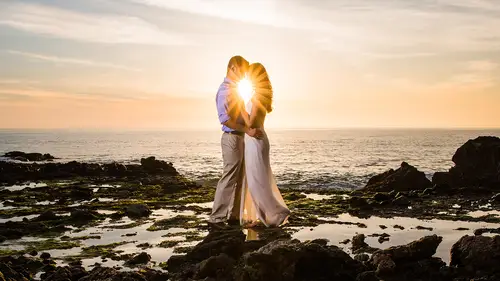
So let's get started. We took about 200 images, which is not bad. So what we're gonna do is just do some basic editing. If you guys have, you know, questions about, what we're doing on the editing side, why we're doing it, be sure to ask. Same thing if we have ... Actually there was one question that Steve brought up during the break that I thought was a really good question. Do you guys have a mic? Yeah, I was gonna ask before we went to the break, when you're using the neutral density filters, I have graduated neutral density filters and the neutral density side will cover the whole lens. Is that good enough, or should I get the full neutral density filter? Yeah, so basically, you want the full ND, because any graduated, even if you don't really see the shift, is basically shifting from darker to lighter, so if you use that to cover the lens, you're actually gonna have a shifted graduation in the tones, you want to get a full ND. You could use that still for special effects and t...
ry it out and see how it works, but it's gonna darken down, then lighten up, you know, depending on how you're holding it. So full ND for all the stuff that we're doing over here. But for landscape stuff, the graduated is fantastic. So, let's do some post production. Okay, so let's take a look at some of these images. I'm gonna go ahead, I have my presets over here on the left side, and I'm gonna give y'all a little heads up here. This is not my working computer, and, this is just my tether station, so if I'm a little bit slow and clunky, it's because I'm usually on my big PC and my keys are all in different places. But let's go through, and what I want to talk about first is kind of the editing and culling process. Obviously this isn't, like, a full shoot. We'll talk more about this tomorrow when we actually get to demonstrate like full shoots and what goes into the catalog and what we end up keeping. But our main kind of rule of thumb here is that every image needs to be better than the last image. The more that you keep, the more we need to make sure is that good, because as soon as you get a mediocre image in your delivery, you kind of get a different, a very different client experience. For example, if you gave me 10 amazing images, my kind of impression would be oh my gosh, amazing, amazing, amazing, amazing, you are the most incredible person in the world. That's amazing, right? Okay. So, if you only give me, let's say you give me like, 30 images, but it's like 10 amazing ones and 20 like, average and maybe five that are not so good, my impression of you as a photographer completely changes. Correct? It's, oh, that one was good, that one's good, oh, great, that one's fantastic, and then when you talk to them they go, "I really like some of the images," and that's like the worst compliment that we could possibly get. "I liked some of the images" is not what we're going for. So the first rule is, as photographers, we generally want to keep a lot more than we probably should, and so, we want to crop, or cut things out. So when we do our culling, we're generally doing all of that from the library module. The reason why is inside of Lightroom, if I press F5, I've gotta press Function F5 on this thing. There we go. So if I press F5 it brings up my modules over here. Oh, there's a little lag in this, okay. So if I press the develop module, when we go into develop view, we're actually loading a different set of previews right now than the library module was. So as we move from image to image, you're gonna see lag time, as we go from shot to shot, as it's loading the library, or the develop preview. If you cull in the library module, then you'll notice that the scrolling between images is much much quicker and we don't get those loading issues. So always do your culling from library. Do your editing from the develop module. All right, let's pick an image that I might deliver. I like this one, the issue with this is, granted, you know, we're on stage and so we're shooting quick, want to get through a lot of stuff. When I shot this, the first thing I go is, I don't like cropping at the forehead when I can't see his hair. I don't mind cropping his head off if I can see the hair. If you crop his head off where you can't see hair, you just assume like he could be a bald person, right? I want to at least have some hair. This is nice, this is cute. So let's take this into the develop module. Now, what we are, our style, I'm gonna show you everything kind of from our style and our approach to editing, and so our style is a little bit more on the soft side. I'm gonna turn, let me just go fullscreen too so you guys have a better view. We like to go, you know, we're not very grungy, like, editorial like that kind of stuff. Our style is very modern, soft, colorful, vibrant, that kind of look. So, I'm gonna produce in that style, but, just take the tips and stuff and apply it to whatever you're doing. So one of the best ways to, you'll notice that we actually have highlights on the skin. This is just because we haven't, the skin, let me set my zoom. Actually, we're good. Okay, so the skin, you can see those strong highlights on the forehead. This is just because the light that's being used is, remember, a little bit specular, so we have a little bit of specularity in the light, and so it's catching and bouncing back. So we can combat that in post pretty easily. Let me bring back my fit view right there. I'm pressing Tab, by the way, to open up the left and right panels you just press Tab, or you can use the function F5 through F8. I do so many Lightroom tutorials, it just makes sense that I spout off hotkeys. It's just normal for me, guys. All right, so what we're gonna do, though, is I'm gonna pull down on the highlights a bit. So what we have is, let me show you guys this cool trick. Do you guys know that your histogram, so this histogram is really important to us, right? We not only use it in camera, we can use it in post too, and we can actually see and adjust things or understand how the develop module works better by just simply understanding that histogram. You notice that when I mouse over this, it actually tells me what section of the image I'm editing. Right, we always tell people in our studio that editing is one of the best ways to learn photography because you learn so much about what can be done to an image as well as how the image, like, what are the components that make up an image? To have an image that has good contrast, we need some pure blacks, some pure whites, if you want contrast, if you want a nice vibrant image. If you want a flat image, like you want that filmic look, you mute the highlights and the shadows. But we're gonna go first, for kind of that contrast look. So I can actually not only adjust this by going down on the sliders over here, I can pull it down, I can also drag directly from the histogram, so if I say I want my highlights pulled down a little bit, I can go right there and pull down. I can go to my whites and pull down the whites. I can go to the shadows and pull up in the blacks and I can pull up in the shadows, to open up the image. And you notice it makes the corresponding adjustments directly down here, which is kind of nice, because maybe you like to edit more visually. But what we're essentially doing right now is we're pulling down a little bit of the highlights. I'm gonna show you just the before and after that so you can see how it softens up the highlights in the skin. We want to be sure not to go too far with this because if you go to far with that adjustment, it makes the transitions on the face look unnatural. So I'm gonna hold down Alt or Option, I'm gonna reset the tone just to get it back. I'm gonna manually adjust. So I'm gonna leave the highlights where they're at. I'm actually gonna pull down the whites, because what I want to do is get that highlight that's kind of on the forehead pulled down a little bit closer to the skin tones. We're gonna leave the other stuff. I'm also gonna bring up the shadows a little bit so this is the midtones, and we're gonna bring down the blacks. This is adding our contrast in. One of the big things is, we don't use contrast to add contrast to our images. That's kind of a studio policy, because contrast is a very heavy-handed slider. When you pull it up and when you pull it down, it's making adjustments globally and so we don't have control of what it's doing with contrast, so we leave that for the very end. I love post production, it's just like eyes glazes over, like, during the whole ... I'd so much rather just ... be doing this into one camera right there, in like my little dark corner of my room, and just let you guys watch it later on. Too bad. Too bad, all right. It's all right. So with that dialed in, what we're gonna do now is adjust clarity lower. So clarity is what gives us that, we call it midtone contrast, okay, so, if we pump clarity up, watch what happens to the histogram. This is one of the coolest things about post production, guys, that you can see what the histogram is doing live. So look at the histogram. Do you see how it cranks up all the midtone contrast? And what that's doing is, contrast, this is kind of a cool thing, contrast is created by pulling apart midtones. So for example, as we shift midtones towards the highlight, what side are you guys on? This is the shadow side, huh, of your side, the left side. Yeah, okay. So as we pull into the shadows and we pull apart into the highlights and we separate those two things, we create contrast. So when you pump clarity up, it's doing that. It's pulling everything apart and bumping up your midtones and you get this, this is kind of that HDR look, right? The HDR grungy, kind of street portrait look, which is a style, and I'm not, I'm not gonna say anything about styles. I think there's a client for every type of style. It's just not our kind of thing. Usually what we're doing is we're dropping. Now if you drop too far, you mute midtones, and you get ghosts. That's kind of cool, let's just call it good right now. Let's just, we're done. (laughter) Kenna's like, uh ... So what we like to do is actually lower midtone, the clarity just by a little bit. And the effect that this has with those adjustments that have been made so far is you notice that we just have a softening effect. Do you guys see that subtle softening effect over the image? And everything looks a little bit more pleasing and just kind of gradual. Okay, so we usually work from largest adjustments down to small adjustments, meaning that, when we see an image, we target the biggest adjustment first. If your exposure is down here, there's no sense in going in and adjusting your temperature first. Because you can't get to the right temperature without the exposure being somewhat correct. So start from the largest adjustments, so that way the amount of going back and forth between sliders is a little bit minimized. And then what I'm gonna do now is, let's go ahead and, my vibrance and saturation, those are fine. I think my temperature is actually fine for right now. We can see what it would look like a little bit if it was cooled down a little bit. I might leave it just on lightly, slightly cooler side, so let's go like to 49 hundred. This is all to taste, right? Temperature to taste. You're like a chef, a chef of post production. Okay, let's keep going down, we have our tone curve. So what I want to do now is demonstrate how the tone curve is now your second form of base tone adjustments. So if you think about Lightroom as a layered approach, that's the way that we designed the presets, is they're designed from a layered approach so you can add one thing to the next to make adjustments to your image. But whether you're using presets or not, it's still the same thing. So, looking at a tone curve, everybody looks at tone curves and you're like, I hate the tone curve! It looks somewhat like something that I used to do in middle school. If you're smart. I didn't get there til high school. Just saying. But it looks like math, right? But it's actually not too crazy to understand. We have the same thing. If you look at the underlying image, it's the histogram. So the histogram is right there. All we need to do with the tone curve is the same thing that we would do visually up here in this histogram. If I want more shadows, I'm gonna click at a point, pull it down so I add shadows. If I want more midtones, pull it up in the midtones, add midtones. If I want less highlights, pull it up down in the highlights. We can pull down the whites. Okay, and you can sit there and tweak back and forth, oops. To get to the look that you want with your image. So what this did was, we muted a little bit more of the, and the cool thing about it is it's very targeted. Up here we have four sliders. Down here, we can create as many points on that curve as we want. Now granted, you don't want to go too crazy. Like, as soon as you start pulling things too far, you get very funky tonal transitions. So let me just press Control + Z to undo that. But this is that second layer of exposure because if, if I wanted to, I could hold down Alt, or actually I'm just gonna right-click and click flatten the curve. I could adjust my exposure from this, right? The same way that I would above. We know that the exposure slider up here adjusts midtones, correct? If I to here, midtones, and just pull, so they're not the exact same thing. So the cool thing about this is that we now have a second level of control and to remove a point, you just double-click the point. And it pops off. The one thing I want to mention with this is don't edit via the tone curve with the region curve. There's two little options right here. If you click on this little bottom option right there, click to edit point curve, it gives you a fully editable tone curve. If you have it selected, and I think it's by default when you install Lightroom, this is the view that you see. We can only add points and adjust in these regions basically. So it's much less flexible, much less useful than the full curve. Okay, so I'm just gonna go back, and then, actually, I need to reset that out first. Reset all. And then go back. This is the other cool part. Starting with Lightroom 5, I think it was, they broke out the RGBs in your tone curve. And this is another weird, wonky thing that we kind of freak out about. But all it is is we can choose to see just the reds and adjust just the reds, the greens and adjust just the greens, and the blues and adjust just the blues. Which means if I want to add blues in the shadows, have you guys heard of split toning? Like, split toning or like, cross processing, that kind of stuff? A lot of times those effects, I mean, they're created, I know all the film guys out there are like, don't talk about this stuff, it's ... I know this isn't technically accurate but basically, a cross processed image generally will have like tonal values, like blue tones in the shadows. They'll have yellow tones up in the highlights. It'll have funky tones because of the different chemicals they're using to basically cross, you're taking one film, you're processing it in a different type of chemical that's not designed for that film, so you get these wonky colors. We can create that with our tone curve. If you want a blue yellow split tone look, you just grab the blues, and if you hold down Shift with any of these adjustments it'll, it'll constrain your pen to go up and down or left and right only. So I can add blues there. I can pull the blues down in the highlights so now what I've done is, I've revealed more blues in the shadows than in the highlights. And so we'll get these bluish tones like in all those dark areas, and that can go actually in the reds. I can say, give me more reds in the highlights, and give me less reds in the shadows. And you, this is, you'll notice that it's creating a cross, right? Your reds are up in the highlights and down in the shadows. Your blues are up in the shadows and down in the highlights. Cross processing. Let's reset this out. Flatten the curve and we've gotta go flatten all of it. Okay, flatten curve. And did it change the grids? Flatten curve, okay. All back to normal. So, let's keep going down. Now, the HSL is one of my favorite areas to tweak because we have a lot of control over HSL and one of the things that I would probably do in this image is, the red brick in the background is a little bit strong for me. So what I might do is jump over to saturation and the cool thing about this is hue changes color, saturation changes the color saturation, luminous changes the brightness. So rather than tweak these sliders, just take this little pinpoint, drag it over whatever you want to adjust, and just click it and then start pulling up or down, okay? Now, I don't want to lose the awesome fieriness of his beard so I'm gonna go down in the oranges and reds here, and we're gonna add it back later on. Let's go into our split toning, and this is, this will blow your mind. Okay, I don't think anything post production blows people's minds, that's all right. It'll be cool. Yeah, it'll be cool. One of the things that we like to do to create a more polished look to an image is we'll add a little bit of highlights, so split toning is, I'm showing you guys all these things because if you think about it, your tone curve can now not only control exposure and everything else, so it can stack with all your base tones, but it can also control color. And now your split tones control color, and your HSL and luminance and, and the other guy, that can control color, your hue. So we're adding like, we have like three to four to five different ways of controlling color in an image, so when you want to fine-tune, you have a lot of power there to do so. What we like to do often, and we'll build this into like presets, is we'll actually add a little bit of hue to warm it up, a little bit of a highlight, so what this does is we're actually applying yellows and oranges over the highlights. We can choose to add that same color. If we want to add a different, slightly, you know, less orange color, we want to add blues even, or whatever we want to do, we can add a different color to the shadows. So pick whatever floats your boat, and then what we do is we give it a little bit of a highlight bias so it's for the skin tones. And if you watch, when I click this on and off, this is a very subtle transition and you might have a hard time seeing it from the Internet and your screen. Just do this on your computer. What you're gonna see is, the blue tones that were present in the skin have now been replaced by warm tones, and so it has this effect of warming and polishing off the image, without actually having to go and, like, try and match skin tones and all that kind of stuff, so it's, it's a fantastic subtle tweak that's gonna make your images look a little bit more polished. So we'll actually keep things a tiny bit cooler in the temperature and then add split toning so it applies across all the, the highlights. Okay, and then with detail. Let's zoom into an area of focus. This is kind of a softer image, which is totally fine. Totally fine with me, I'm all right with that. All right, and we're just gonna bring up our amount, our radius, and this is the trick to sharpening is, if you don't wanna sharpen pores, you turn up the masking and the cool trick here is that if you hold down Alt or Option when you click this and you drag, it's actually gonna show you the layer mask that's being applied to the image. So wherever there's black, it's concealing the sharpening effect. Wherever there's white, it's revealing the sharpening effect. So you'll notice that when we pull it up to about 80-ish, 70 to 80, we're only sharpening the kind of, larger details in our photograph, so the fine pores don't get sharpened. Okay, we always usually add a, always usually. Let me be less specific. (laughter) We generally will add about 15 noise reduction to all the images that we process because at 15, it doesn't really affect hair much. Like, this is already a pretty soft image when you're looking at it, but what it does is over the skin tones, it really softens up the skin. A little bit, so just the pores, it kind of does a really nice job, it's really nice and flattering. Okay, now let's do some cool stuff. All right, so what we're gonna do now is, I'm gonna go back to may HSL. We're gonna grab our saturation, I'm gonna just turn down the saturation of the, the bricks a little bit more, and not worry about his beard yet. I'm gonna grab a radial filter, and we have, inside the presets, we have a bunch of different presets. I'm gonna select a preset, but if you're, obviously, on the left side if I choose these presets, it's hard for you guys to follow along. On the right side, if I choose a preset, you guys can pause the video at any point and then just dial in the settings and save it out as a preset, so that way you have it. It's just a little bit quicker than us going through and manually doing this. What I like to do is pull in a burn like right around the face, just to subtly bring in, this is a .5 exposure burn, it just brings in the attention into the center of the image a little bit more. It kind of reduces the distraction of like the, the bricks and all that kind of stuff. And then to fix his beard, I'm gonna go over here with a brush, and we'll just do this manually, so what we're just gonna do is pump back up the saturation. Okay. And we're just gonna do it right over the beard. Mm-hmm. Let's get that red fiery beard back. He wouldn't like me muting his beard. He worked hard for that. Oh, and it did an exposure burn too, so let me take that off. Actually, I kind of like the little darker, a little more, that's nice. Okay, holding down Alt or Option you can paint it off wherever you need to, so, if you need to adjust, and by the way, his beard is like on fire there, so if you want to take it down a little bit, you totally can, just, a cool little trick here is hold down Alt or Option over any adjustment pin, once you've dialed in a setting, and then drag to the left or the right. You can see that it automatically strengthens or reduces the strength of an adjustment incrementally. Cool, so you can kind of decide where you like it. So we gotta go for this look, so we kind of take it and just go for a nice little subtle soft look and then we might go back and revisit the temperature, warm it up just a little bit, and call that good. Usually an image like this, we probably process as black and white, because there's not a whole lot of awesome color in the photograph to begin with. The black and white works very well with that timeless look. And it's very romantic, it kind of has that feel, so. I want to do that, actually. Let's do a different image, though. So let's actually look at, oh, and by the way, once we've gotten one of these things dialed in, with radial adjustments, it's a little bit tweaky. What we generally would do is kind of, when you're shooting, usually you're shooting a batch of images with a similar composition, then you're adjusting your composition and you're moving and you're doing those kind of things. You're not generally like, shooting, flipping, moving, like with every single shot. So what we do is we dial something in like this. We have, let's say we have our selects in here. So let's say we're keeping that guy. I'm gonna mark it with P to flag it. I'm gonna keep this guy. I like, I like big laughs, but sometimes big laughs aren't flattering, so I try and keep the ones that are kind of really flattering and cute. This one's really cute. Okay, that one's cute, too. You can see his smile, too. All right, so let's say we have those three images selected now. If I turn this on so we can see them flagged. So this is how we will generally shoot, so you'll notice that we get like four or five images that have kind of a similar composition. If we want to deliver a set of them, we're just gonna grab these, hold down Shift, left-click, Control + Shift + S, and it brings up your synchronized settings, or Command + Shift + S if you're on a Mac. And then, because they're in the same position, you could actually select Check All. We haven't changed any crop. We haven't changed anything else. They're in the same position, so our, our local adjustments that we've applied will still be in the same place. So you'll notice that with each one of these images, it drops in correctly over each of them. That make sense? If it doesn't, if you've made cropping adjustments, local adjustments, here's the sync settings that we will do. So we just turn off local adjustments. We would turn off cropping. Spot removal, because generally spot removal is gonna be on an image per image basis, okay? Lens corrections, we usually leave this off. There's not a reason once you've, we usually will apply all of our lens corrections or anything that we need, chromatic aberration, that comes in with the import when we apply a preset. So we're not usually including it, but if you want to, you could potentially include it. But that's usually left off, and the rest we will leave on. So if you screenshot this, this is our setting for copying basically all of our global adjustments to another image without taking in the, the screenshot, or the local adjustments. All right. Yes. I do have a question for you from Allen the architect. Can you just repeat the thing you, when you talked about split toning, where you said you were changing the blues to something warmer, was that in the shadows? Yeah, effective split toning is, it's really hard to describe, but basically what's happening is, is with split toning, you're adding whatever color value you select here. You're adding that to the highlights, and whatever color value you select here, you're adding that to the shadows. So what we do is if we add a little bit of warming tones to the highlights, generally, like, under these, where these highlights are in the skin ... Did you guys, are you guys able to see that shift when I turn this on and off? I can see it on my side, can you guys see that shift? You're gonna see a subtle amount of, especially in the highlights, you'll see a subtle amount of blues and kind of like those kind of off tones a little bit. By adding a little bit of color into the highlights, it basically will bring them closer to the skin tones, so, it has this look of kind of polishing the image a little bit more like as if we took it into Photoshop and we did a little bit of brushing kind of over the highlights and that kind of stuff, without actually doing that. So it's a nice way of getting a tiny bit of warmth and polish into the image, quickly, over a whole set of images, and that's kind of, as wedding and engagement photographers, we're generally, you know, we're working on hundreds of images at a time. We're not processing one or two and so we need to keep everything fairly quick and we process for kind of the 90/10 rule. You know, you process to 90%. Most clients can't see anything past 80%. Like 80%, your 80% is a client's hundred percent. So if you process to your 90, that's already much better than their eye can differentiate. When you start going beyond that and start going to like that level of perfection, nobody can tell the difference, and so you're spending, you know the, have you guys heard of like the law of diminishing returns type thing? Like, you spend, to get to 90, you know, to get to 90%, maybe it takes 30 seconds. To get from 90 to 99%, it takes 10 minutes. So, and if you can't see that difference, there's not really a point of going there. So, that's what we're looking at. But yeah, split toning is pretty fantastic for that. So, we're actually gonna be doing an update to the presets an incorporating that into some of the import presets so that it's in there.
Class Materials
Bonus Materials with Purchase
Ratings and Reviews
CPR Photography
I think Pye Jirsa is one of the best, if not the best, instructor for photography on Creative Live. He is very personable, smart and approachable. He has a perfect blend of personality (comments, laughs, tangents..) to the amount of instruction. He asks the questions for you, because he knows you are thinking those questions right then. He's very good about identifying settings, gear, etc.. and not leaving us in the dark about how he "got the shot". He goes into great detail. His instructions flow, but are linear, which is helpful. He's very organized, and you can tell that he really put a lot of work into his presentations (slides, video, test shoots, live teaching, graphics, etc..) I have been listening to him for like 10 hours straight, and still haven't gotten tired of him. He keeps things moving, He's very funny too. Nice job, I've learned so much. :)
a Creativelive Student
This course was AMAZING. I'd say int he past year or two I've fallen into a slump. Uninspired by my surroundings and uninspired by my clients. As a result, it showed through my work. My posing suffered as well and more than a handful of times some of my shoots became more than awkward. Then I bought this course and watched most of it in the course of a day. I walked away inspired, blown away, and renewed. The next day I walked into an engagement session confident. I gave my couples a quick overview on posing and then we just had fun in front of the camera. Immediately afterwards they texted me about how amazing their shoot was and how relaxed I made them feel about posing. The photos turned out fantastic to say the least. I've since shot several more engagement sessions and each one of them has been amazing. If anything, this course should inspire photographers to think outside the box and provide you with the necessary skills to take incredible engagement photos. Thank you Pye and Creative Live! I cannot speak more highly of this course. I should also state I purchased Pye's Natural Light course on SLR Lounge: this course is a wonderful addition to that. If you already own the natural light course and are hesitant about purchasing this one, don't. Buy it and reap the benefits!
Lisy
This is by far one of the best courses I have taken. Pye makes learning fun and easy to understand. I feel like I have learned so much throughout the course, that I have truly advanced my photography skills. I am so excited to get out there and try so many of the techniques that he showed. I would love to take another course of his. The pricing for the course doesn't even compare to how wonderful the education truly is, I really got more than my money's worth on this one.
Student Work
Related Classes
Portrait Photography