Embellishments and Finishing the Menu
Lesson 9 from: InDesign Typesetting: Design a Restaurant MenuMichael Stinson
Embellishments and Finishing the Menu
Lesson 9 from: InDesign Typesetting: Design a Restaurant MenuMichael Stinson
Lesson Info
9. Embellishments and Finishing the Menu
Lessons
Lesson Info
Embellishments and Finishing the Menu
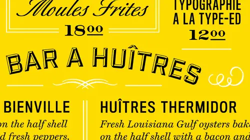
So right now I have you know how some stock embellishments and ornaments in here and you know, I'm looking at to see what I can use you know, for these so for now um I have a pre set you know, choice here but I have a lot in here the we can choose from of whatever kind of relevant to what's going to work with the brand and the french think so in my menu I want to go back and look to see what they've used in the branding already and they've got these kind of marks in here so they have some dots going on so that's great the dots work makes sense so I may want to pick this up in little sprinkle it through the layout so everything's kind of connected you know somewhat again so the ones that I have I've kind of pulled out aside the ones that I'm using here or not I don't know what this is so I just have a few I'm gonna work with I'm gonna pull these in its place him you know where you know my boxes are so I can pull these in and re size them and again I will I will restrain myself from doin...
g this I don't usually do that so I'll do this so I can check my with right so I know it's gonna fit in there so I just cut that and paste it where that box was right pace that where this box was and I can flip this over and so no I have that situation is far style looks kind of french right subjective I guess so then I maybe want a different one here to emphasize this area so I'll go back to these dots right and try to use that maybe to make the brand team happy and uh I'm going to use a p six depth here and then I'll cut that and place it in here maybe uses there again just to help it out on the way out so it's something different and then for my one at the bottom I'm gonna cut this one out from my from moges and put in here right I could turn this over I don't really have to turn this over the thing about the beauty I want to say something specific for um the thing about elements too is you want tio make sure you use your object stiles this is a big time saver too and I have one already preset to tournaments saw and there's a reason for that again it's the same as the styles for type it this is already preset to color so when I changed the cultural change these as well I'll show you what I mean when I get to it when we get to color it really does make color choice really very quick especially if you're using let's say spot color and in a branding identity usually using two main colors let's say spot colors pantone color okay, so for this the cool thing about this is if I notice my my height here is turnpike is if I make this one ten pike is with right and I just cut it I just cut it but it's going to go vertically in here but look what the tables will do to us it'll put it in there this way but if you select the whole cell and see these things here it'll turn it right it makes it quick order out of that so if I were the type type in here that's what I get and you could turn it either way that's what's great about that so now I can just do the same thing here it's like the cell but this way and I could actually do it plus right looks like that's left that's bottom right there so now I have that emphasized fancy for marsh borders so I'll pick and maybe another one yet use it two separate this content here so I need ten pike is as far as my with cut that put it in here it's like the cell turn it what's right um center it and I've got division of space between those so that's what I'm looking at now as far as my lay out okay I may want more emphasis for this section let's say so ah I select my cell and I might want to just emphasize it from left to right so add some borders here maybe just to see if I want more emphasis there I might do the same here but this one so it's counterbalanced again but I need more space here so I have to figure that out ok these I may have to actually combined to get this to work better so if I combine all these now I just have to center my content no evenly so if I returned here what does it do to everything so I may want to make my content rise to the top at a return here or if I want the same space and copy this space and put it in right when I make sure I have everything in here though I lost my element down there somewhere when we just go back there it is oh it's not connected yet that's why says it is the sea sure what's going on here with these cells will see got a problem here todd yeah it's connected somewhere is going on so anyway let's go back to where we were here yeah okay so then we were here and we have some issues with space here because not everything is fitting in so we may want to move this towards the bottom and decrease this space of it that's what it is there's another space in there it looks like but there's not that's together. Okay, so that one is two pikus yeah there's something weird going on with that I don't know what's going on there but there's not one there though so I'm not sure what's going on there um way to go I got it working so I'm here as far as myspace and I wanted I may want to add, you know, maybe just bars between these two might be the way to go. So if I select just this cell I may try to do that I'm just doing the opposite and that's three and it's a double line and now I just need a center everything in between that right? Okay, so we need to, uh, see what we're out here and do a print so let's do that what's ah, print this out and see where we're at as faras layout okay hit kit command p and do a print and then we'll see where we're at and then try our color see where we're at here. So here I'm looking on to see the difference of where I've come and where I was and where I'm at now I've got a little bit more emphasis in the type I can read the type a lot better now with the typeface choice well, everything that seems to be reading well, I've got some issues with widows down here and I've had some ornaments so we're really close to you know what we're going to be looking at as far as a final product here and there's a lot of more refinement issues we could do but for now let's just fix a couple of things and get to our color and I want to show you how we would emphasize color here so let's go ahead and do that save it is to okay now let's just do a couple of reform mints and massaging like this area here we've got a widow and in the copy breaking is not so good so let's see how we can fix that um might be in the cell here which is not so what we might want to d'oh iss maybe reduce this with a bit and add with here but I want to make sure that my head my margins air the same this really should probably line up with the edge of this um trying to get this to work together but I don't think it's going to for me so let's see let's move this over closer to the edge just not working out for me what is that all different? Okay, so one with his closer this the spread on just a little bit just says clean okay with that and let's see, I wanted to go back up here and maybe emphasized this area a little bit more and then we'll get into our color okay? So when we're close to the layout we mean be pretty close here we've got everything laid out we got some style in there and we might want to pull back a little bit on the style but um that's something we can get into but for now when just get everything a little consistent so here we are dividing up space you got a real eclectic feel khun reed might want to emphasize he's a little bit further and make them block and so if I do that go to my dish and I should be able to do it one shot here or it's good it on sure is oh yeah, I'm at the top okay the dish and was trying to block this time so everything should bump up a little bit more it's far them sis in it does it should do it all the way across which it does everything is connected. So from there I got a pretty good read on my layout so now go back to my colors so right now they're blacked out so we had a purple and gold before, so I'll just go back into doing kind of a generic purple for now and you'll see that happens everywhere I needed to happen okay the thing I won't talk about color for menus it's real quick is production you should always have your mind on production when you do now they want to know how it's going to be produced. A lot of chefs changed menus based on the availability of the ingredients per week so if they're going to do that this is usually pretty be printed on a laser writer every every day even maybe so you know it might not have a choice and color it's just going to be black printed out on their laser writer you know every day or week so then you would just tow a pre print this to color brown here on all these eleven by something she sends running blank through the laser writer or if they really had someone you could do the same thing and pre print them um with the two color and then have them re run through one color press with the same purple let's say in this choice since we're talking about eggplant as a color um let me just get this golden here and that's not gold is it get some kind of gold going here it's not use any blue something like this right? So say we have no gold and a deep purple for the eggplant right? So it changes everything in one shot so one of the other things that we may want to change ihs you know the ornament here? Maybe all the ornaments step back if we're going to do to color a print job then I make all the ornaments you know that color um the second color if you're going to run it to, uh color in this case let's just say we're using one color so everything would be just one color right in these edges would be purple and these would be purple, right? So everything's kind of purple all way through and it's showing up darker there, of course, but there's are kind of finished product, right? If it wasn't running, you know, one color this would all be black so we would change everything to black ok, so for that let me just argue this purple just a hair so it's a little bit more heavy you would want to be a little heavier for the reader because the one thing I have always noticed in restaurants is especially in los angeles totally low lighting, tiny copy and it's gray, right? So you're looking at like this so you want to make sure you have plenty of contrast, right? So let's ah let's take a look at this in color and print went out and see where we're at as far as far as a final product and we can compare and see the progression that we took today with this menu and using tabs on tables and in design and type emphasis. So I put that way could see everything. You know that purple is a little dark. So let me try another one tribe back down here. And so you could see, you know, color takes it to another another level. But we can you can see the progression here of emphasis you with the type and the type choices again, with all these very headers here, another prints coming out, you know, it really gets the eye to move around the page quite a bit. Um, and that's, the eclectic nature of you know, this kind of style of restaurant is is kind of a french duality with, you know, a contemporary feel there we could see that that's definitely like laker purple, right and that's, that's that's where we arrived at. So you could really see the progression here of where we started, which is simple hierarchy, and then even more emphasis through the headers. And then, in the end, we even use color for able to in the production of this menu. Ok, everyone that's it for today and think you could find me at type it on twitter and ah, type dot com thanks, everyone.
Class Materials
Bonus Materials with Purchase
Ratings and Reviews
a Creativelive Student
InDesign is a program I use on occasion so this class has been great for a quick refresher on making it work for me. He keeps it clear and concise so it is easy to follow. Even if you are using a newer version of InDesign this class will help you.