Lesson Info
7. Working with Charts
Lessons
Lesson Info
Working with Charts
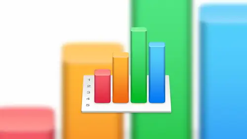
He wants to talk about charts we all want to talk about charged right that's the fun ok, so we're going to talk about charts I'm going to delete this road here we're done with that there's a really cool things that we could do with charts again charge still sound very exciting but they are so and we could do some cool things so let's just dive right and so there's two ways we can create a chart in numbers one is weaken we can start with a chart style that we want to start with and then we can fill in the data after the fact I know I want a pie chart but I don't have the data yet so we'll fill that in after the fact so we can do that or in this case I have the data I just need to create a bar chart to maybe visualize that and graphically represent that to someone else so if I wanted to create a charges on its own and populated later what we do is we come up to the toolbar and we click on the chart button and we are presented with three different categories of chart types to de which you...
can imagine is pretty flattened basic three d and interactive interactive gets really fun okay so to d I say it's kind of plain and boring but in reality it's not they still look really, really good they're they're visually exciting and they grab your attention. The main difference between a two d and three d is with the three d you have some rotation options and some some color options and some other things that that really make that chart pop. Um, this is less this is less interesting when the destination is on paper, so if you have something, you're eventually going to print on paper it's not as exciting as looking at onscreen and so what I typically tend to dio this is kind of kevin's rule of thumb is if the end result is going to be printed on paper, what I do is I will do a two d chart because it's clean it's not too busy, but if I'm doing a presentation using keynote and all of these same chart types are available in keynote and in pages, then I'll typically do a three d chart because there's some really nice color grading options and some shading options and some other things that really make it pop off the screen. Um, if we scroll through here, we can see that they have lots of different styles, and even if you choose let's say, we start with this with a blue theme you can go in after the fact, and maybe we choose this this blue themed pie chart, we can actually change one of the pie slices toe a bright red and maybe blow that out, so it really accentuates that that piece of the chart so even when we start with that based theme, we have lots of flexibility to change that pie chart to look exactly how we wanted to look with x and y values and font changes in colors and everything. So and we'll go through some of that now with interactive let's go back to one of these colors. So with interactive, I'll show you this one here. So this is this is fun because it really takes what if scenarios to a whole new level. Ok, so in this example, I have a a bubble chart, um, and and I'm going to populate that data actually comes pre populated because we created not from a data set but just on its own. So if we highlight that charge and this is the same with any chart, we highlight the chart, and we click on add chart data in this case is going to say, why don't you go select a bunch of data? So we're actually we're going to cancel that for right now, but it's going to look for some some data to pull from? With other chart types, you'll click on the ad chart data and it will give you that option or to give you the option to just manually enter it right there if it's a simple one but what makes the interactive a little bit different as you'll notice this timeline bar at the bottom ok that's that's very intentional and it's very cool so this is a specific chart that may change as time progresses, so maybe we're taking air quality levels in our manufacturing environment over a ten day period so day one these air the test results day to these air the test results and so far so what this bar down here does is it allows you now to then scrubbed through all of that data and see how that data changes from day to day again it's another way to visualize and in this case very interactively what's happening with your data is that cool? Is that something that I mean, I'm thinking in terms of of the in studio students, you know, maybe inventory levels or productivity or a number of jobs over a period of times you can see how your business is growing it seems like there's a lot of potential with something like this that can really, you know, make it look interesting and help you to analyze your business ok? So let's, go ahead and delete that so let's talk about the other way to create a chart. So this way is we're going to select a table, and in fact, let's just highlight the whole thing. And we can highlight the whole table, by the way, by clicking on the circle but in the top corner, it's. Now the entire table is selected, and then from here will click on chart and let's do a two d graf will do a bar chart. Okay, so that is our very busy bar chart. I know, right? Lots of color in there. Um, so by default, it knows that we're looking at percentage, so percentages range from zero percent to one hundred percent, so automatically adjust the the y axis it automatically adjust the x axis with the siri's of names. And it also adds the key that, by the way, we can move tio whatever location we want, and we can adjust things that way to make it look a little more appealing. We can actually move this chart to a different sheet if we wanted to. So if we wanted, she just devoted to maybe displaying metrics for processes, for example, we can have all the data on one sheet and then all of the charts on another one just for visual representation to make it easy to read that data. So once we have the chart let's go and highlight that and you'll notice that the editing pain on the right change on us again because now we want to edit and form at the chart so in this case we have lots of options and we're not going to go through all the options, but I will strongly recommend and encourage you play with these options on your own because the more you play with his options, the more they're going to be ingrained in your mind and more familiar they're going to be and you're going to you're going toe I want to use them and you'll know how to use them at that point. But some of the options is we can change the charts style here, so for example, if we wanted to more subdued color set, we could do that or if we wanted something a little more green for st patrick's day or whatever no more blue we could do that, um we can turn on the chart title so we can add a chart title we can come over here and double click on that and change that to something different we can turn that off again, we could turn the legend on and off sometimes it actually doesn't make sense to have a legend by the way, in this case it makes sense because we're looking at lots of data but if I have a graph that is literally just a line and it's a sales graph, I don't need to know that that's those air sales numbers because that's kind of buildings, it's, you know, we know that is the sales graph, so sometimes it makes us to go ahead and turn that off, we can add a border around it if we wanted teo and we can also show the hidden data. So if we have data, this is a bad example of that, but if we have data that's kind of going in to build up that graph, we can actually show that hidden data we can change the font just like you would expect in a in a word processor or anything else, we can change the background, fill colors and things like that, we can add shadows to it, we can change the chart type down here. So maybe after the fact, we put a lot of effort and energy into making a look a certain way shoot, I should have done a three d something I can come in here in real time change that to a three d and now we've got all those options as well an example of something different, I'm curious how this would look on a different yeah, so let's do a two d area, for example so that's ah again that's a little harder to understand because in this particular example a lot of the values are really close and there's a lot of data in there but you know, the an area graph would be a good draft to use on maybe company growth if you're looking at sales that might be a good option on this can you set a maximum and a minimum value? So for example on this could you set max is one hundred minimum is seventy five because you see that's where all the interesting data is absolutely yes oh actually will do it the other way around so we'll do a minimum of seventy five in a maximum of one hundred that's what I think it meant that makes more such otherwise you'd just be a solid color so so yeah, we could do that so to do that what we do is we highlight the graph we go into access and then we can say by default it's going toe like I said before is going to guess the best that it can, but in this case we want the minimum value let's tio seventy five maximum to be one hundred and we'll do well you're five okay groups I messed up how did I mess up to scale? Well, yeah, but remember when I'm working with percentages, I have to match those values so when I put in seventy five what I meant was seventy five percent but what it determined that as is seventy five hundred percent so I have to make sure I do I did that intentionally to make you guys aware that if you get stuck on something like that just check the detail and and you should be good so in this one we'll change it to that now the date is a little more readable now of course that's not totally representative of the data because there's a lot of data down here but as long as you your scale is clear as long as you understand your audiences is understanding of that, then then I think that's a good option let's go back over here let's see so chart types let's go ahead and show you a three d chart type because I do want to show you some of the features that are only available for three d charts so we'll do a three d bar chart why not? Whoa that's a little hard to understand there's a lot of data in there so with this one glaring difference but I think you can all pick up on really fast is right in the middle of the screen you got this weird orb looking thing that's kind of obstructing your view, okay, so if we d select the graphic goes away select a graph again what that is is that that allows you to rotate and twist your chart okay that's cool because if I want my chart to look a certain way with certain shadows and again this is sort of o c d type stuff then I can use that to do that and it's a very real time so what I'm going to do is click and hold on that and now I can't move that around very fluidly until I get to the position that I think is appropriate which is about maybe that looks good I don't know that's a hard one because there's a lot there's a lot of data but it's so easy to manipulate move that around let me let me change that very quickly to a three d pie chart just so you can see what that looks like with the with the colors so if we do the same thing here I was changed that's good enough you can probably see but you can see as I move that around your lighting is affected your your shadows are affected um at this point with a bar chart or sorry with a pie chart you can select the graft and then select a specific slice of that chart like the thirty five percent now with that selected weaken blow that out and as we d select and re select the entire graph as we move that around now you could see that there is some really cool potential with making your grass look really interesting. So okay, one one more thing that I wanted to point out with a bar chart. Let's. Go back to that and let's, add another bar chart in here. Is that there's a section here and again, this is specific to bar charts called gaps. So if we, if we reveal the gap section here, this is the space between columns and between sets. So if we wanted to remove the gap between the columns, gun removed that down to zero, or we can reduce this size so that all looks like that. Personally, I think it's a good idea to make sure that there's a little space between the sets or maybe you want a lot of space in between the sets and maybe a little bit of space in between us. So you have a lot of control in terms of how your chart looks in that sense as well. All right, any questions with that so far? Okay, if you want to change the x where the y axis formatting the way you do that has select the chart to start with and then select the select the text of the bottom. At this point, we can now change the text here, and we can also change the orientation of the wording so if we had a graph that had a lot of data and what's going to happen is if there's a lot of data in there numbers will try and automatically fill appropriately so it can get all the the major chunks in there so few doing twelve months but with big fonts what I will do is it a list january my skip to march and then may and so is going to skip but if you want to make sure that all of that data is in there what you could do is with that with that data selected come over here to the angle and then change that to maybe a vertical angle or or you could do with something like diagonal you know something like that just to make sure that that you can fit it in there so lots of options in terms of how your formatting you're axes you could do the same thing on the y axis here so you can you can have it match whatever the source data is in this case it's a numerical value so they've got zero twenty five etcetera going on but let's say you want to force that to something like a currency so now we've got it in dollar amounts but we want to take off maybe the dot zero zero at the end so we could remove that with the decimals so now it's uneven number but now we, because their business is doing so well, we want to make sure that people know that this is not twenty five dollars, this is twenty five million dollars, because we're doing awesome, okay, so what we could do with that is at a suffolk ce where we just add on em. And now it's going to add that em to the end of that automatically to indicate that we're talking about millions of dollars here, and you could do that with the prefix as well. So if you if you wanted to use some sort of crazy, you know something to build a prefix into that as well, then then you could do that. So a lot of flexibility around charts. I said it before, I'll say it again, really, with a lot of this stuff, you have to play with it, you really have to play with us, so I would really encourage you to go home and play with us, and hopefully the the at home audiences is playing with this already. As you're watching this, I recommend that you do that, that you play with this and just really get to know it, because the more you know it, the more it's it's going to help you, teo, to improve your your performance, your efficiency and all of that, so ok, let's, talk. Andi think we'll wrap up on this, but let's talk about filtering and sorting. So here we have some sales figures. So what I want to do is I actually want to sort this in a way that shows me my most profitable month and and sort of in descending order from their soaring is pretty straightforward and pretty simple. So it's not going to take long to go through that. But I do want to make sure that we all understand how that works. So in this case, what I'll do and I would have shown this on my other file, but I actually overwrote the data, but that's okay, we can still get the concept eso in this case, what I'll do is I will at the at the top of the row are sort of the top of the column there's a drop down box here that will give us the option to sort a sending or sort descending so it's a simple is that if we wanted sort of a sandy or descending let's, go and do descending, we do that. And one thing to keep in mind is it's not just sorting this column it's sorting all of the rose relative to that data you just happen to be sore, you know, in column b in this case so we can see there are most profitable month was two thousand fourteen and generally for something like this is going to go down uh in increment of one but it looks like two thousand seven actually was our worst month ever even worse than back in two thousand so you know that that's one way we can analyze data just by doing a quick sort don't do the whole sheet if you had a whole sheet of data, they're exactly so this one again this is a small subset of data if we had a table that had twenty thousand rose, all we have to do is highlight that choose that option to sort by descending and it's going to sort the entire table and all of the columns relative to that date so it's very, very quick another way so that's the quick and easy way of doing that another way to do that is with a table selected there is on the right hand side of your toolbar a sort and filter option. Okay, so sorting and filter this is where we can get a little more complicated, so if we had more columns of data we could say sort of in a sending based on column b and then after that sorted on column seon a sending order so this is where we can add a column so we'll do column a we want to sort that and then we can add another column secondarily that then swords by column b and then column c and so forth so if you had a table that had seven or eight columns you could do some pretty serious sorting so can you just choose to columns let's say out of an entire spreadsheet tio sort and not the rest no no because if you think about it if I wanted to sort of just this column here it's going it's going to break the relationship between this column in that column so when you're sorting it is sorting the entire table but because numbers can have more than one table on a single sheet you can sort one sheet one way and sort another sheet another way so that might be another reason why to use multiple tables in a single sheet because if you want to do some different sorting features between the tables sorting like multiple sorts in a row so say you have three uh three columns one is year when his month what his day can you sort by year and then within each year sort by month and within each month sort by day yes okay yeah yeah and that that actually that's good clarification that's what I was getting to earlier when I talked about and again I apologize is about example but but if I if I had another column here when I'm adding these additional columns to soar by that's exactly what I'm doing so if I had if I had maybe value for every month in the year of of every year two thousand fifteen fourteen etcetera I could then sort of by the year so that would be my primary sort and then secondarily I could soar by sales numbers in this particular example so in that case is going to sort by the year first and then by this sales number and you can you can have as far as I'm concerned, we're well technically I think you can have lots and lots of different I don't know the exact number but I have not run into a limit um you'll run into internal complication issues before you run into a maximum number of swords but you can sort you could do that messing sorting virtually as much as you like so so lots of possibilities with sorting okay the filtering so what filtering is is just as it sounds I want to fill throughout just specific data. Um so in this case I'm gonna add a filter by column actually let's do by column b which is our sales so I want to show every number that is above let's say a ninety million so we're going tio how to filter to that to the sales column and then greater than eighty million clips. Did I do that wrong? There we go. Eight million. So I want to show everything that is greater than eight million. So everything else now is out of the picture it's not gone, and I'll show you how to get back to that. But the only thing I'm concerned with at this point is anything that is over eight million. And then from there, maybe I want to sort that again. Maybe I want a massage on the specific way, so I can now take that information and make that look a certain way with with other story or other filtering rules you can see here that we go from row one straight to row eleven so visually in my mind, that tells me there is some data in there, too. So that's one way you can tell if you have a filtering rules still applied to your table. So if you're looking at something and saying, I know I've got more data than that, where is it that's? One way to tell that so how do you get rid of it? Piece of cake come back to the filtering, and essentially, all we're going to do is unchecked, the box next to that filter, and it shows all of that information again now filtering, uh the nice thing about that is we can reapply the filter so if we want to go back to it we just reapply it okay but filtering is good because you can filter and filter and filter so you can filter on filter data so you can mess that just like you can with sorting so you consort ana sort you can filter on the filter um and this is really really powerful especially when you get to a large set of data you know as your business grows you you've got a lot of sales information a lot of transactions one application for this is if you're if you're analyzing a transaction log of sales over a ten year period just show me all of this product I want to see how well this product sold you could apply filter that just on that product from that filter created chart so we're kind of tying everything together now and also you can you can apply conditional formatting so you do a filter you apply conditional formatting so you can visually see the data that might be missing or might be you know should be popping out to to grab your attention highlighted create a chart um you know that this is really where everything kind of comes together and you're using a lot of these tools that we've been talking about in this class t really, really make numbers a super powerful tool for and again, you know, just the same with pages and keynote. That really is what numbers is for its to empower you guys, to empower your business and power employees, to do a fantastic job and to really make it simple for you that's, a lot to take in. I know, but there's a lot of really good things in numbers. We really appreciate it because of, you know, for any business, the members of the life blood, you know, that's, how you stay in business is by knowing exactly what your data is and then understanding what it means, and it seems like this is a fantastic tool for people to achieve that. So I really appreciate you helping us to understand exactly how to use this tool to really make sense of our businesses on we are very thankful for that. So, folks, for now we are going, tio wrap this up. So for intruder, I works, numbers that's, a wrap, thanks everyone.
Class Materials
Bonus Video: What is Apple iWork?
Bonus Video: Why Use Apple iWork?
Bonus Video: Apple iWork User Interfaces
Bonus Materials with Purchase
Ratings and Reviews
a Creativelive Student
Thanks Kevin. I use this software quite a bit so I would have loved you to show more detailed examples using this software. As a visual learner it would have really concreted my learning but thanks anyway.
JustRob
I have Numbers, but have used it very little in practice. Who knew I'd find myself binge-viewing such material, geeking out on the possibilities within reach. Thanks Kevin; I learned and took notes on much more than I was expecting. It was just the right amount of digging deeper for me.
Student Work
Related Classes
Business Basics