Lessons
Class Introduction
11:53 2Why Film
10:59 3Film Vs. Digital Camera Sensor
19:01 4Importance of Metering
04:08 5Reflective & Incident Metering
05:36 6Metering for Color Film
14:31 7Metering for Black & White Film
07:31 8Metering for Outdoor Shooting
17:37Metering for Indoor Shooting
18:39 10The Differences in Film Sizes
11:05 11Purchasing Film & Care
05:04 12Professional Color Film
16:39 13Professional Black & White Film
12:06 14Consumer Grade Film Stocks
06:31 15Pushing Film
18:44 16Know Your Lab
03:41 17What To Look For In A Lab
25:35 18How To Find The Right Lab
13:10 19How To Safely Ship Film
16:46 20Get Started Using Film
06:47Lesson Info
Professional Color Film
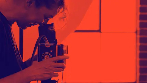
Professional grade film stock. I'm actually super excited about this part because I love talking about film stocks and I love exposure tests and looking at what film does. So, okay, there is no universal standard for film. Which I've said before. Every film stock out there has it's own way of seeing light. It's own way of reading color. It's own way for greens or reds or for whatever it is. Each stock is different and that's fun. So you get to kind of go in a learn about them and figure out what it is that you want your work to look like. How you want your work to look like. And then which film stock you are going to choose to do that. Let's go and look at some films. So color film. We're going to start with professional grade color film. With Portra 400. Portra 400 is available in both 35 millimeter and 120. This is actually a favorite of film photographers. If you are looking online a lot of people just love Portra. It's kind of a go to film stock for everybody. And for good reason, ...
it's beautiful. It has a nice fine grain. That 400 speed gives it kind of a small grain detail. And it's versatile because it's that 400 speed. You can shoot it in a little bit trickier lighting situation which is fantastic. And it has this gorgeous golden tone to it. So this is an exposure test I did a long time ago. But you can really see kind of the golden tones. It does great overexposed in that two to three stock window that we talked about. And so I always recommend with Portra that you rate it at box speed and you meter it in the shadows and you get those gorgeous tones. It just kind of has this warm goldeny feeling to it. Which is beautiful. And outside I love shooting this film stock when I am outside. Which I don't shoot professionally very much outdoors but when I do I always grab this one because it's beautiful. Especially in those fall colors, those kind of goldeny colors. Or it if want something a little moodier. I know in the last segment we had some questions about what if I don't want light and airy? What if want something that's a little darker, a little moodier? So this is an example of this. So Portra 400 and I metered for the shadows. So this is an example of you meter for your shadows so you want that dark part of your image. I don't want these dark to ever look under exposed. I want those to be at perfect box speed. And then I just asked the lab to scan these with a little more drama, more for the highlight so you can get that kind of moody look. Which is beautiful. And I shoot it a lot outside. One fun thing, side note, about film is when you start shooting with film and you're shooting outside you get clouds again. Which is amazing! Because you know how when you shoot with your digital cameras- if you're exposing for the person's face often times it will blow out the sky and lose you cloud detail, that doesn't happen with film because again we have that tremendous exposure latitude you don't lose detail in you're highlights. So you can have a situation like this that's really bright and still get great cloud detail. Which I love. And Portra 400, again, a little moodier, a little darker. So it's a beautiful film stock. And inside it does great too. Fuji 400h also available in 35 millimeter and 120. This is also a 400 speed film. It has a fantastic exposure latitude range. It also has the beautiful fine grain. So it's great. The difference between Fuji 400h and Portra 400h is the color palette. So whereas Portra 400h has that kind of golden tones to it, it's a little bit warmer. Fuji is a much cooler film. So it's pinker, it almost has this kind of pastely look to it. Which is beautiful. I love that look. I photograph kids and babies and I love that pastely, cool tone pinky that I get with the Fuji. Fuji is what I shoot in my work. So if you follow me on Instagram, all of those pictures are Fuji. And it's so funny, I get asked all the time from people like what preset are you using? How do you edit you images. And I'm always like Fuji, Fuji 400h. That's my preset. But it's really beautiful. And outside too, you can shoot it outside and it's gorgeous. What I love about Fuji because it's so cool, If you are working with blondes you get this almost silver tone to it. Which I think is just stunning. That's the contacts with that beautiful contacts look. I love that image. But I also think of baby. I mean how cute is that baby? A lot of people talk about how they don't want to use Fuji on different skin tones but I haven't found that to be true. I think Fuji is beautiful on all skin tones. It's really gorgeous. So I use it all the time in the studio. And it's really great with reds. It's beautiful. People will talk about Fuji red and this is what they're talking about. It just pops that color, which is beautiful. It's that coolness of it. Isn't he cute? And there's a little more Fuji. So, because Portrait and Fuji are both 400 speed color films they get compared to each other a lot. And it's like apples and oranges. I tell people you really can't compare them because they both have something different to say. Yes they're both 400 speed films. Yes they both have tremendous exposure latitude you meter them the same way, all of that is the same. But they're tones are so different. So Portra 400 has that really nice golden tones to it. Warmer palette. Where as Fuji is a much cooler palette. So it really does depend on the look you're going for. What you want your film to say, what you want it to look like. Here's an example. This is a shoot, this is the same baby. This is the exact same light. Taken moments apart. So mom with baby shot on Portra. Dad with baby shot on Fuji. Isn't that amazing? The differences in the skin tones? And in the background colors too. People always ask when I show this example. Which background looks more like the true background. (laughs) And it's really honestly somewhere in between the two. It's really just about the skin tones that you're getting. You can see the coolness of Fuji here and the warm tones of Portra there. When you work with clients and this is the same family, same baby. Yeah. What's your approach to choosing which one you're going to use? Well, I'm glad you asked that. I let them know that I was doing a film test. I said hey friends, do you mind? I would never do this in a normal session. I always stick with one film. One film stuck with the exception of Portra 800. Which I'm going to show you in just a second. But I would never do both of these films in one session. I would choose one. Which always for me is Fuji. Always Fuji? That's just what I do. That said, Portra 800, the next one is a super interesting film because first of all it's an 800 speed film. So people think okay, this is the film I use in a low light situation. However, out of all the three that we're looking at today, it does the worst. With underexposure. This film will fall apart when it's underexposed. So if I'm in a low light situation this is not the film stock that I use. Despite it's 800 ISO rating, I would go with my Fuji. But what's really interesting about Portra is I feel like as far as tones go, color pallettes go, it's somewhere in between that warm tone Portra look and that cool tone Fuji look. So you can have it, you scan more pink or it can scan more yellow. At it's best it's kind of this peaches and cream look. But to answer you question, there will be times when I'm shooting with my strobes, so I have plenty of light and I'm shooting my Fuji 400h. But we might have really beautiful window light coming in and I want to shoot with the Portra 800 because I can rate it at box speed of 800. And it just gives me an extra stop to play around with. So I can shoot this film with my Fuji and have the lab process them with my look, they know what I like. And they'll look the same. It's really interesting because it can really go either way. And again, that's about knowing your film stocks, what it can do but also about knowing your lab and what you're lab can do. Which is interesting. So this is that beautiful Portra 800 at it's best. That kind of peaches and cream. There's definitely cool in there. There's pink in there but it's also got those nice yellowy orange tones. Plus that baby. So cute, there she is again. (laughs) It's a beautiful film stock. Don't let this 800 speed fool you, you can shoot this outside. You can shoot it in bright sun. Actually pretty versatile. Just don't underexpose it because it hates being underexposed. That Portra 800 that those gorgeous peachy skin tones. Which is just so pretty. And there it is again. So can you guys start so see the differences in how they look? So just for fun, because I am a scientist at heart. I did take, there's Benny, I did take the same image. So same exact lighting. Same exact backdrop of all these different film stocks. This is what I'm talking about when I say there's no universal standard for colored film. They all are really different. And you can see it there. Isn't that just amazing. Now with all this said, all of these films to here follow that rule where I would say meter for the shadows, err on the side of overexposure. The only color film stock I don't do that with is Ektar. So Ektar is a Kodak film, it's a 100 speed film. When you overexpose Ektar, you get a little bit like maybe you have a stop wiggle room it will go super red. So all of these were metered for the shadows. This one was metered for the mid tones. That's the only difference because is didn't want it to go super red. But isn't that fascinating? So what I say to people is when you are thinking of your work, what do you want to say. What colors do you like? What is the palette that you're going for? And then do your research. Figure out a film stock that meets those needs, whatever those needs are for you. Play around with it. I'm a big believer in do an exposure test see what it can do and then stick with a film stock. A particular film stock for awhile. So you really, really learn it. Really know what it can do. And then you want to change up, try a round, you can. But instead of shooting a different film stock every time I recommend choosing one and sticking with it for awhile. Until you can get to know it. Yes. So how do you get the peachy tones with the Portra 800? With the Portra 800? Yeah, aren't they pretty. Well a lot of that is inherent in the film. That's kind of what the film does. But this is again something that I would communicate with the lab. When you send it into the lab you would say, hey lab, I'm shooting Portra I love those peachy, creamy, peaches and cream tones that you can get with this film and that's what I'm going for. So that they know go scan to that. And we're going to go into more when we get into scans. You're going to be amazed when you see what a lab technician can do and can't do. But it's a gorgeous film. Portra 800 on skin is just fantastic. I guess that's what my other question is that when we're talking about color and film choice is that there is kind of the look that you get. Whether it's cooler or warmer but what other considerations are there if you're looking at a particular scene that you would take into account. Is the lightness over the darkness of the scenario going to impact how that film looks. The colors that you're clients are wearing is that going to impact it? What are the considerations? That's such a great question and yes, yes, yes. All of it. So, for example, Portra 800, what do I know about Portra 800? I know that it falls apart when it's underexposed. And it will for that reason I'm really careful about the situations that I shoot it in. So if you notice that on all of my examples we're all in super bright light, super back lit. Kind of photos. So we get a lot of light. So this is one if I were in a situation where I'm working with a really dark backdrop, I'm working with dramatic window light, I don't think I would necessarily choose Portra 800. And I keep thinking of this example because I see it all the time and I see it on boards with this film in particular is that people are shooting inside using window light. I see it a lot with boudoir photographers and they're in a low light situation and they're like okay I'm going to grab that Portra because it's an 800 speed film but then Portra 800 does this. So if you're super careful with your metering, darker tones or really deep shadows are going to be down here. So, I mean, that's kind of nuanced, right. I know that Fuji is really great with reds. Where's my Fuji red. It can really pop those reds. So if somebody's in a nice deep blue red like this I'll grab Fuji. But sometimes I walk in and there's that red that's like whoa red and has a lot of orange in it. And that can almost go electric with the Fuji. So I might choose one of the portraits there because it's a slightly different color palette where there's that warmer and it's going to bring out the warm tones. So it's just about kind of playing with it. And this is why this part is so fun to me. Because you learn about these film stocks and what they can do and then it is, it's about making a choice. So you're not just going in again- shooting, shooting, shooting, shooting. Hoping you got something. Cooling it down and then doing it all. It's like no, I'm going to make a choice. I'm going to look at you, gonna look at your skin. I'm going to look at what you're wearing. I'm going to look at the environment. And I'm going to choose to make my images this way. For me, consistency is super important. Because I run a business and that's my brand, right. I need to have everything look good. So I shopped around. I have shopped all the films. When I was coming back to film I really wanted to learn all of these so I could make this choice for me. I just love Fuji. That's all I shoot basically now. Personal work. It's fascinating isn't it? What a difference that it makes.
Class Materials
Bonus Materials with Purchase
Ratings and Reviews
a Creativelive Student
Sandra is a gifted teacher!!! I've been following her work for years and know what an incredible photographer she is - but to be able to teach the way she does is truly a rare gift! I've been shooting film on and off for years and was amazed at how much I could still learn from Sandra's class. She presented the information in a way that was so easy to follow that you couldn't wait to get started. It's wonderful to learn from someone who is clearly passionate about their craft - but who is also excited for others to succeed at what they're teaching.
pinkparakeets
Amy could not have said it better in her review of this class! I am also a film shooter (have been shooting film personally for 8 years and professionally for 4) and even as someone who understands a lot of what Sandra was talking about, I STILL found this class to be incredibly helpful and learned a lot. Sandra is such a great teacher and an inspiration to so many film photographers. Great class! Thanks Sandra and Creative Live for putting this together for us.
Amy
Sandra is not only an insanely talented photographer but she's a gifted teacher. I've been shooting film for weddings and portraits for 5 years and even studied it in photography school so I'm not new to film by any means. But I've allowed myself to be so intimated to create portraits with film using strobes for far too long. But not anymore. I'll be 100% honest when I say that the information she teaches in this course, to a seasoned COMMERCIAL photographer mind you, may be insanely simple. But that's the beauty of it!!! There is no reason to over complicate shooting film with strobes. It's the simplicity and straight forward, clear as day information that Sandra teaches that's essential to rejuvenate today's overly 'tech obsessed' world. Film is alive and well! Sandra's course is gold when it comes to getting that appreciation for our craft back! I'm jazzed and ready to slow my roll down! Thank you, Sandra and CL! The value of this class is far more than that of the strobe kit I finally invested in (HOURS after the class!). : )