Lessons
Class Introduction
02:02 2Planning Trip Research
03:21 37 Principles
04:01 4Gear Considerations
07:22 5Packing Essentials
06:14 6Location Scouting
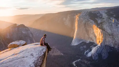
04:19 7Sunrise Shooting
18:48 8Composition Basics
06:14Lesson Info
Post-Production
So, let me talk a little bit about post processing, what I do, and how I go about, uh, reviewing my images whether I'm on the road or in an office. Now, because I am not at home, and I don't have an office or a table I can sit at and review the photos, um, I'm going to be doing this more on the go, so definitely keep that in mind. However, you're still going to be able to see how I go about editing my images and making sure that they look really good. One thing I want to mention is selecting the right image out of the photo session that you might have had. So, as you can see I'm going through here with this session from a kayaker that was conveniently swimming though the lake. Pretty awesome. Uh, photos are great, but I want to try and find the one that looks the best in terms of the spacing. So, I really do like the ones where he is center. This one in particular is probably my favorite just because of the, um, where he is at in the photo, and how he is at in the photo in terms of the...
reflection. So what I would do is, is I would select this photo, and this would be my base for starting to edit. Now what you can do, is you can go through the whole edit and then decide, "Hmm it would actually have been better if he was a little lower." You can go back through the other photos and see if you have something that matches better for what you are envisioning of how you want the photo to come out. So, first thing is I have the shot here, at Glacier, of course, um, it's a pebble rock shot, half of the waters polarized, and half of the top is just the mountains with the early morning light. So, kind of want to look at any photo in general, I sort of want to ask myself, "What's gonna be this, the focus of the photo, and how am I going to go about pulling out the details to bring the focus to the, whatever that subject is." So, here obviously the focus is going to be the pebbles, with the really nice background of the mountains too. So, first what I am going to do is I'm just gonna crop it. It's a vertical image, so I generally like to have my, uh, top of my photo, um, you know, like where my mountains or my background is, not be too close to the top, I wanna have like a little bit of space, just because if it's too close to the top, the photo or the image is gonna a little cramped. So now what I'm gonna do is, I'm going to just have it right about there. Have a nice little crop. Right now I have it cropped at four by five, that's just because, uh, I do vertical shots on social media four by five, on Instagram and most social platforms, that's the maximum that you can do. Um, so, it kind of gives me a boundary as to where I can edit, and edit within. I also do a lot of vertical shots anyways in general, just because some images look better vertical, if it's horizontal I would use similar, um, you know, things in terms of framing and cropping in post process, but we'll start with the vertical images so you can get an idea of how I go about it. So, now as you can see, the image at the bottom is really dark. (laughs) So what I gotta do is, I have to actually raise the brightness here. So I'm gonna get a gradient filter, which I pulled from over here, and now I'm gonna try to even out the lighting so that way the photo looks more evenly lit. Um, the section of the rocks is a little bit dark, but as you can see already, I can see way better detail. I'm gonna undo that. And, um, yeah. So we'll kind of just mess with the, uh, exposure a little bit. There we go. And, um, now you might notice that the photo is a little blue. So, another thing I like to do, generally speaking, on almost all my photos is make sure that the white balance is really good. So what I'm gonna do now is, I'm gonna adjust the white balance a little bit, so that way, um, you know, instead of it looking too blue, it looks a little more, uh, warm, just because it's sunrise, it's early morning and we kind of want to invoke that feeling. Uh, might adjust the tint, very slightly. Tint you have to be very careful with, if you adjust it too much the image is gonna look either a little too pink or green, but sometimes you do need to make that slight tweak in tint so that the colors pop really good. Okay, awesome. So now what I want to do is, actually I'm gonna re-crop this a little bit, drag it down a tiny amount, there we go, just because some of these rocks that are down here, and I want to make sure that, um, you know, I'm including them in the image as well. Okay, so now what I'm going to do is, I'm going to adjust my basic settings. This is really quick. Usually I add a little bit of contrast, um, I'm going to actually lower the blacks a little bit, which will help with the contrast, it'll give it a little low end boost in the darks. Um, I will though bump the shadows a tiny bit, so that this area of the photo where the trees are comes out nice. Um, I'm gonna leave my highlights where they're at cause I actually really like it. Um, you can add dehaze, which is sorta gonna pull out more details in the photo, um, and it is gonna make a little contrasty, so sometimes I'll add dehaze, but then I'll recompensate for brightness. Let's add point one right here. So now, well before and after you can see that, the details are a little more apparent, and, um, it's more evenly lit. So now that I kind of got this going on, oh, and I'll also add a little bit of negative clarity right there. Negative clarity basically makes the photo look a little more, uh, warm feeling. Um, it still retains the sharpness, but it doesn't look almost too sharp. It makes you feel more like you're in the moment, um, at least from like an artistic, uh, choice that I like to do in my photos. Now Tone Curve, personally for me, um, I like to do the manual Tone Curve, uh, with uh, I don't mess with RGB Channel too, too much, but what I will look at is my histogram and I'll try and go through and find which sections of the histogram that I think could use a little bit of boost or take back. There's a lot of darks that are right here, so I'm gonna kind of just leave that where it is, but right after it there is a dip, so I kind of want to bring that level down, just so that it evens out with the darks. I am gonna boost my highlights slightly, just so, cause right now when I move that knob, it's effecting the peaks and the way that the highlights are coming out. Okay, cool. So, now we're going to go to HSL. Now, HSL, I like to have the All up, um, I tap All and it shows me all the different options. You can select hue, saturation, or illuminance. They're all gonna be, um, you know, the same thing, it's just the order of how you want to view it. When I hit All, I really like to kind of go through and mess with a few of the different tones, just to see if, like, certain colors can pop better. Again, this is artistic preference, some people like having their blues a certain shade in their photos, some like not really editing the colors too much, but maybe only adding saturation to one of two colors. This is totally by choice. I have personal preferences to what I do, so I'm just gonna go through my preferences and how I approach going through each of the different colors. So, right now, um, of course, I would really like to see a little more of an orange or a yellow in certain sections of the photo, so, did need to retap that, I'm gonna boost the oranges here. And as you can see in the peak it's getting, um, you know, a little more lit with that nice sunset lighting. Um, I'm also going to just mess with the yellow and see what it does. I can see a few of the rocks that it colors. Okay, that's cool. And I'm actually gonna boost the blues a little bit, just kind of want to see where it's at. So as you can tell right now in the, uh, shadows of the mountains, and a little bit in the water, it's pretty apparent. Uh, I kind of like that because then you're getting a color separation between where the rocks are and the peaks of the mountain. I don't really touch the purple and magenta knobs too much, um, I feel like a lot of things naturally look good in the magenta or purple range, uh, it can be a little unnatural if you do mess with it, in my opinion, so I like to leave that where it's at. Um, for luminance, um, occasionally I will, uh, mess with blue luminance, if I'm, uh if I have patchy clouds and sky, um, if I have water that I want to make specifically bright in one spot. Um, of course to verify that you're making the right part of the blue, blue, you want to bring over this selector knob and it's gonna tell you exactly what you're changing, and how you're changing it. If you just, uh, tap the section of the photo where you think it might be a certain color to see what it is, you can drag up and down, and it's actually gonna effect all of the colors that it thinks are the same color in that exact pixel, um, which is pretty cool. Um, but I'm not gonna mess with luminance, I kind of like where it's at, um, what I am gonna actually add now though, I'm noticing, is I am gonna add, we're over here, what's called the Radial Filter. And I'm gonna select the Radial Filter just on where the rocks are. Um, again I really want to showcase the color of the rocks, that's why people come to Glacier National Park, and make it unique. Um, definitely with each location that you visit, you wanna, uh, make those unique features stand out, and this is something that you can pull out in your post processing. Okay, cool. So now we're kind of getting the rocks showing off here, um, let's add like a little bit more saturation, but the blues are kind of coming in, changed that. So as you can see the rocks are getting definitely more noticeable, and more colorful, which is awesome. Um, another thing I am gonna do is, I'm actually gonna increase the vibrance a little bit on this photo, and take the saturation down. I do that on a lot of my photos just because I want to make sure that the colors are balanced. What Vibrance does is it takes the colors that are less apparent in the photo, but it makes them more saturated. So what it'll do is it'll pull out the nice hidden tones that are in a photo, and, um, you know, add more color to that, but then are the same time it does make the photo a little more colorful, so I dial that off by, you know, lowering the saturation. I'll either do that by lowering the overall saturation of the photo, or I will do an HSL. Okay, so now that we've gone through that, um, Split Toning. What Split Toning does is, you are in a certain hue range, so, lets say you have a white, uh, you know, a white sky, but you want to add a little bit of blue hue to that sky, what you would do is, um, you know, skies are white and bright, which is technically where your highlights are, highlights are of the higher end of the histogram, which is all of your light colors and shades. So let's say I did want to add a blue shade into my sky. I would click my hue right here, blues generally about one-eighty to two-twentyish, somewhere in that range, I'm just gonna go one-eighty, which is more of a blueish teal. I'm gonna add about ten percent saturation. You do need to be a little bit, um, on the cautious side of this, because if you go more than, like, twenty percent it's very noticeable in the photo. Now some people do do that as a stylistic choice, um, you can get a really cool old school film look by messing with split toning, um, I use it sometimes to add complimentary color to areas that don't have a lot of color, you know, again, white skies, bright areas, um, or if it's like a forest, so lets say it's like a deep green and there's a lot of shadows and blacks, I'll add, um, you know, maybe oranges into my shadows, which here orange is about thirty. Again, these are just numbers that I have memorized just from using it so often, in so many different situations. I would definitely get familiar with where the colors are at. So, again, right here I have about one-eighty in my, uh, highlights, which is blue, and I have, um, thirty for my, uh, my shadows, which is orange. I can add ten here. And as you can kind of see, it kind of has more of a polarizing blue orange effect over the whole photo, um, again this is a style choice that people make, some people love it, some people prefer not to do split toning or selectively do split toning. For this photo, I'm not going to use split toning, but I did want to show you how it affects the photo, and how you should go about using it. Okay, Detail. So, in the Detail section, I try honestly not to use the Detail as much, because while I'm editing other things, I don't want to go and over-edit my photo. Sometimes if you over-sharpen a photo, or, um, add Luminance Masking, and things like that, it can almost take away from the feeling, that being at that location, or that spot is actually possible, and I want people to be able to envision that they're there. So, unless the photos like really blurry, or didn't come out exactly the way that I wanted it, I will adjust the sharpening of course here, and the masking. But for the time being, I am going to leave this. Now let's say you are shooting a photo that is, um, you know, dark, or has uh, a lot of noise in it from your ISO, you are going to be wanting to mess with your noise reduction in the luminance, um, area of this section of Light Room. So, in those scenarios you would use it. But besides that, for me, um, you know, occasionally I will add a little bit of sharpness, the Olympus has really, really, really, really good sharpness rate here, especially on these rocks, so I'm not gonna really need to worry about sharpening up the photo, and I actually like the background being a little out of focus, and I guess you'd call it slightly blurry. It's part of the bokeh effect when you're focusing on the rocks. So, I like it the way it is, and we are going to leave the detail the way it is. So, I would use the Transform section if maybe I wanted to tilt the perspective angle of the photo slightly, or maybe I wanted to make it a little bit thinner, things like that. Little quick fixes to the aspect ratio, or just the dimensions of how the image looks. So as you can see, if I move the aspect ratio it makes it thinner, and if I move the aspect ratio that way it makes it fatter. Um, now, a lot of people don't really mess with the aspect ratio too, too much, um, unless it was like, again, our lens that would have a lot of distortion in it. I'm gonna leave the aspect ratio where it's at, but I just wanted you to be able to see what the aspect does. Of course right here's the rotate. Now, you can also rotate it using your Crop Tool here, um, either one is fine. I like doing the Crop Tool because generally I want to crop something, and I want to straighten it at the same time. We already did do a little bit of cropping on here, and it was already straight just because of the mechanism that, um, is in the Olympus camera in terms of the leveling, so we're gonna leave that how it is. Okay, last two sections here. We have Effects and Calibration. So, on the effects generally, um, with, uh, right here you've got the Post Crop vignetting. So, in terms of vignetting, I actually use vignetting two different ways. I either use the vignetting in the effects, or what I will do is I'll add vignetting using gradient filters. What vignetting is, is darkening or brightening of the corners of the image. You can make this really, really, really drastic, uh, by going one of two ways on the amount knob. If I go this way, as you can tell, almost makes it look like you're looking through a window with blurry edges or something, or along those lines. Um, not really my style, and I don't really like to add that much vignette, and if you go the other way, it adds the opposite. It almost looks like you're looking at the sky with a hole of like, you know, an image through it or something like that. It's really weird. Not really, again, my style either, but I will add a little bit of vignette, just because, again, it's gonna draw the eye to more the middle of the photo, and that's really good for both vertical and horizontal cropped images. Now, um, with this photo, just because I did add a little bit of vignette, which I like, I do want to kind of add more brightness to the radial filter that I used earlier. So I'll bump it up just a little bit here. There we go. Um, you can affect the vignette different ways in terms of, like, the shape of it, and how far it comes out in the middle, or the side of the photo. So, if you do wanna add a vignette, but maybe you don't like the natural vignette that comes in light room, you can sort of customize it and tweak it so you can get the darkness in the corners of it coming out exactly the way that you want. Again, this is a stylistic choice. Um, sometimes I'll mess with, you know, the midpoint of it, so I can kinda see um, the sides pop out. So as you can tell right now I'm mid point, the corners are darkened, but the length as to how far out the vignette is going is not going to be as drastic. Um, you can also feather it, if you want to have like, a hard line or not, you can tell that it's like literally a hard line when I go all the way on the feathering. Uh, feathering basically determines how dispersed the vignette is. So right now I kind of like having feathering in the middle, or at the default position, just because it's gonna be the most even, or I will occasionally move it so that it's feathered out even further, just because I want the photo not to feel too angular, I want it to have a nice, natural feel where you're looking through the whole image. Um, calibration. Now camera calibration is a very, uh, is a particular part of Light Room where you do have to be careful with what you're touching. So what it's doing is taking the primary colors and you're essentially effecting all of the related tones and hues to that color. I generally like effecting the primary hue of blue a lot, just because when you effect blue, it effects the tone of your blue colors, and orange. I do prefer having oranges, uh, in my photos, just again an artistic choice that I have selected. I like the warm feeling of orange, and, you know, just, uh, having that nice pop in the photos as well. So, generally speaking I will change my blue primary, you know, somewhere in this range between ten to twenty five, depending on how much I think the photo needs it. I will occasionally change the green primary hue. I like to go plus fifteen or twenty on this side of it, just because what it will do is bring out more lime greens and neutral greens instead of, you know, uh, super lime greens. It'll kind of give more tones, more color contrast. Yellows and greens can be tricky to figure out, but if you're really good at figuring out the green and blue primary colors, it's gonna be easier to see the differentiation between them. Same with red primary, um, red primary is a little more finicky for me, just because it's either gonna give you this yellowish blueish overtone as you can see here, or it's gonna give you kind of this red, teal, muted overtone. I actually do like the muted overtone here at negative twenty, just because it brings out the colors of the rocks here, but you do, again, have to be very careful with the red, just because in some photos it can look a little wonky if you mess with it. On this image, one of the only other things that I'm gonna do, is I am gonna add one more radial filter here, and it's just gonna be to the trees. The trees do look a little dark, but I don't want to affect the rest of the photo. So I'm going to invert that. I'm going to widen that a little bit. As you can tell it's right now too bright, don't worry about that, I'm going to adjust it a little bit. And I'm going to add some white balance here. There we go. Now there's a few other things you can do really quick if you want to get more specific with the edit in terms of using gradient filters or brushes. If I tap the Brush Tool right here, what I can is, I can hit O, and it's gonna show me everything that's been selected, if I don't want the sky, or the background mountains being colored at the same time as the trees, what I can do then, is I can, I'll tap Auto Mask, Auto Mask will basically find where hard lines are, and will paint in between them to make sure that I'm not over painting two surfaces. I can then, uh, of course remove, by hitting the Option, and then Painting. And I can paint away anything that I don't want in the image. I can also select it in two other ways. So right here you have what's called a Range Mask, this is really important and it will save you a ton of time editing. If you tap Range Mask, you can select either Luminous or Color for this module. So if I hit Color, what it's gonna do, is it's gonna bring up this little Dropper tool. If I press the Dropper tool and bring it over to the color that I want to have accentuated, I'll click that, and now what it did, is it's only selecting everything that's in that color range. So as you can see, it just did the exact painting job that I was going to do, but now I don't have to do the painting job, all I have to do is hit two buttons and it's all done for me. It's really intuitive and smart, and it will definitely save you a lot of time if you know how to use it properly. Now you can also hit Shift, and you can add multiple of these, and it will then add whatever other colors that you added in, so as you can see I can add one more here, and you'll notice that it's now affecting this part of the mountain very, very, very lightly. It's also being very light because it's at the edge of the radial filter, and the radial filter is feathered. You can change that, of course, um, using the masking amount on the feathering et cetera to get the look you want. Now I'm gonna remove that, just because I just want this section selected. Now, there is a tiny bit of bleeding over into the next section, so all I gotta do is I have to adjust the amount. If you want more of the feathering bleeding over, you would feather, um, upwards, so like closer to towards to a hundred, but starting at fifty I kind of like to go down more, because I want to get more specific with what I'm masking. So, right now I have just pretty much the trees highlighted, which is exactly what I want. I hit O just to see exactly what's being selected, and yeah, no, it's looking good. The trees are definitely brighter, you can kind of see where the sun's coming in which is kind of cool. So, uh, you know what actually? I'm going to lower it a little bit. So now I'm going to increase the saturation on these trees just a little bit just to have the green pop out. You can also change the tint of it slightly, so if I wanted it to be more green I could just do that, but obviously that looks a little unnatural, we don't want to do that. Probably dial back this a little bit. Cool. So the rocks look great. Now, um, I am going to make one more adjustment. I'm gonna change the blue HSL slightly, a little bit, I am gonna desaturate the blue, actually. So, uh, another thing I noticed again as I'm editing this, is that the reflection of the mountain is a little darker than the mountain itself. It's okay to do that, but I, for me personally, I would like to have the brightness just a little bit more. So what I'm going to do is, I'm going to add another radial filter here, kind of in this section of, where the mountain is. I'm going to of course invert it. You can double click Invert, and then click off of the Brush tool, and it will leave that box checked forever. Just wanted to let you guys know that as well. And, uh, I want to brighten it, maybe do about yeah, like point three looks a little bit like if you do before, it's a little dark, if you go back up to like point three, point four, I think point three looks really good. So, now we want to be able to isolate just the shadow of the mountain, we don't want to affect the rest of the photo, or the actual mountain itself necessarily, or the water. So, we want to use our Range Mask tool again, but this time we're gonna hit Luminance. So what the Luminous Mask does, on the Range Mask option, it actually looks at your histogram and what you're selecting, and it's only effecting a certain section of the histogram, um, by analyzing the image, and then you adjusting the knobs that are in the Luminance Mask. So, I'm gonna hit O just to see what I'm selecting, and right here, this knob on the left, this is gonna affect my darks or my shadows, and this one here on the right is gonna affect my highlights and my whites. So, what I'm gonna do is, I'm actually going to bring down the whiteness, because I'm affecting only the white areas. I don't want to affect the light. And as you can already tell, it's erasing, or moving away from the light areas, and now it's only selecting the dark areas, which is really helpful. Um, like I had mentioned before, you can use the Brush tool, and brush or erase away the highlighted section if you want, but this is way more efficient, and it's gonna get right down to the line as to what you want selected. So, um, let's undo the brush, do Edit, there we go. Now, with the smoothness again, this is gonna affect how far out it's feathered, and how narrow you're gonna make the range. So generally I like to make the smoothness lower, uh, a lower level, so that way it's more specifically targeting that range of darks or lights that I want to have changed or adjusted. And, now that I've changed the smoothness, I'm gonna change that a little bit, see what selected. That looks much better to me, you can really see the detail better in that shadow of the mountain in the reflection, and it brings the whole photo together. So, generally speaking this is a, uh, pretty basic edit, as to how I would go approaching editing a photo. I go through each box, one at a time, and I decide how I would want to change it, I also can look at a photo and quickly say, "Oh, the oranges should be a little more, or the greens need to be a little more." and I'll experiment with the HSL, and the camera calibration, and individually coloring stuff in the photo, to make sure that the certain colors that I want to pop out, do pop out.
Ratings and Reviews
user-b87872
This is actually a question....regarding "park guidelines". Will you cover what permits are needed, costs; and most of all "insurance". I'd like to take my photography "pro", but these "hoops" appear to be confusing and expensive. Is there any way around them? Or to get the cost down to reasonable? I live in Nevada near Death Valley and travel to California often.