Lesson Info
17. How Gels Manipulate Ambient Light
Lessons
Class Introduction: Lighting 301
04:54 2Two-Light Stacks for Portraits with Depth, Pt. 1
36:01 3Two-Light Stacks for Portraits with Depth, Pt. 2
08:31 4Two-Light Front and Back Classic
22:25 5Two-Light Environmental Backlighting
19:38 6Double-Diffused Main with Added Rim Edging
27:38 7Dramatic Light with Wide Vs. Closed Apertures
17:27 8Two-Light Pin for Two Subjects
21:46Two-Light Pin with Ambient Shutter Drag
24:19 10Hollywood Two-Light for Subjects
21:44 11Double Backlight for Environmental Portraits
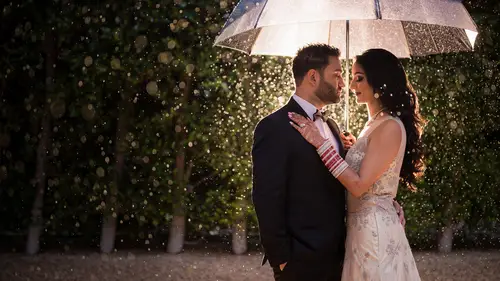
14:00 12Backlighting Rain & Particles
28:32 13Double Backlight with SFX Flare Midday
11:41 14Shooting Through the Foreground
09:29 15Three-Point Starburst Lighting Setup, Pt. 1
20:42 16Three-Point Starburst Lighting Setup, Pt. 2
09:44 17How Gels Manipulate Ambient Light
17:41 18Three Favorite Gels for Ambient Light Manipulation
18:15 19Background Lighting for Portable Silhouettes
16:07 20Three-Point Lighting within a Portable Silhouette
18:58 21Background Light Compositing
18:49 22Wrapping Background Light
13:15 23Lighting and Framing within a Shadow
36:19 24Nighttime Vs. Day in a Single Exposure
17:53 25Flashed Double Exposure - Adding Scene Elements
17:31 26Flashed Double Exposure - Layered Vs. Clean Textures
28:47Lesson Info
How Gels Manipulate Ambient Light
This next video is a reference guide, and that means we're not actually aiming to finish any sort of final image. So what I want to do is put down kind of your pen, your paper. You're walking, whatever you got and just focus on what we're doing. Because in this video, I want you to walk away with the ability to intuitively visualize what's going to happen to the ambient lighting a scene by jelling your main light or jelling that light that's lighting your subject. So what you'll see in this video is we have our model placed in a very colorful field. We're going to work from colored gel to color gel going from blues to greens to oranges to reds showing you each time the color that's applied to the person's face, as well as how that image shifts or how we manipulate the amulet when we correct for that color and the background shifts. Now, the intuitive way to visualize this and we're going to reiterate this in this video as well as in the next one, is to imagine if you're going to add a ...
certain color of light to a person's skin. The background is going to shift depending on how you have to color, correct for the light that's on your subject's face. For example, if you add a CTB or a blue gel to your main light, your subject turns blue right. So to correct for that cold skin tone that blue skin we have to warm up the image now warming up The image is going to mean that everything in the image shifts to be warmer, so we can imagine that using a C T. B is going to make everything look like this super warm, sunset styled background If we used a blue gel, if we use a green gel, we have to correct for the skin by adding magenta to the shot. When we do that, the background shift to a more purple or magenta kind of look in the background. So as you dive into the video, I want you to simply pay attention to the color that we're using, and then how that image is going to shift and post as we attempt to fix the skin tone to get it to something appropriate. Now, keep in mind, this is a reference guy. These aren't examples of necessarily things that we would do in this location. A lot of these gels are going to be kind of over the top and extreme. In the next video, we're going to explain and show our three favorite gels from manipulating ambient light. So let's go ahead and dive in. Now I want to give you guys a reference video that you all can kind of use in the future to see how a gel over the main light is going to change and manipulate the colors in a scene. Now, just for a quick intro, we're here in Lake Elsinore in Riverside County, California, for the Super Bloom. I'm gonna make a quick note about that. But first, let me introduce. We have Alexis right here underneath our light. She's gonna be a model in town for the day, and we have her mom Olivia assisting us. We made a ridiculous trek up here with a bunch of gear just to show this. So hopefully you guys will appreciate this video. But briefly, before we jump into this, I want to make a quick note about just the overall social impact that we're having. Well, social media impact that has over environments like this. When you guys come out to places like this, we've seen thousands of people on the way in people treading across the different kind of fences and things that are set up just to protect the wildlife and to protect the environment. All I have to say is, please be respectful of these properties when you guys are going out, so we can continue to enjoy them as a whole. Now, for this shoot, we have permission to be where we are right now. We're very carefully watching where we're stepping and we're not placing Alexis in any areas. We're gonna be crushing poppies. It's really unfortunate to see all the impact that's been had already. So I just wanted to make that note, and now we're gonna go ahead and jump in. I have a pro photo be 10 set up, and what we're gonna do is we have the O. C. F. Beauty with a white on there with the diffusion panel, and we're gonna fire that directly onto Alexis just so we can see the background shift here for the camera. I have the Eos are set up. We're gonna be shooting at 102nd F nine just to get a full power out of that light. So this is part of the Lighting 300 series, and we always talk about power settings so you guys can adapt and, well, use any light for the same technique that will be showing. And right now we're using 250 watt seconds of power or the beaten at full power. We're going to begin with shooting that first shot, just standard daylight temperature, and we're gonna go through and cycle through each of the different gels. We'll let you know which one we're using, and you can see the background shift as we go. We're also going to use the color checker passport over her face with each shot, just so we can easily wipe balance and have a comparable set of images across the board. Let's get into it Quick. Note. I took off the OCR beauty because we're losing too much light. I don't wanna be using an ND filter that's going to change the overall color of the image. I want to see what things look like, so we're going to shoot with a bare bulb so we get enough power onto Alexis for these shots. So let's go ahead and get our baseline. Here's our color checker. Yeah, let me briefly show you why we're using the color checker passport. So what the color checker offers is by taking a picture under the lighting that I'm applying to the image actually have a neutral white point that I can simply use the white balance tool of the white balance selector to pull a white balance reading the way that this would work in Post is I'm just inside of the develop module. I'm going to press W to pull my little white balance selector tool, and I can just press any of these neutral tones right here, and it will automatically dial in a temperature and tint that's appropriate Now. The trick here is making sure that the color checker is lit by the same light. That is the main light for your subject's face. This is why it's placed directly in front of our subjects face here, and that's how we're gonna get the reading from each of these different scenes and like this, pull the hair in real quick just on each side so it's not going over the shoulder. So just kind of like there. There you go. Right there. Perfect. Right there. Here's the shot. Mhm. Next, we're gonna go CTO. And here's our test shot. Yeah, Okay, so now we have the CTO image, and you can see that with that standard white balance that we shot with 53 50 Kelvin The image, or at least her skin tone, is very warm. So again, I want you to be able to visualize in your head before ever applying the gel to the flash. That way you can see a scene and kind of imagine what gel would help you to enhance or manipulate the amulet in a way that you want to. So in looking at this image, what has to happen, we have to cool down skin tones. And what that's going to do is cool down the overall image. So if I press w and actually click a neutral point, that's exactly what we should see. So let's do that. That's exactly what we see now. What happened was to get to a neutral tone. Well, it cools us off by about 2000 Kelvin and puts us at around plus 19 for our tent. Okay, Now you will have to tweak and fine tune from these places to get to a look for skin that fits your kind of subjective style that you want for that particular scene. But we are very close to where we need to be. And what we saw was the background shift blue with the C t o. Let's keep going, Alexis. Here is the actual perfect right there. Perfect. Yeah. Okay, now we're gonna do peacock blue. Okay, So, peacock blue, what essentially this color is is it's green as well as blue. So it's kind of a teal that's being applied to our main light. Now, how in the world could you visualize or imagine what's going to happen to the scene here? Well, look at her skin tones. So from this gel we need to add a lot of magenta is to basically correct the green out of the image. We also need to warm up the image significantly so our background is going to be warmed as well as have a lot of pink, and magenta is added to it. So now let's go ahead and apply press W. And let's select one of these neutral tones. And look at this. Our temperature flies up to 20,000 Kelvin and we end up adding 120 plus tint. So we were originally Where was it? At 17. We now went up to 1 43 1 44 ish, so the background just shifts to this warm magenta look. It almost looks like something apocalyptic, right? Something that you might see in like a post nuclear kind of apocalyptic movie. That kind of shows this type of landscape. Definitely not something I would want to utilize for this type of a portrait shoot. But it's interesting nonetheless, to understand how it's shifting the background. Let's keep going. Mhm! Actual shot. Yeah, good. Mhm Rose pink or magenta rose pink. Okay, so we're basically applying this magenta tone to the flash that's landing on our face. We get this kind of crazy nuclear pink skin tone. What the heck is that going to do to our background? Well, again to correct For that, we would need to add green, right? So to add green to counteract for all the magenta that we're adding with that gel Well, that should send the background to some crazy green color. Now, will this look good? I doubt it, But let's see what's going to happen. So I'm gonna press W We're gonna go ahead and select a neutral tone and look at this. Our tent shifts all the way down. It maxes out at negative 1. 50 so it might even need more. And our white balance actually stayed pretty close to where we shot it. But we added tons of green to neutralize all the magenta again. Would this be a look that we go for here? Probably not, but it's a good exercise nonetheless. Let's keep going Shot. Let's check it. It does work. Okay. Mhm. Now we got just blue. Okay, so now we have just blue. Now this color is far beyond a Let's say C t b a color temperature blue gel. This is kind of a creative gel that's in the pro photo kit. So imagine, probably putting together too blue gel stacking to see TBS. That's what's going to give you just blue. So in all honestly, if I was to use a blue gel, like either in the magma or in the pro photo kit. I would use a half C T B or one C T B. Okay, so half or a full C to be one single blue gel is going to be adequate. This is a little bit over the top, so again, intuitively trying to guess what's going to happen. Well, our skin tone is so cold that we're gonna have to warm up the overall image. Let's press W and see if that's what happens. And, sure enough, look at the temperature. Fly up and max out at 50,000 Kelvin once again, half CTB or CTB. Don't go with the Gest blue for a main gel. You might use it for, like, a background or a kicker or something like that, but don't use it as that main light gel, but we can see that tent goes down slightly. Temperature shifts up to 50,000, and it's still not corrected for skin tones. So where this would probably have to go is probably closer to like 100,000 temperature to actually get her skin tone to be warmed up because you can see that it's still too cold here. All right, let's keep going and shot. Perfect. Mhm. Okay, so now we have golden amber. So Golden amber is again another interesting tone. And because all the different gel manufacturers make slightly different variants of these colors, this is part of the creative pro photo kit. It's difficult to kind of match them up across to mag mod and across the Lee filters and everybody else who makes these gels. So again, I don't want to get into the exact gel you need to use. I want to get into visualizing and intuitively knowing what's going to happen to your scene. Now This gold slash amber tone is very much like a CTO, maybe a little bit more intense. So this might be like a color temperature orange gel stacked with another color temperature orange gel or maybe a half color temperature orange over your orange gel. Which means it's going to have the A very similar but maybe an exaggerated effect compared to a regular CTO, which we kind of started with right, So it's just more orange, more yellows, and that means the background is going to shift more blue if we correctly understand this because to correct for our subject, we have to shift down in color temperature, and the background should shift to a pretty extreme blue. Let's go ahead and press W and select our white balance tool and click it. And what we get is it drops all the way down to negative 2000. It also shifts out a little bit of magenta is to correct for this, and we get pretty close to a correct color temperature. But again, for this overall scene, I do feel like this is a little too exaggerated. I wouldn't use this in this type of a scene. Honestly, probably the best this far in this type of a scene would be to go with something like a half CTB and a half. CTB would just give us a slightly warmer overall look to the background that would look nice, but really, anything beyond that, I probably wouldn't tweet. I don't really want to send this background to a blue. It's not night time. I don't want to make it look like nighttime. It'll just look kind of odd and unnatural. Let's keep going. Mhm shot. Bring the hands down Perfect. Mhm, yes and mhm. Mhm. Next we have yellow or deep straw, deep straw coming in similar to that golden amber. I do notice that there are more greens in this. There's also, uh, maybe a little bit less oranges. So when we correct for this, we're probably gonna see the overall image cool down. We're also going to see a little bit more magenta being added. Let's go ahead and press W and go ahead and select a neutral point. And yes, So we dropped to 26 50. So this is actually getting to a place where it can be corrected, and then it brings the tint up to 37. So I would probably leave this a little bit on the warmer side. Maybe somewhere around, like maybe 28 2900. But it gets us stylistically very close to what that would be again. A little bit extreme, but it's a good idea. And by this point, I'm hoping that you're able to guess and see what these gels are gonna do before you even see us make this click in like Graham. Let's keep going. Yeah. Okay. Here we go. Shop. Yeah. Mhm. This is sorry. Magenta. Okay, so magenta again. Same thing, right? if we go ahead and press W and we white balance select well, we get to a corrected image by adding tons of green, so it shifts our tent way down. One of the thing that's worth noting this we talk about how gels kind of cause you to lose overall light. Right? Anytime you're applying a color to a light, it's going to cut down the power of that light. You can see just how dramatically it can cut down when you get two colours like the Reds and the blues. And these deeper colors were losing 23 stops of light and on a pro photo gel. It'll actually outline and tell you how much light you're losing. And on a gel like the just blue, you're losing up to four plus stops of light. So just keep mind that if you're in bright daytime situations and you're wanting to add these gels, you're the tons and tons of power. Okay, let's go on to the next one. Oh, I'm out of them blurry. That's it. Shot perfect. Perfect. The goal of this video was to take this complex subject of jelling and manipulating ambient light, and to make it far more simple and intuitive. Now, at this point, I'm hoping that you can visualize exactly what's going to happen to an image when you apply a gel over your main light and then you correct for it as you go into post. So as we go forward, we're going to show you in the next video are three favorite gels that we actually will frequently use to manipulate ambient light. Good job. Let's go on the next video.
Class Materials
Bonus Materials with Purchase
Ratings and Reviews
Jackie Stewart
Lighting 301 is excellent! I learned so many new techniques throughout the class. Pye Jirsa is brilliant at explaining new lighting techniques in such an easy to understand way and his mastery of Lightroom is amazing!!! Loved the class and can't wait til implement the things I learned!!!!
Doug Rogers
This is a great course! I learned a great deal about lighting and editing in PS/LR. Pye is a great communicator and I appreciate his wry sense of humor. Note, this video was before AI, so that is not covered.
Dani
I love the Lighting (101-201-301) courses; I have finally understood the concept of lighting and how it works. I have been referring to my notes and go back to all the courses with ease. One of the best courses I have done for myself and my biz; I am so impressed with my work and the lighting I can create.