Lesson Info
16. Three-Point Starburst Lighting Setup, Pt. 2
Lessons
Class Introduction: Lighting 301
04:54 2Two-Light Stacks for Portraits with Depth, Pt. 1
36:01 3Two-Light Stacks for Portraits with Depth, Pt. 2
08:31 4Two-Light Front and Back Classic
22:25 5Two-Light Environmental Backlighting
19:38 6Double-Diffused Main with Added Rim Edging
27:38 7Dramatic Light with Wide Vs. Closed Apertures
17:27 8Two-Light Pin for Two Subjects
21:46Two-Light Pin with Ambient Shutter Drag
24:19 10Hollywood Two-Light for Subjects
21:44 11Double Backlight for Environmental Portraits
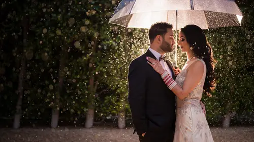
14:00 12Backlighting Rain & Particles
28:32 13Double Backlight with SFX Flare Midday
11:41 14Shooting Through the Foreground
09:29 15Three-Point Starburst Lighting Setup, Pt. 1
20:42 16Three-Point Starburst Lighting Setup, Pt. 2
09:44 17How Gels Manipulate Ambient Light
17:41 18Three Favorite Gels for Ambient Light Manipulation
18:15 19Background Lighting for Portable Silhouettes
16:07 20Three-Point Lighting within a Portable Silhouette
18:58 21Background Light Compositing
18:49 22Wrapping Background Light
13:15 23Lighting and Framing within a Shadow
36:19 24Nighttime Vs. Day in a Single Exposure
17:53 25Flashed Double Exposure - Adding Scene Elements
17:31 26Flashed Double Exposure - Layered Vs. Clean Textures
28:47Lesson Info
Three-Point Starburst Lighting Setup, Pt. 2
in this video, we're going to build on that three light setup, but this go around, we're gonna push those lights further in. I want you to see how it looks when we're using these back lights is kind of a stylized star burst pattern for our dramatic portrait of Seth. Remember, two things are creating that star burst pattern. One is, of course, the aperture right. Closing down our aperture is what's going to a naval kind of that flare that would normally be a bloom when shooting wide open to kind of turn into that star burst pattern. So somewhere between F seven F 14 or even above, ideally, kind of around that range though, f seven f 14. So you're not introducing too much diffraction is a good place to start to get your star burst pattern. Keep in mind, though, that number two is the lens itself, specifically the number of blades on your lenses. Aperture is what's gonna kind of lend a unique flair characteristic, or look to that star burst pattern on each lens that you shoot with. So eve...
ry lens gonna look a little bit different in the pattern that it kind of renders with these starbursts. That being said, let's go ahead and jump into the video. Lean a little bit more. This way. Right there. Hello. You think you can breathe it into the chest a little bit? Suck into the chest. Second, your tummy. Okay, that's it. Relax at all, dude. Mhm. That's crazy. Alright, so here's what's happening. So we've taken that exact same setup. So here's Seth. I'm gonna draw on his beard this time. This is a beard. Is that a good beard? It's a top down view of his beard, So you really just see a little bit sticking out. Okay. And here is that main butterfly light source that's tipping back and towards him. Here's the camera and his motorcycle directly behind him. Okay. And then the gas pumps. So all we've done is these lights that were outside of the frame. We have now pushed them into the frame. And what I've also done is kind of hid the light stand by placing the light directly, actually above and right behind each of those gas pumps. So now we kind of just have this cool, stylized light coming through, and all we see is the light source itself. What I want you to pay attention to in that final shot is one of these lights actually has that gigantic kind of maga ring on it because I was the only thing we had to hold it. The other light is just on the stand. But the kind of shape of the flair and the overall bloom of that light actually ends up covering it up so they look almost identical. So just don't really worry. If there is a little bit of a different shape to the modifier that's holding it, Usually the flare is going to cover it up. As you see in this shop right there. Yeah. Mhm, Yeah, Yes, Tilted. Bring it forward to remember how Carly you had, like, over here a little bit and then kind of rounded in. There you go. There's a little refinement note here that might go overlooked. I made a subtle adjustment to Seth's pose because in this first shot, actually noticed that well, a little bit. The gas pump behind him was showing, and he was kind of standing closer to the light on the right side so you can see the distance between the right. The light on the left side versus the one on the right is just a little bit different. It's not a huge deal, but here's the thing for me. If I'm going to go for a symmetrical pose, I wanted to actually be symmetrical. That's one of my biggest kind of compositional pet peeves when I see our team or other photographers going for symmetry. But there's this small little thing that's off, whether it's the camera, angle or position of the subject, where it's just not quite there. So you'll see on the shot on the right that I have him basically leaning or adjusting his feet just a little bit to get back to the left to make sure that the balance in the shot is kind of restored and the distance between both left and right sides are equal. Now. I loved both these shots, so I'm gonna give you guys to exercise files to play with in this scene. So go ahead and grab one of them. Uh, we're gonna go ahead and process them from the ground up, and we're gonna do the same way, so we don't need to do both I'm gonna go ahead and do this shot. Now, I love this shot, because if this were, like, say, a commercial shoot would be the perfect kind of shot and pose to feature several different things, we could be featuring the glasses, the rings we could be featuring the jacket, the fashion side of it. All three of these kind of worked very well for a shot and pose like this. All right, so let's go ahead and start by lifting the shadows a little bit. I'm gonna go ahead and add just a little bit of clarity as well into our image. You can see kind of everything. Just start to pop right away as soon as we do that. And I'm also going to add in a little bit of blacks just to kind of give us that deep, dark contrast. Okay. Pressing J to kind of bring up my high alert. I don't want too much of this to actually be clipped, so I'm gonna go to maybe right about here in the black. So negative 14 negative 15 ish, and I'm liking the clarity. What I am going to do, though, is I'm going to pull the whites down just a little because I see the highlight on his forehead is a little bit extreme. I don't really need to mess too much with the highlights. And here's a fun thing that you can actually do if you want. You can actually bring the highlights up a little bit while bringing the whites down. Now you might go, OK, but the highlights on his face are too much. You're right, they are too much. But the point of doing this is to actually drop the exposure overall. Now what happens here is by brining the highlights and pulling down the whites. We sort of even out the highlights on the skin. So the highlight areas of the skin that aren't pure white end up brining up the pure white areas end up darkening down, and then we just take the overall exposure and pull it down a little bit. And we get to this really nice kind of refined look in that light pattern or in the light quality I'm gonna now is Let's go ahead and put in our split toning with the shot. I'm gonna see where our natural tones exists. See, I love the natural tones here. Kind of right close to that orange. I love that. I'm going to pull it down a little bit. Leave it around plus 30 and I'm gonna go ahead and grab. I don't think we have any. Well, we do actually have some blues up here, so let's go ahead and grab that blue and pull it down quite a bit. Okay? We're going to balance this more on the highlight side, and I'm gonna pull down the saturation just a bit too. Shouters are actually pretty good. Okay, Now, let's make our fine tuning adjustments to temperature intent and see if there's anything that really needs to happen here. I'm going to go ahead and take a white balance reading off the jacket, so that puts me around 600 plus 17. Now, I'm just gonna warm that up a bit. So right about here is where kind of it fits my style. My look. And now from here, we can tweak and adjust. I have a little bit of Thiel's actually in those shadows, and I like that look a lot. So what I'm gonna do if, by the way, Carlo, what do you think I'm going to do. Come on, Ray. Over. Oh, my goodness. He got it. Yeah, we're gonna put in a radio and let me just remove our text too, so I can kind of see what's going on. So radio with a feather all the way in, I'm gonna go ahead and pull in. Now, one thing to be careful of in a scene like this is to bring those highlights or white points back up. So that way we're not really affecting the white point of those, uh, of the flares in the background. See, when we affect the white point in the flares in the background, it gets this kind of dingy tone, and I don't like that look. So what I want to do is pull it down quite a bit, like negative 1.35 on that burn. But with the white point, I'm gonna leave it up. Okay? Not too high. I just don't want it to be gray and right about there is solid. So that's really it with this shot. Now, there's some other fun things that we can do. Check this out inside of the retouching. Brushes for the visual flip preset, which again, if you guys don't have it, not a big deal. Pause the video and dial in these settings. These are the settings that I use for a hair and detail enhancer. So on a shot like this, it ends up actually looking really cool to go in and paint this right over his beard. Okay, I'm also going to do it just over the hair. And then what I might do is just dial it back a little bit. So I'm gonna go ahead and just hold down. Alter option, pull it back a little bit. Make sure it's not on the brightest of highlights. Make sure it's also not falling onto his skin anywhere. And, uh, here's another fun one. We actually have a You know what? We don't see enough of the tattoo in this one to do it, but we actually have a tattoo enhancer as well for specifically for those kind of more edgy shots. But let's take a look now at the before and after here. So this is the shot that we just brought in. And let's go ahead and make sure that that's reset out. So let's reset this There we go. And I'm just gonna go back to the original. Okay? So one more time, there's the original. And here's our final image. Very cool. Really fun, stylized. Look that we achieved here, all the editing done inside of light room. We get a very cohesive nice look with the colour scheme in the toning and that's it. It's going to the next video.
Class Materials
Bonus Materials with Purchase
Ratings and Reviews
Jackie Stewart
Lighting 301 is excellent! I learned so many new techniques throughout the class. Pye Jirsa is brilliant at explaining new lighting techniques in such an easy to understand way and his mastery of Lightroom is amazing!!! Loved the class and can't wait til implement the things I learned!!!!
Doug Rogers
This is a great course! I learned a great deal about lighting and editing in PS/LR. Pye is a great communicator and I appreciate his wry sense of humor. Note, this video was before AI, so that is not covered.
Dani
I love the Lighting (101-201-301) courses; I have finally understood the concept of lighting and how it works. I have been referring to my notes and go back to all the courses with ease. One of the best courses I have done for myself and my biz; I am so impressed with my work and the lighting I can create.