Lesson Info
10. Enhancing Existing Light with Flare
Lessons
Enhancing Existing Light with In-Camera Dodge and Burn
23:15 2Portable Window Light Anywhere
26:21 3Larger Portable Window Light, Pt. 1
19:50 4Larger Portable Window Light, Pt. 2
17:29 5Direct Window Light
15:33 6Perfect In-Camera Flares with Compositing
21:35 7Convincing Environmental Backlight
32:50 8How Atmosphere Affects a Scene
06:38Enhancing Existing Light
19:08 10Enhancing Existing Light with Flare
18:08 11Backlighting as a Main Light
32:44 12Backlighting as a Main Light with Smoke
10:52 13Midday Hard Sun with Godox
32:04 14Midday Hard Sun with Profoto
11:46 15Light and Airy Afternoon Backlight
11:42 16Late Afternoon Indoor Backlight
16:16 17Shooting Golden Hour Hard Light
19:52 18Working with Artificial Flares
26:18 19Golden Hour Environment
09:49 20The End
00:37Lesson Info
Enhancing Existing Light with Flare
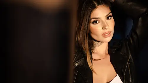
in this video, we're going to build on that last concept. In fact, I'm actually gonna hold Kylie's pose roughly the same. She's gonna be sitting doing the same thing. Camera composition. Everything is going to remain virtually identical. The difference is we're gonna push Kylie about 5 ft in. We're going to add a little bit of atmosphere. And based on her positioning, we're going to augment the existing light with a couple of unique balance techniques to show you how just a subtle change in her position and the way that we approach the shoot, we're going to yield an entirely different image between this shot and the last one. So let's jump in. This is what the scene looks like without flash. Yeah, okay. And this is what it looks like natural. And now we're gonna go ahead and add that flash in and darken everything down. Okay, so let's pause here and just talk about so far, what we have, because what you see on my screen right here is the natural light image. This is at 1 at 1.2, and I...
so 50 Now, let's draw out the lighting diagram because What we're about to do is kind of a little complicated. Gonna build on kind of some of those things that we've done before. So we have that same train car design. Oh, look how nice it is. I can trace it over the previous one. Okay, we have our doors. Yes. And the front door right here. And we have our windows on each of these sides. Window, window, window, window in the back window. Here. Window. Okay, so Kylie was here in that last video. All we've done now is we've pushed her back to right about here. Okay, So now the camera position moves from outside of the door frame to about right here. Mhm. And we captured this shot. Now, if you notice well, so far, this shot is actually pretty darn similar to that previous final shot that we did, right? So if you look at these two like we mentioned at the beginning of the video, I mean, these are virtually identical. But a 5 ft positioning change is going to dramatically shift what we see in the background and also how the light is going to impact the scene. Especially once we start adding and augmenting that light. But first, let's talk about the light that we see now versus the light that we saw a moment ago. So I want to actually compare these two natural light shots. So looking at this show on the left, that was the shot in the last video. We see that nice kind of butterfly light kind of look where that light is coming directly from the front and it kind of falls off to the sides. Um, it looks nice. It has that top down angle Great. In this shot, it's a little bit different where what we're noticing now is she's very much in the shadow. But we do see some light direction actually coming from this right side of the face right here. In fact, if I zoom in a bit, you can see that we have deeper shadows on the left side. Then we do on the right, so there's some sort of light that's actually coming from the right, and if we actually zoom in, you can see the light sources so that little bright speck in the middle that's actually the door behind me. But this spot of highlight on the right side that's gaining some that's giving her some light direction. That's coming off the wall. It's actually coming from this wall. Okay, what's happening is is the natural sunlight is coming kind of through this window and forgive me if the angle is kind of a little bit off, but it's landing right on this wall, and it's creating a brighter wall right here because of that orange sunlight. So what you're about to see me do is I'm gonna set up a flash that's designed to enhance or augment that existing light. We're gonna position it actually, right here. We're gonna use a grid to control the light so it doesn't spill anywhere, and we're gonna fire it directly into that wall. That way it's going to follow the same light direction, but it's also going to have the same color as the light that's already reflecting off this wall. Let's go and watch that now. So I want this seem to be mostly natural light. We're gonna fill it with that atmosphere aerosol. What I would like, though, is there's a little bit of light bouncing right onto this, and that's the main light that we're getting onto Kylie's face. What we're gonna do is pump more light into that so we not only get more light, but it's also the same exact color of what's already there. Hopefully, this works. What do you think? You think it'll work? Yeah, definitely. You got a lot of faith. Hope it's not misplaced. Okay, Okay, Perfect. So let's take a look. That's beautiful. Now, this is fun. I'm sorry. I think all this lighting stuff is fun. But let's take a look at these two images, and what I want you to see is if we zoom in, look at how the light pattern kind of falls off right here on the cheek. Look at how the light pattern identically follows that fall off because we flashed off the same light source. In fact, when we look into the catch lights, you can actually see that same catch. Light now is just getting brighter based upon the light that's hitting it. So you can actually see that exact same catch light light up. And that shows you that we're properly lighting the right spot to kind of add or augment the existing light. Now Carlo made actually really astute observation. And he asked, Well, is it that window that's off to the right side? Creating that catch light? And I go? No, it's definitely this wall because not only do we have sunlight hitting that wall directly, and that's what we're actually lighting up, but also, the window directly to the light would not be visible from the eyeballs that are facing forward, right, Because that's let's like on her shoulder so we wouldn't be able to see that. It's kind of blocked out by the hair. So this is perfect. Let's zoom back out. Now that we have our lights set up and we're getting that nice, Phil, what we're going to start doing is kicking in some atmosphere into the scene, and we're going to arrive at some of our first few final images that will actually keep beautiful. All I gotta do now is just pump in that fog. So now you're gonna pump fog into the room. Yep. Go and don't stop. Keep going. Okay. Now stop. Yeah, We're gonna let the front of it dissipate. And once it's mostly in the back that we're going to start shooting. Mhm. Mhm. They're right there. Kylie. Kind of Go ahead and adjust the pose. Chin down a little bit. Bring the chin over here a little bit right there. Give me some more light or four more fogs, more fog machine. Go ahead and bring both hands into it, Kylie. And kind of move it around a little bit. Like both hands. Don't have to be doing the same thing. Stay centered in your frame. There you go. Right there. Beautiful. Stop with the fog. Perfect. I'm gonna let it dissipate a little bit. Bring the chin over this week, I think There you go. Let that part of that hair just fall straight. There. Right there. Switch it up. Go ahead and move freely. Mhm. I love that. Love it. Do that jacket over the shoulders. Yeah. There you go. And then bring the hair forward. So it's like, actually this one. Let's see the ink to So pull the hair in the back. There you go. Perfect. I love it. Love it. So good. Amazing. I want to do one last thing. You down. I'm gonna add one flare coming into my camera. Let's pause for just a moment to take a look at the images. Now, in here, you will see some of our final images. So we have the image. Well, this is what it looks like raw. And then we have, like, a final image produced very similar to the editing in the last video. But what I want you to pay attention to is really my recommendation when you're working with atmosphere is to allow the atmosphere to dissipate. When I have atmosphere that is coming out of the cans are out of the machine and it looks like clouds. It has definition to it. I don't generally like that unless I wanted to appear like clouds. So here, this is kind of a toss away shot, and what I'm gonna do is actually wait for that fog to dissipate a little bit. And I'm gonna take the other images where the light is much smoother where we have kind of an atmosphere, but we don't have noticeable clouds. So now we get to a couple of different final images, and what we're gonna do at this point is going to add another light to sort of simulate what would be happening if a light was coming through the window from the left side to be adding a flare into our camera. Let's do that now. So let me get one more light up on a stick. Move it up about six inches. Thanks, Mickey. Right there. And then push it into the frame a little bit more and aim it down to this side a little bit more there. Just make sure it's not bleeding over her. Yeah. 65 Yeah, on B. Yeah. Okay, so it is bleeding over here. Turn the head towards this. Like, right there. Right there. Still bleeding over her. Um, push it out this way a little more. But there, there. That's good. Okay. Mhm. That's 65 or I just lost power. Yeah. There we go. Okay. Go ahead and lay down fog and stop. It's like hit the back side of the room. Yeah, I love that. Okay, switch up the pose now. Kylie, That's fantastic. Switch it out again. Perfect. Oh, I love that. Bring the hair down now in front of you with that pose. Mhm. Pull down on each side. Kind of get it all sitting straight. There you go. Now, before we dive in a post. I want to pause just for a moment, because I want you guys to all appreciate how dramatically a scene can change with just a few feet of subject positioning. So by moving Kylie back 5 to 10 ft and spacing her in the other door frame the way that our composition shows through the window lights that we see in the background, the light that's coming through and the way that we lit the shot, it leads to a completely different image despite being in the exact same scene. Now let's go ahead and go into post now for y'all. I'm going to give you a couple of different images from the scene to kind of work through. Um, we'll go ahead and select this one right here. It's going to be actually pretty darn simple. First, I would get a white balance read. You can grab it right off of just the white top by pressing W and clicking right on there, and we're gonna do the same thing that we did before where I'm gonna go ahead and boost my highlights a bit. I'm gonna drop the whites just a bit, actually, on this one I do want the window lights to be nice and bright, so don't drop it too much. But that's about right right there. I'm going to add a little bit of shadow to the shot, and then we're gonna go ahead and add just a little bit of blacks, so lift shadows a little bit and then add a little blacks. Okay. From here, I'm gonna go ahead and drop in my radio burn, okay? And then I'm gonna go ahead and grab that radio burn and make sure it's placed over the face, and we'll go ahead and just kind of change the size of this to kind of fit more. So the door frame kind of behind her. And this is looking really nice so far. So what I might do now is just kind of adjust the temperature a little bit. And you know what? Before we do that, let's add our dodge and burn. So I'm gonna go ahead and go back to my quick dodge and burn. Um, let me actually show you another trick here. So what I'm gonna do with this is I'm going to go to my Dodge and burn whites and I'm gonna change my flow up to 100. I'm actually gonna paint this just over the face and really just over the skin, because that's the only thing that I really want to dodge with this first layer. Okay, so let's just go over the skin. I'm not even gonna do a good job of like, drawing it in right now. Notice how messy it is right now. What I am going to do, though, is I'm gonna go to my range mask, Fluminense, and I'm gonna go ahead and start pulling this off of all the shadow. In fact, I'm gonna lift all the way to the point where it's really only touching skin tones, which is right about here. Next thing I'm gonna do is I might see if I need to pull it off of the brightest highlights. And honestly, I kind of like the way it exaggerates. Kind of the doing this of the skin. Yes, doing this is a word. At least now it is. I'm gonna increase the smoothness a little bit, so we get a little softer feather. Now, I'm gonna go ahead and holding down. Alter option to erase. I'm just gonna pull it off of the whites of the outfit. So I don't want the white of this outfit to kind of be affected by this. I'm gonna pull it off there. I'm gonna go ahead and go up here. I'm gonna pull it off the little edge on the hands so as not to affect that And also off this highlight. Just cleaning up the mask a little bit. If I press Oh, I should be able to see where it's at now. It's not affecting the hair much, so as long as it's off the outfit and it's primarily on the face, I'm totally good with that. So what that did was it gave us a really nice dodge and kick directly to the whites and the highlights of just skin tones. And we did it very simply, right here inside of light room. Now, if you want to hold down alter option, you can click and drag the left to reduce the effect. If by chance you wanted to increase the effect, which I don't, I would go ahead and right click and press and duplicate. But it's going to get us to a point where it's a little bit too exaggerated. Um, I just want you to know how you could duplicate the exact same brush if you wanted to. What I'm gonna do is reduce it a little bit, and this is starting to look really nice. I might add a little bit more to my exposure a little bit more to my contrast. Okay? And we start getting a nice kick. The whites look white on the top. Everything looks good in the frame. I'm gonna add a little bit more highlights as well. Okay. And just drop the exposure. A tiny, tiny bit. Now, the last thing that I might do with this image is I'm going to remove my information. By pressing I and I might just exaggerate that flare coming from the top, right? So once again, I'm gonna pull into my retouching brushes again. Those that aren't using the visual flow brushes. Just go ahead and select those that are select 68 sun flare. Those that aren't just go ahead and pause. Dial in the settings. And what this is going to do is it's going to give you a really nice flair coming from the top left of the frame. So what did I do with that? All I did was a one click to again enhance the existing flare that I created. And this is the the critical piece about knowing what you can do so simply with that raw file in post, because by just adding that flash, I know that if I add a light source from that direction where it looks like there's light coming from there, I can kind of enhance that in post and have it look real and authentic. So that's really it for the image and with those adjustments made we get from this to this looks really nice, super convincing. Be a great candidate also for a black and white. And if you're gonna go black and white, by the way, I would just flip this over to this guy. So I have a son flair as well inside of the retouching brushes that's created for black and whites. So this removes the color effect from that, so just make sure that if you're going to do a black and white, you remove the color effect from the flare. But that's it. Hopefully, you guys enjoyed this. You guys can follow the same post. I'm gonna include some of the close ups as well, but let's go on to the next video.
Class Materials
Bonus Materials with Purchase
Ratings and Reviews
Nev Steer
Jye is an exceptional teacher and these videos really breakdown the construction of great lighting techniques. Enjoy the dry humour throughout. Well worth watching for even experienced photographers as there are lots of tips and tricks here.
Funfotog
Kyle made Pye's work look simple. I learned a lot of new ideas and was reminded of some that I had forgotten about. I'll be reviewing 201-401 again with the practice images.