Lessons
Day 1
1Pre-Show Banter
07:02 29:00 am - Introduction: Why Lightroom®?
13:23 3The Lightroom Library Catalog
16:42 4Staying Organized
15:00 5Backing Up Your Library
11:12 6Importing Your Photos
34:20 7Preferences & Settings
28:57Settings Q&A
10:49 9Reorganizing Files and Folders
33:25 10Using Views and Labels to Evaluate Photos
45:00 11Filtering and Stacking Photos
13:37 12Assigning and Managing Keywords
31:42 13Keywording Q&A
12:43 14The Metadata Panel
14:38 15Searching for Photos
20:54 16Creating a Collection
15:25Day 2
17Day 2 Pre-Show Banter
09:09 18The Map Module: Assigning Locations
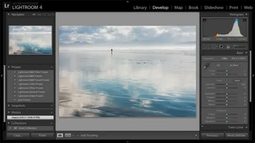
43:33 19The Develop Module
11:37 20Fixing Your Photos: Histograms and Cropping
22:02 21Fixing Your Photos: Spot Removal Tool
33:25 2211:30 am - Upgrading to Lightroom® 4
12:14 2311:45 am - Basic Developing in Lightroom® 3 & 4
21:29 24Basic Developing Part 2
19:43 25Color Adjustments
23:36 26Tone Curve Panel
18:59 27Making Subtle Adjustments
13:22 28Lens Corrections
10:54 29Local Adjustments: Partial B&W
13:03 30Local Adjustments: Portrait Touch Up
26:05 31Additional Local Adjustments
09:55 32Graduated Filter
24:24 33Bonus: Day 3 Preview
01:19Day 3
34Day 3 Pre-Show Banter
12:44 35Bonus: Recap of the Develop Module
08:44 36Virtual Copies
08:58 37B&W and Creative Effects
20:50 38Noise Reduction
12:23 39Sharpening
18:33 40Sharpening for Portraits
08:46 41Syncing Changes to Multiple Photos
17:53 42Autosync
21:09 43Creating and Using Presets
15:53 4411:45 am - Lightroom® and Photoshop
22:49 45Sharing Your Work
08:42 46Exporting for Web
16:59 47Exporting for Print
26:06 48Workflow Recap
40:50 49Thanks + Credits
07:02 503:00 pm - Lightroom® 4: Publishing
20:52 513:30 pm - Lightroom® 4: Video Editing
12:38 523:45 pm - Lightroom® 4: Book Module
19:36Lesson Info
B&W and Creative Effects
Okay, so let's go ahead and go back to this black and white virtual copy. Well, it's not black and white yet, but that's our gold. And let's talk about converting. It's a black and white Now, when it comes to black and white conversions, you could start by doing color work and then cover to black and white. You can cover to black and white right away. And then and then, you know, do additional work work. Then there's no secret to the order. There's no magic to the order. You do things so well just converted to black and white from where we are now. Now, as faras uh, so let's go ahead and scroll down on the right hand side here. You know, I'm getting tired of scrolling here on the right hand side, frankly, so it's because all of my panels are expanded. So I'm gonna right click on any one of the panel names, and I'm gonna say solo mode That way. When I opened up one panel, it will collapse all of the others, just less scrolling. Now it ages sell color black and white here. This time we'r...
e gonna click on black and white, So I've converted it to black and white. But of course, that's just the beginning. So light room has started with, um it's kind of what it believes mathematically. Maybe a good starting place. But from here again, like always in light room, we can take full control. So just like when we were working with H S, L, we've got sliders for the colors. But when I slide the blue slider here in black and white, I'm darkening or brightening anything that was blue in the color version in the underlying color version. So if I slide blue to the left, you'll see that I'm darkening the sky because that was the blue in the photo. If I go in the other direction, I'm frightening it. And as with H S, L, we have this nice little targeted adjustment tool. If I click on the targeted adjustment tool, then wherever I click light, one will figure out what the colors are in the underlying photo so I can click and drag down in the sky. Light room will detect that that was blue, and it will darken what was blue in the underlying photo. So maybe I'll click and drag up in the building here to see if I can get the front of this. The front of this building a little brighter now The reason I have hope that that will work is because the building eyes the only red in the photo, the only red and orange in the photo so I can see that light room slid the red and orange sliders, and they didn't affect anything else in the photo. So you have a lot of control here over your black and whites. It's, you know, just very easy to Dio. Now I should mention that we came down to the black and white panel and clicked on BMW. You can also in the basic panel. There's a black and white button here. I don't bother with that because I'm always going to go down to the black and white panel anyway. But you can click on this and just accept the default or go down. Click on black and white, black and white panel and take control and and use the sliders to fine tune your black and white Now black and whites often, you know, just if we want to mimic the look of film, we might want to add some grain to this photo as well. So let's take a look at how to do that Here in the effects panel, which is a few down from black and white, we open that up. We can do a couple things here in the effects panel vignette ing. So actually, let's start with a vignette ing before we do the grain, because this photo really could do with some darkening of the corners to kind of bring the focus into the center. So as I slide, uh, let me just mention here that post crop vignette ing in the effects panel is for adding creative vignettes. Sometimes people use vignette ing in the lens corrections panel to add creative vignettes. Now notice how in the lens corrections panel as I slide this, it's on Lee darkening or brightening the right hand side of the photo because the left hand side has been cropped off and landslide. Yet ING looks at the original photo because it's designed to fix lens issues that only show on the corners of the original photo. And in addition, lens been getting doesn't have much, many, many controls here, so it's not as powerful. So when you're adding a creative and yet you want to use the effects panel, so they slide amount to the left. Here it darkens. If I go amount to the right, it brightens. So as let me just make this obvious and I'll explain the other sliders. Since I'm here, midpoint determines how far into the photo. The vignette is going to go. Roundness controls how rectangular it is, versus how round it is and then feathering controls how harsh or how soft the edges So you can see that you can. You can create a lot of different looks here now one that I kind of like just for well for creative effect is this kind of film border. So the secret for the film border is to slide all of the sliders to the left, so often do that, and then I'll take the feathering up just to soften this edge a little bit. And sometimes I go the other way. I'll take the amount all the way to the right so that we end up with a white, a white border as well. Now I think it would be cool if we could save these settings to apply, and later. So maybe there's a way we'll see a little bit later on. Of course there is. It's presets, but okay, but let's go back on this one. I'm gonna reset the sliders. Double click on them. Well, I could just double click on amount for now, Dark and the edges. And then I'll reset these other sliders. Michael here, with this particular photo was something a little more subtle. I just wanted to darken the edges to bring the I in a little bit more. And if I had to switch on and off here, a top of the effects panel you can see without with All right, let's look at look at grain here. And I will see if there are any questions. I'm gonna go ahead and zoom in here. So I clicked in the photo to zoom in and I'll add some grain often can't see when you're zoomed out. Just how much grain you're adding. Now there's this question of Well, how far should I zoom in on a photo? You know how much detail should I see? It really depends on how you plan to share that photo. If that photo is only going to appear online very small, then I would do your work zoomed out. If you're gonna print the photo world so all of the detail is going to show, then you're gonna want to zoom in and make sure that you haven't overworked the photo. So let's just keep it zoomed in now because it's easier on screen for you to see three effect of the grain here. So we've got we can ADM or or less grain. We've got a size slider and we have a roughness slider. Now I'm not a grain expert. I don't have that much background in film, But people that do have background in film that I've talked to have said that this this grain is just really excellent in terms of how it replicates the look of film. Sometimes I don't know quite where to start because I don't have that background, but you can use presets that the light room team has provided you with as starting points. So over here on the left hand side, we have the presets panel. If I come down to affects presets, I have grain heavy light and medium. So sometimes I'll start with grain heavy and then that sets thes sliders over here for a good starting point. And then I can say, Well, the amount is too heavy for me, So I'm just gonna back off on the amount. But I'll stick with Stick with that size, size and roughness, and I'll do command minus control minus to zoom back out, questions on effects or these black and white conversions in the um, I was just wondering if you could go through the vin getting styles, um, the highlight color and, um, paint overlay. And then could you show again how you turn it toe white? The secret you gotta You gotta purchase the video. Okay, so that the styles here Neil's talking about about this year, So we have highlight priority, color, priority and paint overlay. Frankly, this is one of those details that, as's faras definitions, I don't sweat too much, but bottom line is when you're adding a vignette to a color photo, everything I've showed in terms of applying vignettes and applying grain works for color photos as well. So that's not limited to black and white. When you're adding a vignette to a color photo. It can first of all, dark and your highlights. And it can also, um, affect your colors. Your colors can become more saturated and kind of shift a little bit on the edges of the vignette. So they have some base. Basically, you could make a decision on, um, which one you want to control the most. So if I add a heavy vignette, I'm not sure if this particular photos gonna gonna show the issue here. But we're live, and we're going with it. So I'm on highlight priority. I'm gonna go ahead and switch this the color priority. So there's a little bit. It's just got a different effect. OK, so what I would do personally, frankly, is not sweat the definitions, I would say Which do I like better knowing that you've got three options? Paint overlay is the old light room to version. So they've kept that version in Aziz. Well, so that kind of just adds gray on top of the photo. But I generally stick with highlight priority. But if I see some color shifts along the edges that are not working for me, I'll switch it to color priority once I switch it to color priority and make make. Of course, a different decision on how dark or you know what other settings I go with this? Well Oh, the white forgot. I knew you had a second question, but maybe I want to do it. Okay, so the way is just so amounts of the left is black or dark. Amount to the right. Is white. Okay. And actually, let me just show you a little bit more. So let me go back to my favorite kind of film. Border effect here. If you don't go all the way to white, let me zoom in a little bit. Here, I if you don't go all the way to white, but you go towards white, you can see the photo through the edges. So I think this is kind of cool that I've got a border, but I can still see the photo through the edge. And that doesn't have to just be on a narrow vignette. Of course I can. I can bring this. Let's see, I can bring this fit yet in further, you know, and have have that kind of effect as well. So you know what I This came out light from three, and I definitely spent some time playing with this one and creating some presets. So, Lord, we do have a couple questions. Yes, means star asks regarding vignette. The netting. Can I specify a focal point, or is it always been getting towards the center of the Onley? The center? You can't change. You can't shift it so you could do a if you just wanted to. You know, let's let's go to this photo here, for example. And you wanted to. I gotta zoom out here with Mac, Okay? And let's say you wanted to dark in everything except the dog's face, so you kind of wanted to vignette the photo. But the dog's face is not in the center. You could use the adjustment brush to do that so it doesn't give you, of course, the nice just slider control. But it is another option to either darken or Teoh Brighton. It's a question from Omar in New Jersey Open Zillah, who was here with us on Sandy Pucci's workshop, and the question is, I heard that you can de saturate each color individually for black and white and then used the luminant sliders for tuning. Is there an advantage to this? De saturate the colors individually. So let me think about this. Okay, so, um, let me go back to a color photo here. So, Teoh, take color out of individual colors. Individually, I would use hs l. I wouldn't click on black and white because that would convert everything to black and white. I click on HS l and I could take the color out of the blues. And, of course, then I could do the same out of the yellows. Now, what was the second part of the question? The second part was, um, then using the luminant sliders for tuning. Once you've taken all the colors down individually, be saturated them. Okay, so all right. So let me take the yellows and greens out here and the Reds. And then and then I'll go to the loo minutes panel, and I'll go ahead and dark in the blues, you know? So I see it's it's working. It's definitely working the same way in terms of getting the effect on the brightness or darkness of individual colors. Never thought about doing it that way. I'm not immediately seeing an advantage to this way over the other way. To me, it looks like the same. Either way, you're getting all of the color out, and then you're using thes these color based sliders to darken or brighten individual colors. So I'm not aware of any technical advantage to that. Did you have more questions? Uh, G Q. Asks. Can you explain the highlights Slider on the effects in yet? Sure, Let me. Let's see, let's go back to Let's see if this one will Let's do this one and I'll go to the effects panel and let me go with just kind of a traditional. Just double clicking on these words to reset the slider. Go darker here. Okay, so I'm making this very obvious, of course, but I've got a dark vignette on the corners and I have ah, highlight slider here that if I slide it up, will protect the highlights that have been vignette it out. So I'm darkening the edges, but you can see that if I slide that up. The highlights are not being darkened nearly as much as they would have otherwise, so it's a way to kind of allow the highlights to shine through. So if I say before and after, you can see the difference that that house question from Nikki UK If you turn something to monochrome, can you then saturate areas again with the adjustment brush? Does the adjustment brush over rule were over right? Adjustments from the menu below it. So if I convert this the black and white so I use a shortcut key, which is V as in Victor and which is the same as hitting being W. But and then I'm gonna go into the adjustment brush and I'll go with positive on saturation here and I'll go ahead and paint. Now. Why is it getting bright? Because I didn't double click on exposure here, so I'm painting with positive 100 exposure. Herb are saturation. It's not bringing back the color. Okay, so that method doesn't work, but the opposite method does. So let's instead going to go back in history before I converted to black and white and let's go into the adjustment brush and let's paint with negative 100 saturation and just take the color out. Here I go again, didn't reset sliders take the color out of the parts where we don't want color. So that's the way that you'll get to that effect of having just a partial black and white partial color photo. So we did that yesterday. This doesn't look very attractive, of course, but, um, we did that yesterday on this photo where we painted everything but the glasses and the nose and converted him in the background to black and white. We don't have the work on here right now, but that's how we did that. We just painted where we wanted to turn to blood turn into black and white. Um, another question from Wendy Alana from Ontario when converting portrait's to black and white are their recommendations for skin tones. She brings the red down, which brightens the face. But then the color drains from the lips as well. What I would what I would do in that case is again you. You would let's go ahead and and convert this the black and white and put the adjustment brush away here and we'll go to the black and white panel now. Okay, this week, why? I converted to black and white and her lips are in color. Why on earth. Is that anybody in class here or have any idea of what it is? This is kind of one of those problem solving things where it's like, you know, what on earth is going on? I hit black and white. I believe we used an adjustment brush yesterday to select lips and exactly 10 color. So yesterday, in the adjustment brush, we added color on top of the photo. So if I go in here and I delete that we no longer have color lips in our black and white photo, Okay, so So addressing the question, though. So when you convert to black white in the portrait the reds as a Z user, a Southie viewer mentioned you want them to be fairly bright. But sometimes the lips can become washed out because that you want the rest of the fairly bright because you want the skin tones to be fairly bright. Another example of something you want to control. Is the blue Slider actually? Well, this is where you learn from from, um, from my confusion. Why is this not working? I'm in black and white and I slide the blue slight Well, okay, well, there no blues in the photo. Well, of course not. Okay, I can take it. I don't need to look like I always know everything, so all right. Okay. So what I would do is I go ahead and accept that red conversions with the long way around to this this viewers question. And then I would use the adjustment brush too dark in the lips if they get washed out.
Class Materials
bonus material with purchase
bonus material with enrollment
Ratings and Reviews
Miguel Lecuyer
Great workshop! New to Lightroom and found it very helpful. Saved me a couple hundred dollars and time by not taking an evening LR class. Creative Live workshops match my learning style perfectly. Laura is awesome! My only complaint is maybe Laura can use a PC next time which is what she seems more comfortable using. Her shortcut mix-ups on a Mac were making me a bit dizzy :)
a Creativelive Student
I cannot express enough how impressed I was with Laura and this class. I learned more in the 3 days of this workshop than I did in all 6 weeks of a class I took online that cost three times as much. I left not only impressed by the class but MOST importantly - refreshed and energized to put my new knowledge to use! Thank you for that!!!
a Creativelive Student
Excellent workshop bar none. I learned more about Lightroom than I did from any other tutorial/workshp that I previously encountered. Thanks Laura!