Lessons
Day 1
1Pre-Show Banter
07:02 29:00 am - Introduction: Why Lightroom®?
13:23 3The Lightroom Library Catalog
16:42 4Staying Organized
15:00 5Backing Up Your Library
11:12 6Importing Your Photos
34:20 7Preferences & Settings
28:57Settings Q&A
10:49 9Reorganizing Files and Folders
33:25 10Using Views and Labels to Evaluate Photos
45:00 11Filtering and Stacking Photos
13:37 12Assigning and Managing Keywords
31:42 13Keywording Q&A
12:43 14The Metadata Panel
14:38 15Searching for Photos
20:54 16Creating a Collection
15:25Day 2
17Day 2 Pre-Show Banter
09:09 18The Map Module: Assigning Locations
43:33 19The Develop Module
11:37 20Fixing Your Photos: Histograms and Cropping
22:02 21Fixing Your Photos: Spot Removal Tool
33:25 2211:30 am - Upgrading to Lightroom® 4
12:14 2311:45 am - Basic Developing in Lightroom® 3 & 4
21:29 24Basic Developing Part 2
19:43 25Color Adjustments
23:36 26Tone Curve Panel
18:59 27Making Subtle Adjustments
13:22 28Lens Corrections
10:54 29Local Adjustments: Partial B&W
13:03 30Local Adjustments: Portrait Touch Up
26:05 31Additional Local Adjustments
09:55 32Graduated Filter
24:24 33Bonus: Day 3 Preview
01:19Day 3
34Day 3 Pre-Show Banter
12:44 35Bonus: Recap of the Develop Module
08:44 36Virtual Copies
08:58 37B&W and Creative Effects
20:50 38Noise Reduction
12:23 39Sharpening
18:33 40Sharpening for Portraits
08:46 41Syncing Changes to Multiple Photos
17:53 42Autosync
21:09 43Creating and Using Presets
15:53 4411:45 am - Lightroom® and Photoshop
22:49 45Sharing Your Work
08:42 46Exporting for Web
16:59 47Exporting for Print
26:06 48Workflow Recap
40:50 49Thanks + Credits
07:02 503:00 pm - Lightroom® 4: Publishing
20:52 513:30 pm - Lightroom® 4: Video Editing
12:38 523:45 pm - Lightroom® 4: Book Module
19:36Lesson Info
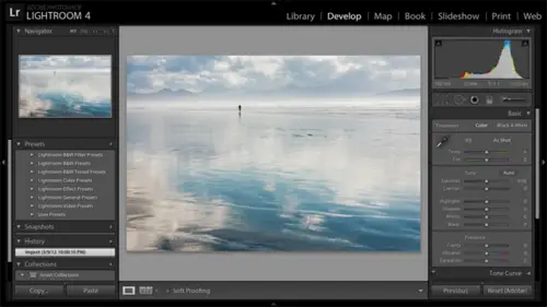
Color Adjustments
Now I've talked through the controls. I've talked through a little bit about white balance in terms off sliding these sliders to visually changing change the effect of the photo, go ahead and go to this portrait. Though it's I can talk a little bit more about white balance. Okay, so let me just start by saying that I don't often start by setting white balance. I want to get the overall exposure in an area that I'm comfortable with first. Because if the photos to brighter too dark, it affects my perception of color. Not the color is really different. I just can't see it as well. So this photo is a little too bright for me. So I'm gonna go ahead and reduce the exposure. And then visually, the photo looks kind of pink to me. So it has a color cast. It has what I would call a magenta color cast. So I have some different options to color. Correct this photo. I can slide the tints lighter because the tent slider controls the green magenta spectrum. I can slide it away from the issue that I s...
ee. So Aiken slight away from magenta towards green now Obviously, if I go too far, I'm gonna turn the photo green. But sometimes going too far and then backing off can be an excellent way to, um, t decide how much is is appropriate. So visually adjusting white balance is one option. Now you do have a white balance tool here that can help you if there's something that's color neutral in your photo, something that you believe is white with no color casts its not yellowish white. It's not pinkish white or gray with no color caste. Then you can have light room. Figure out how to correct for the for the color cast of the light. So let's take, for example, his T shirt. If his T shirt is a neutral gray, if light room finds red there, it's going to say that red must be the color cast of the light shining on the entire scene. So I'm gonna back out that read from the entire photo, so we'll take this eyedropper, click on it, and then we'll click in this neutral gray. Actually, let me reset it first, because I had already done some white balance adjustment. So let's start from I guess I had done some spot remover work to. That's fine. So I've read. We've started without any temperature intent adjustment. Click on the eyedropper tool. Click in the neutral gray, and it makes the adjustment. In this case, it was pretty subtle. So let me back slash before backslash after. But you can see that it found a little red in that T shirt and it back that read out. The adjustment that it has made is to take temp tint 10 points towards green and then temperature just a little ways away from yellow towards turns blue. So again, that only works. If you have something color neutral in the photo. A photo like this one. That's John Cornyn Jello took of me. There's on a day when I was too sleepy. There was nothing color neutral in this photo, right? This my skin tones. I'm pale, but I'm not grey, right? I do have some color to my skin. I have blues. I have Brown's, There's no gray. There is no neutral white to use, so I couldn't use that tool. Now, when we get to working on multiple photos at once, I'm gonna show you how to use a white card and then copy your changes over toe other photos. So we'll be getting to that tomorrow. But I wanted to introduce that I drop her to you. Questions on white balance. Oh, yes. Now let me just say before the question that you can apply your white balance corrections to J pegs as well as raw files. But when you have to do heavy duty color correction work, the work is going to be much more effective on the raw file than it would be on the J pic with the with the eyedropper tool. One of the tricks that I like to use zooming in on the whites of somebody's eyes and using the eyedropper around the whites of the eyes. Do you find that to be a problem at all or No, I don't find that to be a problem at all. I think you've got to be careful because obviously, in the whites of the eyes, you have blood vessels and you know, but you pretty much, you know, when you when you when you hit something. So if I take this eyedropper tool, let me reset this photo, make sure there's been no work on it. Take the eyedropper click in there and now I'll zoom back out and let me just, uh, a little bit more. And I'll hit the backslash key so before, after, At least it's a good starting point. Now, I can always start with the eyedropper tool and say, Well, that made it neutral based on assuming my eyes were completely neutral, but it still feels a little pink to me. So I'm just gonna take the 10 slider and go a little more towards green. So great technique. Okay, I have a question. But if you could just let me know he will be addressing this tomorrow as well. Life by Rebecca has been asking great questions, and we're trying to get to the can, Uh, and she's asked us for two days straight. So what is the best way to import photos if you're using a white balancing device such as the expo disk on the color checker? Is that what you gonna talk about tomorrow? Yes, Unfortunately, it is great. So hold on. Yeah, Please come back tomorrow. Asked that question again. Okay. And then Zug z 64 wants to know is the tool the drop a tool taking the center point of the average of the area. Well, with labour before you have more control over this. So I'm gonna hit the eyedropper tool again and grab it, and I want you to see I'm gonna zoom in on the screen here that you control the scale here. You control how? Finally, it's sampling. So that's really handy. Particularly in photos. I'm gonna zoom back out, particularly in photos where you have a lot of noise. You don't want to accidentally sample of magenta piece of noise or something. So it's a nice, um, nice enhancement for, like, four. Okay. All right. The next thing I want to explain is the difference between vibrance and saturation for intensifying color. So I'm gonna come to this fabulous photograph of the creative live crew, and we're gonna look at this. Um, now this is a J peg. It's probably been worked some, um, let me just go ahead and do a tiny bit of work here. I'm just gonna brighten it up a little bit and let's see, I'm gonna use the eyedropper tool on this skirt to see if that gives me. Maybe it's a little bit yellowish is what what results. So inside the temperature slider towards blue a little bit. Okay, but let's say the photo looks great. Now. I just want to punch up the color. John's shirt is a little bit. Didn't mean to zoom in quite that far. There we go. John shirt is a little bit washed out, but some of the other colors are already pretty intense. So let's take a look at the difference between vibrance and saturation. First, I'm going to intensify color with saturation. Slide it to the right. You're going to see that it does a great job. I'm John shirt, but it's look, look a TSA less hair, though, right? So before let me go before after. So to get John shirt colorful enough, we end up intensifying the other colors too much. So let me go ahead and zoom out a little bit more, and you can also see that to get John shirt saturated. We overshot saturate his jeans as well. So saturation is an equal opportunity slider. It saturates all colors equally. Watch the skin tones As I slide the saturation slider. You see how that skin tones turn yellow So it's equal opportunity. It will. It will give us hepatitis interrupted hepatitis or jaundice. I don't know. I mean, this is great. If you're a portrait photographer and you give the No, the child's John, Mr Hepatitis you know you want, you won't be hired back. So, yes, the skin tones are very important. The saturation is an equal opportunity slider. It just it just saturates everything by 20 points. Okay, Vibrance is more discriminatory, which in today's world, that can be a bad thing. But in this case is a very good thing. Okay, So as I slide the vibrant slider up, let me just take it all the way or close to all the way. Notice how John shirt gets more saturated, but it pretty much leaves the skin tones alone. And if you look up here at Celeste's hair as I slide it up, I'm not going to see nearly as much of an effect there until I push it all the way. But even when I go from zero to you can see that it's focusing on colors that are less saturated, so it's discriminatory. It will saturate the less saturated colors. Mawr than the more saturated colors, it says. Well, the green jacket here is already pretty saturated, so I'm not gonna add as much to that as I'm gonna add to John's shirt, because John shirt is very washed out. So it focuses on what needs a boost, and it does a great job also at protecting skin tones so it works on primary colors it leaves. It leaves skin tones pretty much alone until you really push it all the way. Um, but if I'm working on Portrait's, I'm always gonna use vibrance unless I'm just using just a tiny bit of saturation so that I don't affect the skin tones. And if I'm working with a photo that's got a mix of saturated and washed out colors, I'll use vibrance to really target the more washed out colors. Now, I'm not saying that saturation is bad. If I have a photo that just needs a quick boost in overall color, I'll use the saturation slider without any concerns at all. Okay, let's go ahead and zoom back out. Go to the next. I still have this local white balance issue. You see how I have a different color cast to the right here. We're gonna work on that when we get to the adjustment brush. It's also darker on this edge. Would be nice to brighten that up. And we will go to Can I ask another question on the white balance tool? Is that picking up a particular point? How many pixels or is and is it an average of a certain number pixels? It's picking up an average. Okay, but how large of an average is set by this scale slider. Now, I don't actually know exactly how it specified in terms of how many pixels based on how this skill slider is set. Yeah. Okay, let's go to this photo here. Now, my plan with this photo is toe work it through the basic panel. This photo doesn't need a lot of work, but then I'm gonna introduce us. Did you have a question? Okay. Okay. Then I'm gonna introduce the next, um, new and exciting panel to Okay, so I'm just gonna work this in the light room four version. So Okay, so the overall brightness meaning the average values for exposure, are a little bit too bright to me, So I'm gonna nudged down the exposure slider just a little bit and I'm gonna add some more contrast, make it punch here. That does start to dark in the shadows. Too much remember, contrast Brightens brights stark in Stark's so sometimes it could have an unwanted effect on one end or the other. In this case, I'm gonna come down to shadows and just add a little bit of light back into the shadows next. Now that I have the tones, they weren't too far off where I started, but I'm gonna come up toe white balance and I'm gonna consider just warming this photo up. Just a touch so moving away from blue towards yellow. But that's just purely a subjective decision. I just tend to like warmer photos and I'm gonna try taking the 10th slider a little bit away from magenta towards green. But you know what I've done that I don't like it. Well, simply double click on the word tent and I'll just go with a little bit of a warming effect. I'll come down now to the present section, add some clarity, some three dimensionality, just a little bit in this case, and then vibrance and saturation. I really want to pump up this guy. This guy is very flat now, as I use vibrance, I can't get enough in the sky and the grass is it did doom or on this guy with The grasses are very yellow. And if I use saturation, it's on Lee. Affecting the grass is pretty much a something not affecting this guy, so I just can't get what I want. So this is time now for a new tool, and that's working on individual colors separately. So to do that, we're going to scroll down below the tone curve. We're gonna skip the tone curve for now down to the H sl color black and white panel. I'm gonna click on the word HS cell now. H s L stands for hue, saturation and luminous. It's I'll talk about each one individually, but we're going to start with Lou Minutes. Lou minutes is brightness and darkness. So I wanted darkened the blues in the photo. So it's luminous that I'm gonna click on once I click on luminous here. Then I can slide the blue slider to the left to darken or to the right to brighten. I also want to dark in the the greens and the yellows and the grass down here. I'm not sure what mix of yellow and green I have. Aiken slide the sliders to see Well, okay, there is yellow in the photo because those air changing there's a little bit agreeing, but it looks like it's mostly yellow. But, you know, that's just too much thinking for me. I don't want to have to figure out what colors air in the photos, so I want light room to actually do it for me. Okay, So what I want you to do now is reset your sliders, double click on your sliders to reset. And this is hard to see probably. But there's a little circle tool right here to the left, but I want you to click on that's called the Targeted Adjustment Tool. Now I'm on Lou. Minutes Now I'm gonna click in the blue of the sky and I'm gonna drag down to darken. So my cursor went away as I did that but I clicked in the blue in the sky, held my mouse down and dragged down If I drag up, it will brighten Now I'm not telling it to darken or brighten the sky. I'm telling it to darken or brighten the blues. In the photo where I clicked, it found blue and therefore it darkened or brightens the blues. If I had a blue car in front of this building that would have brightened or darkened as well, let's do the same thing in the grasses. So I'm gonna click and drag down, maybe in this bottom right hand corner, a little bit to sample the colors there. Now the color mix varies across the foreground. Here in the grass is so I may click and drag down elsewhere in the grasses as well. A light room is just sliding the sliders for whatever colors it finds. So over here in the panel, you'll see that it's slid not only the yellow slider but the orange slider. When I was in the grasses and for this guy, it slid the blue and the aqua slider, so I darkened these colors. Let's now saturate the colors more, so click on the word saturation right here. Webs scrolled up. I can slide the sliders justice before I don't have to use this targeted adjustment tool, but I like it so I'm gonna click in the sky in the blues and drag up to saturate Or I could drag down if I wanted to turn this guy black and white again I'm turning the blues to black and white but I actually want to go in the whips in the positive direction That was a little too far And then I can click and drag up in the grasses Different places to sample differently to saturate the foreground grasses as well. Okay, Is that cooler for okay, I just want to make sure you know now I got to get in. OK, so I got these a little yellow now I could click and drag, but it's I click and drag. I'm gonna be taking out yellow and whatever else had found. Now I just want to go specifically to the yellow slider and back off on yellow so I can work between the targeted adjustment tool and the sliders. Now, the targeted adjustment tool is one of those tools that's gonna follow you around. So you're going to see this symbol on your cursor everywhere you go. So what I like to do is just click back on the circle here to put it away. You can also hit the escape key. Let's go to Hugh. We'll click on cue here now. This particular photo is in a great one in terms of a realistic application for it. Perhaps, but But it's still fun. So Hugh will shift from the color towards other colors. So if we take the targeted adjustment tool and we click and drag up in the sky will shift away from blue towards purple. If we click and drag down, will shift away from blue towards green. So that's how you can shift colors. So that's another handy tool. For example, I'm just going to control a command Z look. There we go. It could be another handy tool for shifting skin tones A little bit, you know, a little bit away from from red tour. It's towards yellow, um, another tool in your tool kit. Any questions on this part? Yes, we are getting at what people are saying. This is very, very cool, and they're really enjoying that. You've shown us how to do this, um, and veil Gucci. I hope I got that right. And can you target this just to a specific location of the photograph, like a local adjustment with this panel with the H itself panel. No, we are going to get into the adjustment brush, probably this afternoon, where you'll be able to actually paint exactly where you want to effect. So that would be where you'll do that. Now let's say that I did have a blue card in front of this building. I still might choose to use the H S L panel to darken and saturate the blues, and maybe the car gets too saturated. But then I can go to the adjustment brush and just reduce the saturation on the car tow back out the effect of what I've done. So it's kind of a combination of global and local work. Now, the reason I teach the adjustment brush and graduated filters last released last in the in these kind of core tools is because often you can achieve local results without resorting to painting. Right. H s l is a perfect example of where I was able to achieve something locally just with a slider, and I'd rather use a slider any day rather than having to paint this guy particularly around something like a building like this, you'll find that there it won't be too bad, but I still prefer not to do it. I have a question from a TBS key CSKA, in the order of the menus on the right hand side, be rearranged to facilitate a certain habit of work flow. The order cannot be rearranged. There is one other view of this that I don't know. I don't think what it would help this particular questioner, but I like the HSE cell view of this. It separates you. Saturation illuminates in tow. Three different panels. Basically, there is a color view if you click on color that will separate it into individual colors instead. So if I come to this photo saying I'm gonna work on the Reds or work on the greens, I can just click on Green and I'll have all three sliders right here available. I can also click on this word all to see all three sliders for all colors down this long panel. That's just a little too long for May, so I prefer to stick with with H s l one more from Steven. Sylvester asks if you reset the hue after the color adjustments. Do they all reset? Or is it just the hue that resets? So, for example, when I let me see, that would go back here when I was in Hue and I shift the hue of the blues when I come and I reset this blue slider in the actress lighter. That is just for this Hugh panel. Yes. If I come back into loom in its I've still got my Blue Lou minutes and I've got my blue saturation adjustments.
Class Materials
bonus material with purchase
bonus material with enrollment
Ratings and Reviews
Miguel Lecuyer
Great workshop! New to Lightroom and found it very helpful. Saved me a couple hundred dollars and time by not taking an evening LR class. Creative Live workshops match my learning style perfectly. Laura is awesome! My only complaint is maybe Laura can use a PC next time which is what she seems more comfortable using. Her shortcut mix-ups on a Mac were making me a bit dizzy :)
a Creativelive Student
I cannot express enough how impressed I was with Laura and this class. I learned more in the 3 days of this workshop than I did in all 6 weeks of a class I took online that cost three times as much. I left not only impressed by the class but MOST importantly - refreshed and energized to put my new knowledge to use! Thank you for that!!!
a Creativelive Student
Excellent workshop bar none. I learned more about Lightroom than I did from any other tutorial/workshp that I previously encountered. Thanks Laura!