Lessons
Day 1
1Pre-Show Banter
07:02 29:00 am - Introduction: Why Lightroom®?
13:23 3The Lightroom Library Catalog
16:42 4Staying Organized
15:00 5Backing Up Your Library
11:12 6Importing Your Photos
34:20 7Preferences & Settings
28:57Settings Q&A
10:49 9Reorganizing Files and Folders
33:25 10Using Views and Labels to Evaluate Photos
45:00 11Filtering and Stacking Photos
13:37 12Assigning and Managing Keywords
31:42 13Keywording Q&A
12:43 14The Metadata Panel
14:38 15Searching for Photos
20:54 16Creating a Collection
15:25Day 2
17Day 2 Pre-Show Banter
09:09 18The Map Module: Assigning Locations
43:33 19The Develop Module
11:37 20Fixing Your Photos: Histograms and Cropping
22:02 21Fixing Your Photos: Spot Removal Tool
33:25 2211:30 am - Upgrading to Lightroom® 4
12:14 2311:45 am - Basic Developing in Lightroom® 3 & 4
21:29 24Basic Developing Part 2
19:43 25Color Adjustments
23:36 26Tone Curve Panel
18:59 27Making Subtle Adjustments
13:22 28Lens Corrections
10:54 29Local Adjustments: Partial B&W
13:03 30Local Adjustments: Portrait Touch Up
26:05 31Additional Local Adjustments
09:55 32Graduated Filter
24:24 33Bonus: Day 3 Preview
01:19Day 3
34Day 3 Pre-Show Banter
12:44 35Bonus: Recap of the Develop Module
08:44 36Virtual Copies
08:58 37B&W and Creative Effects
20:50 38Noise Reduction
12:23 39Sharpening
18:33 40Sharpening for Portraits
08:46 41Syncing Changes to Multiple Photos
17:53 42Autosync
21:09 43Creating and Using Presets
15:53 4411:45 am - Lightroom® and Photoshop
22:49 45Sharing Your Work
08:42 46Exporting for Web
16:59 47Exporting for Print
26:06 48Workflow Recap
40:50 49Thanks + Credits
07:02 503:00 pm - Lightroom® 4: Publishing
20:52 513:30 pm - Lightroom® 4: Video Editing
12:38 523:45 pm - Lightroom® 4: Book Module
19:36Lesson Info
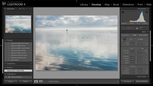
Making Subtle Adjustments
I want to take one more photo just through the basics, and then we're gonna move on Teoh converting photos to black and white. So I think we're doing good on time here. So I'm going to Here it is again. I gotta pointed out. See this targeted adjustment tool following me around escape and let's go back up to the basic panel. And one of the main reasons I want to work this photo is just to say that not all photos need a lot of work. I mean, you saw me take this beach shot from this to that right? Dramatic results. You saw me take this photo from this to to that. So they were photos that needed a tremendous amount of work. But a lot of photos don't need a lot of work. Right? So this photo here, I mean, maybe the composition needs works too late for that, but it's part like, here's a church. You know, it doesn't say much about the church. Leslie's ah, photography teacher. She could teach me a bunch on that, but, um, but as far as the post processing work, I don't want to leave you with the...
impression that if you don't do a lot of work on your photo, you're not doing enough. So I'll expand the hissed a gram, and I'm gonna start with since let me go ahead and do this light from three and light room four because it's going to be fairly short. So I'll switch this back to the light room. Three way of doing things. And actually, yeah, let's go ahead and set the exposure. Now for the white point. We're in light room three version. So how bright should the brightest tones be? The bright tones feel pretty bright to me. And as I hover over the hissed a gram, there are actually a few blown out highlights there. Just kind of in the stairs there. Not a big deal. But since the overall photos too bright, I'm gonna reduce the white point. Bring the whites down a bit. I don't have to recover any highlights. I don't have any deep shadows than I need to fill light in. I'm gonna bring the black point up. I'm in a dark in the darkest tones in the photo, just a bit here and then overall brightness. I'll just bring down just a touch. Make it a little punchier. Now, when I had contrast to this photo, it brightens that church again. I was kind of trying to dampen that church down a little bit. So when I had contrast, it brightens the bright star kids, the darks. So often, when I add contrast, I end up going back up in the light room three version to brightness to balance that out to bring the brightness down a little bit. Then I could come to clarity at a little bit of clarity. So this is where I'm working and Clary with light room three. So let me show you what happens if you go too far with light room three clarity. If I slide this clarity slide to the right, I get this ugly shadow along the edge. You'll see when we do this in light room for that, that won't happen. But be careful in light from three. Okay, so let's back off on that. And then vibrance will just bring out that sky a little bit more and a photo like this, I would just experiment with vibrance and saturation. You know, the idea being maybe bring a little more green to the little bit of other green in the photo without taking the blue too far. Now, of course, as I worked on this photo, problems have become evident to me. First, I have this spot right here so we can click on the spot removal tool, click on the spot and move the mouse out of the photo. And it's done a fine job. It was a very easy one for light room to find clean pixels. So this was the fix. This is where it took clean pixels from. I could take him from somewhere else. There's really no need to I can zoom back out, and I think I'm gonna crop off the bottom of this photo a little bit as well. So I'll click on the crop tool, click and drag upward. It seems to be tipped a little too, so twisted. I'll click outside of the corner here and just twisted a little bit. Put the crop tool away. Just looking at when I was when was I going to introduce this to Okay? All right, let's work this. Let me show you before, in the after before after, So I didn't take a lot of work it wasn't didn't take very long to do it. And to me, it's an improvement. Let's click on the reset button to reset this and updated to the new process version and work it in the light room for with the light room for technology. So exposure the bright overall brightness average brightness is too bright. So I'm gonna reduce exposure, add some contrast, make it punch here. The highlights in the photo there just a little too bright for me. So I'm gonna experiment with just dampening them down. Just the touch and the shadows look fine. The dark tones in the photo. I could see detail in them, but they don't feel too heavy, so I'm not gonna go any further. So here's a perfect example of where I barely got into these. I barely got into these four sliders at all. Exposure, in contrast, was almost all I needed. Bump down highlights a little bit. Never touch shadows, whites or blacks. And I really find with light room for that I don't get down to these white and black sliders, Um, for the majority of my photos and then I'll go to presence. Add some clarity now clarity. It's adding contrast along in local areas. So it kind of intensified the sky out here. If I zoom in here on the edge of the building and I show you no clarity clarity, you see a little bit of shadow there if you stare at it. But it's it's much improved from the light room three version, and because I reset it, I would have to go in and, of course, remove the spot, crop it again. But I'm not gonna bother to do that. I might just tone down this vibrance a little bit, take a little bit of that blew out. Maybe not. No question. Yeah, um, other tools like I photo and stuff like that because I have a little, you know, kind of magic wand type thing that you click that just kind of automatically does those three or four different adjustments based on what other algorithms it thinks is a good starting point. Does his light room for have that life form does have this auto button. So let's just reset it again, and I can click on the auto button here as a starting point. So it's right, right here. Yeah. Now, this is its image specific, You know, looks at the tones and in your photo and optimizes it according to some math that I know I could never comprehend. Puts in this case, It's too heavy handed, so I could certainly use it as a starting point and continue to work it from there. Other questions before I jump into the black and whites se question from Brandt 8 47 Is there a way to display with the program? Sees as highlights and or mid tones or shadows like the color red or blink? What? The program. See this as highlights or okay with shadows. Well, a couple things come to mind first when you're in the tone curve. Oh, I see what you made in terms of of these sliders. Okay, Now let me just I haven't tried these with all the light room for controls. Let me try this first. Okay? Didn't. Well, maybe it didn't work. Hang on one sec. It's just learning on the fly. Okay, so it seems to Okay, so it worked with light. 13 seems to work with light room for that. If you hold down the alter the option key and you slide a slider, you will see what it's affecting. Now, this photo is not the perfect photo to show you but the shadows. You see how well I'm sorry? That's a brain cramp there. What this is showing you is actually is not not what? The users questioning with what this is showing you is what's getting blocked up or blown out. Okay, So as I hold the alter, the option key down is I slide the shadow slider to the left. Eventually, I'm darkening these stairs down here so much that they show up when I'm holding the old to the option key down. So my apologies for taking down you down that route for the wrong question. I don't know of a way to show thes thes particular sliders in terms of what the image is. The thing is, they're not just ranges of tones like the tone curve where the highlight slider was 25% of tones from white toe light gray. That would be easier to show. In this case. The highlights is its tone mapped its map to specific tones in the photo. So the math behind it is more complicated than I don't know of a way to show what what it comes down to. Does light room have? This is from MJ Seattle. Does light room have a way to copy the same general changes to multiple photographs? So if they will need the same change in exposure, color, saturation and sharpness? Absolutely. And I'm holding that for tomorrow, Okay? And I think that's the question from Steven Sylvester Tone Curb Is the history Graham in the curved window, the same as the history Graham above? Yes, it is. It looks a little bit different because it's condensed into a square here, but it is the same shape, and it goes, you know, if you look at the fact that I've got tones almost up to pure white may be hard to see on screen, but I'm seeing the exact same thing here in the tone curve. So just go ahead. Laura. I have a general workflow question, and maybe this is a little off topic. But before we go on to black and white, I wanted to ask it when I'm doing adjustments like this, and if I'm staring at the screen for more than 20 minutes, I find that I can't tell which is better. Just that it's different, some loving, that backslash toggle key that helps to go back and forth on the fly. But I've experienced that when I get a phone caller distraction and I look away and then looked back. I always have the answer. And so I kind of worked that into my workflow is like a minute timer of, like, you know, look away. Have you had that experience? Oh, absolutely. And I think that's great that you brought that up. I mean, I look at this photo that I went back to this photo, and now I'm looking at again. I feel like, Well, the grass is just got to yellow there. Whereas when I was doing the work, it looked fine. So I definitely agree with you. Get up, walk away. Come back the next day. Whatever it may be, get a different perspective. Sure. So thanks. Okay. Especially when in the tone curve and using that targeted adjustment thing, um, seeing all the colors just go crazy tells me that I don't know my color theory well enough to understand. Like, why it's doing that do you know of or maybe later can give us a resource Kind of good color theory for photographers on why, When I, you know, taken orange couch and do that all of a sudden, you know, it's goes why it goes from this color. If I intense increased this to another color when I decreased, let me look that up a break. I have an idea, but I want to confirm. But yeah, I think just you just having that's attractive color will, you know will help you with that.
Class Materials
bonus material with purchase
bonus material with enrollment
Ratings and Reviews
Miguel Lecuyer
Great workshop! New to Lightroom and found it very helpful. Saved me a couple hundred dollars and time by not taking an evening LR class. Creative Live workshops match my learning style perfectly. Laura is awesome! My only complaint is maybe Laura can use a PC next time which is what she seems more comfortable using. Her shortcut mix-ups on a Mac were making me a bit dizzy :)
a Creativelive Student
I cannot express enough how impressed I was with Laura and this class. I learned more in the 3 days of this workshop than I did in all 6 weeks of a class I took online that cost three times as much. I left not only impressed by the class but MOST importantly - refreshed and energized to put my new knowledge to use! Thank you for that!!!
a Creativelive Student
Excellent workshop bar none. I learned more about Lightroom than I did from any other tutorial/workshp that I previously encountered. Thanks Laura!