Lessons
Day 1
1Pre-Show Banter
07:02 29:00 am - Introduction: Why Lightroom®?
13:23 3The Lightroom Library Catalog
16:42 4Staying Organized
15:00 5Backing Up Your Library
11:12 6Importing Your Photos
34:20 7Preferences & Settings
28:57Settings Q&A
10:49 9Reorganizing Files and Folders
33:25 10Using Views and Labels to Evaluate Photos
45:00 11Filtering and Stacking Photos
13:37 12Assigning and Managing Keywords
31:42 13Keywording Q&A
12:43 14The Metadata Panel
14:38 15Searching for Photos
20:54 16Creating a Collection
15:25Day 2
17Day 2 Pre-Show Banter
09:09 18The Map Module: Assigning Locations
43:33 19The Develop Module
11:37 20Fixing Your Photos: Histograms and Cropping
22:02 21Fixing Your Photos: Spot Removal Tool
33:25 2211:30 am - Upgrading to Lightroom® 4
12:14 2311:45 am - Basic Developing in Lightroom® 3 & 4
21:29 24Basic Developing Part 2
19:43 25Color Adjustments
23:36 26Tone Curve Panel
18:59 27Making Subtle Adjustments
13:22 28Lens Corrections
10:54 29Local Adjustments: Partial B&W
13:03 30Local Adjustments: Portrait Touch Up
26:05 31Additional Local Adjustments
09:55 32Graduated Filter
24:24 33Bonus: Day 3 Preview
01:19Day 3
34Day 3 Pre-Show Banter
12:44 35Bonus: Recap of the Develop Module
08:44 36Virtual Copies
08:58 37B&W and Creative Effects
20:50 38Noise Reduction
12:23 39Sharpening
18:33 40Sharpening for Portraits
08:46 41Syncing Changes to Multiple Photos
17:53 42Autosync
21:09 43Creating and Using Presets
15:53 4411:45 am - Lightroom® and Photoshop
22:49 45Sharing Your Work
08:42 46Exporting for Web
16:59 47Exporting for Print
26:06 48Workflow Recap
40:50 49Thanks + Credits
07:02 503:00 pm - Lightroom® 4: Publishing
20:52 513:30 pm - Lightroom® 4: Video Editing
12:38 523:45 pm - Lightroom® 4: Book Module
19:36Lesson Info
Tone Curve Panel
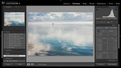
The next thing I'm gonna talk about is the tone curve panel. So I'm gonna zoom back out. Command minus here. Does my Mac assuming and I'll go to this bench. Now I'm gonna talk about the tone curve panel, but I want to qualify this by saying that I don't use it nearly as much as I used to use it. You'll see. You know, I'll explain more about that, but particularly for beginners, if you are. You know, if you're already starting to get information overload, I don't see the tone curve tool as a critical tool. Now, I'm not saying tune out. So So you online audience, you stick with the but But I'm saying don't don't Don't sweat it so much, but I do want you to understand what it can do at a basic level and at and at a more advanced level. So, this photo let's say that this photo has now notice that my mouse what is my mouse? My mouse? Is that targeted adjustment tool? It's following me around. Just like I threatened. They would. So I'm gonna hit the escape key to put that tool away. All righ...
t, so this photo has generally been worked, but the bench is very bright now that I'm gonna come back up to what? Where I would probably today use the basics panel to achieve this. But I want to just first explain to you what the tone curve panel will dio and, um, give you an orientation to it first. So let me go ahead, set this up. So the tone curve panel is right below the basic panel, and it has some sliders at the bottom. If yours doesn't have sliders, then you can hit this little square here to get to slider view. It's called Parametric View. Now the sliders air here because the curve itself, it's not clear what the curve means or what to do with it. So the sliders aren't easier way and sometimes a quicker way just to make changes. The tone curve allows you to brighten and dark in particular ranges of tones in your photos so I can brighten or darken just the highlights in the photo. So the highlights the top of this benches like over, Um, it's just way too bright, so I could slide the highlight slider to the left. Too dark in the highlights in this photo. Since I slide up a little bit, I'm gonna collapse the hissed a gram here. We won't need it for this example. So as I slide the highlight slider to the left, the bench becomes a little darker and the curve bends downward. So light room does whatever needs to do to the curve for that to happen and really what it comes down to As as the curve bends downward, it darkens As the curve bends upward. It brightens. But I got there through a slider. Now I'm able to work on any range of tones. Highlights is the find is the brightest 25% of tones of potential tones in the photo. If you had everything from white toe like gray, then we have lights than we have darks. And then we have shadows. It's like a dark and down the highlights I could dark and the lights here is well, maybe to further dark in that bench. Maybe. Maybe the darks air too dark. So I can Brighton with the dark slider a little bit to brighten the darks. Now, this is starting to sound a bit too a lot like what I was talking about using the basics panel for right, um, frightening particular ranges of tones. We had mid tones with exposure. We have shadows and highlights, and whites and blacks to two fairly well isolate ranges of tones in your photo for brightening or darkening. Now I find that the light room four controls in the basic panel are so effective that this particular version of the tone curve I don't come down to it very often. So let's go ahead and reset thes sliders. Just resettle four by double clicking on the words. And then let's scroll up to the basic panel, and I'll think through this from a basic panel approach. The overall photo is a little too bright. So will darken the exposure. Just a touch the highlights airway to Bright. So I'll bring the highlights down. That doesn't much better job than the tone curve for my perspective. And then there still I want to, like bring the whitest of the white tones down, so I kind of need to turbocharge this with whites. So I'm gonna push whites down, and I'm able to very effectively isolate that range of tones that that highlight range using the basic panel. So with the advent of light Room four again, I don't I don't use that very much. Now there's a more powerful version of the tone curve that I still find useful in some situations. I'm gonna show you that as well. So let's let's see, Let's go back down to the tone curve and I want to show you the point curve version of this. But I think I want to go to a different photo. Let's go back to our balcony photo here. It's got a nice wide range of tones and got another issue that I'm gonna fix with Issa's Well, and I'll show you the point curve version. And again, I don't think that beginners need the point curve, but you'll make the decision on what level of complexity you want to get into. Um, I'm gonna click on this little square and I'll zoom back out now that I've done that and you'll see that my sliders air gone. So it's up to you to understand, of course, what to do at this point cause there's no sliders and I'm not gonna tell you. So I'm just gonna okay, bad joke. Uh, even the best comedians have jokes fall flat, right? I mean, okay, thank you. All right, so on the tone curve hurt here again, our tones go from black on the left toe, white on the right. So from black to white and as we click and drag down on the curve were darkening As we click and drag up on the curve, we're brightening now. I clicked right at the mid tones, right, the middle gray, the average values and that part of the curve went up the most. So that's what got brightened the most. But in fact, I did brighten all tones all the way up, toe white, some. It just fades off. So there's a little bit of frightening in the brightest tones, a little bit of frightening in the darkest tones. And if I hit the switch on and off of the top of the tone curve, you'll see these switches at the top of every panel except the basic panel. So if I hit that switch on and off, you'll see before and after, so I bright the photo. Yes, I could write in the photo in the basics panel, but as far as the lesson on the tone curve, I can actually isolate my changes to a particular range. So if I wanted Teoh dark and the bright in the shadows, I would take this point are actually I'm gonna drag this point off the curb to get rid of it. So I just click on it, drag off, it's gone. I'm gonna put a point in the shadows and drag up to brighten. But then I'm going to say I don't want all these other tones to brighten as well. So I'm gonna click in these brighter tones and anchor them back to the diagonal so that there's no change to them, so that I'm just bending the curve up in the shadows. I'm just frightening the shadows that gives you more control. That's what the point curve is all about. And, you know, there's lots of Power Point Curve users out there until the point curve came into light from three. You guys were still going to photo shop to do your curves work, so that allows you to isolate ranges of tones. Now I'm still going to challenge you and say that I'll bet you I can do a lot of this work more effectively in the basic panel, but not always. So, um, don't email me with the exceptions because I know that they're there. But there is something that's, you know, even that is new and that you can't do in the basics panel and you're only going to see this in light room for So let me go ahead. I'm just gonna brighten up these shadows just a little bit. But let's say that I also want a warm up the shadows. I want to add some yellow into the shadows in the photo. The shadows tend to be bluish. They tend to be cool. So I want a warm up the shadows that I can only do. I could do with the adjustment brush, but its first curves go. I can't do with light from three. So if you're a Lightning three user, you won't see this. But in light room four, I have individual color channels, so I have red, green and blue here. We'll zoom back out here now I want a warm something up. I'm gonna choose the Blue Channel. And the reason I choose the blue Jail is that the opposite of blue is yellow. So you know you have to learn your color. Your your subtracted color will your like color will. There's a hint here, up in white balance shows you The opposite of blue is yellow. The opposite of green is magenta. It doesn't give you the third component, the Red Scion. Okay, so I'm in the Blue Channel now is a click and drag up. I'm adding blue as I click and drag down. I'm adding yellow, taking out blue. So if I click and drag down in the shadows here and then I anchor, I could put more points on the curve to anchor them back to the diagonal. And then I zoom back out here and I hit the switch on and off. You'll see that I've just warmed up the shadows, but I warmed and brightened the shadows. OK, I brighten them back in the RGB channel. So yes, I've gone too far. But I want to make sure that it's obvious for you guys watching this on screen that that's in fact, what I've done. So it gives you again mawr local control over your photo without having to paint with the adjustment brush, so it's definitely useful. Let me just show you that other channels here so blue we did read and Scion are opposites. So if I click and drag down will take out red and add Scion, click and drag up. I had ad red, and of course, the other one would be green and magenta. So if you need to shift, I think the best example really is shifting the shifting the tones in your highlights of your shadows, shifting the colors very handy. Tool Question. Some dunker. That's super cool. I'm excited about that, huh? Let's look for I wish I could take credit for these things. I mean, it's just amazing what they built into this program already. It's I like it. Obviously, we can congratulate the messenger. It's the opposite, something one might say. Um so question in the audience. Yeah, um, is the ah RGB, and then each of the separate color curves those air. There's not one replacing the other. You can adjust each of the four of them separately, and they combine additive lee to get what you want. Exactly. So in this particular example in the Blue Channel, I warmed up the shadows and then back here in the RGB, which is the composite meaning, it's the brightness and darkness. I actually bumped up the shadows. There I brighten the shadows as well. So they just combined. Yep. And the effect is both frightening and adding yellow. So a question from motives up are the quick developed settings in the library module completely independent from these in the develop module independent, they will both affect your photo. You can use both. So I guess I would call that independent, maybe. Or if you make a change on the library module, it's gonna be There you go. Yeah, by five. Bump up exposure dramatically here in quick developed and I come to develop that has affected a photo. Yes, your photo and the instructions live once of the difference. I mean, obviously the develop module has a lot more going to command Z here. The develop module has a lot more tools. It also works a little bit differently, and that quick development is adding relative amounts. So you're bumping things up by 1/3 regardless of where they are in developed, you're talking about absolute. So let me let me just say that in quick develop. I have these two photos here that have very different exposures. Okay, if I slide, if I click on the quick develop exposure slider, I could bump him up by by the same percentage amount as opposed to the same absolute amount that I would be doing in the develop module. But I tended to use quick develop. Really, if I just need to do a little bit of quick and dirty adjustment to make the decision on whether this is a picker reject, which is what I talked about yesterday. And I do most of my developed here in the develop module and Vivian hyphen photo she's at wondering in my light room four tone panel the RGB choices not showing up and should be above pointing curved and linear. And why would that be? That would be because either you have light from three or you have, like, room for, but the photo is still in the old process version. So I'm gonna take this photo back to when I had worked it in light from three so that it still had this exclamation point here and here in the point curve. Now I have no RGB. I have no individual color controls. So as long as you're still back in the old 2010 process version the light room. Three way of doing things you won't have the new basic panel controls. You won't have the red, green and blue point curve controls, and you won't have the new features in the adjustment brush and the graduated filter. Okay, And the question Oh, in the audience, Go ahead. Thanks. I was wondering what the difference when you're working with the tone curve, as opposed to when you have kind of the region's expanded versus when Not, it's like when they're not expanded, you're adding points that you can then adjust, but when you expand it, it doesn't show up that way. You're just kind of dragging the curve. What do you mean that the region's oh, you OK with little line icon? Yeah, when it's expanded, its a different view, and it seems like it functions different than when it's collapsed. So when you when you use the region's here, you can't put points on the curve. You can click and drag, but it's not the same as putting points on the curve. It's just like room is sliding the slider, and it's kind of I would say, it's it's trying to protect you. This version of it is kind of the safe version of the tone curve in that it won't let you do really abrupt changes to your curve. And as I drag this, you may see that shadow to see that kind of oval shape around the curve as I come in here. That's the limits of what you can accomplish using slider view. So what it's trying to do is make sure that as you brighten or darken, your effect fades off gradually, between ranges of tones, with the point occur, it's assumed that you want full control and you'll take responsibility for any wacky results. Let me back out, back out in history a little bit so I can put a point here and I could put another one and I could drop it down to be crazy, you know, crazy, abrupt and do whatever I want. But, um, that's for those that want to take full control. Cool. And can you do both? Can you make adjustments in both and do they work in tandem or is kind of one or the other, because I feel like I was playing with bulls and getting some new results. Yep. So I did that really abrupt change in the point curve, and I came over here notice that my curve here all of a sudden is very chopped off here. But I can continue to work with these sliders, and I'm sure you confined presets for all kinds of kind of whacked out looks on the Web, you know, to download. I'm gonna go ahead and go back to my conservative view of this photo. But you can have some fun there as well. A question from Holding Pattern, who has noticed the targeted adjustment tool there as well and is wondering it's similar to H S L. It's It's very similar to H itself, so thanks for pointing that out. So I'm in slider view in the tone curve, and as I click on that and I click and drag in a particular range of tones, light room just decides which slider it's supposed to slide so that where I clicked and dragged was in the lights. So it slid the slider that works a little bit differently in Let me reset this now in the point curve. So I'll click on the point curve here, and I use the targeted adjustment tool click and drag in the shadows up here. That actually puts a point on the curve exactly at that tone, so it's a way to sample it and get that point on the curve so that you can then take further control of it.
Class Materials
bonus material with purchase
bonus material with enrollment
Ratings and Reviews
Miguel Lecuyer
Great workshop! New to Lightroom and found it very helpful. Saved me a couple hundred dollars and time by not taking an evening LR class. Creative Live workshops match my learning style perfectly. Laura is awesome! My only complaint is maybe Laura can use a PC next time which is what she seems more comfortable using. Her shortcut mix-ups on a Mac were making me a bit dizzy :)
a Creativelive Student
I cannot express enough how impressed I was with Laura and this class. I learned more in the 3 days of this workshop than I did in all 6 weeks of a class I took online that cost three times as much. I left not only impressed by the class but MOST importantly - refreshed and energized to put my new knowledge to use! Thank you for that!!!
a Creativelive Student
Excellent workshop bar none. I learned more about Lightroom than I did from any other tutorial/workshp that I previously encountered. Thanks Laura!