Lesson Info
15. Develop Module: Global Changes
Lessons
Class Overview
05:48 2What Is Lightroom Classic?
03:18 3Lightroom Classic vs. Lightroom vs. Photoshop
07:34 4Shortcut Keys
08:33 5An Overview of the Interface
11:48 6The Catalog System
09:34 7A Look Under the Hood
11:04 8Workflow and Presets
02:42Library Module Overview
07:44 10Library Module: Importing
50:13 11Library Module: Organizing Your Images
27:57 12Library Module: Picking Winners
20:18 13Collections and Collection Sets
23:52 14Develop Module Overview
11:14 15Develop Module: Global Changes
34:36 16Develop Module: Local Changes
42:37 17Virtual Copies
14:19 18Building A Develop Preset
14:38 19Exporting and Export Presets
32:32 20Creating a Watermark
17:53 21Creating an Import Preset
10:28 22Photoshop/Lightroom Integration
32:30 23Catalog vs Lightroom Preferences
21:35 24Managing Catalogs
30:08 25Tethered Shooting
14:37 26Publish Services
13:52 27The Map Module
12:32 28The Book Module
15:38 29The Slideshow Module
25:50 30The Print Module
20:15 31The Web Module
11:03 32Creative Cloud Integration
11:03 33Class Wrap Up
01:13Lesson Info
Develop Module: Global Changes
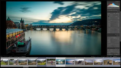
we are now ready to dive into the develop module and start learning how to process images. Now, the way that this normally works as you will do global changes first. Those are changes that apply to everything in the image. Once that's done, you go and make local changes. Those are things that are specific to individual parts of the image. And so in this session we're going to look at global changes. Now there's a little workflow that I normally use, so there's a little graphic of that and so normally we would start with a preset if we have one. And so the nice thing about light room classic is that as you go through and start working on things, you can create a preset by processing things, you do the white balance, the exposure, fine tuning all that kind of stuff. And then when you're finished you can create a preset. That preset is then used again for the next batch of images that you use and then maybe you'll do it a little bit differently. You go through all those steps and then tha...
t creates a new preset. Then you'll use that again and you get this loop of developing things and creating individual presets over and over and over again until eventually you have an entire library of presets that you use. Maybe black and white presets, Maybe wedding presets or whatever it is. But Lightning Classic will grow with you as you are creating more and more presets. We have a session specifically about building presets a little later on. So we're not going to start with using a preset because we need to understand how they're built before we just click a button and everything is magically done. I want to show you how the magic works. So, what I've done in Light Room Classic here is I have gone through the images that I have in this catalogue and I have put them into a quick collection so that I have some samples for uh to show you and work through. We've already gone through and very quickly change this image of Carisa. And so what I want to do, I have a better example and this is this image of Teresa. So we're going to do all the color correction and tonality changes on this to start with. And then we can learn more about the process of global changes. So, to get over to the develop module, I've selected this image. I can either click up here on the develop button or I can use the D shortcut key that will take me into the develop module. So that's what I'm going to do. What I've done is over on the left hand side. If we did have a preset and I do have a preset for Theresa, I could just go over here and click on that and that would apply that preset and then I can start working from there. I don't want to do that, I don't want to cheat. Right now, I want to show you how I created this. Um and so on the left hand side, normally we would start over here by applying a preset to save us some time, but right now we're not going to do that. So I'm going to hide this panel so that we can learn more about it later. So right now I only have the right panel going, I'm gonna hide the top. We don't need our our slideshow down here, we don't need these thumbnails down here. Someone to hide that. We only want to work on this image. Maximum real estate. So the first thing we want to do is fix the color temperature of this image. So right now it's green. It's just orange is not correct. So what I can do if I had a reference point, a white card, I could go over here and I could I think I've got some fingernails that might be white. I can go to this tool right here, this eye dropper tool and then I could click on something that's white so that looks like it's overexposed white. Maybe this would work if I click on that. Yeah, looks like that. Did a pretty now. I didn't do a very good job so I can try this but in this image we don't really have any reference. So a nice thing to have is a great card that you can click on to set your white balance. We don't have that in this. And so we're gonna have to manually get there. So for this, I'm going to lower this. I don't know down to about this looks okay. I think the tent is a little off so I'll bring that up just a little bit and okay, we're getting close and for these, I know artistically, I want them to be a little bit warmer so they look a little bit more sepia toned now. Right off the bat. I can tell that this image it's under exposed. Up here on the history graham. We can see a lot of things to the left hand side that need to be sort of in the middle. And so what I need to do is I need to change this exposure. So I'm going to go down here, bring this exposure up about half a stop. So plus six five ish. I don't want to go overboard and I'm just gonna go just a little bit. I can click on these triangles up here in the history graham and they will show me if I go too far. Anything that's underexposed with no detail is going to show up as blue. If I go too far to the right, it will show up as red, as no detail overexposed. So these little guys here can help us understand what's happening with our exposure. So I'm gonna take this down. This should be contrast e by default. So it's just a little bit underexposed. The other thing I can do with this is I can use it to help me get the color balance um set. So that is what these different lines are. So, if I had a calibration target a great target, I could line all the colors up. I don't have that in this one. So I'm going to have to sort of be creative and eyeball it. So about 43 60 ish. Something like that is going to be good. And then we can play with our tent just a little bit to bring this into what I think is going to be an okay color. So now that we have that we have an okay exposure, but notice that Teresa's hair is all just sort of a blob and so we have blocked up shadows so we can go down here to these sliders and I just want to open the shadows a little bit so I can bring that up. So, notice as I'm bringing the shadows up and down, we can see more and less detail in Teresa's hair. So I'm going to bring this up to, I don't know about 65, We really want to bring that out, Then we can go down and we can play with the black levels of the highlights. I think that's about right. I'm just doing this artistically. So, this section right here, it is all about getting our basic tonality corrections set. Are the highlights, right? Or the too bright or too dark. I can play with this until I get exactly what I want. I can always go down also in the presence here and I can increase the texture of this to make it much more textured, which is usually not a good thing to do in a portrait and makes your skin look bad or take it less textured, which looks also just as bad in my opinion. So this is really, really over sharpened. This is really, really under sharpened. So this is something that's great. If you're doing scenic stuff for products, stuff, we can use that or clarity and so clarity also changes the contrast. And so that clarity slider can be used for this image. Neither one of those I want to use. We're going to do some other images in the future where we play with texture and clarity. And then D. Hayes is if you have a really foggy uh seen or something like that, you can go in there and you can make it more or less contrast, but in this one it does nothing but mess up what we're doing. So we don't want to do any d hazing vibrance and saturation helped the color saturation takes all the colors and makes them more saturated. That's a global change to all the colours vibrance. Just take some of the colors and makes them more saturated. So what I normally do for a portrait is I'll increase the vibrance if I wanted to be a little bit more colorful, not the saturation because vibrance is a little less oppressive, it's a little less overbearing than the saturation. So what I've done right here is just to refresh, I set the white balance first to get our colour to a good starting point and then I set the exposure, white balance and exposure, exposure meaning, highlights, shadows the white levels, the black levels to get to a point where I think I can start working on this. So if I want to see what I've done before and after, there's this little button down here and I can do that to see the before and after, or I can just hit my shortcut key, which is why and I can see before and after. So that just gives me sort of a view of what's happening in my image and you can see that we've really changed that color. We've really changed how this looks. This still looks a little bit too green for me, but we're working on it. Okay, so we can go in here. We can even bring this tint to the right a little bit more to get it less greenish. Okay, now that we've done that we can do some other things we can use if you like working with curves, we have curves here. So you can go in and instead of making an adjustment that is specific to shadows or whites, you can make a very gradual adjustments. So you can bring the levels down in the center of this can increase the levels over here. On the left hand side, you have the amount on the right hand side. On this bottom, you have what it is. So on the left hand side, these are all the blacks in the middle grays, the highlights and the whites. So if I want the middle tones to be brighter, I pull up the center of this. If I want them to be darker, I pull this down so I don't use curves very much because I prefer using these sliders, but a lot of people have become accustomed to using curves so those are available to you and so I'm going to reset this so it's back to normal. So tone curves are there if you like using those, you can also go in and do adjustments to just the red channel or the green channel or the blue channel all of them together. And so you can also click this and you have sliders that make adjustments for you instead of dragging on this. I don't use tone curve very much, but a lot of people love it. You can play with that to uh see if it's something that you want to use in your workflow. We have the effects panel and effects allow you to do things like add a post crop vignette. Now post crop means that when you crop an image. So let me just explain this to you. So in the olden days in Photoshop, if you put a vignette around the edges, so if this is the edge, is this right here of this? If you put a vignette which is a dark area around an image and then you cropped it later, you would also crop out the vignette, you chop off the vignette as well. So a light room allows you to do is when you add a vignette, if you then crop the image, it brings that vignette into uh the post crop area. In other words, it's applied after the crop, which sounds like a little thing, but it's a huge timesaver. So the post crop vignette, you can add that. That just adds either a white or a dark area around. I don't think this image needs one because we shot in a high contrast environment. So we'll just leave that there. If you did have this, I'm gonna make it white. Just so you can really see the exaggeration of this. We have some things that we can change. We have the midpoint. In other words, where does this start from? Is it way out to the side? Is that way in the center? That's the midpoint. How round this is so less around very round. You can change that with this. And then the feather is how what's the transition? Is it a hard transition? Is it a really soft transition? So to the left, it's a dark circle to the right, It's a bright circle. Now, the thing with this and I'm going to take this off because I don't think this needs it. So the problem with the vignette is that it is only on the edges and it's always exactly proportional to the image. So I like to add vignettes but I'd like to put them maybe off center or just around somebody's face or around a specific area in an image. Those you can absolutely do in light room classic, but you do those as a local adjustments. We're gonna do that in the next session. We're going to do that on this image. Let's keep going. So we also have underneath here, H. S. L. That's hue saturation and luminescence. So Hugh, if I take the read I can change that read from really read to maybe yellow. So I can change the colour of the dress just by pulling this around so I'm gonna leave that. So Hugh is changing colors from one thing to another. So you can see that, I'm changing the colors in this. So you can be something that's really cool, saturation is changing how saturated the color is. So very very red. Or taking that red down to black and white. So we have that and then luminescence is changing how bright color is. So we'll take this and make it a darker or brighter area in the image. So hue saturation luminant H. S. L. Or if I click all all of those show up all together. So I normally like to work in the saturation area only or the luminous area only or the hue area only. The other thing that we have, that is just one of the most incredible things is this little thinking right here, this little eyeball adjustment thing and you'll see this in adobe Creative cloud applications and it allows you to drag on the photo. So what we're going to do here is I'm going to go over here and on this little thing, I'm going to click it. So once I've clicked it, you notice that my icon has changed and so if I go in and I'm going to zoom way in so you can see this little icon, the Crosshairs are saying, what do you want to change? What color do you want to change? And so what I'll do is I'm going to click on Theresa's dress and so when I click on that and drag, notice that it knows now that you're clicking and dragging on red and orange and so I can drag up to make it really saturated or drag down to make it less saturated. And so it's a really cool thing if you're not quite sure what color is that you need to adjust. You can just click on this little thing, come over and say let's take that down or up and then when you're done with it, you need to come back over here and you need to again click to put it away. So uh it's not put away unless you your icon or your cursor goes back to the point or magnifying glass. So the way that that can work in practicality in real life is for example, we can see that Teresa's skin tone looks, it looks to me like it's a bit orangey, but I'm not sure if that's orange or if it's red or what that is. So I can do is go over here and click this thing on her arm. I can click and drag down just a little bit and you can see, oh her arm is orange shouldn't be orange, so I can take just the orange out of this image, but it's not just taking the orange out of her arm, it's taking the orange out of every part of this image. So you have to be careful because you can impact something unintentionally, Any orange anywhere is going to be changed. That's the same true of hue or luminant. So if I want this orange dress to be brighter or darker, I could go over here and click on it and then drag it up, it's brighter, drag it down, it's darker, but notice it's also impacting her face and skin tone. And so that's something that we wouldn't want to do as a global adjustment. We would want to do that as a local adjustment so that it's only affecting a certain part of the image. That's the difference between global and local. The other thing we have here is color grading. Color grading is more of an advanced topic, but I'll just show you what you can do so what you can do in an image, you have different areas. So if you look behind me here, maybe this computer monitor right here, it's almost black. So if I was color grading and I only wanted to flavor that area, this thing right here, I could go into the blacks and say, you know what, make that a little bit blue. And so this computer monitor, we have a bluish tint to it. The shadows behind me here would have a little bit of a bluish tint to it. I could go in and say anything that is white. like this keyboard here. This uh, keyboard cover right here or ipad cover, that's a brighter thing. Maybe make that a red tint and you can sort of start changing the color casts in your image, but only in specific areas in the shadows or the mid tones or the highlights. Let's show you how that works Here in adobe. Creative Cloud are creative, Adobe, classic light room, classic tongue twister. So we have shadows, we have mid tones, we have highlights and so we can go in here. So in the shadows, what I'm going to do is I'm going to pull this over to blue and notice how everything that is. A shadow is bluish can make it reddish orangish, whatever. And so just a little bit, if I just want a little bit of a color cast, I can do that. And this is definitely something that you would do as a creative choice. So I can make the highlights here whatever color I want. So in this image I don't want to do any of that. But it is something definitely available that you will probably due to some of your images detail is how how you can sharpen an image and make it appear sharper. So sharpening what sharpening does is it's a process where you look, computer looks at pixel borders. So edges and things like that where there's a dark area and a light area and it makes the darker side of that darker, even darker and the wider side even lighter. And so what you're looking at is how many pixels wide and we want to affect that. We just want to do the line between make these darker and these lighter. Or do you want to have a wider radius so that spreads out so the larger the radius, the sharper it will look. But you also start to get halos and things like that. So let me show you how this works. So we're gonna go in here and we have, you can see that this focus is a little bit soft, We have a sharpening amount of 40, which is not a lot, especially for this camera. So as I take that higher and higher, you can see it gets sharper and sharper. It also gets a little bit noisy. If I take the radius and make that a lot lot more, you can see it's too sharp And we start to see some weird effects there. So we'll take that will take it may be down to 70 ISH, depends on the resolution of your images. And so we'll put it about right there. You can see more or less detail increase that just a little bit and the masking will leave to zero. If you have a lot of noise, you can see, I don't know if you can see on this video, but this looks start to look a little noise. You can reduce that noise by adjusting this slider and you can start changing either the noise from the luminous at the brightness or in the colour. If you have a dark image from a night shot, You can take that noise and reduce it using these sliders. So this is a pretty awesome little thing. Now when you do sharpening, make sure that you are zoomed all the way into 100% to understand exactly what is happening now. Just a note about sharpening in light room classic. Later we're going to be exporting images and there is an option to export uh, to sharpen on export. So traditionally when you were working in Photoshop or other image editors in the past, you would always take your image, do all the edits, resize it for final output and sharpen at the very, very last because sharpening is resolution specific. The nice thing about Light room Classic is that you can sharpen it uh, at any stage and then when you export it will ask you again, how should I apply the sharpening? Should it be a little bit or a lot or not? Very much or none at all? And it will automatically apply sharpening at the very, very last stage. So the way light room Classic does sharpening is really, it's almost um so easy you forget that it used to be really complicated, but it, it does things for you automatically that you really don't even have to think about and it works great. All right, let's keep going. Some other things that we have here, lens corrections. So by default these are checked and so depending on your lens, there are thousands of lenses that are in Light room classics library. And so what Light room Classic does is when you take a picture with a modern camera that camera stores the information about what camera you're using and the lens that you're using in the metadata for that image. So when you import your image into light room, classic light room classic looks and says, Hey, is this lens that I know about? And if it does know about it, it says, are there some corrections I need to make because maybe a wide angle lenses distorting things or older lenses introducing something called chromatic aberration where you have a little bit of a hint of green or purple around edges and it will automatically remove those problems from your photo automatically. So when we're looking at our image, we always want to have enable profile corrections turned on and you can see that this new which lens make model and profile were used and these are by default, you can make your own profiles for lenses and cameras. It's a very advanced topic. We're not going to do that. You don't need to really know how to do it because all this is built in. So if I undo that you can see that this is sort of dark and if I do this it's fixing a vignette that this lens has a problem with. So it's a huge difference turning that on or off. It's your choice though. Some people specifically, I have a bunch of old like lenses that are very, very old. They're up here on my shelf and I like the distortion and the color that they introduced as an error because I think it looks great and you spend a lot of money to get that bad, bad looking look. So some of the stuff I don't want light room to mess up something. I paid a lot of money for. So it's your choice to turn that on or off if you're not sure, just turn it on. All right. So we have the lens corrections turned on by default if there is no profile. So if there's like it says, I don't know what lens you're using. You can manually go in and you can change distortion, You can change the colour fringes, all that kind of stuff. If you see that again, you probably if you know how to do this and you know what it is, you'll know how to do this and what it is if it's new to you. Um Don't worry too much about it. Just leave it enabled and you should be fine. All right. So the next thing we have is this thing right here called transform. Now I have something for you. A little treat. So in your class files there is a folder called upright. And so right now let's take a little detour and go into our library module, click import. And then what we're going to do is we're going to go to our class materials. We're going to go to upright. Make sure you select all of those things. We're gonna put them into our photos folder. And what we'll do is let's go in and put these into his sub folder called actually just put them in by original folder. That'll be fine because it will actually stick this in a folder called upright. So just put this into your photos folder. Don't worry about anything else except choose organized by original folders and then say import. So let's talk about what this transform does. There is a problem with every camera and that is if you're shooting any kind of architecture, buildings, artwork, anything with lines that are vertical or horizontal, unless your camera sensor is in alignment with that. So if it's off just by any bit, those square lines become wonky and we need to fix that. So traditionally we have used tilt shift lenses to fix all of those issues. Now you can do that automatically here in that room. Classic. So let me show you how to do. So we have a bunch of different images that have some lines. These should be square, they're not. So what we can do is learn how to fix these in the develop module. So choose this very first image, not the house, but this little image right here. It's the very first one I'm gonna hit d to go into the develop module and the very first thing I'm going to do is fix the color temperature. So I am going to choose this little picker. This wall should be white, I'm going to click on it boom fixed and that's how that should work. Okay, it should work just like that. It did because this is a neutral background. So now our colors are fixed. Great. So we're following our workflow, our colour temperature is fixed, our tone is just fine. We don't need to do any of these effects. But let's talk about this up right here. So what we want to do is we want to learn how to do a guided a guided upright. So this is um when you can't do an auto correction so I'll try doing auto and it says I can't I don't know what you don't know what this thing is. I say vertical level, full, anything I do here, it doesn't know what to do. So I have to tell light room classic to do this like guiding it. So I'm going to click on guided. So again we're in transform and I've clicked on guided and so what we'll do here is when I go over to the left hand side notice I have a cross hairs and I have a little loop so I can see really, really closely. So what I want to do is I want to put the crosshairs on some kind of vertical line to align that that's why you have that right hand side of this little cursor. It really allows you to magnify and get in really close. So I'm going to click and hold down my mouse button and drag you'll get a line. So I am clicked and I'm holding I want to put another point on the other side of this line and I wanted to be as accurate as possible. That's why we have this little zoom ian thing. So I put a line there. So I'm telling Light room Classic. This should be straight up and down. Now you have to put at least two lines for Light Room Classic to know how to fix the image. So I'm gonna go over to this other line here. I'm going to click and drag all the way down here. So I have put that right in the center of the line and boom, just like that. We have our image and it is and I'm gonna put this back over here. It is square, it is like it should be except we have a big problem. What the heck is this over here and this over here? Well when light room classic fixed your image from what it was and it had to warp it to make it look correct. Well, there was parts of the image that didn't exist and it created that for us. So the next thing we have to do when we've done some kind of radical correction like this is crop out those areas that we don't want and so we can go back in here. Now we're going to do something right now. That is technically a local adjustment. But just for this uh demo, I'm going to show you how this works. So up here we have this little tool, it's called the crop tool so I can click on that and I can drag in the side and notice that it's coming in square. It's keeping the aspect ratio of the original image. And so if we do that, it's going to chop off part of this image. So what I'll have to do is go over here to this little padlock and they need to unlock the padlock and then I can then get as much as possible in this image and say close. And now I have that. So if I hit why you can see this is before all wonky second. Now it's straight and works just fine. This is the before. This is the after. Okay, that's really cool. But what does that do for us in real life? Well, we have another image that is a real life example. It's an image that looks like it's falling over backwards. Let's go grab that. So it is in this uh import that we just did. So we have this building here and it looks definitely like it's about to fall over backwards. So we're going to hit d to get to our uh develop module and let's go down to transform and before we do a guided. So this is the guided thing. Let's just see what happens if we tell it to do an auto. So there's an auto, correct. I'm just gonna click that and it's pretty close to being okay, but it still looks a little wonky to me. So I'm going to undo that by hitting off let's say vertical, so that will only correct the vertical aspect of this. I'm going to click that, That looks pretty darn good. We have these wonky areas here that we need to fix, let's say off, we can say level, that only corrects the level that left to right. That looks pretty good. So on this image, these auto modes are working pretty well. Or we can also do a guided. So now what we need to do is find some straight edges and this is why you have this zoom ian thing. So what is a very, very straight edge? Well, we've got this bricks right here so we can drag that down. That should be level right there. So I'll click on that and then let's see these windows should be level. So I will click on that. We have two points of reference. Okay, now I'll put this back by going over here to this little area right there, click now we've got a building that straight. We need to crop this so it doesn't have these little white areas over here. We have this constrain crop area. So if I click that it's going to crop for us, but it's using a crop that is the same aspect ratio as our image, that's chopping off the bottom part of this image. So what we need to do is do a custom crop. So we will unlock the aspect ratio and let's just go in here and drag this to a much tighter crop that is more acceptable to us. So I'm just going to pull this around something like that, I will say close and now we can look at the before and the after of this image and that is a huge difference. This looks normal, this looks like it's falling over backwards. So the nice thing about that is if you are an architectural photographer or senior photographer, anything that has to have vertical lines just remember to shoot much much wider than you normally would so that when you uh fix that in post production, you have enough space that you have to crop out parts of your image. Okay, let's keep going. So that's the transform. It's really an amazing little tool. The last thing here is called calibration. Now calibration is something you really don't have to worry about. But it is a process that adobe camera raw uses to correct the colors and things in your image. What you need to do is to make sure it's the latest version by default, it's going to be what will happen is as you have light room classic for many years, you might have a catalog of images and you want to take that catalog of images imported into a new catalog that might be three or four or five years newer. And when you do that, you'll have images that don't have the same process version. You might need to upgrade that really. You would only manually change the process version if you had some kind of a camera or issue where there's some consistent color inconsistencies, but it's very rare. In fact, in my 10 plus years of using light room classic, I have never ever changed any of those sliders and so I don't think you have to worry about it too much. Okay, so we have done a lot of global changes. Changes to the entire process, the entire image. But that's only half the story. We need to be able to go in and make adjustments to very specific parts of an image. Maybe whiten up some eyeballs, maybe darken some hair, change the color of something in the image. Um, do some things like that. And so to do that, we need to do local adjustments. And so that's what our next section is all about.
Class Materials
Bonus Materials with Purchase
Ratings and Reviews
Karen Sessions
Great class - excellent content, excellent presentation. Thank you Mark, through this class, I finally understand the difference between Adobe Lightroom Classic, Lightroom and how they work together. And how excellent, there is so much more available to learn - photography essentials, lighting, Adobe products.
user-d55dc6
This is an excellent class to learn about Lightroom Classic. Since it's not the same as Photoshop, I found Lightroom Classic to be confusing and difficult to intuitively figure out. Mark Wallace is an expert and exceptional teacher for the program and I learned so much today in this free class presentation that I am planning to purchase the program so I can continue to have a solid understanding of Lightroom Classic basics. Thanks, Mark, for inspiring me to get back into computer photo editing with LR Classic!