Lessons
Day 1
1Importing and Organizing Part One
55:47 2Importing and Organizing Part Two
38:08 3Tonal Adjustments
16:01 4Exposure and the Histogram
46:02 5Color Adjustments
35:06 6Fine-Tuning Individual Colors
43:15 7Maps
25:50Exporting
38:09Day 2
9Intermediate Organization
44:41 10Morning Q&A
38:53 11Localized Adjustments
1:00:57 12Image Enhancement
1:23:57 13Slideshows and Printing
1:13:47Day 3
14Shooting Tethered
30:52 15DNG Conversion and Keywording
50:15 16Keywords Q&A and Publishing Services
29:24 17Publishing to the Web
18:16 18Quick Collections, Dual Displays
13:12 19More Publishing Services
12:44 20HDR in Lightroom
23:18 21Advanced Adjustments
44:03 22Lightroom Preferences
30:02 23Sharpening Photos in Lightroom
31:02 24Book Module
15:02Lesson Info
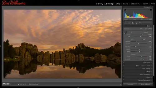
Exposure and the Histogram
So in this image, when I was done adjusting it, I glanced the history ram I saw a gap on the right side with that tells me is I have no white in my picture that's one reason why my waterfall looks somewhat dull because no white in it it's not close to white, so I'm going to adjust the whites and see if it helps my image. Do you see how it's brightening up the waterfall right now, the brightest part of the image? I don't want to blow out the sky, though there if you want to experiment and see what it looks like it one setting and then see if that really helped or not here's a little tip you could use, and that is with any one of the sliders that are found in light room you khun double click on a slider to reset it to this default position, so I'm gonna double click on the white slider, which will reset it to its default, and I look at my waterfall and then without moving my mouse, I'm keeping in the same position I was that earlier, I'll click again to bring the slider right back to whe...
re it wass and I can see the difference, so I just try not to move my mouse get on top of the white slider, double click to reset it and then you click one more time to bring it back to where it wass and I could see the waterfall becoming a little bit more uh have a little more life two exits going closer to white we'll talk a lot more about those sliders a cz we adjust mohr images and I'm going discuss all of these sliders and in the end I'll tell you exactly what the difference is between all of them I'll draw little diagrams upon the board and all that so right now I'm just trying to get started with a few images uh so overall with underexposed images exposure for overall image if the entire images to brighter to dark once the problem becomes isolated where is not the whole image instead of just the brightest or darkest areas it's highlights or shadows with underexposed usually shadows you could bring it up if you need more detail there when you're done with those then you can glance at your history graham look at the ends don't care aboutthe shape in the middle look at the ends is there a gap or a spike on the left side? You see a huge spike it's really tall in the very end if it's really tall in the very end or there's a gap then go to blacks and adjusted it might help your image do you see how I can get even more shadow detail out of that by doing blacks I don't know that I want to see that shattered detail because once I see it it's not very exciting in there, so I'll probably bring impact down maybe double click to leave it that way, I could move in the opposite direction to hide the shadow detail to say, force more areas to solid black I actually like that better because it simplifies the image it makes me look outside to the building in the distance and just look at the shape of this opening, which is really what has taken a photo of, uh, so that I could find to and the other sliders exposure for overall highlights for the british stuff let's start working with some overexposed images. Here's what I have for over exposed if you look at the sky in this photo that's over exposed all over the place that's terrible all those images I thought looked pretty bad over exposed so let's work with him. I'm going to go to the develop module with the first one, and if it's the image is a hole that has the problem, it would be exposure. But in this case, I don't think it's as a whole because I like eighty percent of the picture it's only the sky that I don't like, so if it's isolated to the brighter dark parts of the image, remember that would be highlights or shadows I'm going to bring highlights down because that's the part I don't like bringing it down darkens it that much better if I want more shattered a tell it could go to shadows but I think showing the detail around that arch just distracts you I want you to look into the distance so I'll bring it down a bit fine tune exactly how bright that is and then if I want to control the difference between that dark in the bright uh that's what contrast does I can increase that difference or decrease? It depends on the image if you bring it down too far usually it looks kind of boring and dull so I only bring it down when it's an extreme case where the highlights and shadows are just so greatly different that it's hard to deal with you another one images the hole looks pretty bright so I'm gonna bring that exposure until the images the whole starts looking a little more normal around there I might want to see just a little bit more in the shadows in here so I could bring up shadows control how much detail I have in that area if I want sky detail or I want detail in the headlamp that's that would be the highlights so I could bring that down with all of these slaughters moving into the left till dark and moving to the right will brighten and that if I want to control difference between bright and dark it's contrast, I want more of a difference less sometimes with overly contrast, the ones you just need to bring contrast down a little bit. All right, so let's, sugg, go back. I'm typing letter g to go back to the grid. That's just what I'm used to using. I've got this image selected, I'll hit develop now with this image is similar to the one I just adjusted, and so I don't want to start from scratch doing everything I did to the other image. So near the bottom of all my adjustment sliders is a button called previous it means why not grab the settings from the previous image that you would just just finished adjusting? I hit that it just stole the settings from the previous image I adjusted plopped him on this one, and so now I might just find tune the image. Ah, look at my history, ram! I don't see a spiker gap on the left on the right might be the tiniest gap, which means the white slider I could try to use, but otherwise I just might find tuna a little maybe this one needs to be just a little bit darker overall, so bring exposure any time you think overall it means exposure. I can also change between images I don't have to go to the library duty each time you see is the arrow keys on my keyboard caroline will just let me go through my images all right let's try this one overall little bright so I'm gonna bring down exposure once I bring it down now the problem is isolated to the brighter is that's highlights let's bring it down I look at my history graham and I see a gap on the right see a small gap if it's on the right it means to adjust the whites if it's on the left it means to adjust the blacks it doesn't mean that it absolutely needs it it just means it might help. So try it in this case I don't know that I'm going to notice yeah I don't really notice so it doesn't really matter but in some images like the waterfall it will because the most important part of the image might be the really bright areas and if they're not close toe white it can look kind of dull and so when I'm done and the images looking overall ok it's the ends of the history of my glance at that tells me if I want to adjust whites or blacks then I can adjust contrast which is the difference between those bright and dark sometimes it needs to go up or down all right images the holes a little bit right so I'll bring it down but then once I get to about here it's mainly the highlights the really bright areas so I'll bring down writes you can see it was a formula kind of to this in that I'm always going for exposure of its overall and then highlights or shadows can't get this dark enough with highlights it's not dark enough so I would possibly either go to a different feature that we haven't talked about yet we'll talk about one called curves most likely tomorrow uh I could go to that or just goto exposure bring it down a little further shadows are getting to be just a little too dark like where my pants are things so I could bring up shadows when I think I'm done I glance at a history graham I see a gap on both sides which tells me I could ah just blacks or whites and it could be helpful if there's a gap or spike so let's try whites see if it helps let's try black not dramatic necessarily in this image, but it tells me when I might want to experiment question do you ever use the auto is a starting point or is that just sure use ana was the starting point you can actually in your preferences also have photoshopped automatically hit auto for every image in your preference is it will I have a choice for auto tonal adjustments and yeah, if you ever have a difficult image also, you can hit that, but it's not how would I say it? I try not to rely on it where I I find the people that use auto manually by clicking out a lot often don't know what the sliders do and don't know how to find tune it just right in relying on auto gets it where I don't get my mind around how these sliders work as well. So I actually like doing them individually, but feel free to use auto and then fine tuned with these let's. Just ride on this one, okay? There's auto, um, still, this is a little too bright, possibly little to dark, but I just gotta find to not bring up, uh, bring up the shadows a little, bring down the highlights a little so you can start with auto and then go to the er mindset I was working with. All right, those are the overexposed ones. Try some more. These I thought we're lacking contrast all of these were taken in burma there's, an area of burma that has see if I can remember I probably can't something like in a sixteen square mile area there's something like twenty, two hundred temples, it's ridiculous to experiment it's hard to photograph because there's so many and you're trying to show people what you're seeing, but in a photo, how do you get twenty, two hundred temples in it? You know that kind of thing. So it's it's pretty crazy all these I thought were lacking contrast let's, go to the develop module and see how we might deal with them when I say lacking contrast contrast means how big of a difference is there between bright things and dark things, and so here the bright stuff in the dark stuff is pretty similar. So that's what I mean by lacking contrast. So if I look at a history graham up here, don't care about the shape overall don't care about the colors in it. I care about the ends if what I see is a gap on both sides gap on both sides, it usually means contrast should be adjusted like as the first thing you adjust there's actually two sliders I would end up using uh, if I see a gap on both sides of the history, the first one is exposure. Watch what exposure does to the history graham ignore the picture just look at that bar chart. The exposure is going to take that history around and push it to the left or push it to the right and that's the overall brightness in your picture so if I get that reset, do you notice that the history ram to start off with was a little bit right of center? Uh, I'm gonna get it centered just to make demonstrating other things easier, even if that's not what the image needs. Now watch what happens to the history ram when I just contrast if I increase contrast, history am gets wider if I decrease contrast, history ram gets skinnier, huh? So if I ever open a picture, I'll get these back to their defaults and I glance at a history ram and there's a gap on both side it's that usually means there's no white in the image and on the left side there's no black in this case, nothing anywhere close to black, so what I might do is start with contrast and push it up I'm going to push it up, but I'm going to stop if the history ram hits the end because if I go any further after the history, ram hits the end of where it could show up. I'm going to start losing detail if it's on the right side will be in the highlights if it's on the left side will be in the shadows, so I don't usually want to throw away that detail unless I'm working on a silhouette you know, it's an image where that area should be a black shape instead of a detailed object. Then it would be okay to have a spike in the left side. Um, let's, look at what some of the other sliders do in relation to the history. Graham, ignore the picture. Look at the history, graham let's, look at some other sliders. Watch what happens on the right side of the history, ram. I'm gonna just whites and then I'll bring it down. You notice that it's working on the right side of the history round the left side of the history? Graham isn't doing much. Can you see that? So if you ever have a gap or a spike on the right, you always go to the white slider. If it is a spike, it means you've lost detail. You have solid white because tall means lots of information. Short means little information. Where little part of your picture big party. Your picture. So the height of the spike tessie, how much of your picture so big spike means big area of solid white small spike means smaller of solid white. So if I glanced over there and I see big spike, it means I have no highlight detail. That's fine, if I have a picture that has the noonday sun in it I don't expect to see detail the noonday sun fine should be blown out should have a spike on the right side but if the brightest part of my picture is what should be a blue sky and there's a spike on the right side is gonna be a white sky and so it's going to be whites that I need to go to to just that end I'm going to bring it down until I get a gap and then I could bring it up until it just kisses the end and just say that's the highest I want to go if I don't want to lose detail in the highlights when it kisses the end it doesn't turn into a spike and then I look at my picture instead of looking at the history and I say it's either this setting or lower and I just look at the images say what looks best for the highlights to determine how bright they should be watch what happens to the left side of the history graham when I just blacks if I bring blacks down it will pull the left side to the left making it darker closer to black closer and closer and closer to black if I bring it to the right it's going to move that side of the history graham towards the right making it brighter so if I see a gap in the gap is on the left side of the history graham it's the black slaughter I want to go to if it is a tall spike it means large area of solid black because the left most part of the history graham talks about black and so if there's a big spike there the height of the history grand means how much spaces that take up in my picture so tall spike means black takes up a lot of space if it's a silhouette that's great I got a nice black shape for whatever that subject matter is that's the way I want it but if the darkest part of my picture is a black car or the tires on the car or something, I might want to see the detail there and if so I go to the black slider to do it. I will move the black slider well looking at the history graham, I'll move it until it just kisses the end instead of creating a spiker again it just kisses it and I think about that is being the lowest I'd want to move it then I start looking at my picture instead of the history graham and I say okay, if that's the lowest I want to move it then I might bring it up a little bit see if it helps we'll bring it back down but the gap of the spike tells me if I want to go to the blacks or whites slider so what we're just talking about when it comes to history grams, the history graham tells you the brightness levels you have in your picture I beg adobe to please one day add this little grady in't below it because if that little grady in was below it then all I would have to do is look straight up from any one of these brightness levels and if the history ram was up there it would tell me is this shade of gray and my picture somewhere if there's a bar on the bar chart above it yes it iss if there's a gap it isn't so then if I see a gap on the right side it means hey there's no white of my picture instead the brightest is wherever that history men's whatever's below it in this bar if there's a spike on the end the height of the history ram tells you how much space it takes up in your picture so that means white takes up a lot of space to spike means so it's on this side it's stuff near white so I grab the white slider if it's on this side is blacks and so I grabbed the black slider and if this little bar was in light room he'd be so much easier to understand so I apologize for not being there wish I could get there all right? So when it comes to images that are lacking contrast that is usually going to mean that the history ram is not very wide so let's go to a different image haven't messed with yet and let's see what we can do to it okay that's lacking contrast look at the history museum gaps on both sides so first I looked at the image and I think about it is overall what's going on with the brightness and if the image it looks too brighter to dark as always I goto exposure to adjust so I might adjust that until I'm starting to like the overall brightness an experiment move it to extremes to see you never know if it's going to be better unless you pass the point of too far and then go back I'm going to say about here for my taste then if I got those huge gaps on the other side of the history and the next place I'm going to go to his contrast and I can minimize those gaps which means get me closer to white closer to black by increasing contrast so I'll bring it up looking at the picture I might go back to exposure after that say hey that's too dark now bring it up a little more like that after doing that I'll look at my history graham and if there's gaps or spikes on the ends that means go for the whites of the black sliders okay, so I'm going to go for the white slider I'm gonna bring it up not even looking at the picture instead looking at the history graham bringing up until the history and kisses the right side if that's possible I'm going to think about that is the highest setting on most likely want to use kiss the side now I'm looking at the picture and I'm going that's way too bright I just know that I don't want to go any higher than that because I'd start fresh in a lot of detail so I start bringing it down just until the highlights and the picture look good I'm not looking at the images a hole I'm looking at the brightest areas and I'll just decide each image would be different in each photographer has a different idea as to what good looks like this is my photo so I could make it look the way I like to your photos the way you like it now I look at the history and I see a gap on the left side which tells me I could've just blacks, I'm gonna grab blacks, I'm going to move it down until the left side of his graham kisses the end around there I'll look at the image and think of that is most likely the furthest I'd like to move it and then I'll bring it up a little to see where between there and where I started, what I want to be and actually like it was kind of dark and that at any time, if you think the dark ish areas not dark est, dark ish areas need adjustment that shadows if you think the bright ish areas not bright est areas, and if you can get the difference in the definition there, then you want to goto highlights so I look at this and say the shadows orbit dark don't bring it up a little, so I want little more shadow detail, a darker highlights, and I can continue to fine tune this in many different ways. It all depends what you think looks good in a photo, get rid of that big gap on the right. Okay, so I think we covered the general concept in this area here down here and how they relate to the history ram julie's conceptually so exposures overall brightness, whereas if the problem is in the dark ish or british areas it's highlights and shadows you want to go to when you're done adjusting that stuff and you look at the history ram you see gaps or spikes on the ends, then you want to go to whites or blacks that works at the extremes of bright est absolute, brightest and absolute darkest, but when you're adjusting whites and blacks there's a way to see where it's happening because the history ram tells you if you're getting solid black or solid white but if you have a noonday sun the sun's going to be white in the picture you don't get sun spots and those it's only at sunrise or sunset you see detail in the sun so what if you have a noonday sun? You're gonna have a spike in the end you're history ranks or guy have a larger white but how can I tell other areas away from the sun are turning white if you have a silhouetted picture, you're gonna have a spike in the left because you're gonna have black were subject is how can I tell if, um if it's where I want it or it's beyond that here's how you tell one some adjusting dunne adjusting the whites or blacks sliders I'll move my mouse. What? Well, how she says, if the history graham either kisses the end or turns into a spike on the end that tells me something is most likely white or black in my picture if on the other hand there's a gap on either side there's no white or black so I don't have to think about it and find out where it's happening that's not happening anywhere, so if there's a gap on writer left, you don't have to do what I'm about to do on ly if the history graham is kissing the edge or turn into a spike on the edge would I do the following okay if it's on the left side I would be doing the black slider as always if it's on the right side I'd be doing the whites there's a gap on the right so I don't need to do whites it might be kissing on the left I can't tell my screens like six feet away from me so I can tell so I'm gonna do blacks here's what you do go to the slider that you're thinking about it's in the left side of the blacks if it's on the right side the whites move your mouse on top of it get it centered right on that slider is if you're about to click imagine you're going to try to click on it without moving it then on your keyboard hold down the option kiev here on the mac altered your windows and keep it held down then click that slider and it's going to give you a different view of your picture if you're working with the black slider your screen should turn white for most of the screen and you might but won't always see other stuff showing up right now I don't see anything else showing up which tells me I have no black in my picture because what it's trying to do is show me on lee where things were black if the screen's white that's the areas that don't contain any like so I'm going to move this slider to the left to try to force areas the black and I might have to move it a little bit I'm ignoring colors at the moment I'm looking only for black I see in the lower right corner of my picture and therefore I can tell exactly where it's happening and I could look at my picture when I let go and say, is that an important part of my picture where I'd really care if I lost detail or not? And so I see it lower right that's not an important part of my picture it might be find it, force it to black I find that the majority of pictures like eighty percent of them look best if they have a small area of black I don't mean a huge blob a black I mean a small area and if they're lacking that small area of black they can look a little dull these don't have a foundation to the image in so with the vast majority of images I adjust when I'm done and I think the image looks good as a whole I glance that they hissed a gram see if there's a gap on the left and I go to my black slider and move it down until that gap goes away I hold the option key click on that black slider and I see where it's being forced to black and I make sure it's not big it's not like this you see how big that is instead and suspect it's a little bitty area it's not so little bitty would be more like this and I find that improves most images the same is not necessarily true for whites, but if I see a gap on the right side of my instagram, that means I have the potential of bringing whites higher without losing detail and I might see if it helps the image so let's try another image dull images usually mean bring up contrast but this image even when I bring up contrast looks too bright. So if it's the images, the whole exposure is what's going to do the images the whole so I'm going to bring it down I like kind of a moody, dark look with this image and maybe, uh already got contracts up as high as it goes. I look at the history, ma'am, you see the gaps on both sides that tells me blacks and whites could be useful if they're gaps or spikes on the ends that's when I go for blacks and whites uh so let's see here I'll bring whites up looking only at the history ram until it kisses the end and then I'll start looking at my picture and I know I don't want go higher than that unless I want to trash detail in the highlights so I now watch the image and say okay, how doctor, I want those highlights each image would be different I'm adjusting this for the monitor that's in front of me I don't know if that matches the view you're getting online all I can see this one monitor if I look at the screen that's behind me it's similar but on the screen that's behind me enough you get to see my setup I see much darker shadows on the screen behind me that I see here so depending on what view I have of my image would adjust it differently. That's why it's good to have a calibrated screen inaccurate one in here for this particular of broadcast I don't know exactly what you guys are seeing online so I might be making these look to brighter to dark know that what I'm seeing in front of me though in the end I'm doing it I like it so uh all right let's see in this one I'm going to do blacks now there's a gap of the left I'll bring blacks down until kisses the end and you know I like it when it gets down there most images benefit from a small amount of black, so hold on option grab that slaughter bring it further till I see the little spit a black show up okay and then there's other things I can do in here we haven't talked about clarity clarity also khun increase contrast but it doesn't a different way clarity emphasizes the textures and urine fish if you have the weave of fabric on your shirt, you have the texture of brick on a wall. It brings out those it's almost like sharpening your picture in that it would bring out those uh if you happen to be used to sharpening pictures in photo shop was something called on sharp mask some of you would be some wouldn't it would be like having the radius setting set really high and leaving the amount relatively low if you're not used to sharpening in photo shop ignore that statement to just don't worry about but clarity it could make things pop more so I might bring up clarity to get more definition in there. Be careful with lowering clarity if you've brought it up a little bit decide you don't like it and you bring it back down don't push it into the negative side it will blow your picture so unless you want a blurry picture, leave clarity in the positive range zero or positive there's a use for bringing clarity in the negative range we'll talk about it tomorrow but it's not in landscape in normal pictures it's usually applied in an isolated area like somebody's face that kind of thing not so much to an image is a hole unless you want a dreamy kind of soft look then you could use it all right now with these and see if I can get this set up where I can show you that's not going to do it just a quick time check bandits fifteen minutes till break okay okay um with fifteen minutes so break let's move on to one other thing before we think about showing you before and afters and other things uh then we'll do that because these are some images that have too much contrast we gotta learn how to deal with those two so contrast is the difference between bright and dark so too much contrast would be when there's way too big of a difference willie and bright and dark oftentimes that's when one areas in the shade in the other areas in the blatant son that's when a lot of people think about shooting with a kind of shooting technique known as hdr where they take more than one shot that various and brightness they merge them together end by doing so you can get detail in your shadows and details in your highlights when they would otherwise showbiz black or white we will cover that on probably the second or third day of this because we can do it in light room but I find with the new controls and light room that you don't need to shoot hdr is often is you maybe are used to they fear an hd our shooter so here I am in southeast asia at a temple I think the shadows are way too dark highlights away too bright so how do I deal with it? I think the image as a whole uh don't know that I could even judge because it's it's all shadow and highlight its bright and dark it's there's not really a whole if I darkened this this will become too dark and all that so this is the only normal part and that looks fine so if it's the bright ish areas that need it it's highlights will bring that down if it's the darkest areas that need it is shadows and remember moving into the right will always brighten moving to the left will always darken and if that's not enough then the difference between bright and dark is contrast and so off in these situations I might need a lower contrast and that's not a bad way to start either so I bring it up I get a greater difference between bright and dark bring it down yet less when you get less you'll find that if we bring it down to a certain port your image will start looking a little bit bland in almost foggy ish kind of uh that's gonna happen when you start getting gaps on the end of your history graham and you can fix it with the blacks and whites sliders anytime you see gaps or spikes or you can sometimes fix it by bringing up clarity just to get a little bit more boost in that image are gonna find this a little more to go back. The slaughter's highlights pianos in old versions of light room I would start getting worried if I moved the sliders this far. There used to be a slider that was called fill light it's the equipment to shadows and if you moved it this far you would start getting halos around the edge of trees in other things that doesn't happen with the newer versions of light rooms if you use light room for quite some time and you're used to the older versions of the sliders you might be gone oh cheese is he ever going to zoom up on this picture or something? Because it's gonna look terrible now the new version looks great when you zoom up. The old version looked like halos and other stuff especially with clarity if you ever bought clarity of he had glowing trees and buildings you don't anymore not with the surgeon uh okay, I'm right now ignoring the color sliders anything would do with color because that's our next session we talked about adjusting color I could make these look better by making it more colorful and other things so here's another one same place this one the images the whole I think is mainly what's outside I might darken a little bit there and then decide what I want to do with shadows do I want him as a silhouette or don't want to see what's going on? They're so I might bring shadows up see if I want to see him shadow our oppa's high as they can go um usually when that's the case, I would actually switch to something called the tone curve, but we haven't talked about that yet just is a preview you could click on this doughnut that's what I call it donate their undertone curve if you just scroll down a little bit, then you can click on your picture and say I want stuff that's this bright to be bryant you could get even more out of it, but we haven't talked about that, so I'm staying away from that in limiting to what we talked about might just clarity here kind of thing sometimes, though if you find that you just can't get enough out of the image let's say it shadows I just can't get it bright enough in there going to just exposure say take the image is a hole in brighton until he starts looking okay and if your highlights go too far they just go down to the highlight slaughter say mellow out the highlights because sometimes your exposure gets kind of in your way, and it limits how far you could move your shadows, your highlights and s o if I find him at the limit of one of those two sliders either highlights or shadows and I wish it could go further, then go into just exposure if it's only one of those two sliders out it's max in whatever area gets to brighter dark is the result, go to its appropriate slaughter and adjusted either highlights or shadows, so I don't think that looks too bad with that now, with this item not always thinking about the history ram the hiss graham, I'll improve my image, the more I get used to when I'm done glancing at the history and on proved my imagesmore refined them or the maura I check if I have a small area of black when I'm done, but sometimes I'm lazy, sometimes I'm in a hurry sometimes I need to cover some other feature in light room and I'm teaching and I don't think to do it, but just so you know, if I really was going for the highest quality when I was done, I would glance of the history there's a gap on the right that means whites I could bring it up until it kisses the end can say, does that look any better? And it might the highlight of the temple that's out there is going to end up getting closer too white and it's gonna look more like a bright reflection there it can help uh but don't stress about the blacks and whites they're more of a refinement not everybody spends a you know a good amount of time on their images go to blacks I hold on the option the all time windows click to see do I have a little black if I don't bring this down a little bit to get a little bit of black usually going to improve the picture on most of them not all goto this image uh looks like it's pretty close to kissing on the right just say now with the white slider you can also hold on the option key it'll show you where you force things to white so you can see is it only the noonday sun that's white or is there some other area the inside of a car you know that kind of stuff and you could bring it up and say how high if I brought it up where would areas become white and say hey maybe it's okay that the sheen on a temple is wykes it looked really shiny then so you might say what does it look like if I bring it up that far don't want to go any farther it see if it helps and just double click on it to reset it to see if it look better at defaults on click again to bring it back and that could make that temple look much shiny er don't you see it up in the gold of the temple but the clue that tells me that I might want to try that is a gap or spike on the end that is the same thing for the blacks as faras holding on option and say good we have a smaller in black so that's usually indicating it's going to be pretty good looking image uh it doesn't I shouldn't say it's going to be a pretty good looking image just I've covered my bases and I know there's not some small little tweak I could do to make it better all right then just because we have six minutes and I need to cover this at some point the mice will do it now uh the other thing I do in the developed module that's overly simple and a lot of you've probably already done but if you knew the light room might not know how to do yet is cropping so here I've opened an image this is one of those temples in uh burma it's not as if the general areas called might butcher the name but it's begun began uh and you can take a hot air balloon over it in the morning it's an amazing experience because in a lot of these places they're making bricks kes to build more temples, I think, and they're also cooking and doing the things and you can get a lot of smoke in fog and stuff going between these buildings and then with the sun coming up going catching all that plus all the temples in the balloon it's amazing experience it's called blooms over begun if you ever go there, be sure you do that anyway. The crop tool is right above our adjustment sliders in this little area here, it's the one left click on that and it puts a cropping rectangle on my picture in all I need to do is grab the edges of the picture and pole, and I'm just going to get rid of some distraction in this image to concentrate on what I think is most interesting areas like that. Um, to get out of the crop tool, just click the tool again you're kind of talking it on and off and the history graham, I believe, will change when you do that because now it's not gonna look at the images the whole anymore it's going to look it only that area, and so sometimes you'll end up gaps on the ends that you didn't have before and stuff because you cropped out the noonday sun and therefore there's no longer a spike saying there's a large area white, that kind of thing, so anyway, this image I think can use um some black you see a gap on the left side bring this down so there's no gap option ultima windows so I can see it small area black uh that looks a lot better I think if I want to see more detail in the sky more information I could bring on the highlights we haven't talked about color yet though, and I think without the color there it's not helping that much then you bring up clarity to make things pop a little bit so if there's no obvious problems with the image, I don't have to go in and do exposure and highlights and all that sometimes just a few sliders sometimes I want more shadow detail really depends on the image we'll talk more later on about how to do things like adjust just the balloon and not the rest of the image we could do that based on color where we could do it by painting and we'll get into that we just need to slowly progress into things and not go too fast. I hope so anyway, I think we covered the overall adjustment controls for tone ality whenever I say tone ality I mean the tonal range in your image which is another way of saying the brightness range so if I ever used the word tonal or tonality I mean brightness independent of color so the other kind of adjustment would be color adjustments and that's what we'll get into next, but what kind of questions? Again, um, we have many, many, many questions or you would yeah, so question from br coleman, who said, is there a limit to how much you should adjust exposure before you degrade your image? I have read just under two stops are over just under two stops over or under uh I don't think that way myself. If the image is still too dark, then the option is dough I throw away the image, or do I move it further so I move it a ce faras you need the one thing I would say is if you end up moving exposure or shadows a good amount until the image looks radically different than it did originally, like when I had that picture of the one waterfall that looked almost black to begin with. Uh, the next thing that I would end up thinking about is noise reduction because noise is lurking in the dark portions of your picture and bringing up exposure or bringing up shadows is going to make it easier to see the noise that's there it's not that noise is being introduced by these sliders, it's that you just didn't notice it before because it was so dark. And now you've brought these up you got a lot of shadow detail in what came along with that is now you can see all the noise that was there, so if you move what he might want to think about when he talks about two stops bringing up exposure is maybe two stops is when you suddenly really have to think about noise ction to see how dirty those shadows are they clean and usable and if they're not cleaning usable than what would be most ideal is if you can reshoot it is to do hdr we take more than one shot combine them because then you don't get noise in your shadows because you have a shot that was over exposed that didn't have the noise so I don't know if that answers is question or not move it as faras we need to fix it but then if it happens to be brightening a lot, look for noise and you might need toe do another step uh, question from barefoot the option button and click spider that you talk about is that for light room for because they're using light to light room three and there's been a couple people who we were wondering if some of the chevy in previous versions the holding on the option key I think has been in there for quite some time uh from what I remember if you're working with an older version of light room let me talk about a few equivalence because they changed the names of the sliders and how they work, so if you have an older version of light room, and in fact, I can make this look like an older version of light room by going down here, too. Uh, camera calibration in changing this thing called process from two thousand twelve to two thousand ten, so I'm going to this area called camera calibration, and I'm changing this setting called process this means what kind of math the sliders work with should it be the current stuff that they invented most recently, or should use the stuff they admitted back in two thousand ten? And if I choose that now, if I scroll up thes sliders looked different now, instead of having shadows and highlights, we have recovering fill line, so if you're working with an old version of white room, you might have this set up for your sliders where you see how we have recovery, fill light uh, that kind of stuff. If this is what you see and you have the new version of light room, you'll notice an exclamation point down here. Do you see that guy? That means this has been adjusted with an old version, and so we're giving you the old slaughters so we don't change the look your pick if I click on that, it would update it and give me the new sliders so I could use the newer version. But if you have an old version of light room, you'll be stuck with these sliders because it doesn't have the new stuff built in fill light with the old version is somewhat similar to shadows recovery is similar to highlights you still have exposure. You still have blacks, although I think of these differently, I think of exposure is the same as whites in the new version, because this exposure will work on the brightest part of your picture, which is what whites doesn't. Anyone I think of this brightness slider is more like the exposure slider in the new version, so what I'll do is all right down the equivalence on the board during the break. In that way, those of you using older versions can get a better sense for it, but know that upgrading to the newer version is like going to a decade forward in history. As faras technology goes, it is dramatically better, I mean, ridiculously dramatically better, so it is beyond worth upgrading, because if I did feel light and I moved it to an extreme in the old version, I would see a line around the edge of a bright object where it touched a dark one. It would look like I traced the edge of the pen in that doesn't happen. The new version, if I brought up clarity, buildings and trees, would look like they're glowing. That doesn't happen in the new version, so the new version is dramatically better. I would really suggest upgrading.
Class Materials
bonus material
Ratings and Reviews
Gordon
Since most photographers give classes on PS, it's just great having such a great teacher teaching LR. I don't have the time or money for PS and teachers like Aaron Nates work only with PS like most others. They all are great teachers and I watch even though I can't use what they teach, I don't consider it all a waste of time. Bill Willmore is one of those great teachers and goes into great detail. I would love to have the money to purchase this class as it's impossible to retain all the detail that he goes into.
a Creativelive Student
This presentation was awesome. After going through two versions of Light Room, I still learned more in three days than I learned in 3 years doing self study with hundreds of dollars worth of books. Ben Willmore works magic in Light Room and shares his expertise with all. This is a great course and a real bargain. Not only is the course valuable, but so is the PDF as a bonus with this course. Thanks, so much. See you tomorrow for Photoshop masking.
Rico
Ben Willmore is a fantastic teacher. The PDF download is superb and worth the price of admission. If there was a way for me to do the techniques that Ben is teaching, with him, while he is teaching the technique, then that would be a perfect learning experience.