Lessons
Day 1
1Importing and Organizing Part One
55:47 2Importing and Organizing Part Two
38:08 3Tonal Adjustments
16:01 4Exposure and the Histogram
46:02 5Color Adjustments
35:06 6Fine-Tuning Individual Colors
43:15 7Maps
25:50Exporting
38:09Day 2
9Intermediate Organization
44:41 10Morning Q&A
38:53 11Localized Adjustments
1:00:57 12Image Enhancement
1:23:57 13Slideshows and Printing
1:13:47Day 3
14Shooting Tethered
30:52 15DNG Conversion and Keywording
50:15 16Keywords Q&A and Publishing Services
29:24 17Publishing to the Web
18:16 18Quick Collections, Dual Displays
13:12 19More Publishing Services
12:44 20HDR in Lightroom
23:18 21Advanced Adjustments
44:03 22Lightroom Preferences
30:02 23Sharpening Photos in Lightroom
31:02 24Book Module
15:02Lesson Info
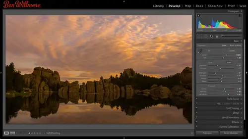
Lightroom Preferences
So in light room I'm gonna go up to the light room menu in choose preferences and if you're in windows go to the edit menu instead and there's a lot of things we've already talked about in the preferences and so I'm going to skip over those things and just look for anything we haven't covered yet that might be of any kind of importance if it's not important I might just skip over it and at any time when we're done with this think about your questions if there's something I didn't cover s o I might be able to some of these air overly straightforward like what language do you speak do you want the interface for for light room to be in english or some other um with that when you launch white room you could get a little splash screen that shows up here you could turn it off automatically check for updates is a very good thing to have turned on because they update the camera plug in on a frequent basis to support new cameras and sometimes they end up putting in bug fixes and other things uh...
and light room is based on the camera plug in so that's something I definitely make sure you have turned on so you know about new versions then here says what happens when I start up light room should it load the most recent catalogue should it ask you when you're starting light room where do you want to tell it about a specific catalog to use that's a really nice setting because if you work with one catalog all the time your master catalog then you could just say load the most recent catalog and it's just every time you open it yet same catalog because you never use a different one but what if you use a different catalog for each client? I think I mentioned that before where you can either to use one catalog for everything or individual catalogues for each client where each project well if you do one for each kleiner project you could set this to the name of a master catalog maybe it's the catalog that you have your portfolio in so it's the one you want to go to when you're not working on client work that way it would know which one that you like to use looks most frequently and then any time you want to use a different catalog you could go to the file menu and just use open catalog and you know next time after you're done working with that catalogue and you re launch uh light room it would default back to the one you have your portfolio in the one you like to have when you're not working on client work if you're constantly changing between catalogues for different clients then you might want to just have it prompt you each time you open it so it's up to you, I'm having mine unloading the most recent one here you can have it show the import dialog box right when you put your memory card in your computer. If the only thing you do I put in your memory card in your computer is ingested in the light room and you never connect that memory card for other purposes than that would be a nice choice. Tohave just one fewer steps. You don't have to hit the import button let's. Just keep over a few here. Tio here. Treat j peg files next to raw files. A separate photos. You know how in your camera you can set it to shoot raw or shoot j peg, you can also tell it to shoot both. Sometimes people have it shoot both because they're doing things like let's say they want to give the client that j pegs right away were if you're shooting tethered, you might tell it toe on lee, send over the j peg files to your computers. It takes less time to transfer over, especially if you're doing that wirelessly. But here, if you have that turned on, if you have two files with the same file name. It's only the file extension on the end that's different between ron j peg, you'd see them both, so it looks like duplicate images in light room. If you turn that off, I believe it would hide the j pegs on ly show you the wrong ones. Then when it's done, uh, importing, you can have it play a sound if you'd like that way, if you're waiting for it to finish importing before you could go and maybe check, focus on things and all that if it's coming in, you can hear it. Um, let's, see here, this one here brings me over to catalog settings we can look at that separately once we're done. Looking through here, I'm going to go to the next tab over which presets and here is where some people asked about the auto tone button there's like a little auto button when you're in your basic part of the adjustments, and if you like that, if you find that you're clicking it on almost every image you open, turn this on, and then it will do it for every image that you haven't adjusted yet when you open them eso you can control that by default, it doesn't. When you convert to black and white, it automatically applies something by analyzing your picture, then here you can have make default specific to camera serial number so you could have different camera, different serial harshness in different settings for each camera you shoot with if you find that one particular camera uh, let's say you have a nikon and you also have a cannon you shoot weddings, you're husband and wife team or something and you find that the nikon and the cannon render skin tones differently. Well, maybe you come up with a default setting that adjust your cannon images to make him look more like the nikon wants, and so you might want to say, ok, I'm going to set that as the defaults, but only the defaults for canada because you're working on a cannon imminent at the time uh, it would do that for your serial number, then you have make default specific to camera s o setting maybe you want to create different default settings with different amounts of noise reduction so that the higher the I s o setting usually the more noise you get in if you ended up saving multiple defaults, just making sure you're viewing different eso images, you know, like I saw one hundred and I also thirty two hundred need quite a bit different noise reduction uh, that would be useful because then it we keep track of it based on the I s o setting all right, then here you can store your pre sets with your catalogue as opposed to just storing them on your hard drive in your operating system. The time I might want to use that is, if I'm a student or I'm a how would you say it? A transit worker, somebody that I don't have my own computer? I put my stuff on a stick drive are a little hard drive, and I go to the library and use their machine, and then I go to my friend's house and use his machine, and then I go home and maybe have a machine there and on that hard drive are all my images and my light room catalogue? Well, you're presets so usually stored in your operating system in the adobe, you know there's like a folder for adobe stuff, but if you click this on now, those presets thatyou might create the develop module in other areas are going to be staved right in the catalog file, so if you move your hard drive with your, uh, images and everything, the catalog with you, you're bringing your pre sets with you. Also, when you leave another computer, you're not going to necessarily leave your presense behind for other people to use that might use that computer next, so that could be cool. If you need to copy those presets and put him on a different machine because you want him both at home and at work here you can show your light room presets folder and if you look in there and find that particular folder any presense you happen to have saved in there you copy, go home and hit the same button copy of the same location. Then we can restart any kind of defaults that we might run across in case we messed them up uh by clicking these various buttons over here we have external editing and this means if I open that image from light room in photo shop usually that's done by going to the edit menu uh and I'm sorry the photo menu and there's a choice called edit in and that's where you can tell it to go to photoshopped it wants to know what file formats should it save the end result in I used to use photoshopped file format for all of those things mainly as a management technique for my hard drive that way, if I ever saw the file extension psd which is photoshopped file extension, then I would only use that file extension when I had layers in my image and just by glancing on my hard drive I had a list of files I could tell you which ones have layers and which ones don't and I would only use tiff for images that don't have layers that I made in photo shop, and that way I could always glance at a folder. I see the psd cds and I go hey, they asked those have layers, I'd see the tiffs, and I say those don't it was just a way I managed things, but then there are some things that are more efficient in a tiff file and more compatible in its if file so let's mention that briefly. First off, when you use photoshopped file format. If you ever save something from photo shop and it asks you if you want to maximize compatibility you've probably saved to file before from photoshopping, this little dialog box pops up with a check box saying, maximize compatibility you need to have that check box turned on when you save and photoshopped file format in order half the image to be able to show up in light room. In general, what it's going to do is save a flattened version of your picture, along with a layered version in light ramon, he read the flattened version to say, this is what the image looks like if that's not in there, then light room doesn't know how to display that image, so that's uh one thing with it if you don't have to worry about that tiff can be a little bit more efficient in the way it saves the image and you can also have compression in a tiff file that'll make the file smaller and photo shop if you do that hdr effect I showed you where you use photo shop to do the merging and then you save the image it needs to be in tiff format if you have the hdr image you're gonna process in light room needs to be in tiff format so it's not bad to use tiff here and then finally I think the photo shop file format has a and I could be wrong with this uh a four gigabyte file size limit you might think that you'd never run into that I've run into it multiple times abs I have massive panoramas. I also have multi layered images that might have one hundred sixty layers that are, you know, really high resolution images to create complex things and I can run into it and there's a larger limitation on the tiff files I can get him saved his tiffs so that's why I have this set to tiff instead of photos. If you have a good reason to use photoshopped, go for it. I use that for a long time, but I've now switched a tiff the color space is going to determine how saturated the colors can become in your picture um sergeant you will be my most limited but is needed for the internet and needed for a lot of service bureaus that print your images so you have to see what use your pictures for you might want that if you print on your own printer sitting on your desk and dobie rg is a pretty good choice in pro photo id only use if you really know what it means you know why you're using it I mean if you do then find to use it but don't casually head there unless you really have researched what that means it's too easy to mess things up hear it that's versus sixteen bits there's a big controversy with this in fact, last time I was here I remember afterwards hearing that online there was people talking during back and forth back and forth saying that there's some people claim you can't see a difference between these two I've bought brought proof with me you can see a difference it's just not all the time uh this here tells it how much information is going to be sent to photo shop eight bits is two hundred fifty six brightness levels sixteen bit is thousands of brightness levels and those extra bits the sixteen bits are mainly useful when you're adjust your picture you can get a slightly smoother end result but it's rare that you're going to see a difference but I have brought proof let me see if I can find proof here are two panoramas that I stitch today the's panorama zehr from identical files that I had in my room I'm going to zoom up on this one two hundred percent view and well, we match the zoom on the other one I've been photoshopped at the moment so I can show you these easily um the way I need to hear I've made it so the other file is zoomed up to the same position uh this image I'm going to move around a little bit let's see if I get up in the sky this is part of a panorama of a sunrise a little noisy image I could do a little noise reduction on but let's see how smooth this looks compared to the other version. This will be subtle it's usually not dramatic but I can see it when I look in this image and I'm not sure how well this will translate online I can see banding let's see if you guys consider it all I'll try to kind of trace out where it is right here I can see a line just subtle no you can't see down there can't see it up on that screen I can see it on this one though right here I can see a band right there a very subtle one where this might look more greenish whereas this looks more ornish and it looks like I could draw a line right where that edges I can see another band right here another one there everyone here we can see it online then can you see it yeah I can see it right through here coming this way okay that's what you can get if you work with eight bit images now let me go to the exact same position within the sixteen bid file okay? I just matched the zoom and the position and I'll switch over to the sixteen minute okay to my eye it sure looks noisy but it's smooth if I move around within it I don't see those weird looking little bands where the color it looks like where I can trace around and see it whereas on the other one I do see them now taking that sixteen bit image when I'm done merging my panorama here's panorama uh it's already done with emerging at the time it did emerging that that problem happened once you're done adjusting your image flattened the image so you don't have any layers then you could do this and by doing sowe going to eight bit mode now your file size is going to go down but that additional information that was in your file originally was used when the panorama was stitched and so once you're completely done with your image you can output it tio eight bid file and it'll look nice and smooth it's only when adjustments are merging has done that the banning could be introduced so this can still look nice and smooth as an ape in image it's kind of weird, but this one not so much I can see if I can exaggerated a little bit could see it right there banning but that's a rare occurrence it's not gonna be on every image. So what I would say is, uh, when it comes to choosing this, the difference between eight and sixteen bit is sixteen that is twice as big of a file in a bit. So it's not a casual decision there and then if you use multiple layers like when I did one hundred sixty layers, which was just a stack of hundred sixty pictures in one photo shopped file for a very complex light painting the fox is was so ridiculously big if I use sixteen bit, whereas eight that it was so much smaller, it was almost funny, so I would use a pit for most things in on ly if you notice things not looking smooth when you're done mainly with panorama stitching, if you look see skies not being smooth, that kind of thing go back and redo it, setting this up sixteen bit and you'll probably end up with a smoother result, but only if you saw the banding most images he wouldn't see it here's resolution I had a table of recommended resolution settings I showed on the first day I think if you get the handbook it'll be in that uh if you are on the course singing backup in the class to see it or whatever but to forties a good setting for printing if you have the tiff file format here's if you want to apply some compression to it l z w uh zip this will make your file size smaller but will not degrade the quality, so if you want to get a little smaller you can use that does slow down saving a little bit though if you don't just use photo shopped for your external editing, you can choose a second program you want to use from in here so here's the application hit choose and you can just go on your hard drive in your applications and tell it that you want to edit things in other programs. I don't have other programs loaded here. Uh uh this is not my computer uh but let's say I wanted to use elements. Now I can have my second editor here as another program like elements when you have two programmes shown up there when you go to the photo menu and she's edit in you'll find additional choices you can send it to another program, the second program you have set up here here's a stack with original and remember how we could do stacking how had multiple images that looks similar went to the photo menu? I think it was and shows either photo or library and shows group in the stack and that put him always one image with just a little number on top, I could click to expand it click again to collapse well, this wants to know if you're gonna open an image and edited in photo shop in the end photo shop is going to create a new file in this case a tiff file and do you want it to stack that with your original picture which might have been a j peg might have been a well, most likely a raw file s o you have still only see one it could be convenient uh then this is for file naming if you just usually puts the word added on the end, if you'd rather have it put photoshopped or something else, you could click here and say you want to edit this put the word if it is a coworker just too something like make it so all their images from now on named manipulated at the end whenever they use it in photo shop over to file handling uh we talked about this before this is if you're going to convert dmg when you important your images what settings are used down here it says metadata if your image has some meta data attached, other programs treat meta data in different ways and here is just saying what should it do if it encounters certain characters that are not necessarily common and metadata how should I treat him and how should it also treat these other characters? Let's say when you're done you need to upload your pictures to a new service and the news services server is old in antiquated cant handle complex file names well, you could say don't allow these weird characters in your file names that that server can't handle uh don't you know don't allow spaces instead use underscores or dashes in st so on here is your cash if you ever get a message says your hard drive is full and you want to save some space hit this button birch cash that means you're um uh any information it has it's not essential of the images and it can be some of your previews and things could be purged will have to be regenerated the next time you view the image but that would be done automatically uh that kind of stuff this is cool I think want to customize light room and close this up in light room you know how we had our identity plate we could put our name up there, put a logo up there well then on these little side panels when you scroll through you can get something to appear right down here if I come in, why preferences you can control it under interface and they're called n marks and you can put a flourish there you can put a box you can put all sort of things and some people really like that little I think it's like great do you really need that? No but there's one other thing you khun dio and that is you can click here and say go to panel end mark's folder that's a special folder on your hard drive that most people don't know about and if I go to panel and mark's folder it will highlight this panel and mark's in there there's nothing but if I go and try to find hide, others see if I have one oh I have it somewhere here it'll take me a minute to find it I think it's called the bend badge remember what I've been water marking my images with remember there's that little circle called the ben badge there it is well, I'm going to drag that over here it's a ping file now used to save for web and photoshopped to save it in a file for matt called ping, which is a file from that good for logos for the internet so I just put it in that folder now I'm going to go back a light room and in here we see if I have it yet it might need to close us and reopen it hopefully we'll just be in preferences yeah there ben bash he's not usually pm though even now I can have that right at the end of these panels it'll appear both on the right and the left panel when you scroll down to the bottom I think it's kind of cool you put your own one especially because most people either don't know you can even have something there or on ly know how to get the plain old ones uh so anyway there's things about font sizes and other things in here and just see if there's anything else uh relatively important I think the others are relatively self explanatory so if there's ever anything about your preferences your thinking about don't know what it does you're welcome to ask about it quick before we move on we did have a couple questions redhead seventeen from liverpool asked what does ben recommend for the size of the cash ah the size of the cash when you go over here to preferences and uh see right there the cash depends on the size of your hard drive and how fast your hard drive is that kind of thing? If you're working on one of the newer laptops that haven't ssd drive in it that's limited in capacity then you might need a limit it quite a bit but otherwise when you were, if you have a large hard driving, such one biggest is usually going to be fine, but if you want to knock it up a little bit, you're gonna be ableto hold mohr previews in there, it's just a matter of how much space you have on your drive and how much you're willing to give up for something that it's just a little bit of a convenience factor make things show up faster the next time you view them. But it's it's not critical alright, alright now let's talk a little bit more about adjustments just want to make sure we covered the preference ideas so that if it's light ra mastery, we need to be able tio no, what most that stuff does all right, when we're in the developed module, we'll press d to get there. We have all these adjustments, so we've been talking about we have the basic adjustments, which we went over on the first day we have tone curve, which we went over today hs elway went over think the first day split tony we've already talked about uh when it comes to tinting black and whites, I also use split toning by the way to warm up shadows if I have the dark parts of my image are looking to cool, I could go here to shadows and say let's pump a little blue in them and just put a little hint of blue in them to make it so they are not blue. I'm sorry kind of a reddish orange because they'd already be two blue what happens is in the shadowy areas of your image it's the blue sky that's eliminating them instead of the warm sun. But that's one way you can get a little bit more warmth in your shadows. We talked about split tony, we haven't talked about detail and we haven't talked about camera calibration those of the two spots we have left so camera calibration we have talked about this menu. That menu is where you can switch between older versions of light rooms processing it's, mainly so you can keep old files that you've adjusted in the past looking consistent that they allow this. So when I go to two thousand twelve, which should be the default with this version of light room, I get the most modern sliders when it comes to my adjustments. If I go to two thousand ten, it'll show me the kind of adjustments I could have in the previous version alight below that we have something called profile in here are some pre set profiles and this is going to change the way the colors in my image are rendered in general it's similar to switching different brands of film going from kodak film fuji film to whatever other brand each one would render the colors differently so if I click here, adobe standard is what you've been applying to every image if you've never look at this but look at the image and steven see a difference when I choose camera faithful you see it shift a little bit when she's camera landscape when I choose camera neutral can't report and standard now I don't like having to switch between all these things clicking each time for each one I just want to be able to see my image very quickly with each one of the settings. So what I suggest you dio is in the developed module go over here and make a set of pre sets in all the preset would change on your picture is this menu because do you remember with presets how you khun mouse over them like these? And right up here you seen instant preview of what it would look like on your image? Well, if you want to see which one of these would be best for any particular image, why not save them always presets and then all you have to do is mouse over each one up and down like this what you look at that preview once you find the one that renders the colors in the most satisfying way, click on it and it'll be applied to your picture I find that to be much more satisfying than randomly picking at this menu that make any sense you could also find tune that mohr so instead of just using one of these you can come down here and find tune things behind the scenes. Your images are made out of red, green and blue every little pixel mix up your image has a certain amount of red, a certain amount of green and certain amount of blue. Here we can control what color that underlying red is. Our image is made out of weaken color control, what color of green and what color of blue and it's going to change the way the colors are rendered in our picture, we can also change how colorful the red is. We can change how colorful the blue is in how colorful the greenness in by messing with this, you might be able to simulate one of your favorite types of film if you like film that makes blue skies much bluer, you probably had a more saturated blue primary color behind the scenes. If you like the way cream grass was rendered in different kind of film, it might have had a different color of green behind the scenes, and you could move these around to see if you can get close to that. Once you get close to it, then you could say this is a pre set and apply it to your images is that default if you wanted to war applied on a selective basis some cameras also produced a little hint of kind of purplish in the shadow area I think it might have been fuji cameras I don't remember for certain now and this was in there to compensate for it and that means we could shift the color just in the shadows away from magenta or away from green so if we had a a camera that had that problem we'd be able to try to compensate for it there but this is the camera calibration yes I was one if you've come across preset settle match exactly what cannon has done or what he can't have done I haven't looked for them so I don't know er there might be some out there I'm not sure you could do a google search and see what you come up with so I just want to make sure you knew that was there and the main thing is I would make a precept for every one of these and once you get used to the one you like out of these as far as how it renders what what kind of thing you shoot like biscuits, skin tones vs landscapes then fine tune it by moving these sliders around to see if you can get it to be even more closer to what you'd like and the save that isn't preset too and you're going to get a slightly different look with your images. It's. Kind of funny, though. How they named these because I usually hate using camera. Landscape on landscapes usually makes things up to ah vivid for my eye.
Class Materials
bonus material
Ratings and Reviews
Gordon
Since most photographers give classes on PS, it's just great having such a great teacher teaching LR. I don't have the time or money for PS and teachers like Aaron Nates work only with PS like most others. They all are great teachers and I watch even though I can't use what they teach, I don't consider it all a waste of time. Bill Willmore is one of those great teachers and goes into great detail. I would love to have the money to purchase this class as it's impossible to retain all the detail that he goes into.
a Creativelive Student
This presentation was awesome. After going through two versions of Light Room, I still learned more in three days than I learned in 3 years doing self study with hundreds of dollars worth of books. Ben Willmore works magic in Light Room and shares his expertise with all. This is a great course and a real bargain. Not only is the course valuable, but so is the PDF as a bonus with this course. Thanks, so much. See you tomorrow for Photoshop masking.
Rico
Ben Willmore is a fantastic teacher. The PDF download is superb and worth the price of admission. If there was a way for me to do the techniques that Ben is teaching, with him, while he is teaching the technique, then that would be a perfect learning experience.