Lessons
Day 1
1Class Introduction
24:29 2Lightspeed Workflow Overview
39:04 3Skype Call Testimonials
16:13 4Backup Options and Safety
19:00 5File and Folder Management
16:36 6Job and Client Tracking
31:27 7Enhancing Presets
17:47Lightroom Preferences and Watermarks
32:11 9Renaming and Export Presets
27:54 10Basics of Making Presets
36:49 11Assigning Metadata and DNG Conversion
20:00 12Editing Workflow
24:33 13Overview of GoodSync and Kumu
31:38 14Labels and Quick Enhancing in Lightroom
32:53 15Editing with Lightroom
22:39 16Photoshop Integration
27:53 17Compositing in Photoshop
33:50 18Publish Services
20:11 19Slideshows and Orders
36:38 20Albums and Soft Proofing
19:57 21Portrait Workflow Part 1
32:22 22Portrait Workflow Part 2
24:56 23General Q&A
11:44Day 2
Lesson Info
Basics of Making Presets
so before the break, we're having a little difficulty with the WiFi. And, um, it shows if I type of the manually, Basically, if you can see on your screen now, if I just type in the address, which normally you have to do with this program. But then it pulls up your phone and all the, um, albums that you already have on your phone are right there, and you can create a new one on the fly cause you could say, This is my my new images or whatever you wanna call it. Boom. And then send it off to that to the phone, and then it transfers over and she's am there it is right here on the phone, right? I just popped up. I know it's on your phone, so it's It's pretty slick. I mean again. I think you should be taking advantage of keeping your portfolio, which is on your phone, because you can. You never know when you might show a client, you know, walk into somebody in the elevator and they say, Oh, your photographer like you have any work with you. Yeah, that's right. Here. My phone. Have some, yo...
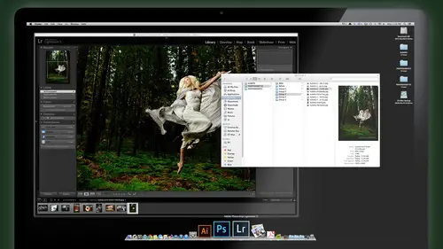
u know, was funny. You should ask. I happened to have my old portfolio right here, you know, or your IPad or whatever it is transfers that were pretty quick and slick. That's that's kind of nice. Um, so again, these are just little time saving things that I found. I want to share with you or not Have to put these into your workflow. You don't run out and buy this 99 cent app or whatever. They're gonna break the bank stimulus, but it's good to know. So let's go back to light room and let's finish up with what we were talking about, which is getting ready to do our actual workflow. And the last thing we need to do before we actually on this job is to set up some presets for adjusting the images for tweaking them. Um, we talked about earlier about defaults, and there's some great questions that came in over the Internet. About what if I want my images from my camera to look this way, but my partners images, they don't like that saying, Look, they want something different. How do we set that up? So here's how we're gonna do that. And give my two tomorrow, we're gonna get hard core into tweaking images, getting deep into the develop modes and how to use that the best. Going to photo shop. So all the fancy pants, he artsy fund stuff. We're gonna really get into that tomorrow. I'm gonna touch on now, just setting up these defaults. But if I don't explain it, 100%. Just know we were gonna get that tomorrow for sure. Okay, But it's part of setting up your light room ahead of time that we're gonna talk about. So we're gonna go development. What's a shortcut for develop mode? The yo boom, You get another IPad? Yes. Wow. Stacking them up for you all courtesy of Creative Live Do They are so, so nice about that. Giving away ipads all of the it seems like. Stop it. Okay, so let's say, for example, um, typically, you want this image to have a little more pops on the right hand side. I'm just gonna scroll over to my adjustments and make these windows a little bit more spacious for you, which they already are. Pretty much it's because they're gonna get hide. The hissed a gram. We need to see that. So in the basic panel here again, we will go into these in depth a little bit mawr. But the basic adjustments that we want to do for an image would be here. Exposure. Contrast highlights. And generally you don't want to mess with your exposure and stuff, because if you shot it right in camera should be pretty close. But a lot of times you will want a punch up other things. For example, the clarity. Let me just return these back to normal here. Clarity, if this is on zero, is his weight comes in straight off the camera, on vibrant straight at the camera. I almost always want a little bit more of this stuff like that of clarity and vibrance just works so clarity. If I crank it way up almost two gets like HDR looking. It has that really kind of three dimensional feel to it, which is actually pretty cool. You could do some cool effects with the clarity slider, but for standard images, we just want to get rid of that digital Hayes, for the most part, you know, it's funny. I like to take credit for this. I probably can't really take credit for. But years ago I wrote I start writing actions at an action called Clarify that used a few photo shops, little tricks there and I melding together and call This made this action called Clarify that did exactly that. It got really digital Hazel. That and then, like room comes out with one called clarity and like, Hmm, Mary, I'll just pretend I had something to do that right? And, um so anyway adds a little clarity to the image as part of my default. Look, I kind of crank that up. And the vibrance, uh, is really cool because of vibrant, unlike saturation. Doesn't really jack up your skin tones. So much like I can creek the vibrance all way up in the skin gets kind of orangey, but not so bad, but normally, like things like the sky and the greens get really nice and punchy. Okay, but I don't want all the way up generally, but I want Mawr. If I was to use saturation for that same purpose, skin tones get really orange. Look at her skin tone is just kind of Martian like, you know, she's been in the sun too long, so be careful with saturation. Onley used that a lot if you're working on landscape art images, but if you want to preserve skin tones, be careful how much saturation you bump. That's when Tippett vibrance. On the other hand, you can give that a nice little kick, and it still looks fairly natural. But it does boost blue skies, which we really have any blue sky here. But greens blues start to look more vibrant. Uh, so let's say that's what I want this to look like all the time, more vibrance. And I want, um, or punchy image like snap images. I'm gonna go for a strong contrast curve is my starting point. Maybe that's why I want maybe I want just medium contrast. This is again. This is up to you with what you like for your default. But keep in mind as you're doing this, that if we say this as a default, it will apply to every raw file from this camera from now on. So don't do something that only looks good for this one image but won't look good for another image. Keep them generic ish, but I find after working thousands of images that I always bump my clarity and I always bump my vibrance, and I always like a little more contrast than what I get straight at the camera. So I've just built that into a default. That's that's my starting point. Then I tweak it from there. Okay, everything else down the line here, we're going to save this for creative enhancements later on, playing with our luminess, that sort of thing's going down lens correction. One thing that sometimes we do build in and I have people do this is adding a little vignette ing because I really love the look of a little bit of in yet my images and I almost always apply it either with a preset or some sort. But I know that a lot of my students say you know what? I apply it 100% of time, so why not just make that a default? Build it in? If you do, that's fine. This image has some natural vignette ing on it, cause it was shot with a, um, in de filter like a polarizer, a neutral variable indie filter, and it was shot with a super wide F 1.4. So it's got some natural vignette ing already going on on it. But you can add that if you wanted to down below under the post crop vignette and Adam maybe add a wee little bit. Not too much. Maybe minus 567 Whatever. Okay. And then finally, the last part of camera calibration. This is where you can really affect the core color qualities of that image. And be careful with this because it's a little you can get really strange really quick. So you can always my shadows air always to magenta there always to green or whatever you can. Then play with that here again, This would be a global adjustment. So I personally don't use this because I don't find women just to be that far off. I really just want them to have more punch. I don't think the colors air off really at all, so I don't mess with this, But if you do have a camera that use off all the time, you confined to knit here and tweet that. Okay. All right. So once you've got this whole section dialed with the general tweaks that you would use in all your images down below you hold down the option or Ault key on your keyboard and you'll see that this little reset button turns to set default. Okay, well, the option on the Mac alterna PC turns a set default. Doctor, I thought you click on it and the window comes up saying I'm gonna change this so that whenever you shoot a D three s raw file, I'm gonna do this whenever I imported, no questions asked. And it gives you this scary note. These changes are not undoable, and in fact, they're lying because you can't undo it all. You gotta do it said restore Dobie defaulting it done does what you just did. So it's not that scary. So you say update to current settings. And now whenever I import t three s images, it'll have as a starting point this bump in contrast and this bump in the presence, clarity and vibrance. Okay, so that's how you start a fine to give a base for the look that you want all your images and it could be as crazy as you want. You could say I want all images to come in Is black and white no matter what, and this is actually good will kind a little trick that you've been to my art creative workshops. I'll just throw this out there because it's a nice little sidebar to what this black and white thing. If you ever tried going out shooting like art stuff, set your camera to black and white and shoot in black and white because you see it and you start to visualize contrast Shapes composition tones better when you're actually shooting in black and white. It's actually pretty fun once you get used to that. And if it's shooting raw, the good thing is you could bring it into light room and switch it to color. Black and white doesn't it's not. It's not permanently embedded. But when you're shooting in camera, what you see on your screen and cameras will be a nice black and white, and it really helps train your eye toe. Look for composition, tones, shapes and shadows, much more so we do this like in Italy workshops, Africa, Let's stuff. We just put it straight on black and white camera shooting raw. Of course, he shoot JPEG, and it set the black and white. It will be black and white forever. There's no turning back. It's a make sure shooting rob, but that's just a fun, cool way to kind of bump your shooting creativity. Try that out, all right, so we don't want that as our default. We just want what we had there. And so now that's my new default. So at any point, if I was to do reset on an image, so let's say I take a different mature Let's take this one and I create black and why, and I do kinds of crazy stuff to it and, like, I don't know what I'm doing. I don't like that. I just want to go back to my default reset. I don't in the bottom right. Takes it back to your default that you created up. Yes and no be told us. Be careful. There's no going back what it really is going back, because if I, um, hold down the shift key on my keyboard, I can reset it back to adobes default, which is before what I did. And that's the adobe default. Okay, that's my default so you can switch between adobes default just pretty bland your custom default or whatever. High Fallujah tweak it and fancy stuff you did. You know, at any time it's very easy to switch around and do that. Sebastian, you question, Since we're talking about colors, usually okay, now say we tweak everything and everything looks right. My laptop, my Mac book pro. And now I'm using an external monitor on, um, I'm I'm seeing. The difference is now, So any recommendation, our tips on getting the car is old matchup. Yeah, great question. And that is probably the first things you want to do. Is just a photographer setting your studios get a color, calibrate er and use their familiar with those little devices that you slap it on your screen. Uh, everybody should have one of those. Really. It's a no brainer thing is a pro photographer. You gotta have calibrate your screen, and you can calibrate your laptop with it. Calibrate your external monitor with it. Keep in mind that laptops, even when they're calibrated some laptops, they just will not look 100% right. Where's a good external monitor? I use monitors from ISO e I z o. Just really, really nice. Very accurate. Slightly on the expensive side, but they're worth it. If you do a lot of color correction, work yourself and that modern Aiken depend on will be 1% accurate. Once I've calibrated it, where is my laptop? Even when I calibrated a look at the two calorie both and look at my laptop and it's pretty close, close enough for government work anyway, on, uh, I'm good with it. But there is a difference. I can tell. Even when they're calibrated. There is a slight difference. I just keep that in mind, but you have to be calibrated to get you in the ballpark. Otherwise you'll just be way off. Yeah, and I think that's a great question because a lot of people just don't even think about how important that is to calibrate use it. Use a hardware calibrate device. There's no way to eyeball calibrate your moderate really is not. I've tried to do that for years. It's just not practical to do that. Good question. Another question on calibration and monitors off. That was a great deal. Sidebar. We don't really talk about that, but it is. That's important to your to your workflow is to make sure that you don't have to redo prints because they look completely wrong. So using a good lab and calibration is really the only two things you need to make sure you're doing. And then there's some photo shop. Specific color settings will cover tomorrow to help you ensure that you're on the right track. A Zara's color management. But it's pretty simple. Calibrate and use a good lab and bed your profiles when you send it to them so they know what you are looking at. Yeah, okay. And a questions were briefly hitting on monitors that we might. You might have mentioned this, but to monitor Set up Yeah, light room is awesome with two monitors set up and you can simulate the two monitors set up down in the bottom left. Here, here's a little icon for monitor one of modern tube. If you click on that Number two, this is what if I had a second display. This is what I would see on the second display on. This is a great way to work, and this is actually how I do work. I have my big eyes and monitor right here on a little stand So it's directly above my laptop, so I just kind of look up. Going side by side to me is not as intuitive, is just looking right above, up and down. My neck goes this way easier than this week. So I have my big Meyer here, so I've aligned it. So it's just like seamless transition for the top of this to the next monitor. And then I dragged this son to the second screen. Or, if you have it connected already, it'll just pop up. And then you can set this screen to show whatever you want. Maybe this could be your full frame, and then your main screen would be your your thumbnail view. Okay, so you can click on thumbnails here, and as you browse through thumbnails, they show up on your big monitor, and that's where you would judge the color on the big monitor. So you put the main image of big moderates color accurate, and your thumbnail just for browsing and editing are on the other monitor. So that's a that's a really nice, efficient way to work. Um, you can set it up so this second monitor will zoom when you zoom or second monitor can have your thumbnails. And the other one has the big ones or whatever you want. It's up to you. Okay? Okay. Go back over that. Okay. Dokey. So you guys got the defaults. Now let's set up some presets that we can use when we're importing images and we're creating looks for images to so in the develop module shortcut D you have access to all kinds of cool adjustments that go deep into the core of the image. And this is where you can really pull out a lot when you especially shooting raw files. So you'll notice here, my little zigzag, um, tweaks to my highlight shadows, whites and blacks here, straight down the line as part of my default. I like when we talked about that. We like to kind of get more of a full range out of my image. So I opened up my shadows a little bit. I bring down my highlights a little bit, and I find that even when I shooting high contrast situations, the detail gets preserved better. So this is actually part of my default. And I'll just give you these numbers. If you guys want to try these. Maybe make a preset for this and then try it. See how you like it If you don't no skin off my back. I am totally cool with that. Just don't tell me you hurt my feelings. Okay, so here's what you can start with. Take your highlights down a little bit. So minus on your highlights. Shadows go up a little bit. Plus 18. whites go down a little bit minus black point could stay actually where it is Normally, I don't find I need to tweak on that. Too much exposure will stay where it is. Assuming that my camera was properly set when I shot it, Um, and then the ones we talked about four bump the clarity bumped the vibrance, the numbers that you could start with here, plus unclarity plus 17 under vibrance and tone curve medium. And this might make a really nice, detailed images full of shadow information. Highlights come down a little bit. It's a good starting point for other adjustments. You throw onto there too. Okay. So create those. And from this point right here, let's do something that's even more snappy and say that as a bonus, like a separate preset, we can apply. So we've got this kind of a default setting right, which we already saved when we said this set default over that And then let's say let's bump this up a little bit A little more clarity, a little more vibe. Crank the contrast. Too strong. Okay? And I'm going to scroll it on down here and make sure my effects. I have a little post crop vignette ing on there, just a wee little bit minus 12 ish. Okay. And now this will be a popular, snappier version of what we had is our default. So I'll save this. I could reuse this one if I want. And on the left, scroll over towards his presets and in presets here I will create a new one with the plus button, and we'll call this nappy er we're going to save that totally up to you. Put that into my basics folder, and here's the deal with creating presets. Give us some tips on it. You want to check the items that are affecting the image on Lee if it's not really affecting the image then leave them unchecked. Unless you're doing a baseline kind of a preset that you want to reset everything, but generally just want to tweak those color things. You don't want us. If I've already adjusted the exposure on this image, I don't want to reset the exposure back to zero, which is what this preset had, right? I didn't touch the exposure of that. Only to the vibrance. Other things. So I'll start with check. None. And what do we changed? You guys remember what we change to make this image snappier? Highlights shadows, whites. We did the tone curve, right? We did clarity. Vibrance. What else? We did One more thing. And yet you post crop vignette ing process version that by default, that turns on just leave that on. That's, uh, each year, adobe changes there. Core technology. You want to make sure it stays with this one, so it looks the same. Oh, and that's that's it, right? Just double check yourself. Is there anything else that I touch to get this thing? Um, no clarity. It's good. Okay, so now I hit, create. And now I have my snappier preset that I can apply any other images. I wanted to throw it on that one. Snap down a little bit. That it Pop it on there. Okay, So what you want to do is before you start working, of course, is to create some presets. Get them sample images up there, start dialing in some cool presets and cool adjustments. Play with him. Five mine, if you want to. I've got some amazing ones that you guys can buy by. Somebody else is there are a lot of great presets out there, but the main thing I want you to do is to start using presets extensively instead of trying to manually tweak. Every single image is just too much time. So find a cool presets that you like. I've got some beautiful ones that I use a lot. And that depends on the image damage style that I'm working on. Okay, so for example ah crem dela crem use that one. That was cool. I like that one has kind of a vintage. Makes the skin tones kind of creamy one click. And it's just describing out the backspace or back slash story that will show you the original before and after your preset foreign after fashion. I see a question brewing in your mind, Kevin. So I've been using some of your presets and develop presets, and some of them you can stack them for something. You? Mm. And is there a way to tell from the menu from that list or just kind of by experimenting? Yeah. Yeah. You know, like, big netting shirt, because I can stack them, but the otherwise Uh, yeah, you kinda have to know the preset. Well, well, OK. And that's a great question because people are used to thinking of Ah, Photoshopped. You can layer actions, right? I can run in action running again and just keeps building it up and layering it up. It doesn't care what you already did to the image and light arms A little different When you make a preset, you only have one adjustment of the curve. So if I have a preset that gives me medium contrast and then I apply another preset that adds the changes that a strong contrast it ignores the medium and now makes it a strong contrast. It doesn't add it were Photoshopped, it would add it so I would get like, super strong contrast, because I have medium plus the extra in light room. It just says, Erase what you had replace it with this. It was a one shot deal. So depending on how you save that preset, which is what we were doing earlier here, go back to develop mode if I save a preset. And in this preset I checked everything. This is a mistake a lot people do. It basically erases everything that was on that image and replaces with this one set. And that's fine for certain things, but generally not like the If I did have been yet, and I just said I would just select everything inclusive and yet it'll do the vignette, plus a bunch of other stuff I don't want it to do, so I can't really layer them that way. So you kind of have to know this preset only affects the vignette, which that's why I designed them. So that's why I make sure that when I'm creating a preset, I only check off the things that are absolutely essential to that look so that you can somewhat layer them. But, um, a lot of times one has one vibrance, and the other preset has a different vibrance. It just gets swapped. Yeah. Okay, so we created the basic preset. Here's another one. They give you a couple of their little formulas for some basic presets, and then we'll do some brush presets on my favorite tools as the selective adjustment brush. So I want to show you a few cool ones that we can use there, and they were gonna start jamming on the job. Okay, So Okay, so here's a Here's a boost E color formula. We talked about that. The, um this one's a little different. This one has more complex adjustments to the loom in its to the saturation. It has split toning into it into the highlights. It has post crop vignette ing a certain type. It's a compass. This is a fairly complex one to get this. And it took me a lot of work to get this look, which actually be love and uses a lot of my images now, because it has kind of a vintage e a nice poppy color look to it. But I also have some really, um, favorite black and white formulas, which I will share with those with you two right now. So I'm gonna return this back to default command, shift our control shift. Are you on a PC? Resets it back and let's go straight into black and white mode. Go away, Stop it there and let me show you a formula for black and whites that I really like. So I'm gonna skip down into tone curve and we'll set this tone curve too strong contrast. And I'm going Teoh Similar to if you put if those have used to shoot film photography and put filters when you do black and white way back then I need you probably back shooting film at one point. Right Start with film Miami to remember We used to put shoot black my film and you'd put an orange filter a red filter over the lens in order to change the tones of the reds and the oranges or whatever. So say we wanted to change the tones of skin tone kind of make it creamy or whatever we want to do. Pump that up here in the filter. So we're gonna kind of filter that up just a little bit. But I also like the kind of look of the infrared e pseudo infrared where the blue skies get darker and greens get lighter. So I'm gonna do that boost on the greens and a drop in the tone. They didn't have any blue sky. This machine can we see it? But this is kind of formula dropping in the blue. In the aqua they usually toned. You'll find the skies. Skies are getting darker. Greens will get lighter, a little more contrast. Skin tones get a little bit lighter. Scream here and the red's of like things like the red of the car tends to lighten up and is your nice contrast here is Well, okay, then what I would like to do is to add a little split, Tony. Okay, so split toning. I don't want to make this a c p A. But I want to add a little bit of warm chocolate syrup to the shadows of this image, such that when I make a print, it looks rich and deep, but not plain cold, straight, black and white, which is fine, but I like to have a little tone in, like selenium. Tony, remember darkroom days and we did selenium toning on your prints and have that. Just that perfect little warmth in the shadows. It was so cool. That's kind of what I'm shooting for. What? I'm doing this. OK, so what we're gonna do is go to the split tone section. All right over here, All right? And I'm going to first of all, choose a color for the highlights. So click on the little color Swatch, and you're gonna choose something that's kind of chocolatey. Okay, you need to worry about the saturation. You can go ahead and crank that saturation up if you want to. Don't worry about how it looks. I just find that nice, warm, chocolatey color that you like on screen. I can see what you guys are seeing there. Okay, So play around with that. Find the chocolate tone that you want. You can keep the saturation of high. Just you can see the color. All right, then we're gonna come back here. We're gonna switch the balance. This tells me, put that toning all in the highlights or only in the shadows. Okay, so here it's Maurin. The highlights. Here it's more towards the shadows. So what I want to do is to find a nice balance so that I have less toning in the highlights and mawr towards the shadows. Okay, so crank that up a little bit and then I'm going to take the saturation slider down. Oops. Did I just do highlights Click the wrong total button. I'm throwing that. That's a different. I'm showing you two different things. I'm doing the shadows bumper. Alright, guys, it's been a long day's work. It's only beginning. Uh, I have another one that tones the highlights, and I'm Yeah, put into the shadows. Chocolate in the shadows slide the balance lighter up to the right, about 3/ of the way, plus 58. It's a good point to start at you notice now that I have nice, chocolatey shadows and the highlights are still fairly clean. And to further clean that up, I now return to my saturation slider and dial that down just a bit, probably about their 23 24 25 and that will restrict my chocolate to the shadows, keep my highlights clean and get a nice, rich, tasty black and white that way. Okay, the more saturation you kick up, the more it starts to look like a c p a print. Um, but it's really not bad. Like if you had a true CPO, the balance would be down more towards the middle, where everything looks kind of brownie, which is cool, if that's what you want. But I really want just the shadows to have that. So that's why scoot this balance to the right about 3/4 of the way up. Okay, guys with me on that. All right, Cool. So now I got a nice, rich black and white. I've got the contrast that where I wanted to on that thing. I've played with my color filtering on it before I've saved it. Then we save it on the presets. Let's go and make this see Rich and creamy W And what did we save for that during the whole off? What do we adjust to create that number? We did do a bump to the tone curve, right? Made it strong. Contrast. Yep. We did the black and white mix. We did little toning was anything else? We change the vignette in on this one. No. Now we can leave the vignette in alone because that could come or go. We could do what we want with that later on. We just really want the things that makes that the rich black and white. And that's pretty much it right there. Tone curve like in white mix, split tone. All right. And we save it. Have a quick question about the split toning cause, um, cause yet you went to the highlight. I guess Thea and you went through, like, the color picker chart. Did you go into the chocolate tone? The chocolate section elected? I saw that you actually dated for the shadows. Yeah, I was. I was in the wrong button because I was thinking about different preset, as I'm teaching you a different presets. So So erase that one part, that really, for this particular one, we only want in the shadow of the shadows. OK, so the shadows, that is what you're making. The the chocolate and the highlights were leaving it alone. So you can see here on the highlights. I got saturation down to zero. That means nothing's happening. And the shadows is where but the chocolate and crank that upto anywhere between here 50 and 25 is nice to spend on. Well, a rich want that thing? Okay. Did you automatically put the saturation down to zero in the Hewitt 45? Or was that the hue? Doesn't matter if you're saturation. Zero this. Actually, until you crank that saturation up, then this actually affects the highlight saturation. Okay, I understand. So keep that at zero. Then it's doing nothing. Thanks. Yeah, I just want the shadow. We'll have another one. It's like a cross process where I put some sort of blue creamy things into the shadows and then warm tones into the highlights. And you get that sort of cross process. So that's when you use them separately and put different tone to the highlight. Different tone to the shadow. That's how I would use a different or put them both in the same. Make it a CPO kind of print. All right, so there is your warm and tasty black and white. I would suggest once you dial that in play with variations, save that as a preset been play with variations of maybe having mawr. Less contrast, maybe mawr or less, uh, adjustments. Selective color adjustments to the tones here. Maybe you have one. That's for landscape one that's for people, one that's for dark skin. You might not want to do the same thing for dark skinned people. One that's for men when it's for women, you know. I mean, tweak it to your needs and your clientele, and whatever you think looks right, but have variations that some of the cool thing to is you have variations of them so that you can say, Oh, I've got 100 different black and white presets in here. Um, and I use a lot of them because I just find different ones work for different things. Not one's gonna work for everything. So give you a couple other ideas of good presets that you guys should create. Um, another one is vignette ing. I have presets for low vignette, medium vignette, heavy vignettes. I can quickly apply that any time. Um, I have, uh, of course, all kinds of different color effects. Vintage things over a navigator, just like in he has made. We know this, but in light room, if you just hover over a particular effect, it will show you a preview of it in a little navigator there. There's across process Seattle thing. I made that when we was here creativelive last time. Maybe it was when we made for fun here. Um So here's all the different kind of things, and you just kind of scroll over and they like Lightnings happening. Snappy Default Black and whites. Here's our noise reduction preset for 4400 eyes. So if I click on now, it applies noise reduction to this image for high I So which I don't need because we don't have it on this image. That's kind of how that works here. Okay, so you have a few presets, I'll let you up. I mean, I wanted to show you the basics of making presets and some of the key things that you guys could start playing with them or go out and get some presets. Whatever makes more sense for you. Some people like to tweak him in themselves, but keep those basic rules in mind when you're making your presets about Onley saving the right ones, knowing how they're gonna layer and knowing, of course that you could make varieties for different uses for different skin types. For different subject matter, you're gonna have slightly different presets for different things and have fun with it. And there's another kind of just cool, cool thing you can play with on your own. If you click on this little curve icon here, this is in the tone curve section. You actually have access. You notice this curve here changes here from, um, you're straight up tone curve with just highlight shadow darks and lights to an RGB tone curve where you can access the Red Channel, Green Channel, Blue Channel. And this is for those of your little more geeky or you worked in photo shop a lot. You could do some really cool cross processing by tweaking each channel separately. So say you want to add blue to the shadows. Um, do the opposite to the reds. Some crazy kind of tones here. Yeah, magenta. So you can kind of funky the fine tune. However you want base by tweaking each individual color channel are we want. So that's kind of an advanced thing. I just want to show you those you are advanced may be out there and those you hear who played in photo shop enough and you know how manipulated tone curve can affect your image. It gives you a lot of cool options here for creating looks in light room based on the tone curve of each color channel, and that's separate from your RGB. So just know that you click this little icon down here, and that boom gives you access where it hides. It makes it simple.
Class Materials
bonus material with purchase
Ratings and Reviews
fbuser 471f6dc7
Amazing.... Amazing.... Amazing
smilies
This course has been more than helpful in the areas of organization and functioning more efficiently with my photography. Thank you for all you do Kevin Kubota and CreativeLive!! :)
a Creativelive Student
This course was really helpful for me to speed up my workflow. It gave me ideas about how to keep things organized and backed up, making me more efficient and my images safe.