Lessons
Day 1
1Class Introduction
24:29 2Lightspeed Workflow Overview
39:04 3Skype Call Testimonials
16:13 4Backup Options and Safety
19:00 5File and Folder Management
16:36 6Job and Client Tracking
31:27 7Enhancing Presets
17:47Lightroom Preferences and Watermarks
32:11 9Renaming and Export Presets
27:54 10Basics of Making Presets
36:49 11Assigning Metadata and DNG Conversion
20:00 12Editing Workflow
24:33 13Overview of GoodSync and Kumu
31:38 14Labels and Quick Enhancing in Lightroom
32:53 15Editing with Lightroom
22:39 16Photoshop Integration
27:53 17Compositing in Photoshop
33:50 18Publish Services
20:11 19Slideshows and Orders
36:38 20Albums and Soft Proofing
19:57 21Portrait Workflow Part 1
32:22 22Portrait Workflow Part 2
24:56 23General Q&A
11:44Day 2
Lesson Info
Labels and Quick Enhancing in Lightroom
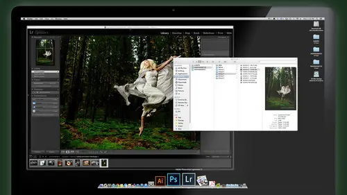
labels air are cool because I use labels to help me quickly identify things for post processing. So, for example, the red label is something I want to take the photo shop and I want to tweak X. I have an idea of what I could do to this image in photo shop. So this one, I definitely have an idea of what I want to do to this. And Photoshopped. I want to talk about this just to make kind of a square instagram image out of this kind of vintage border or some sort of edge effect or sloppy border and make the photo having some some greedy textures. Looks like an old camera film kind of shot. I think that would fit the style of the sixties ish feel of the image. So I'm just gonna get six on my keyboard, which is shortcut for a red label. How do you know that? Got a meta data color label set and edit. And here you can change what red, yellow, green, blue on purple are for you. So you decide what you use these four. If you don't ever do any composites or any panoramas, then don't use that. So I...
've changed. Red Red has always been my number six. That's the key. Shortcut means I'm gonna tweet that photo shop so I can quickly tagged these images as I'm working the red ones that need to go to photo shop. Uh, anything that I think definitely should be a black and white. Maybe I want to convert that in Photoshopped rather than light room, or I can do it either way. But I want to make it a black and white. I could tag it as a yellow with the number seven Panorama images. Sometimes you shoot a Siri's that you want to stitch as a panorama. Super easy to do in photo shop in light room. It's almost hands off automatic. All you need to do shoot it properly, and this is a great tip when we do this panoramas all the time, and a lot of people do panorama as you do on your IPhone and all that. But to do a professional level panorama with your real cameras really just is easy. You just need to post process it. And But if you think about this for your jobs, I think people do this for fun, like on family vacations and trips and things. But think about for a job but a wedding where you had the center of their album was this beautiful panorama of the entire dancehall or whatever or the wedding location seen? If it's in a beautiful dramatic scene, how could you not sell a panorama of that seen as a big spread in the album? You know, really, if you take the time to do these shots on your jobs, even a family portrait, you know, think about doing up. Maybe you do all your family portrait and then the last shot. Let's have the family group here in this beautiful background. I'm gonna do a panorama of the whole thing with this family. Beautifully kind of hanging out over here becomes more of an environmental scene setter. Big Panorama. You know, we've seen sold so many of those as big, big panoramas on the wall, in addition to the close up portrait of the family that we had planned to shoot. And they see this and they go, Oh, so it's like an art piece. I'll put it up on the wall, so I I think because they're so easy to shoot and put together. You should try to incorporate them into almost every shoot you do, and just think of it as a bonus. Add on sales piece because they really have a lot of potential. Anything that you do that's different for the client is gonna be exciting for them and for you. So, uh, if you want information on how to shoot the panoramas, there's a lot of mission out there. Really give you a quick, quick tips camera vertical that we shouldn't Horizontal should have vertical. And you want to overlap about 30%. And you really don't even need a tripod because photo shop is so good. It's fixing these things is I can you know, I could do a panorama and 10 seconds, you know, hold it is closer to town to your center of your body vertical and take a shot. Make sure you lock your focus, lock your exposure. Does it change between frames that Emmanuel, if you need to and you just rotate from the scent of your body? Boom, boom, boom and overlap about 30% each shot and go is why it is you want to go without moving your body too much, just kind of pivot. And you're good. Bring those in and actually show you I can pull it up and we'll just stitch it together real quick here. But it's super easy on worth incorporating. Okay, so anyway, a little side trip on that. But I think it's a good sales tip for you. Green is my key. So when I see an image is that I know are for stitching together. I select them all hits eight on my keyboard that labels in green. And that's my panorama group composite images. I can label nine for Blue Means composite, and HDR doesn't have a number for it. But HD ours would be purple because I don't do HDR is as as often here in this group. Right? So of course you set that up and you save it right. We're all about saving presets in light room. Once you set that up, this is my working label set. Save it. All right. So do you remember the composite label number? Hey, nine. Good. So I just select those images that will be for that composite and hit nine on my keyboard labels them all blue. That gives me a nice visual clue. And also, I can easily grab those later through a collection if I want to. And these two are actually gonna be composited as well. So I'll get those in nine. Is such this is the one I was gonna take and do a little photo shopping on that. Give that a six red label and the others can just have basic light room tweaking adjustments. Of course, these will be Photoshopped as well, but since I've already got them labeled, we know where they're gonna go to photo shop. I don't need to give it. You can't give it to labels. She's one of the other. All right, Any questions on them were at so far. So we've got our images picked. Uh, we've got them selected for our next step, which is the post processing. We're gonna do some basic adjusting now in light room before we actually pass to photo shop and go on to do the heavier duty or stuff. So we're still gonna work it here in light room questions so far, what we're doing, Kevin, you flag the pictures twice, right? So you first when one time and flag them anything. You like them again. So basically, that's a great question. What we're doing is we're sort of refining it, bringing it down to our Mona Lisa shots talked about yesterday, And the flag is a great way to do that, because you can use that fun. Little refined photos function in light room. Say that five times fast find for dysfunction. Find photo. You're fine photos function, which basically takes your flags. Uh, everything that you didn't flag, it'll exit for you. So that's hidden. And then it clears the flag. So basically it's setting you up to go back a second pass. And that's exactly we did that. We made a second pass. So now that we know, everything we're looking at is a potential image. Look, AKI Berg, right? Some people like to use stars as a way to, you know that's a one star. One star means its potential one star potential. That's fine. You could do that, but then you can't really is that refine tool to kind of narrow it. You have to, you know, Then pick it. Then you have to go back and start. If you decide you don't want it. And that sort of So it's that's why because that's what I heard, that you have to flag it and they are flagged it again, the ones that you know, 18 So it just seems to double work. Yeah, so this refined does that automatically for you and which is just a little a little slicker waiting to get to the same result, which is narrowing it down to the best of the best. So and at this point, once you're looking at images that you think all our good to show, you may have favorites that you again want for portfolio. Maybe that's you might decide that after you've tweaked them in photo shop, which we're gonna do later on. That's where you can use your stars to bump it up. Like I say anything. It's a five star is It is an image that not only is great for this job, but it's something I want in my portfolio. So I will hit five star three Star is something that I really like. It's also means that I've fully tweaked it in light room and tweet didn't photo shop and it's it's top of the list, but not quite a portfolio piece will be a three star in there. So use the stars, however, makes sense to you. All right, So the first thing want to do is a side on the right, preset, and let's go to our presets again and develop move because that's their some fun stuff we could do with presets. As you guys know, you kind of touched on that yesterday. So I'm gonna scroll down so you can see my thumbnails on the bottom we're looking at, and sometimes what I do the job is I kind of look at the first image from a series of images and decide what kind of look I want. And this again is a personal preference. Some people like to just go different. Look on every single image. I prefer to kind of keep a theme based on this shoot. So I find a preset that I think works for one for this Siri's. I'm gonna use it kind of on all of them, maybe throw in a black and white or two here and there. But I think it looks to hodgepodge if you say like, well, this isn't across process. This is gonna be vintage. This one is gonna be normal. This is gonna be black and white. Listen, is gonna b c p a And then it starts to look kind of hodgepodge. Whether I rather have a theme kind of going on in my images with a certain a few key things different, maybe so to do that first thing would be to try, um, some of the presets. Now you can roll in the left side here, just kind of roll over the presets that you have to kind of preview them or you can commit one if you just click on it. So as I'm going through here, I'm looking Here is ah, vintage fun. Nice warm vita mix just gives a little punch to the color across process that could works is kind of a sixties seventies theme for here. Um but I'm gonna try a couple of them cafe creme boosted. I like the look of that. A lot of the creamy and the contrast what it does to the reds. But that boosts the it almost washes it out, which is cool for some. But I'm now that I'm looking at that one. There's another one, Um, a crem dela crem, which is similar, but without boosting the punt. The contrast too much. And I like that look. So here's before and after, and I really love that. Look, this is actually one of my favorite favorite presets for this style or something is kind of a vintage E, but it makes the the contrast really nice. It gives it a kind of a vintage feel, but it's not too off normal that it looks crazy. So what I'm gonna do now? Because I know I might use this preset to keep the style consistent on a lot of images. There's a couple way to do that. I could just select all the images and apply Cafe Crim to the mall. Okay, Orel Developer goes to Cafe Crim, making sure auto Sync has turned on the time. Or I can do another thing, which is to load up my spray can in library mode. So let's talk about the spray can. This is a fun little tool, your library mode. Look at your bottom of your window, and if you don't see it, press T on your keyboard. T on the keyboard will hide and show your toolbar at the bottom, and there's little tool here. The spray can if you just click on it and it says paint settings and you can choose a preset. You can choose metadata. You can choose labels, keywords, all kinds of things. But we're gonna choose that. Crem dela crem preset the one we decided it was a cool one for this whole job. Once that's loaded into my spray can, all I need to do is tap on any image with it and blast it with that preset. Okay, I could select several if I wanted to, and tapping with the preset as well. These have already got the preset on it down below. Look and say OK about, but my script can back and say I'm just working, working, working, and I select these four images that shows you the keys in the bottom. If you were wondering what that's popping up in much, that's the keys that I'm holding down option shift that will give you the instant spray can, no matter where you are. Library. If you're working once, you've loaded it up, option shift. Now see my little spray can popped up with these four men just selected. So as I'm just browsing through, is it who those four would be great for? Criminal? The cream pop Nailing with spray can. They're all crem dela crem. All right, These other ones. I'm not gonna touch those cause I'm gonna take those two photo shop and do some photo shop. It knows, but he's already got crem dela crem, and they're looking pretty good the way they are. Don't need to do too much. Okay? So spray can Nice fun, tool. Sometimes I'll load it with my favorite black and white. That, I decided, is gonna be the theme black and white for this job. So although that as I'm editing, I'll see one. I like option shift tap. It's black and white scrolls girl. Edit at an edit option shift tap and again, the way to change it. You just go to criminal a creme. Go to your black and white if you want to loaded up with a black and white one and let's say you decide that this one here you want black and white to make sure nothing selected you just tap it. Now that when we get your black and white preset. Okay, Questions, a couple questions. Yeah. Wow. Good. Um, that spray cans Super powerful. Yeah, you keywords to correct. Yes, you can load it up with keywords here in the bottom. My screen Here, you can say I want some metadata keywords to be loaded up that I could just tap on images. Now there. We could have an advanced class on light room and using keywords. And I've got some really cool things that I've done with using keywords to integrate with photo shop just to give you some of you geeks out there in the inner world, some ideas, uh, I've set up keywords, sets that tag images for orders, and then I have smart collections that automatically search the keywords and gather those into folders for my order. Says I'm tagging It says I could tag this with the Order, order, order, order. My smart collection grabs that by searching the keywords. And then I've got a photo shop script that will also process images based on the key word So I could tag an image, say, with an action that I want to use in photo shop, the name of the actions have Lord of the Rings. When my favorite actions from from a long Time, I might just tell you with that keyword. And then when I open it in Photoshop, I have a script that Photoshopped Marines. The keyword that's tagged in the image, opens it up and applies at action for me. So there's a lot of power in those keywords because it's universal. Other programs read them. So if you start to think about that, um, kind of your world isn't. Is your oyster all of a sudden as far as post processing? But I don't want to overwhelm you guys we don't need. That's like That's more than you need to be worried about right now, but there's a lot of cool things, but yes, thank you. The keywords labels flags. There's a lot of stuff you can use that spray can for and one more from frozen photog. How do you remove the preset that you spray across so you can reprocess the image at a later time in a different technique, if you choose to do so? Yeah, well, you could do it. A couple of things I just spray can that one here, Uh, you select the image and you do command shift our that returns it back to the the importante fault the way we first brought it in. If you had just spray candid, for example, you can just do command z undo that last thing you just did. The other option is to create a virtual copy. Sometimes people want to show a black and white and color of the same, and they want to give both to the client or show both to the client or show them options. That's when you'd use a virtual copy, which we're gonna get into. Maura. We do our ordering steps later this afternoon. We use virtual copies to create separate crops of the same image, but that's really easy here. What you do is you write quickly. Image choose, create virtual copy and you'll see a 2nd 1 appear with a little tag. A little folded corner on the bottom, which means this is a virtual copy, mean it's not a real image. It's actually pointing to this one, but you can treat it like a separate image. You can do whatever you want to this one, and let's say we want toe. Kneel down with black and white, but keep the 1st 1 in color. Or maybe you load the 1st 1 back with creme de la creme. That might be better options that matches the others. So we have that one, plus a black and white version. Okay, and here's the thing in light room. What you see is what you get, So if you see it on the screen, you see two images. When you export, you'll get two images. When you do a slide show, you'll see and show two images. If you don't want to see both, you want toe hide one or the other. You'll stack them, meaning one slink, but it slides underneath it and it's hidden from view. And we're gonna do that when we do photo shop, so you'll see more about that. So just remember that one thing. What you see is what you get when you export slideshow batch process, whatever. If you don't see the image, if it's hidden, you know nothing's gonna happen to it. Thank you. Cool. Okay. All right. So we did those basic to get rid of your spray count. If you selected it. The escape key kind of sends it back to its home on the bottom of your bar here. All right. Okay. So before this one goes to photo shop, we're going to photo shop after the after the break here, coming up in a little bit. I do want to do some color correction on it because it needs a little help. So I'm gonna hit D for develop. And even though the light didn't go off on this, I like the pose. I like the wind blowing. And I think with the post processing gonna do in photo shop, we can still make it work. So what I'm gonna do, first of all, is to white balance make this little warmer. It's a little too blue. So very simple. Of course. You go to your white balance tool up here, and we'll cook temperature up just a wee little bit. And I also want to open my shadows. So when we talk about, um, getting the optimal tonal range from your image, especially the raw file, we can keep an eye on our hissed a gram up here if we want to hear hissed. A grammar type of person. That's geek stuff for budget bars and lines. But basically you're gonna do it by I. And that's kind of one of things that I teach versus the way a lot of other photographers teach it. Some may be very technical. Do it by the numbers, and that's that's great. If that's the way you think. I think Mawr. If it looks good, it is good. And I'm very concerned Too much of the numbers. I don't care if this is perfectly white balance. I want it a little warmer. Want a little dirtier? I wanted a little cooler. Darker, whatever. Same. When we're shooting, we got to shoot another topic. But by meat Oring I meet her by I in back of my camera, not with a light meter, and I teach how to do that actively and effectively. So anyway, if it looks like what she wanted to look like and you're keeping in mind what's gonna happen down line photo shop, then you know what's gonna happen here. So I'm gonna just open up my shadows just a wee little bit, okay? I love the way that light Room five has fixed their adjustment tools to actually work intuitively properly. Uh, it's awesome. And then I'm gonna crank my clarity just a wee little bit. I'm gonna corrupt this image to get the square of the instagram kind of feel that I wanted and I When I shot this, I knew I would be cropping out this junk on the sides here. So R on your keyboard for car, right? Are. And then once the corrupt tool is selected on the rate, I'll quickly say, make it a 1 to 1, make it a 1 to 1, which is square wink, Okay? And then you just kind of center that up, enter and there's your There's your crop for that image. Okay, so again, it's it needs that Photoshopped to make this thing kind of fit that feel that we want. But right now it looks good. But let me show you one more thing before we pass on this image. The adjustment brush is one of the most powerful tools that you have in light room, and that should be your best friend. And to get to it just member Kevin's favorite tool shortcut K. Alright K, for Kevin's favorite tool jumps to the adjustment selective adjustment brush. And I'm gonna show you how to make ah handful of my most to used presets for the adjustment brush that you will not be able to live without after this class. I'm not sure exactly how to make each one of those. Okay, so we'll take a little time to do that, because these are gonna be very valuable to your to your workflow. So someone there's already some had already built in here from light room for you. And those are great. You can use those. But the basic idea me time to selective adjustment brush is that you can create settings, adjustments, whatever and paint them in wherever you want. Which is absolutely powerful is like painting with light or painting with a dark or painting color correction or painting. In contrast, its's crazy. It's so fun. It just gets me excited when I talk about it. So anyway, we're gonna make these right here. We're gonna make a because these will use for retouching a color booster when could use a color booster. Yeah, call time. You can use a color booster. How about if you're touching a nice, close up portrait of somebody and in classic portraiture retouching, you might want to enhance the color. Somebody's got nice blue eyes. You want to kind of boost that color a little bit. You just get your color booster and dab it on the I boom, a little more saturated. Maybe the lipstick is not quite vivid enough. Paint a little right over the lips, quick and easy. Maybe you like the color of the car to be a little more vivid, but you want to touch anything else. Paint color booster is a great useful one. Digital fill flash hands down the most powerful, useful tool you could have possibly have right here in light room. I think, um, I drops, cleans out whites of eyes. So you got a bride, your clothes, a portrait and her eyes are bloodshot because she was partying the night before has ever happened to you guys. I don't have a lot of rides like that in my day. So you want to just clean out the bloodshot eyes? Maybe, Or maybe they have yellow teeth cause they drank too much damn coffee before they came to the wedding America. So I dropped is good because it will clean up bloodshot eyes and yellow teeth. Eyeliner is exactly that. It's an eyeliner tool that helps to enhanced the eyeliner makeup it might already have. Skin powder helps to soften the skin. You paint that over and it's kind of softened out the skin. Shiny nous, things like that on then. Smokeless burn is the operative digital Fill flash when you wanna burn in an area without harming other parts of the image. This is perfect for that. All right, So let me dissect each one of these for you guys and for you out in the inter world. How to make these? Because this is something I think we should all have our tool belt here. So let's look at the color boost. First of all, to make a new adjustment tool, you basically just change some of the settings here. The slider. So my color boost is really gonna be a slight boost to the saturation. And I'm using about 32 points when we talked yesterday. If you go too far on that saturation, it starts to look freaky. So you wanna stay in the range of, you know, no more than maybe 30 to keep it natural. And then you painted and slowly so I'm just gonna make sure everything else is zeroed out. Okay? And if you want to zero a slider, uh, or everything in a slider, You double click. So, for example, regular says effect. I just double clicked it, and it cleared everything to zero. If you want toe change, just one slider. DoubleClick, the name exposure. I just double clicked right here. And it brought that back to zero instantly. Okay, there's a quick trick to know everywhere you go in light room. If you double click the name of a slider adjustment, it zeroes it back to its normal. All right? So, color boost. We're gonna boost the saturation up to about 32. Once that set, we go to popping the menu, save it as a new preset and call it color boost. Already have it. So I'm not going to save it. I'm just showing you how to save it. Okay, Lorenzo, You got that? Yes. And I also have a quick question. Like, uh, I'm in a situation where I could work at home and at school is in a way that I could actually instead of having to go through and rebuild. Is it like, a mobile way I can keep, like my presets with me so that I'm not gonna build a moan, You know, three different machines at school and then having to Yeah, you can, um, take some of the presets with you. You can export presets. And if you actually go to a preset on the left, right here, right click on it and say show and finder. This will open up the finder and hear all those presets in that collection right here. So you have all of your presents If you look over to the left column here, um, all your presets here, so filter presets, export presets, all the things we've been making the last few days, they're all in here. So I have to do is just copy these folders, putting my little thumb drive and take him with you wherever you go. Then you get to the other light room, drop these in there and start working. Yeah, you can get moving back and forth anywhere you want. Yeah, that's a great question. That's a good good thinking there as faras being portable with your workflow. Kevin, quick, quick. Question these adjustment brush presets. These are not things did not come with the light room, right? These air part of your we're creating the electorate, creating okay, Yeah, that I do sell them with my adjustment with my life. Mine preset package that we sell has all of our tools on the left, all these presets over here for effects. And it also has brush tools. It has export presets. All the presets we've been talking about that I've already made that I use are available in that package. But of course, you don't have to buy that. I'm showing you how to make him write yourself. If you want to just spend some time and do it. Make it these it nothing else. If you're not going to anything else, make these or because these air again hands down the most useful tools you can get to save you Time. Time. So let's look at the other ones too quickly. Here, digital fill flash. What makes up digital fill flash on the right hand side. Here. We're basically opening up the shadows about 50 and our exposure. We're gonna crank that all the way Now, keep in mind, that might sound like an extreme adjustment, but you're gonna paint this in slowly with a low flow brush. In other words, you put your brush flow down low 25 or so and then you painted in so that more you paint them or this effect comes in. Morte applies. So don't worry that your cranking these numbers up way up because it's it's gonna build slowly as you want. So that number Okay, so this is the maximum number that it can reach, which is boom blowing the exposure way up. So set your digital fill flash for plus all way up on four on exposure and about 50 on the shadows. That means the mid tones and a little bit of the shadows would be opened when you paint. Save that one at the preset called digital fill flash. Okay, next one we want to create I drops. I dropped is a little bit a little bit more complicated. This is the one where you can paint over the whites of the eyes, that kind of blood shot. And the goal of this is to de saturate a little bit to brighten a little bit. So we have a kick in the exposure 1. since the why Whites generally include highlight areas as well as exposure areas. We also gonna kick the highlights up 39. And we want a de saturate because we're taking the read out. Because why? I White eyes are white normally ish, but they're not pure white, not paperwhite. You don't want it to look like crazy ghost or something, so we don't want the saturation all the way down, which would make it kind of a natural looking. So we bring it down to about 62 which that's the most you could do on the I whites. So still look natural, but we just kind of stripped the in a yellow or red tones in their out of it. Okay. And again, that works on teeth too. I've used that. I'm yellowing teeth. It helps him out a lot. And then once you have those dialed in, save it. Call it eye drops. Eyeliner. This is a really cool one. I'll show you what we use this in a bit. Eyeliner is going to Onley crank down the shadows and the way this is cool is that you paint, for example over. See, women normally put eyeliner, but maybe it's not heavy enough or doesn't bring enough their eyes out. You use this tool, you can paint it over the eyeliner they already have, but you don't have to worry about being exact because it's only gonna work in the shadows. In other words, it won't dark in their eyes. It won't dark in the skin tone. It's only in a dark in the darkest parts, which is the eyeliner they already have. So it's a selective darkening of only the shadows, making them Richard heavier. Okay, so I let her down. Shadows minus 100. Save it as a preset skin powder. This is a nice one. Skin powder. We're gonna take the contrast down minus 49. Take your clarity down all the way minus and your sharpness all the way down 100.275 pi r squared thereabouts and save it as a new preset called skin power. What does the skin paddle do is it doesn't like, take out the shine like off my head. Okay. Yeah, it'll help. Basically like skin shine you know, they're kind of oily little pores if they're real visible in the skin, sort of like patchy nous. It just softens and smooths that out. So it's not gonna be full blown retouching like we do in photo shop, but you might find for 80 90% of the jobs you need your working on portrait. This is enough. It's a natural smoothing. It just takes the shine off the harshness off that doesn't affect skin tone, cause it's something as for Muskie and is a lot darker than it doesn't really affect color of the skin. So it's not gonna make it lighter, darker, whatever. It just softens. Okay, so it works without any skin tone or skin color. Even mean it just basically just softens what's already there, softens and smooths. It'll be like that. Okay, so that's a great one. Seeing powder created, save it. And then lastly, we're gonna smokeless burn, which is simply the opposite of digital fill flash. But smokeless burning really needs to just focus on the exposure, which is the middle tone values of this image or whatever. Average so cranky exposure all the way down. All right, and then of course. Save it. Call it smoke. Whisper. All right, so those are my most use. I have one more called blackout and black out. What this is for is if there's an area of an image that I just really want to almost like, burn it to the point where I can't see anything sometimes have something really distracting. I can't clone it out. I don't use it very often, but once in a while, it it's effective. Actually. Use this. Once, when I photographed a car and I didn't want the license plate to be readable, well, I could go in and retouch the photo shop, clone it out, whatever. But instead, I just used blackout, just darkened it and just made it almost black so that they couldn't see it just look like a black blob on the license plate. So that could be useful. So that one if you want I'm a put that up here, drop the exposure all the way. Contrast all the way up. Highlights all way down, shadows away, down clarity already down sharp is all the way down. Save it as a new preset called black. Oh,
Class Materials
bonus material with purchase
Ratings and Reviews
fbuser 471f6dc7
Amazing.... Amazing.... Amazing
smilies
This course has been more than helpful in the areas of organization and functioning more efficiently with my photography. Thank you for all you do Kevin Kubota and CreativeLive!! :)
a Creativelive Student
This course was really helpful for me to speed up my workflow. It gave me ideas about how to keep things organized and backed up, making me more efficient and my images safe.