Lessons
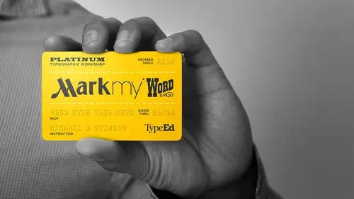
Types of Logos & Wordmark Classifications
12:22 2Assignment 1: Analyze the Mark
29:22 3Assignment 1: Concepting a Wordmark
39:49 4Assignment 1: Sketching Letterforms
30:27 5Assignment 1: Sketching Continued
39:00 6Assignment 1: Finalizing for Digitizing
24:58 7Assignment 1: Digitizing Sketches
35:34 8Assignment 1: Critique
06:59Lesson Info
Assignment 2: Typeface & Symbols Part 2
So by making a flush right, everything is kind of moving to the right, just like the eagle is. So this decision to produce over here is is moving our eye this way in motion with the eagle that's the reason I did that, right? I have it over to the left and they be counterintuitive, I'm hitting a wall here, right? My only problem with this whole thing is that this negative space is not working for me. So if I find may choose for me, I might just place this on the left instead of the right where the eagle kind of leads into it. Now I'm like one of flesh left this now again and put it over here. Another thing to do is go back to where I was and nothing to stay for me if I was looking at this is to bring the grid with it over here. This is another thing, too. So if you're on this cred to this bird is on, this may go down here or something as well, or may just be riding on top somewhere, depending on if you're reducing it to a symbol. Now, because now you have, you know these lines, they're ...
pointing and directions, this is it's like I trying your logo it's pointing up right so you may put it on top so you may move this over so there's lots of versions if I keep doing this I could have lots of generation but for this one since it's uh it's just trying to keep it simple for me on this I would just try to keep it proportional to this you know, like I've seen there might be a proportion here even know it looks probably looks better with the eagles head at the same height um yeah, I would want to probably maybe look at that too if I make the type smaller in this case I may want to, uh try exploring if I'm using trying to emphasize singapore I might pick one that's it could be like a bleak and black like for instance, this is another thing to show you guys this eagle is difficult because it has rounded corners but not all of them around it but then a typeface like a new one like joe grotesque here it's got slightly around it, you know, corners like jammeh's own logo that we did so I don't know if since it doesn't have any point, I just kind of a thing does this type face is that a candidate to be paired with this symbol? To me the round thing would be would not be if everything was more rounded in this than it would be a no brainer to me but for me it's kind of ah that's kind of a cut see a lot of times you if you get if you use a heavy enough weight right so I could balance this the weight of these wings out with the stems of the and then if I bring in the character spacing and get the sizing proportional then I can start to see if it's more appropriate for that symbol and then I use the type of low too connected this down here which might be this so my decisions air are based on a couple of things there does this this weight balance that now looks more intact the typeface not be might be a good choice but this what this weight that I'm seeing this connects to the lower half of the eagle this is the lower half of the brand mark upper half upper half they're starting to connect okay um so that's what I would do there great looks good now I'm curious to know how our students are doing you guys coming along a little bit more time finishing up yet where you guys out with yours are you guys use to this point baby were you like zeroed it down to a couple type features maybe face as faras like getting into the details of how to like everything yeah so I think the thing the thing is yes is for like if I'm going to see it for here crying so what I would try to just at this point look at his father's relationship I was going to use this typeface I probably start to pick up on this this distinct visual here because it happens repeatedly throughout the symbol so when you use that characteristic somehow so if I were to actually you know, digitize this I may simply just take that and use that and that might be enough for this so for instance just to get it to connect I may do this actually you know what I'm gonna do this is what how I would probably handle this I would do this once I have one of these mate I can use him throughout I'm taking it strayed from the mark make this yeah yeah so just that characteristic might be enough to connect stubborn aereo okay, so I mean may just use that as a connection to the wing there but I mean um now it's just a matter of choosing which ones are appropriate so I wanted my frame of mind here's to keep it simple so where I might concentrate that the use of this would probably be here and uh I might make a swing or I might make it uh the p it's going to snow so the p here I'd probably use it over there I made me it get rounded at the at the leg of the are over here or if it did it again over here at the r and then maybe just the last leg of the heat or just the top one and that would be it would just keep that same way or might rounded on the rights doesn't left but the point is is I'm making the connection to the symbol there okay two dot three other that work for you did you see I was doing that I am trying to figure out how that works for me still so you're with what their alpha okay so what you have to articulate what's happening in this simple here you basically have thick and thin lines right straight curling around going into something else so depending on the type face that human use you have things talking behind right so like on the one I was doing here I brought out that dimension in mine this way right c may try that as well but maybe it's only with it doesn't come to a point for years it just notches in or something okay that's one idea yeah uh now this might be a typeface choice only as it is to me um just looking at the nature of this thing is asking for a single story that's what I did good yeah ok so let's just start in friday's yeah, I like the the single story a and it's very geometric to stoning I had limited type places but I went with teacher but that's the on ly type beef I had with a single story it's tough when you when you have limited typefaces to explore with um yeah the other indication that I probably look at us that you know you have these angles to deal with, which is not going to be I think you know a connection through the stress so that's out but this is this is very linear this thing and um to me I don't know why I was decided this way but maybe this it was proportionally this way but you know is how this cuts right through the dot and the uh and the centers so that always kind of turned me off about this I don't know why they just didn't put this is the center let everything float like the centers in the dot I don't even know if you actually need done but I would definitely probably try this also in italic all caps um yeah, I think there might be a way to indicate that this as the stroke comes around it goes behind the stem just like this does and since you have two ways and it's indicated it's in a thing that you know the three days so it may be that only happens in these two e's right but, you know, maybe there's a way to another solution would be to customize is where it's all in here here these are all lower case, but maybe this is a capital f in some way were you there are type is where these days are actually capitals that I've seen, so so we're at about a ten minute mark till we print guys so in the next five minutes, you just want to finalize we have, um, even if you have just some indications in the characters of what your what were you were doing? Um, as a connection to that, that symbol originally, right? That would be fine. Okay, make sure you didn't do like what we did last time and tried tio include the original as well, just to see we'll get to that that point, right? Everybody feeling good about theirs? It's a challenge? I mean it's not again, it's, that you're putting a typeface with you're putting a tight a new typeface with a symbol but it's ah again there's more to it, just like that friend mark we talked about and again, I'm not saying that this is the ultimate solution, but it's it's definitely what I found in the past in exploring, um doing logos to create harmony between the visual and the type ok, any questions were you know, I think that we're pretty well here we'll have a few questions that we'll get to in just a second after you get through the printing but how are we doing here? Is everybody any final questions like before you have any final things he can help you on I'll see you poor guy did that help? Okay, I haven't heard you can how are you doing? Imed fine. You've got atlantis right have bali oh yeah boy yeah that's interesting too boring to look at too. I don't you know, I think that this version of this logo I think is uh not a final version it's a little often inspector there's a corner here in the corner there tests of this this artwork might be a little altered you know, we actually had a question come up I don't think you touched on this yet we had five people vote as we're wrapping up here. I want to get your opinion on this. We have a question here from a viewer five votes saying I'm curious as to when you start thinking about color when making word mark most of the focus here is on the typography but in the end a logo will feature colors at some point does that ever effect the design process for the word marks when you're adjusting the type effects entirely that's why it's always last yeah okay that's a good point you know, very emotional I never showed color to a client in initial stages of brand marking because you want to concentrate on form and structure first so you try to walk them through a structured, you know, process to make one decision at a time color so emotional with with our brains and our eyes that I don't know how many times I've been in, you know, in my earlier days come in with all this excitement. Well, all these logo's and I was going through an orange phase in the heated orange so they would not look at anything. I'd be sent back to my drawing board. So never color first it's always last interesting. So that never plays a part into how your design I mean, you may not show it to the client, but do you ever have in the back of your mind? Absolutely. And there's all kinds of things going on your mind? You know, when you first get invite tio input meeting so yeah, absolutely. They will influence you in color. A cz well, so, yeah, color it's all rolling around in there, but you kind of have to break it apart. And, rickard, you take it back to the client and, um, structured manner where they can make, you know, concrete decisions. When people are doing just practice exercises like this is this a safer bet to just stay with the black and white and not get too caught up in the color until you kind of get to the point where you feel comfortable with all these world yeah if we were doing a combination look like this we would start with symbol the visuals first and then once that's kind of approved then we would go to hear symbol and type and all those versions we're type face works well we stopped go there and then we would add carter the color would be third stage and we look at is it all one color do we have to color combination? You know? Is it going to be ingredients involved? You know what kind of all the finishing touches that's kind of like how I've done it for years okay how you guys doing here so there we're going to start loading up her falls now, okay? And uh we wantto saved as a pdf again guys and I'm born here and we have flash drive there that's not convincing me trying to focus on, you know, it's tough on you gotta teach your hovering around I was yeah see, I don't don't worry about for completion just, uh, make sure you've got a couple of points in there before you were headed, you know with, you know and again, it doesn't necessarily have to be a full you know, customization of letter forms like where I was headed with spanner, but my only job here is just to get you to think an extra step further rather than just pairing ah uh out of the can tie face with a simple yeah, I have a quick question that came in here well, we're wrapping up the designs there's a question for one of our viewers who says I find as a designer I end up sticking with my five favorite fonts any advice on how I can start thinking outside of the box and using new things that I may not have used before? Yeah and there's that's an easy way to do it in the way I've done it is always if you're making good reason for your design decisions to connect to the brief or the input that's involved or in this case a symbol that's the designers already designed involved with it the decisions shouldn't be personal they should be based on what works the best for that solution. So it for instance, if you're used to using let's say, you know gotham let's say if you ever had the types that anything, anything in a narrow paragraph gotham's not your choice because golf miss super wide and big so um but also you would want to look at what the context is you know, there should be very thought variations of factors in there, it's going to lead you to the decision of the typeface that you choose, okay using fire, and I did the same thing I had to that I use for years, but now, over the years, I'm really better at pairing up typefaces to the context of the content or the story of the content of fuel. If it's sounding like it needs to be a little bit more and the content is talking about history, let's say, my mind is already thinking, sarah, and now it's a matter of where in history is it? If it's, if it's anything in the nineteenth century, I'm going back to gothic or, you know, anything would type or something like that, let's say so that's, just to tell you an example where my mind would go, so by doing my party's by doing that, you're going to broaden your range of choices of ty faces, you know, and get out of that five typeface. Thank you, great. All right, looks like people are finishing up here see a couple of questions that came in as you're sort of thinking about this when you're going through the process ah, question here that came in that has a couple of votes on it, um when do you start to think about the size of the logo like how it will work whether it's going to be used very small say on a business card or something or if you're going to blow it up to put it on a wall or a billboard do you start to think about size when you're at this immediately yeah I mean it really and that's why I was trying along time ago is you know my first place at work you know there's a quote golf ball side of a truck you want to look it immediately in both because the proportions of even if it doesn't have any type even with like this eagle the's thin negative spaces when they get to certain size they're gonna clog right so you always want to keep everything in perspective that's why I had you set it up large tiny so it's right from the get go you want to keep that perspective going you know all times okay said people are ready to print or I think we're done with you go online stuff so do we are we ready to print it okay okay cool well we can get through a couple more questions here ok already talked a little bit about some of the rules that come into play when you're looking at typography and when to break them but we just had another question that came in and I want a clarification here are there any hard and fast rules of what not to do when putting the type with a mark? I know you talked about breaking the rules or earlier, but are there things that just don't work, even if you do them suddenly? That's a good question now we're talking about, like, microscopic level of yeah, we're getting to you coming to the end of our session, you're right. That's a challenging question again, I think that typefaces two symbols I mean, it depends on if they're if they're done from scratch, we we've doing him in our office is, um, the characteristics of the symbol on the thai fish, you know, I kind of want to coincide um, if it's, a typeface like the good example is what I was talking about earlier, where if everything in the symbol has rounded edges that's going to leave me a certain direction immediately, I'm going to look a typefaces that have rounded edges around the corners let's say so it so I don't have to make them, but in amazon's case, you obviously have to make them so um as faras rules of pairing, there are no rules appearing honestly it's about, but where I start with, I get asked a lot parent typefaces for typography. I try there's a short list that I go through one first is the x height if you have your matching if you're trying to pair a serif and sans serif I learned in the photo typesetting days match excites they're in the same range of being used don't put an avenue with the missus ekes all right that's a good point and you know while you're while you're doing this maybe you want to just show a quick examples like that as we have a few minutes here have already printing it could help for the people at home so for instance, a rule I get asked, you know, that's a common thing on the web as well um so one of things I look at parent typefaces that you know that I was talking four types of indians was excites, so if you have, you know, um, a scenario like this this is a good example this is a good fundamental type party kind of thing and I'm on the same baseline with these so excite is an indicator first for me so let's say I have avenir right hand at the same type size if I use mrs eaves and I've seen these paired together before and I'm not saying they can't um we find this first they can it's just you're gonna have to do have more work to get them to work together but then I learned the first indicators right out of the kids of how they are set at the same size that's a major difference between excite so after it did do something extreme with size of avenir or something extremist size with mrs eve's so something what would be more appropriate knowing that avenir is a geometric jamie actors have high excited so I may try something more of a transitional like plated that's a little larger that might be closer to the excite of that now I'm going to getting in range the other thing is character with so I also want to do this and just kind of analyze character with now we all know that did you know um geometric should give me a lot wider than anything else usually right moderns too. So as far as with I might use a modern typeface we'll plant and I believe this modern but maybe it's something more like guidoni here, right or not? Maybe that wasn't good example that the ring magazine or um something that's a little more contemporary or a wider like school book let's say the point is just to analyze yeah that's pretty good because this is kind of like the same with and so they the character with the similar see how this is narrower so that's where I start out, I've always been taught those two things first and then I start to say, well, what classes air are they in? Um, parent typefaces is, you know, you want to make sure they're not too similar, like you wouldn't want to necessarily put these two together into service there too close for comfort, right? And this is where they all the ambiguity is for the, you know, people, they're trying to practice design that our new these days is all of these little details you have to see if they work together for instance, it's not just these air to close in class, but this is heavier than this. The contrast didn't pick the thin is less here than it is over here. That's another thing so you want to start to see ok weight wise he's worked together better than these two and overall color the weight so that's another thing great let's! Just get one more quick question here before we get to the print outs and here's another one that's got a couple of votes when redesigning the type that goes with a mark. At what point do you decide that the mark itself needs to be adjusted if it's not working or if it doesn't modernize easily? And they say a good example to use would be american airlines who recently updated their logo within the last few years and they came across this problem any any insight on how that goes about? Yeah, we're trying to make that a short answer. Is it's all going to come up way before design stars? Yeah, it's going to become come of it in positioning of where it's headed, especially with american airlines, you know that was a classic for so long, just the same living with us, you know, at some point decline is going to go, we gotta internet. We're in a new age where you call that language, right. We need to look like that. And like starbucks, I always say to starbucks doesn't just serve coffee. It's just the mermaid now, there's more to offer. The mermaid offers a lot more than just coffee, right? Ninety does a lot more than just running. Yeah, you know, satan so on. So on so that's a really big question that happens before design, usually, and you would want to if you're in the middle of doing that. I think he missed something in the beginning in the planning.
Class Materials
bonus material with purchase
bonus material with enrollment
Ratings and Reviews
kathleenc
Great class. It's nice to see your sketching/thinking process. Love seeing the tracing paper and ruler.
user-b4d49e
Thank you so much for the amazing course. Learned a lot of stuff even as a beginner.
a Creativelive Student
Great course, thanks very much!
Student Work
Related Classes
Branding