Lessons
Adjustment Panels in LR Develop Module
12:30 2Basic Adjustments in LR Development Module
15:39 3Vibrance vs Saturation
06:41 4How to Use Drastic Tone Curves
08:14 5How to create a film look using tone curve in LR
04:25 6Black and White Mixing in LR
02:46 7Using Luminance, Saturation and Hue for better color in LR
03:22 8Split Toning Explanation
05:49Lesson Info
Vibrance vs Saturation
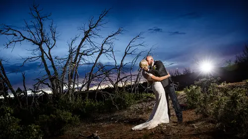
Let's talk about vibrance versus saturation saturation we all know is just colors getting more rich right? Blue gets bluer red gets redder just write that saturation so that's an easy one usually I don't touch saturation all that much, but when I do I go negative with it because I think that colors look better when they're a little more subtle all right, so I go towards subtle colors and so you'll see in this one have actually got the saturation of negative thirteen, which means that my image is going to just look a little bit more like film it's a little more subtle colors I like it better the vibrance, on the other hand, is a really excellent tool if you want if you want oversaturation you like I want it to be really poppy vibrance is the tool for you these vibrance allows you to increase the poppy nature of the color but not over saturate the skin tones and the warps and stuff like that you don't want the warms toe over saturate and so vibrance is an intelligent tool that's really a...
ctually looking at the entire image but it's trying to protect skin tones and so the yellows, the oranges, those things were protected plus it on ly increases colors that air super vibrant to begin with and so the blues in this are going to increase and you know the purples and the things like that but her skin tone is going to be protected so watch what happens when I go up see our skin tone stays fairly similar, whereas that blue really starts to pop whereas if I did the same thing with saturation watch what happens see how her skin tone gets to that's not good, right? It gets really bad really fast whereas with the vibrance you can get all the way up to here and it still hasn't even gotten close to his about it what? And I'm not one hundred percent now in the vibrant so the violence is really trying to protect her skin tones from being oversaturated so use the vibrance in the positive and use the saturation in the negative generally speaking that's a pretty good rule of thumb there are check times where you don't follow that rule thumb but in most cases that's pretty good okay, so we've normalized the image and we've started to create style and that is pretty much all there is to the basic area of the of white room except for there's this little eyedropper deal and a lot of people who are new to the game of photography and they're not sure what color balance to use those people need this white dropper tool and you can you can collect it by hitting the w key so just clicked w and it will light up or you can grab onto it just by clicking that circle and that little thing I just pointed it something that is gray white or black it has to be a known white gray or black has a neutral it doesn't have to be white even though it's the white balance tool it could be gray it just needs to be a known neutral tone if you have a great card perfect for a great card all right yes do you ever use something like the color checker passport absolutely ideo the axe right uses there's it's this big well color check her passport and it is perfect fits right in my pocket I have it with me on every shoot and so if I run into something that I think the color's a little going it's going to be tricky the color is gonna be tricky I simply take a picture of that in the same light that I'm shooting and put it away and then I just try and match the light as best I can in the camera but when I come back here I have all the data I need to actually get the exact tone that I want the exact colors that I want and in fact down at the bottom in the come camera calibration is that tool is very useful to actually create your own camera calibrations for that camera so we'll talk a little bit about that absolutely keller checked her passport by x ray is an invaluable tool and it fits in your pocket so I'm going to choose a tone now this dress isn't pure white but it's close enough to white so if I click on it that's going to give me a pure white in that area that I clicked but did you notice what happened the colors they went ultimately to blue and that's because I clicked on a warm part of the dress. Now watch what happens if I click on it. See how this part's cool watch what happens if I click on the pool cool part of the dress? See how everything's warm now so it depends on where you click and every single white dress white shirt blacks tux has two different color tones. If it's in the sun it's a warm version of that neutral if it's in the shadow it's, a cool version of the neutral and so that's why the cool area here is in the shadow see it's cool here is the sun hitting it and it's warm you want to find the appropriate balance between the two. So usually if you kind of find the half shadowed, half warm part it's kind of neutral that's where you want to click, but if you want the whole thing to go a little warmer without having to fuss with it err on the side of the shadow and if you want the whole thing to be colder air on the side of the warmth, so just follow that look for that curve there's always a curve it's always a wrinkle in a shirt or something like that. And there's shadow here, blue and there's a sunlight here warm and then you choose appropriately and you will get the right tone that you want. Okay, so the white balance till is very useful in getting you into the position where you're close. And then at that point, you kind of fuss from there. And by the way, the white balance tools really good at getting tent dead on accurate, it does a really good job. As for temperature temperature is more subjective, it's something that you get to decide if you wanted to be cooler or warmer that's up to you, and so you can choose that you could say color temperature is right or wrong, and you might be right wrong, but tent, I can tell you some things, right or wrong, because if it's to magenta or two green, it looks ugly, but temperature that's kind of that's one of those things that everybody's right on that one, so but everybody most people are wrong on tent, unless they're absolutely right, okay?
Class Materials
bonus material with purchase
Ratings and Reviews
Bill Frye
A very informative course dealing with an important module within Lightroom. Significantly improved my comfort with and capabilities in Lightroom.
Raquel
Thoroughly enjoyed this package. I learned a lot and found everything Jared explained very useful to me. I'm new to using Lightroom. Thank you!
a Creativelive Student
I am only half way thru and I love this class! I knew there was more to LIghtroom and what I could accomplish and Jared did that for me! Big thumbs up for me!