Lessons
Day 1
1Class Introduction
09:10 2The Design Flow Basics
18:27 3The Designer as Co-Creators
06:48 4Get to Know Your Material
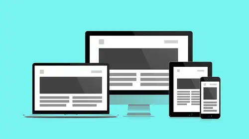
17:07 5Responsive Vocab: Floats, Flows, & Images
11:58 6Mobile First: Working Small
09:46 7Future Friendly: Embrace Unpredictability
14:17Collaborating with Your Clients
13:52 9Prioritize Your Users
39:42 10Best Practices for Defining Success
08:58 11Intro to Scrum
04:24 12User Stories & Epics
35:53 13Content Basics
27:40 14Defining the Visual Language
22:31 15Starting with Type
35:31 16Starting with Grids
15:40 17Gutcheck & The Product Brief
22:03 18Working With Developers
12:33 19Communicating with Developers
16:25 20Finding a Common Language with Developers
06:28 21Code Literacy
04:37 22Sitemap & Wireframe Basics
33:48 23Prototyping Basics
12:02 24HTML Prototypes
13:28 25Code Literacy & Developer Tools
11:46 26Developer Lingo
07:23 27Interface Personality & Behavior Galleries
17:27 28Designing for Performance
18:19 29Progressive Enhancements
07:00 30Designing a System: Discovery to Pattern Library
12:25 31Workflow Examples
20:25 32Applying the Style Guide to the Pattern Library
09:08 33Alternative Workflow
23:04 34Alternative Workflow Part 2
21:52 35Tech Requirements
21:53 36Retrofitting an Existing Site
12:15 37Project Cupcake: Building a Site from Scratch
24:08Day 2
Lesson Info
HTML Prototypes
HTML prototypes or stuff really starts to, you start to get more native into code. Again yesterday we looked at looking at the browser to generate code for us, we looked at GridLover, which produced a type scale for us. So again I consider that a form of prototyping in the browser. I'm beginning to work with my brand and my components in the browser. I would highly recommend checking out Typecasts. They've got some great tools again that get you in the browser playing with type sizes, scale and color, and even allow you to make things like style tiles and element collages directly within the app. And they generate code that you could use. GridSet is another app that I encourage you to play with. All these things are one form of prototype. Now the last piece I wanted to show you today is this is a tool called Froont, and so this takes a lot of those idea we looked at in separate pieces and actually puts them here. Again a lot of people and products are trying to conquer this market or t...
rying to establish alternatives. Like, do I have to learn code? And how to make a website? Kinda like get in the browser sooner. So I find a lot of those tools to be compromised because they're trying to do too many things at one time. They're trying to not only let you design, and have communication, they're also trying really to produce code. And I just, I'm not sure how realistic that is. Just because they're sort of separate things. It's challenging. What I really appreciate Froont who is one of our sponsors, allows you to look at some key elements and the cool thing about Froont is when I was demoing a lot of things that I wanted to show, this is the one where I turned it on, I hit some buttons, like wow, that did something. I didn't have to like, ramp up and take my knowledge as a photo shop user and a code person and put them together and try to figure out whatever weird metaphor system they had come up with. This is what it did, I jumped in here, I was like, this is pretty nice, what, wait, what, that's great! So I start to see how this project, how these components, so they have prebuilt components, off to the side here, multicolumn desktop components, that are built and designed to become flexible on the browser. So I take an element like this four column grid, I can drop it right into my comp, I'll change those images to make them space related. But how does that get responses, wait, like what they have done is what I think is really cool about this tool is that they added these little enhancements, these animations, that like, I can see breakpoints in codepen, right, I can see breakpoints, but there's something about how they've animated and art directed these components like they've curated these components that as a designer I can imagine someone who's sort of bridging this gap, they answer a lot of questions for me, and they're enough to illustrate as a designer to a developer, this is what I intend to happen. So this is a bridge, I see this as a bridging tool. Maybe not as final code output although, they're ready to add URL's to these sites you make here. This is a publishing platform, but on more complex projects I see it as an illustrative tool, as a learning tool, something that's sort of like bridged again that gap between a traditional visual designer and a front end developer. The way that this breakpoint graph works, if you watch the icon here, so this is the portrait display on a phone, this is the horizontal display you can see the icon flip. Again this is the portrait display on a Ipad tablet, this is the flip and again this is full screen. If you want to, you can get into, more styles. And actually have Google fonts hooked up, to where you can actually select, just Typecast does this too, it allows you to pull and preview fonts that are being hosted by various hosting services into this directly so that you can use your Type Kit font, you still have to set up a Type Kit account in order to publish it, but it can be in previewing it. Again you'll see more of these partnerships that are separate business models are all kinda getting tied in together. The Google fonts of course are free so you can sort of add those in and feel okay with using that stuff. The Type Kits stuff you just have more options. But you have to set up a Type Kit account in order to sort of use those and publish those fonts. And you wanna use Fat Boy don't you. Yes! I can just tell. I'm looking at that and I'm like, (laughs) Boom! There it is, that's exactly what that needed. That is really it, and again we're in M's and so we could take a look at our font in M's. We again we've got a line height that we, again you can still do those calculations in GridLover, bring those measurements over into Froont, and then start using again these tools that do very specific operations and build upon them and again get closer and closer to something that represents a technically achievable thing. So next up Front End Frameworks, so again, that's all independent of a developer. I want to encourage you to experiment. When you do finally sit down with a developer you're more than likely gonna be starting with a framework. And what frameworks are, they're sets of components that have already been worked on. Known to work, they're successful patterns that are then offered up in an opensource manner, and encourage people to use them. And they have different communities behind them. And each one kind of does a different thing. HTML5 Boilerplate is the most basic, it's just a solid reset, it brings a lot of legacy browsers older browsers that don't support HTML which is a standard, a growing standard. It brings them all up to date and allows them all to work predictably. And give you as a designer the benefit of all these new HTML5 elements. Next up the list is Foundation, which has some prebuilt components. Again, HTML5 used ASAS and CSS, and a lot of Javascript, but again, not so aesthetically driven, more about like a front end market structure that you can use to make prototypes. Bootstrap, probably the most popular for application building. Like, you don't need to make designs you just wanna get something out the door. Like again they all do something different. Bootstrap, if I were making an admin or a dashboard, or a really specific piece that I wanted to be super functional I would use Bootstrap because I want to see some activity on the page. I want to see some metrics or lots of admin-like dashboard tasks. So again Foundation is what I use a lot, just because it's sort of more minimal. Allows me to sort of get in there and sort of design and dress the interface as I see fit. And they make customize it based on what my application or team needs. Front End Frameworks have a couple different things going on, they have prebuilt components that allow me to quickly sketch and not really do any markup at all, just go a, b, c, d, and see something. There's a common language and it's modular, they've already tested the modularity, you don't have to worry about the modularity, you don't have to worry about the conflicts, and they're based on standards so you don't have to worry about browsers and stuff. They've worked all that browser stuff out. They have grids which you looked at yesterday. We saw this grid in the browser. They also have these components. So this is the secret sauce that everybody gets really excited around Bootstrap and with Foundation, like, they did all this for you, they gave you all the popular stuff that your clients are asking for. Galleries, pricing tables, progress bars, buttons. All of this stuff comes rolled in. And as a designer all you really need to start to do to get your head around this stuff and again work with the structure of it, is begin adding these components in. Again we're just in the prototyping stage. We're just in this place where again we're thinking flexible, functional, wireframe, representative content, interactive patterns. We're not talking about like the brand reset at this point. So again, examples, navigation buttons, galleries, alerts, tables, and type. Also some Javascript, your developer may or may not want to use this stuff. The good news is that this is the bridge between HTML to CSS and real interaction patterns. This is that sort of this other level stuff. This is the interactive elements. Slideshows, scrolling from left to right, pagenation, panels, tool tips, overlays, responsive images, is all built into this framework so again you don't have to dome up with this stuff. They found a set of plug ins and tools that work together. Now you have this tool kit that you can begin playing with. And if you're a designer that wants to leverage one of these frameworks but you're not gonna be able to get into a browser, then and you wanna kinda design a comp, then do a search for say, Foundation UI kits, or, you know, Foundation stencils. You're gonna find kind of files that will be full of these elements so you can kind of create the mock ups, and so that way even leverage the grids which is something that you can kinda just quickly build on top of what was already available and how that's gonna map back to you know what's going on in the browser, but already be familiar. Yeah it will cut down on that friction. If you are of the adventurous type, CodePen we looked at yesterday, has a deserved foundation components loaded in there, so you could start playing with this stuff and seeing what things do, I highly recommend it. It's a pretty nice service. And again you're not writing this is literacy this isn't penmanship. So a couple of different kinds of prototypes that we'll just get through really quick. When we come back in our next segment we'll get into the finer levels of code literacy is how that works. Lo Res first, again, really blocky. This is the stuff that we looked at before. These are HTML Content reference elements. These are really, really simple things. They're just taking those wireframes, and we're directly, we're in Foundation but we're not adding any components. We're just using it's grid to understand breakpoints. This is what that looks like across browser windows. This is in HTML now, I can flex and pull this, I can actually see this stuff working. So this is my HTML content reference wireframe. Again, not a whole lot of nuance and design happening here. What I'm curious though, is what I suppose would happen in static form, does that make sense? Oh yeah, that ticket that I need to be at the top, this content summary brief, I still need that ticket to stay close I don't slip underneath content full, so I'm able to work that out with the front end dev. Okay cool, my ticket stays at the top, I don't lose the ticket, I still get both the mobile experience and the desktop experience and I don't get that compromise, so you can work all that stuff out. Again, really low level stuff. Next up Medium Res HTML wireframes, this is again, plain text exercises we're gonna flow this stuff into those really blocky eight bit things that we just made. We're using native Foundation components, we're not adding any styles to it we're just adding content, that as a designer we're not there to make aesthetic decisions we're there to make structural decisions. This is what that looks like. I didn't do anything yet as a designer. I haven't touched CSS. I've modeled the things in wireframe, I worked with the front end dev to draw... The front end dev really hasn't done much to customize this. This is just the stuff that came, the only customization we felt was necessary was overlapping the headline on top of the photo cause it really matched the layout in the wireframe, that's it, everything else is just drop and click no styles. So again it is important to understand that prototyping is not a simulation, prototypes rely on that UI library that we made it relies on everything that we've done it's now rolling and gaining speed at this point. It's like, this is why we did all that stuff. We keep styling to a minimum, we're not worried about production code, and we're just trying to take the thing to the next level, so thanks.
Class Materials
Bonus Materials with RSVP
Bonus Materials with Purchase
Ratings and Reviews
CityGirl
I've already taken several web design classes, but there were still some details that I found confusing. Andy and Jesse did a great job of explaining things like; programming languages and how they interact to form the structure of a site, work flow responsibilities between team members and the blurry lines between them; and agile methodologies applied to work flow. They used case studies to illustrate how this all happens, where variations crop up, and how to address them. If you're new to web design, or just want to understand the functions of other team members, this is a great real world look at the whole process. I haven't found this in any other class, either on-line or local. Andy and Jesse are both very experienced working designers with current knowledge. They're very responsive to questions and seem to really enjoy teaching. Having two instructors is a great benefit because you get double the perspective, knowledge, etc.
Junko Bridston
I worked with Andy when he was a Creative Director at Funny Garbage, a design studio in New York City. I found him to be knowledgeable, articulate, and lovely to work with. I learned so much from him at the beginning of my career. In response to a previous comment: it seems silly to dismiss this class because Andy wears t-shirts with his blazers. If you think leaders only wear suits and ties, then maybe this class isn't for you. But if you want to learn from someone with loads of experience and a friendly manner, I really recommend it. You won’t be disappointed.
user-3d865b
I was looking for a class that would not only address the web design basics but also their place and function as part of a workflow. This class did not disappoint and Andy's and Jesse's engaging presentation style made it easy for me to follow along during the 2-day live session. By using real life examples, the presenters provide plenty of tips and strategies how to best work with clients and developers alike — the many, often intangible ingredients that go beyond technical expertise and can make or break a project. Highly recommended.
Student Work
Related Classes
Branding