Lesson Info
6. Photo Hand Tinting & Workflow Options
Lessons
Day 1
1Introduction
37:33 2Why Do Expressive Painting
21:39 3Adobe Bridge Setup & Image Optimizing
27:03 4Jack's Painting Presets
15:18 5Enhancing Source Images
24:01 6Photo Hand Tinting & Workflow Options
26:23 7Working with Brushes & Palettes - Part 1
20:10Working with Brushes & Palettes - Part 2
37:59 9Pattern Stamp Tool & Watercoloring - Part 1
22:08 10Pattern Stamp Tool & Watercoloring - Part 2
13:58 11Enhancing Methods of Watercolor Image
27:33 12Creating Repeating Patterns
17:14 13Actions, Layers & Filters for Sketching
24:50 14Accessing Jack's Free Basic Presets
06:32 15Smart Objects & Oil Paint Filter
34:10 16Inverted Mask Trick & Q&A
13:00 17Q&A
10:22 18Mixer Brush & Parameters
21:27 19Jack's Brushes & Brush Strokes
15:20 20Secrets of the Mixer Brush
20:05 21Still Life Painting with Mixer Brush
28:27 22Still Life Underpainting
30:32 23Final Blending of a Still Life
25:17 24Print Discussion with Q&A
09:28 25Snapshots for Painted Portraits
15:19 26Painted Signature Stamps
10:15 27Simple Portrait with Mixer Brush
53:01 28Pet Portrait Overview
08:42 29Enhancing in Camera Raw & Lightroom
35:28 30Painting a Pet Portrait
1:17:41 31Pet Portrait: Final Blending
13:41 32Photo Prep for Watercolor Painting
17:36 33Watercolor Painting of a Flower
36:27 34More Enhancing & Embellishing of Images
28:04 35The Liquify Tool & Sketching
39:12 36Comic Book Action & Watercoloring
15:22 37Changing Image Aspect Ratio
11:55 38Framing Effects & 3rd Party Apps
16:39 393rd Party Painting Filters
23:56 40Final Q & A
15:54Day 2
Day 3
Lesson Info
Photo Hand Tinting & Workflow Options
Let's go ahead and do as a starting point you saw the painting that I did have my mom here another way of painting and photoshopped this would be the simplest one before we go into photoshopped proper is I'm hand tinting right here within dobie camera are like and I think it is much better it is the most beautiful way of hand tinting a photograph has done in adobe camera or light room it is not being done in photo shop because you're going to see you have a lot more control finesse the quality all thatyou khun dio in hand tinting in um don't became iran light women's beautiful absolutely fantastic! So one this kind of gives you you khun you know do a little pseudo hand tinting in the sense you khun de saturate portions of an image but I can't go in and and you know change it all I can do is use what's already there in this case I'm starting with the black and white I want to add color back in the other thing that's nice about hand tinting you know you saw some other landscapes of water...
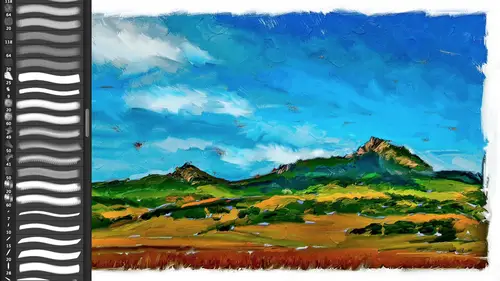
falls and jungles that I that I showed you is a traditional hand tinting back in the day think of the old, you know, forty niners, the gold miners and civil war where they would hand tin images a very limited palate at the most six colors, usually three, three, two, six colors, very simplified, very soft edges. Nobody was going in trying to make it look like a color photograph that exist, they were quickly tinted, so simply de saturating an image or doing something else to an image doesn't imitate. It doesn't look like it was hand tinted, because if you start with sixteen million colors and you just do something to it, you still have sixteen million colors, which you want to do is create something that has a limited color palette, and therefore it looks like it's hand tinted it's. Also something to keep in mind when we enhance images for photo shop. When we get into a photo shop, you could also post arise this down to a limited palette, because no painter is going to mix sixteen million colors on their palate, right? They're going to have a gay, I've got a dozen main colors, and I'm going to mix those two do other ones. So that's, another thing that shows sometimes this digital aspect of it is the tonal range isn't what a real painter would use. We have a limited palette, and our landscapes can do that so post a, rising an image, or reducing down the number of colors, and it is something that can also be due. Be done as an enhancing step in this case hand tinting I've gone over to my adjustment brush same thing that's in light room going to the adjustment brush and and a doe became a raw if you have, you know, fifty different sliders changed because the last thing you did is such clicking on any of the pluses or minuses will automatically reset um all your sit sliders back to their default on lee, leaving one behind if you're in light room if you click on the, um title of whatever panel you're in and the upper left hand corner usually of that panel double click on it will reset that entire panel's parameters so it's a good habit to get into in this case we want to color an image and so by simply clean on the plus resets, everything else were on ly changing color. Now I'm gonna click on the color swatch I bring up a color picker and, um I can pick color, so if I want a little you know skin tone orange um that is my skin tone orange. If I want I can take that orange, you'll notice I'm holding down the option key on the mac or the old key on the pc and I can actually fill I've got five little swatches here at my disposal as I mentioned I like a reduced palate so I'm actually going to make it the palette that I'll do here, and I could do maybe fifty images from the same palette. In other words, I'll save the palette in here in my dopey camera raw, so I'll have a skin tone, a full ege sky, you know, a few other colors so there's my skin tone like simply come over here, let's hide that green circle. I'm going, teo also use a nice big soft brush looking at the brush parameters here, here's our first brush. We're not even in photoshopped gonna do brushes so I've got a big feather flow in density it's going to do that go as fast as possible up to whatever value I have. Density is a little bit like opacity. The thing why it's not opacity is that if you take, um, the density down to fifty percent let's reverse that opacity. If you have a brush that fifty percent of passing you do a brush stroke, you fifty percent, you do another brush stroke. On top of that, what do you get? One hundred fifty one fifty density always stays. Whatever you do. This is an object oriented brush and it remembers its at fifty so you could paint on it all day we'll never go past fifty if you paint with it at hundred goes to one hundred change it to fifty paint on top of the hundred what does it do? Takes it down to fifty so even though you're not a racing if you have it at fifty it will paint fifty and nothing other than fifty that's wasn't a cold opacity doesn't build up if you want something to slowly build up that's the flow you take that down and it will gradually build up so that would be like a near brush setting but this we're gonna have it all the way up here feather all the way up the size I'm going to, um control um by even though I do have my click wheel here on my, uh into us, I often turn that off for teaching because I'm resting my hand on it and it just gets annoying because you see the pop up in you there's a heads up display that shows up and it just gets a little annoying if you'd always see the heads up display. So I'm going to use the square bracket keys so you can see that the square bracket keys allow me to change the breast size so I have my finger's on the square bracket keys shift square bracket changes the feather and this is the exact same way that photo shop works so these square brackets and photoshopped changes brush size shift, square brag it changes the feather in photo shop works exactly the same as in both light room and a ceo. Okay, so I've got a little orange here. I'm going to do skin tone. This is how quickly I'll do skin tone, okay? And you'll notice that I went over the eyes so it's often easier to race where you don't want it. The shortcut forgetting to your erasers hold down the option key on the back of the old key on the pc, you'll notice it went from ad and the adjustment brush to erase bite me simply holding that down. So I'll just a race where I went over the eyes or the lips with a brush, and I'm done okay, but I don't mind the fact that it went over the hair, I don't mind that it went over the blouse, you know, I could clean it up a little bit, but that's spillover is actually part of the hand tinting process that would have been the case back in the day. So, um that's the skin tone because that pin is still active, you can see the house sloppy. That mask is if I haver my pan over it, I can click on that color swatch either now or anytime and I go, you know what? I want that a little bit more you know, saturated up here is saturation left and right is your few up and down the saturation. You can also use that saturation slider so again, we'll give mom it'll that moreover town, she grew up in florida. Okay, so I'm gonna come up here, say, new I want to make a new adjustment brush you'll notice that is no longer highlighted. That pen now is hollow. I'm gonna click here. I'm gonna, uh, come over here and we'll find a kind of a green for my background kind of misty green. Hold down that option key. Now that green is permanent, I can use that for folded your trees or something like that, I say, okay, here's my background. Okay, done. New swatch blue here, there's no such thing as color in black hair. She's got black even though it's a little bit of a brunette will give her black hair. And just as we all know from superman, superman has blue here and, uh so we're gonna give mom blue here blue highlights in here. So I'm gonna just go over the highlights and I'm also doing what they did in the day and I'm going to use the blouse and I'm gonna make that blue because white also not having a color, they would do a little blue intent in there if I have her my cursor over the pin I can see where I painted it temporarily shows me that mask I can also click on the show mask icon in light room that's tapping the okie allows you to see the mask of oas a hole in a mask tapping the oki is your shortcut for viewing the mask okay like it so so far so good I'm gonna come over here is hit new click on my color swatch now let's go to kind of a red lip color so when it come over here and actually, well I've got a nice big brush let's come over here on my mom's cheeks and just go tap tap those air nice rosy cheeks okay? And, um that's all that we need that well, zoom up a little bit more, take my breast size down okay? And I may turn on that mask so I can see because sometimes it's a lot easier with something as detailed as the lips I'll do really sloppy here, hold down the option key and then clean it up with a small, harder eraser. Whatever you set for that brush will is sticky so that way I could do the bottom lip really quick without needing to go into a tiny little brush I'll do the top lip here hold down a racer and that way, you're able to get, you know, a detailed painting without necessarily needing to go into a little brush like I'm doing now to cheat, okay? And then, uh, tapping the waikiki is how you can turn the shortcut. Returning on and off the mass show mask is also tapping the waikiki, and if I want maybe add a little bit saturation, too, that I click on it, that pin is still active, so I can take that up a little bit to add if I wanted to exaggerate, as they often did, the little cheeks and stuff, okay, and I didn't add the red. I want to add that red, so I never have to do that again. So now I've got my skin tone my background. I forgot the blue blue is up here so I could go back to it and I can so there is my skin background make up and blew and there is my, um, before after before after intending now, it's really cool and I'll do that question a second. Why this is much better than photoshopped as I mentioned, is when I come up here to that background. In photo shop, if I did a tent on a layer in a separate layer, that would be a separate layer. Now I want to change tone. I want to change focus, or I want to blur it because that pin has every single thing. That's basically part of that tango at its disposal. Uh, I can come over here and say, take that exposure down or lighten it up. I confined too. You can see that how sloppy it was, but I can take it down a little bit more. I can take that clarity down now, clarity up a cz we know. Is it going to exaggerate that texture on the edges? But if you do an anti clarity, guess what? It's a wonderful film, gua little, you know, um, ghosted, uh, softening filter on there. So there is, you know, I've just did a beautiful little film noir background on the all around the hair that back backside let hair. Same thing I could go on the cheeks if I want to, you know, make those a little bit darker or lighter. I have both I have everything at my disposal and every one of these pins, which you don't have in photo shop, you'd have to do more. You know, each one you'd have to share the mask, you'd have to make a clipping group, you'd have to put them in a folder and mass the folder you know you'd have to do half a dozen steps if I wanted, you know, mom's skin tone to be a little bit different, okay? I can lighten or dark and any of these, if I go to the blues here again, I can come over here and change any of these aspects. So that is the reason why not only is a beautiful, subtle, wonderful tinting translucent, but every one of these areas you confined tune with all these parameters at your disposal, which is much easier than doing in photo shop. Okay, question wedding dress would you still at the blue to that? Or would you leave it all? I would do a subtle one where you'll notice that where there is no tone there, there there's nothing for it to grab onto, so to speak, to die it has no effect that's the great thing and why this color swatch when you click on that thie color swatch doesn't have it's just hugh and saturation there is no luminosity you can't change the tone of an image, which is great it's exactly what you want, the last thing you want is to muddy up everything by painting on it. You do have your exposure toe do exactly that, so to answer your question it's up to you and what you're doing, um, whether you would want to add a little bit of color to it. If that's outdoors and it's got a sky, the dress actually would be reflecting the ambient light of the scene, which would have ah, you know, cool cast to it if it were shot indoors, a beautiful wood library than that dress by definition would be bouncing off that ambient light, so a little bit of warmth could be it's up to you. What? But that's the great thing with the painting completely up to you what you want to, you know, try and achieve a very good question. Yes, um when you choose an image for something like this, what you should you look out for, what are things that are very good things to avoid? Um, what do you really looking for or does anything work anything works? It depends upon how much you're trying to imitate a timepiece, a vintage piece. So obviously if if you're trying to make it look like an old antique picture having an old picture works or something that could be an old picture, you could it's a it's, a wonderful juxtaposition of doing something that's, obviously incredibly new and modern but using an old technique, you know, that's again one of the great things with all these patina as of all these photographs, we have all these new modern scenes recorded as if they were done with a no ah uh sayin a type, you know, some wet process things. So you've got this wonderful juxtaposition of modern imagery with antique technique so there's nothing per se for landscapes. I love doing landscapes that I shoot a lot of infrared and so I love that because you've got this, you know, dramatic lights and darks of the foolish based upon an infrared converted camera um I would convert to black and white first and then, you know, just that's the limited number of colors that will really sell the effect and the fact that it's real sloppy I mean, you can look at these masks, you could not get a sloppier mask in these areas, but that actually helps sell the effect. And when you look at that there's no way a person's going to say, well, that was computer colored in a sense that it was a filter why did command deaf and did that it was hand tinted. The nice thing about that is you will charge for it as if it's hand tinted because it was hand tinted and that is going to set it apart from billy and bobby and susie and everybody who says, why am I paying you for a photograph when I've got an iphone? That is the scary thing about the current state of the industry is everybody has a phone, everybody has effects, they're throwing them into the cellars now everybody's got everything. So why are we paying you is an artist and you'd better have an answer and the answer is because I'm a storyteller I'm not a shutter pusher, I'm a story teller and I that's the nice thing about painting and even hand tinting the reason why you're paying me is I'm going to make the most potent image about that place about that person, about the scene, about the family I am going to interpret, whether with traditional photography or painted photography I'm interpreting your scene, you're paying me as an artist to make a statement about this person, place or thing you're not paying me because I have a cool piece of equipment, okay that that those days are gone used to be if you if you could sharpen focus, you know, colorful you're hired right now that those days are long gone you on that one? Not a shutter pusher? Yeah, you're not so tell her you know, all of us have got one of these thiss the word teaching and I photography class september middle of september preed two day class today three day class here creative life I love it it's awesome freaky amazing the problem is is every single person on the planet has got a freaky amazing little cellphone so you'd better get your storytelling down so that it's obvious person looks at your work they look at a painting they looked something they go I want art on my wall I've got enough instagram I would like art on my wall you give something as a gift to somebody and they go that's going up not because it looks like it came off my iphone but because it looks like somebody is actually shaping a story and how they were obviously this starts with a beautiful studio photograph beautifully lit you know so I'm starting with somebody else's art work in this case but hopefully with how I shoot different scenes and stuff like that you know the story here it's garbage image but the story was there and that then we'll convert into painting beautiful photograph but it will be different once it becomes a watercolor okay, so we're going to start off with one of these we could open up a bunch of these and put ashore but we'll start off this one. This is the one that has the pdf that's available again if you've seen this painted over the years I apologized but it does have a nice range and gives us our story they're different ways you can open it up in foot of shop. I mentioned the bit depth okay before about with the color space and also resolution um, the pp I, um, different things in, um light room, you're going to go into preferences and there's an export cab, and you're going to set these exact parameters in light room under the export tap. In this case here in adobe camera, this little piece of what looks like hypertext is actually a button. These are your what are known as your workflow options and the workflow options when you click on this brings up your work flow options, and this one lets you set your color space, so I'm going to set this even though it was photographed with the camera said to s rgb, I'm going to set it to adobe rgb this right here is where I mentioned you can use pro photo it is abroad color space. The problem is you're responsible for proving that I don't recommend it unless you're really know what you're doing. Um, the bit depth over here you do have the option of doing sixteen bit or eight bit, as I mentioned before, if you're doing all your color in tone and light room or a doe became a raw, you have sixteen million colors of an eight bit image as we all know to to the eighth power is is what? Just go ahead and do that in your mind. Go ahead, don't be shy to to the eighth power is two hundred fifty six colors and you have that for each one of the red, green and blue channels that make up your image. And, as we all know, to fifty six times two fifty six times two fifty six is one sixteen million colors that's where the sixteen million colors come from it from a j peg file verses twelve bits of information per channel, which we won't go into gives us the potential sixty billion colors of a raw file. As I said, the human eye can only see about ten million colors get into dogs and shrimp and your whole otherworld don't get me started, but sixteen million colors here is plenty most your monitors can't show sixteen million your printers can't do it so eight bits per channel is fine if everything you want to do with that image in terms of color and tone, you've pulled out all the shadowing highlight detail you done all your color work, you have my permission to work in eight bits per channel you're not a second class citizen if you don't work in sixteen bit. Because sixteen bit the files half the size of works twice as fast and all your filters air available in photo shop your creative filters and that's what this class is about so sixteen bit you're going to photoshopping you're going to go, huh? How come it's not working? How come I don't see you know rough pastel as a filter so eight bits per channel especially since you've already done the color in tone and you'll never do curves or levels or contrast and push up ever again will be fine resolution I'm not going to raise it up or down in this case, it's a very lower his file for teaching you can't do a specific pixel size if you want to do that this resolution doesn't change the file when you change what's known as the pixels per inch of a file, all you're doing this numeric value is how many pixels they're going to be squished together when you hit print and tell you hit print you could set that to ten thousand you could set it to three and will not change the file at all it's only makes a difference when you hit print it's just saying how many pixels to squish together? I like to twenty five especially for doing paintings that's more than enough, you could probably get away with one hundred fifty pixels print if you're printing to canvass watercolor paper you need a bit more if you print a glossy stock because your paintings going to go as a poster then you probably should have two twenty five you could possible even go up to three hundred the nice thing with two twenty five which is an adobe recommended middle of the road resolution is it is middle of the road you can go for glossy stock and go for textured stock it's half almost half the file size of a three hundred pixels per inch file that's great that's cool it's awesome I've also made all my textures and brushes toe work at exactly two twenty five for just that reason so all the textures when your image is set two to twenty five and use one of my patterns and printed out it's exactly the same resolution as a real piece of canvas of watercolor paper which is really really bitchen okay that's the technical term it's bitchen one last thing here and you could do some output sharpening in this case I like running my own sharpening we haven't run through sharpening but in this case because you were going to paint it really were mainly concerned with output sharpening when we're all done at the end of it so we're not even going to get into that right now ah but open in photo shop is smart objects this may be a nice habit for you to get into what that means both in light room and you two get this on right light room if you go down to your filmstrip in right click and say open in photo shop as smart object, it actually takes whatever you've done in light room raw r j peg or tiff brings it into photo shop, so you still have access to the raw material very, very cool. Change it from color to black and white do whatever you want same thing goes here if you click this on as a default, this button down here becomes open object, not open image if you open image traditionally, it rast arises the images that becomes flat, it burns everything into the file. You can't change it afterward, so smart objects air cool. They're also cool because you can apply filters to smart objects and they're non destructive. You can also take multiple filters and put them together and make a smart filter recipe and that's also non destructive that's also cool because you can take a smart, filled a recipe and drag it from one photograph to another one, and will automatically do the effect. It's also cool because my painting recipes and photoshopped or based apart smart objects so the actions I'm going to be giving and we get into smart. Filter painting are actually being done to the raw files and you can actually do a painting on one image. Open up another photograph, drag it over to another image and be done which is really cool. So smart objects are nice. I turn it on is a default so now mind says open object if you did want to rest, arise it for some reason and open it up. Dumb open, smart outbreak open dumb object holding down the shift key toggles it from open image to open object. Okay, so the shift key and again in light room, you right click and you say open in photo shop or opening photoshopped a smart object either one. Okay, so that is that right there I'm going to say open object will just go ahead and do just that one right now and that is going to open it. Answer your question in terms of what we're going to do here, I have already loaded in all those presets we already went through that before the break so those are all going to be, uh, ready for me. Let's go into here that should be sitting. I said, open object and it's not here, don't you hate it when that happens, where is that's our image, uh, open object done okay, second time's a charm. So here we have it. What we're going to do is we're gonna take advantage of things like the pattern stamp tool. I have loaded it in so I can come up here and I can say hi to aunt told presets or while painting sampler whatever years happens to say it will load in things like our watercolor that will open up our options bar we're also going to find our actions are wow. Action sampler. So things like this over here? Well, painting, action sampler. So it's going to have different filters here, and when we get into creating a layer using something like a pattern, we're going to find that layer knew, like pattern. We're going to find that our patterns like our jess oh, pattern here are going to be available. And again, we have a little, um, gear over here. So when we do something like a pattern field, which will do all together, we're going to find the wow patterns, canvas textures, watercolor paper. Those sorts of things are going to be sitting right there for us. Okay, but we will cancel that now we have a photograph.
Class Materials
bonus material with purchase
Ratings and Reviews
Shannon
Okay, I'll be first. Jack has an easy, approachable way of teaching. It was more like being in the room with him, watching over his shoulder as he created something utterly new and exciting. Even when he worked on images he had done many times, I never sensed boredom or a lack of enthusiasm. He was patient with questions and answered them completely. I hope Jack enjoyed this way of teaching as much as the world enjoyed watching. Maybe he'll find more to share. I know I'll sign up for his next one. This workshop inspired me to start creating art again. I'm slowly losing my sight and sad to say, I was starting to let it get to me. As I watched Jack, I tried just a few things and realized that I can do this. Digital art is much easier for me than pencil and paper because of the technology. I miss the pencil and paper drawing, of course, but this is so much FUN! The techniques that Jack shared are wonderful and the results rockin' ... or as Jack says, bitchin'. Thanks to Jack and creativeLIVE I'm back in my head in a good way.
a Creativelive Student
Thank you Jack Davis. Having tried to paint, both in the real and digital worlds, this is the first time I have seen a comprehensive demonstration of the techniques and philosophy for the artist. This course is valuable for any aspiring artist, digital or otherwise. By the way thank you CreativeLIVE for the long form training space you offer both the teachers and students. Jack is inspirational, talented and sometimes funny. Watching him paint in real time is by far the most impressive sight but the information about why is more valuable. Overall this course will give you ideas, knowledge and skills (if you practice). I highly recommend this course for anyone that has tried to paint in the past and was underwhelmed by the results.